Heritage – kitchen papers and flooring, part 2
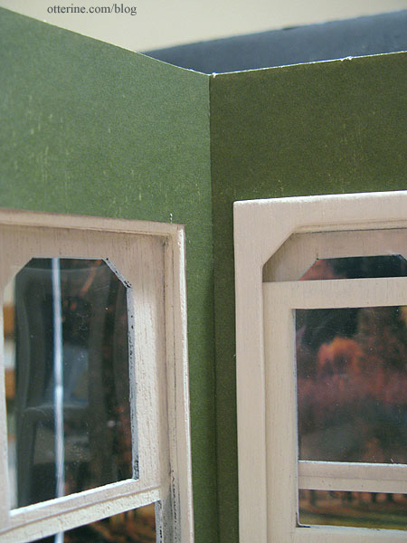
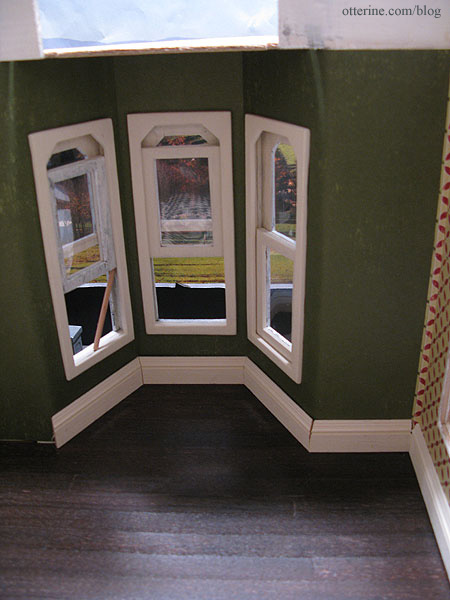
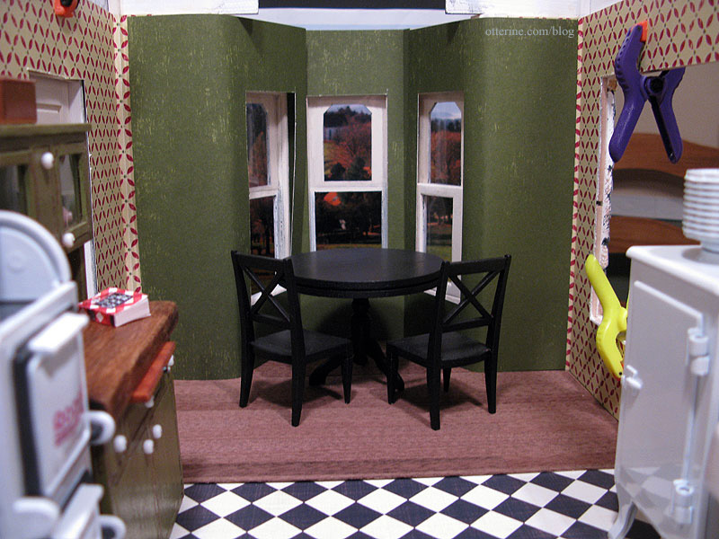
Continuing work on the kitchen papers and flooring. I started pasting the wallpaper in the front bay window as well as the newly installed kitchen side wall. With the bay window paper in place, I was able to start gluing in the window trim. I used the same super glue trick installing the trim – just a few dots to hold it in place while the white glue dried. It made it so much easier. And, the middle window still works! :D
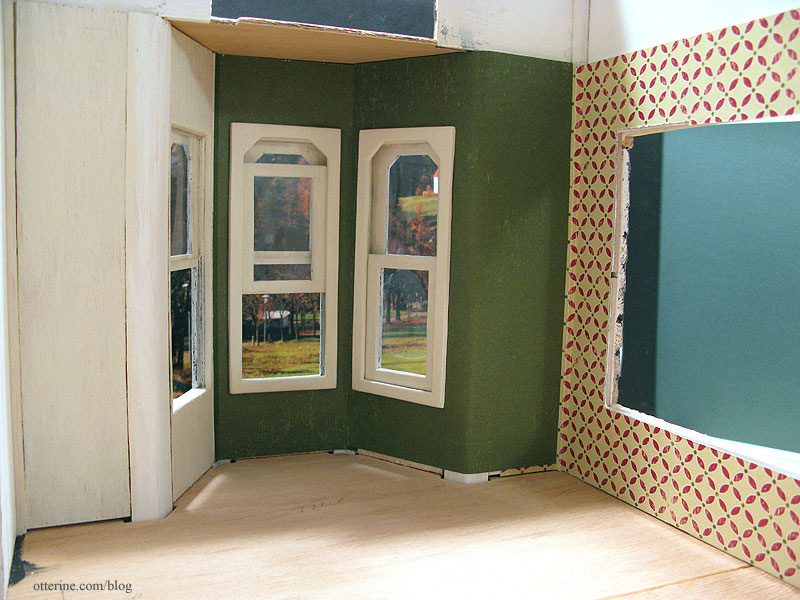
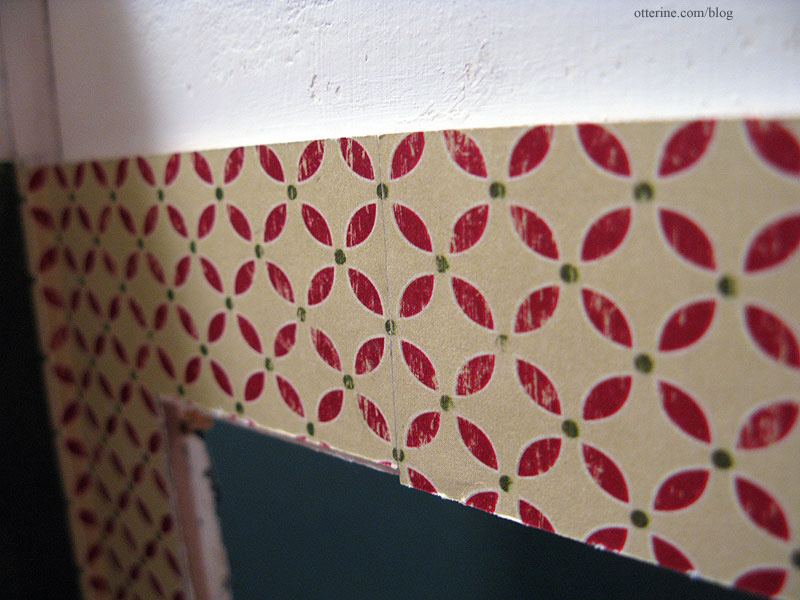
Since scrapbook paper is limited to 12 inches in length, areas needed to be pieced. It’s easiest to piece at a corner since your eye already sees this area as a dividing line and the seam will be less obvious. To get a good match in a pieced corner, I include a bit of overhang.
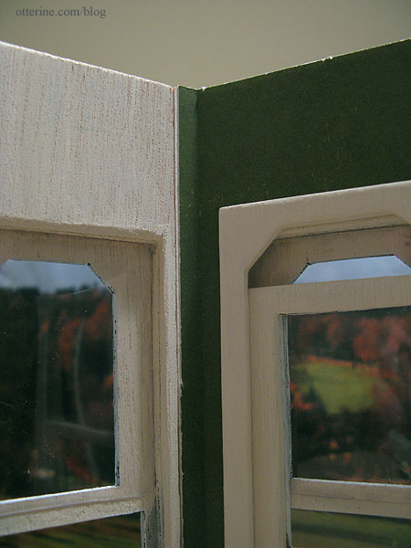
I then paste the adjacent piece over this extra paper for a nearly invisible seam.
When the paper needs to be matched on a long wall, I cut the pieces to match in pattern and paste end to end. The seam is somewhat visible, but it should blend well and not draw your eye once the room is furnished.
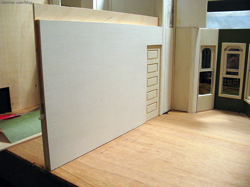
I finished up the pocket door and primed the two separate walls before gluing it all together. I again used super glue to hold the pieces in place while the wood glue dried. That’s fast becoming my favorite trick for building! Once dry, I glued the assembled wall into the house, being careful not to glue the door itself to the floor.
Once the glue set, I was able to paste the rest of the wallpaper.
I always use Yes! paste applied with a brush.Note: I no longer recommend Yes paste – I use Wallpaper Mucilage instead. Yes paste has problems with longevity.Up next, installing the wood floor I finished previously. I’ve built in enough clearance for wood flooring to continue under the pocket door when it is closed. This part of the floor will be installed when I work on the entry and parlor floors. And, yes, the third window is still loose enough to require a dowel to prop it open. :D (Of course, I installed the insert wrong side out and had to do a bit of trim removal to reverse it.)
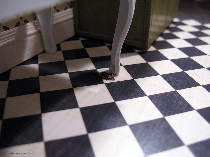
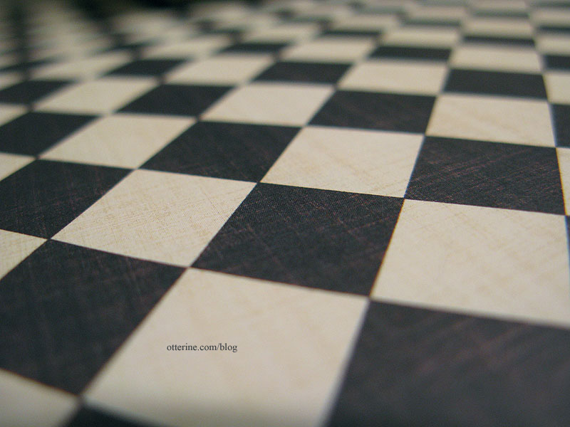
To finish the tile portion of the kitchen floor, I used spray adhesive to attach the cut piece of Cream Diamonds by The Paper Studio to a larger piece of Bristol paper to give it added weight and durability. The wood floor it will be next to is thicker than the scrapbook paper itself.
I sprayed the surface of the paper with matte sealer. I was heavy-handed with it, so parts turned out glossy and others spotted. There are even a few random imperfections. All of these things make for a perfectly aged floor! :D I just wish it showed up in the photos. At least you can see the aged pattern of the printed design.
I’ve started cutting the baseboard pieces, but they are not yet glued in place. Since the Heritage kit doesn’t lend itself to straight and square construction, I will need to do some filling where the cut pieces of baseboard meet. It’s a fairly simple fix, and I’ll detail the process in a future post.
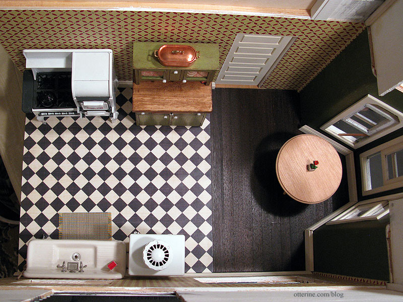
And, here is the kitchen with the pieces I plan to use for it.
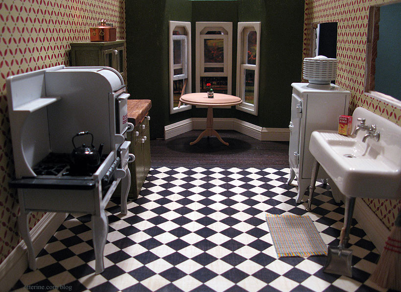
I really like how it’s turning out. :D
Categories: The Haunted Heritage
December 10, 2011 | 0 commentsHeritage – kitchen papers and flooring, part 1
I installed one of the last two outer walls – the one on the side of the kitchen. I used a trick I learned on the Greenleaf forum of putting a couple drops of super glue (I used the gel kind) to hold pieces in place while the regular glue dries. Ingenious! The wall had a bit of a warp to it, and the super glue held it better than masking tape.
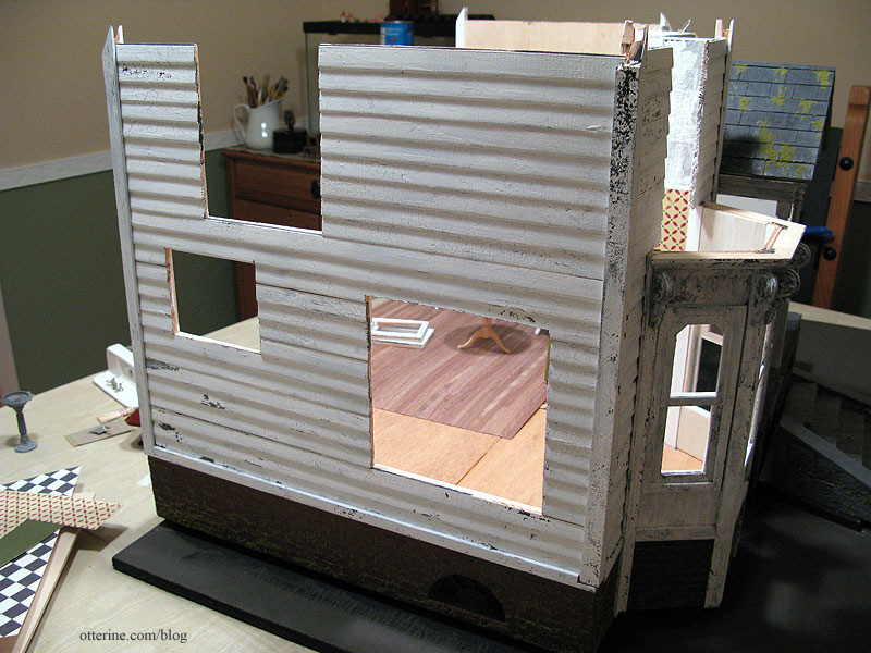
The flooring is Cream Diamonds by The Paper Studio and the wallpaper is Geometric Fa La La by Making Memories, both scrapbook papers. With them is the tall baseboard molding painted Vintage White by Folk Art. I thought it might be too much, but as Lyssa informed me, ‘too much’ was the style of the day. I’m more used to subtle modern design.
The flooring paper is very thin, so I plan to use spray adhesive to attach it to a sheet of cardboard. I’ll then coat it with matte sealer (which actually has a slight sheen to it) to bring out the color and give it the look of well worn linoleum. I love that it has the weathering built right into the design.
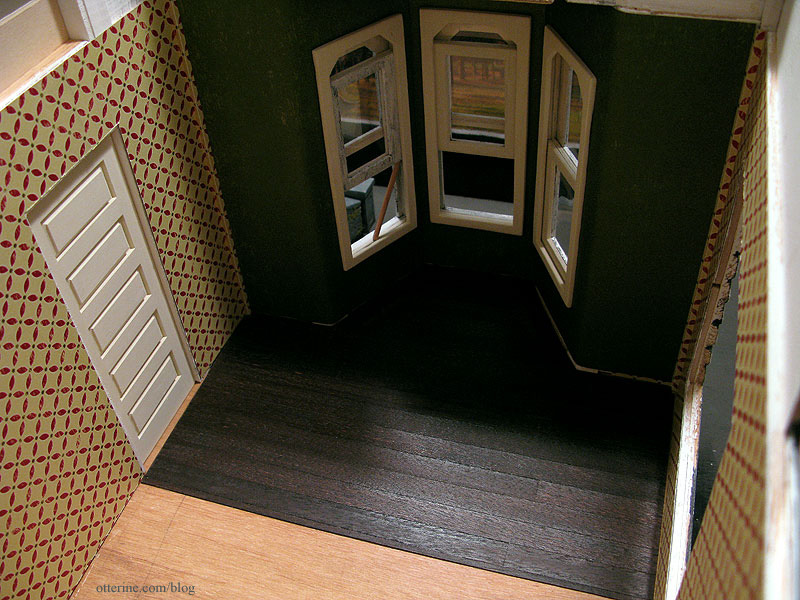
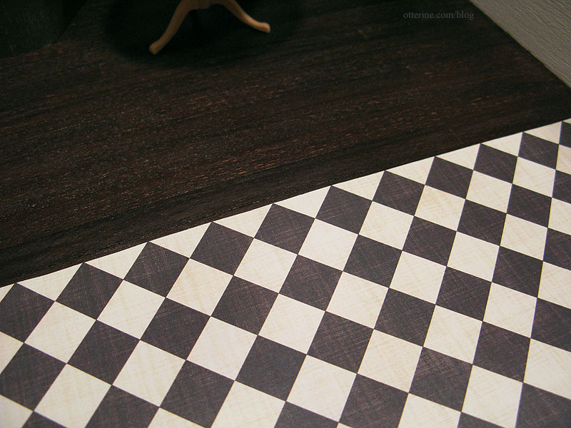
In the dining area and bay, I’ve used some scraps of walnut wood flooring left over from the Newport instead of continuing the rather busy black and cream checkered tile. It breaks up the areas and tones down all the pattern going on in this room.
I also opted for a solid color in the bay and adjacent walls: the aged green printed on the reverse side of the Geometric Fa La La pattern used in the kitchen. It’s meant to coordinate, so the color is spot on, and it has thinned out portions printed in the design so it looks like it could use a touch up. Plus, it ties in perfectly with Keli’s Hoosier cabinet!
Here is what the flooring looked like out of the package.
Lyssa wanted raised floorboards in my old house, so I cut the paper between a few of the pieces. This should allow for enough give for the wood to warp and lift.
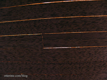
I used Minwax Plantation Walnut stain on the walnut floor, and it worked well for a start.
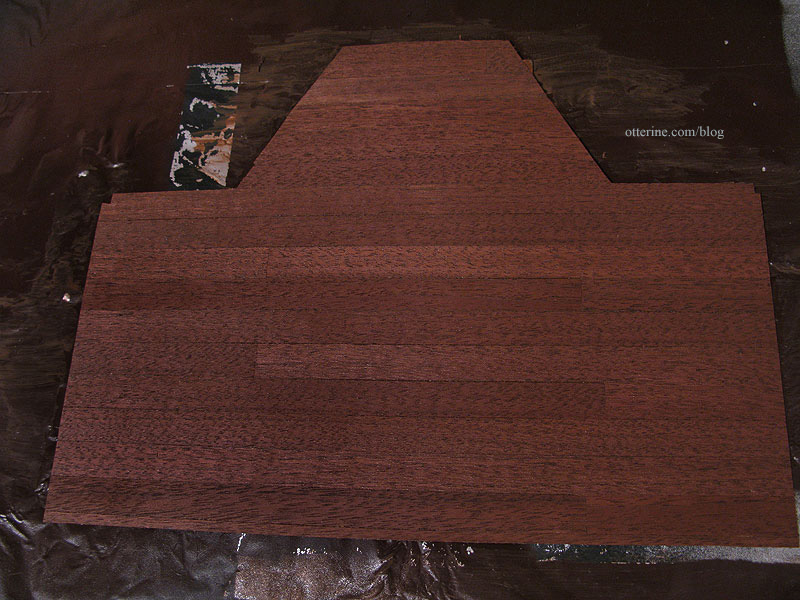
I then added a few dark washes of black and brown acrylic paint. Now we’re getting somewhere – all those years of grime. ;]
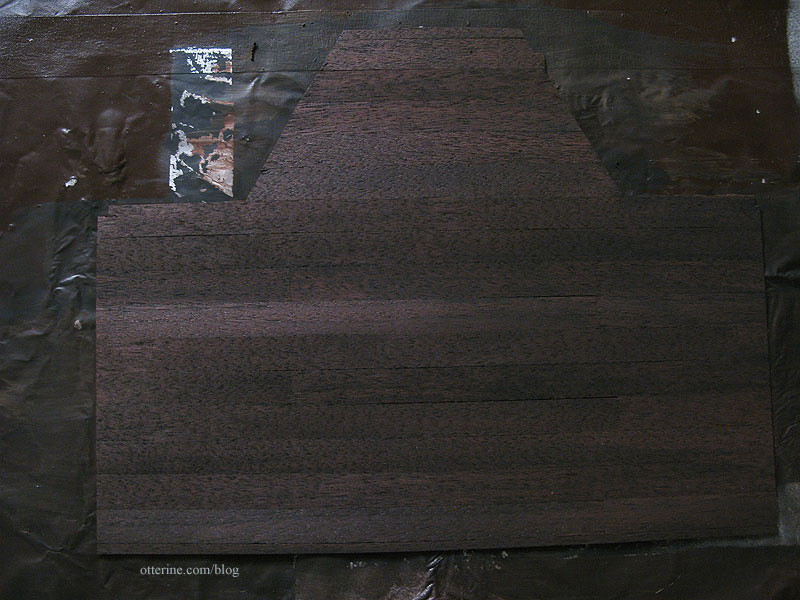
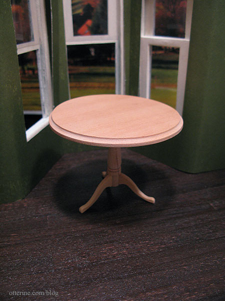
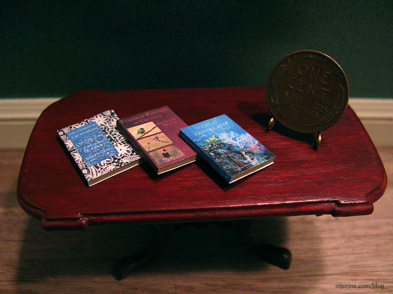
I sprayed the floor with matte sealer and once dry I sanded the hell out of it. I brushed on a thin coat of satin varnish, which I wiped away before it dried. I’ll mess with the finish more when I install it, but it is at least the basic color I was looking for. The table is a House of Miniatures kit – assembled but not yet finished. I am awaiting the chairs I hope will work with it.
The darker floor works better with the checkered floor.
Categories: The Haunted Heritage
December 7, 2011 | 0 commentsFilled bookcase
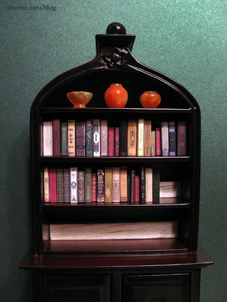
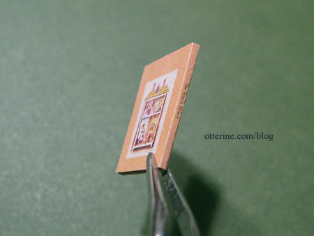
I bought a lovely bookcase quite some time ago simply because I liked the look of it even though it wasn’t modern, the usual style I worked in for the Newport. When I started the Heritage project, it found a new home. But, I’ve made only a handful of books and those are in Baxter Pointe Villa. For the Heritage, I wanted a mix of antique and newer books – a collection built over time. I printed and cut 130 book covers with the plan to fill them with balsa wood inserts.
There ended up being a few duplicates in the 130 since there were a few books I wanted to be sure I made (I liked the covers) so I made duplicates in case I messed up my first attempt. As you can see, I made it through 30 of them in one day. Yes, there is one duplicate in there – a two volume set. Ha ha!
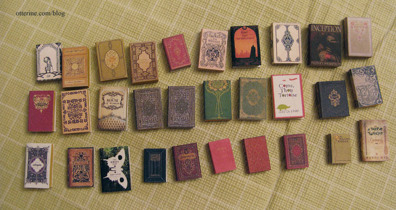
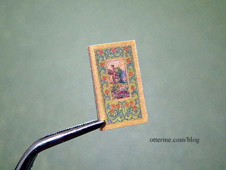
A few came from Carrie at A Lavender Dilly but most are just found online images. If I can’t find a full image of the spine and back for a cover I especially like, I sometimes make up the spine and back in PhotoShop. I like my books to be complete, even if the backs don’t show in most settings. I also paint my edges in an array of yellows and tans for variety in case I use any for tabletop displays.
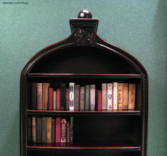
I have lined my past book covers with heavier drawing paper, but this is harder to work with. So, for the sake of ease and time involved, I used only the paper printout over the balsa for this grouping. Here are two shelves of the bookcase with my 30 books in place.
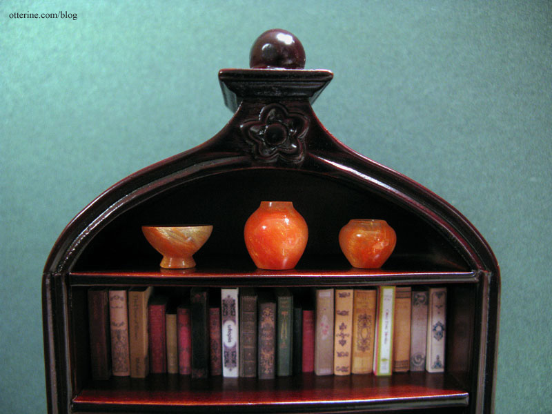
As I was finishing up the books for the bookcase, I was thinking about what to use on the top shelf. I could have put a stack of larger books on their sides, but that seemed almost too cluttered. I ended up buying a matched set of orange acrylic turned items from CW Lubin Wood Turning, two vases and a bowl. They were advertised as quarter scale or half scale items, but I often find those smaller scale items look wonderful in full scale scenes.
I arranged the two shorter items on either side of the taller vase to make the most of the space on the top shelf. Getting these in there was interesting. My normally dainty hands became giant paws inside that shelf and tweezers were no help since the pieces are so smooth. I finally managed to get them to stick to the shelf with some mini hold wax and pressed them down for a good bond. I think they’ll be there forever as long as the wax holds! :D
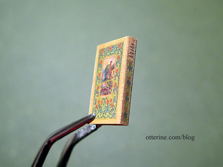
After a few more days of book building, the bookcase has been filled with books! :D
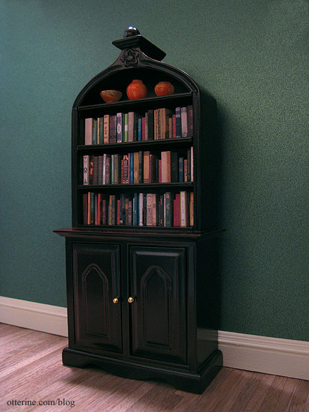
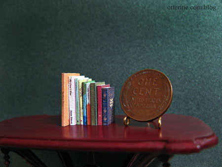
There are 79 in total, arranged in random order.
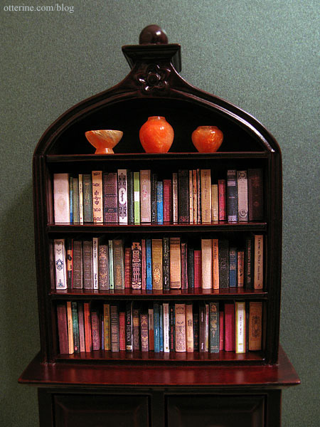
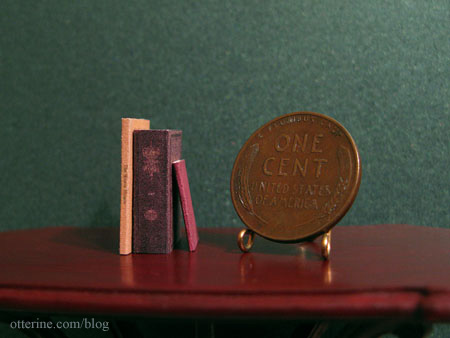
They range in thickness from 1/64″ to 3/16″ and from 1/2″ to 3/4″ in height. I think the variation in sizes, colors and design gives them that extra push toward realism.
tallest, thickest and smallest To make sure they sit prominently on the shelf, I added some scrap balsa wood to the shelves. The pieces are held in place with mini hold wax in case I ever want to rearrange the shelves and remove the wood supports.
Update: I finished up another batch of books for the house, sixteen more for the collection.
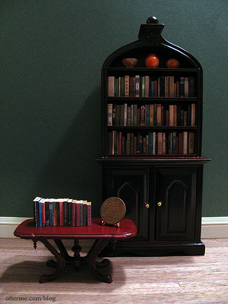
I even included some coffee table books on lace making, birds and the Great Barrier Reef. :D
Categories: The Haunted Heritage
December 4, 2011 | 0 commentsBooks – a few of my favorite covers
I always judge my mini books solely by the covers, though I do occasionally add books that I like for their content in real life. As I was making up books, I figured I’d share a few of my favorite covers. Some of these might be hard to see since I am photographing the minis I made. They do lose some legibility from printing so small, but I don’t want to violate any copyright laws by posting book covers that might not be in the public domain. You can always search for the titles online if you’d like a better look.
The House Mouse, by Dorothy Joan Harris and Illustrated by Barbara Cooney. This has a super cute dollhouse with a mouse occupant! I’d like to make the cover illustration as a wall hanging mini house.
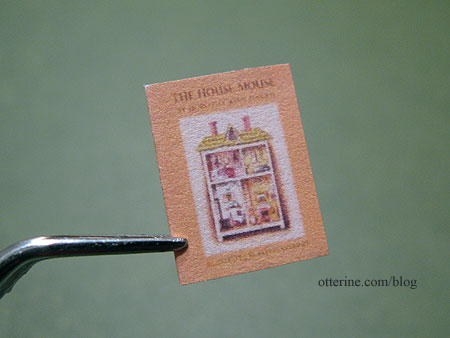
I was able to find only the cover, so I made the spine and back in Photoshop. For the back, I used the image again and eliminated the text.
Sweet of the Year by Emily Ridgway. This came from abebooks.com, an excellent source of book covers and sometimes spines. I love the villa in the garden illustration.
This one had the spine in the image, so I duplicated the front image for the back cover, flipping it in the opposite direction.
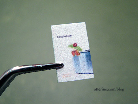
Amphibian by Carla Gunn. Froggy. Enough said. :D
Return of the Bird Tribes by Ken Carey. Beautiful illustration.
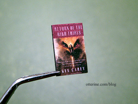
I made up the spine and back cover, this time using solid colors and dropping in a UPC box on the back cover. This is one of grandma’s many modern additions to her library. ;]
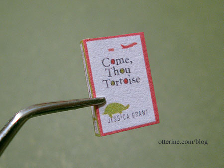
Come, Thou Tortoise by Jessica Grant. Lovely colors and graphics. This is apparently a funny book, but I’ve not read it.
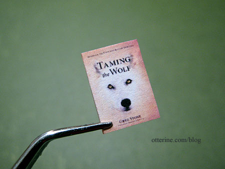
Taming the Wolf by Greg Stone. This is actually a self help book on resolving conflict, but the cover to me says adventure in the wilderness. I could see this cover being on the sequel to The Return of the Bird Tribes shown above. :D
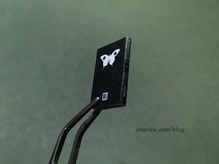
The White Mary by Kira Salak. Love this cover – the greens, the butterfly, the layout!
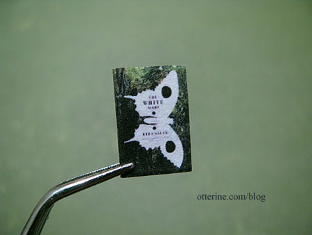
I made the back by copying the butterfly graphic, rotating it and removing the text. I made the spine by copying the green background, duplicating it in mirror image and adding text. I also added the UPC box again. I later found the actual spine and back cover, but I liked mine so well I printed it instead.
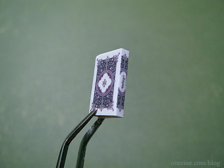
Utopia by Thomas Moore. This is a book first published in 1516, though I don’t believe this is the original cover. Ever After is one of my favorite movies for its fun take on the Cinderella story, not to mention the costumes, and this book plays a part in that movie. When I first stumbled onto the cover during my online searches, I knew I had to use it.
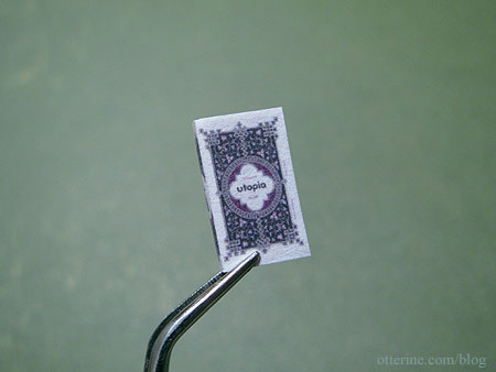
I created the back by mirroring the front, removing the text and copying some of the border design elements into the middle. The spine is a section of the front cover, with text replaced.
Obviously, I haven’t used any covers I don’t find appealing in one way or another, but these are some of the highlights.
Categories: Miniatures, The Haunted Heritage
December 3, 2011 | 0 commentsNavajo rug – introduction
Natalia Frank recently stitched a gorgeous Navajo design on 40ct silk gauze. I am one quarter Navajo, though I don’t know much about the culture since I’ve not had much contact with that side of my family since I was very young. I thought it was a perfect way to bring that part of me into my miniature art, like gathering the pieces that make me who I am to include in my mini projects.
I checked out numerous books from the library and found many designs I liked, but it wasn’t until I did a google search that I found the perfect piece: a beautiful contemporary weaving presented by Steve Getzwiller (below, see the second weaving from the left for the one I was immediately drawn to). You can see more of these wonderful works here. So many intricate and beautiful designs to admire. I love the corn stalk weaving on the far left, too. True artisan work!
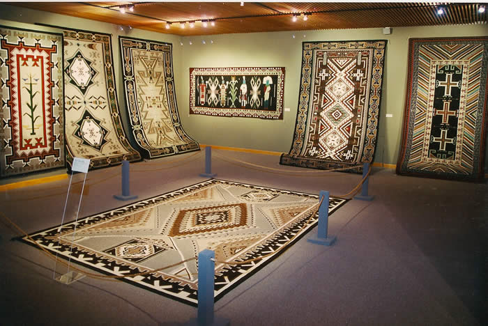
I was instantly drawn to the colors and shapes of that one particular design, so I set out to find a better photo. This was the best I could do. That is Steve Getzwiller.

I wrote to Natalia to see how she charts her patterns, and she offered to chart it for me. I can’t tell you how grateful I am to her. She saved me so much time and headache since I had no idea where to begin. She has captured the beauty of the rug in miniature scale, and I will soon begin to stitch.

Mine will be cross-stitched on 32ct Jobelan in parchment, though I do plan to stitch the entire rug, including the background. I just thought it would be easier on my eyes than stark white. I like the coloration as it appears in the first photo above considering the room I plan to put it in, so I’ll use colors similar to those instead of the warmer earth tones of the second photo.
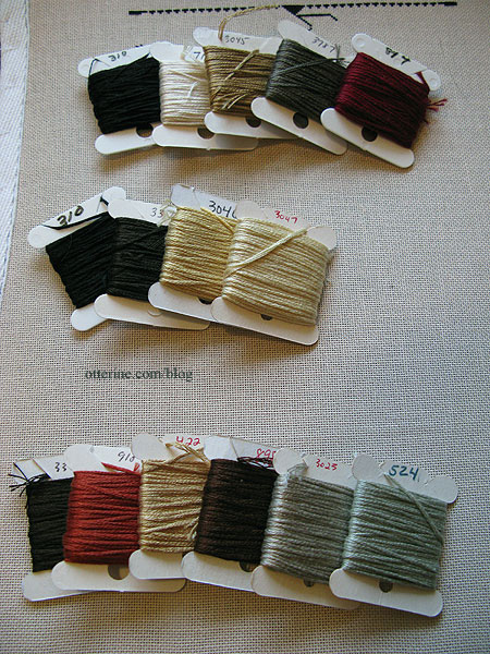
I have the project on a wood frame since that’s what I had on hand. It is held in place with thumbtacks on the right side. I’ve picked my colors from my existing stash of floss, though I need to buy more of the center background color. I plan to buy several skeins so the dye lots will match since it covers a large open area. Most of the other colors won’t require as much, so I’m set as far as those go. I went with a subdued palette though I think the contrast levels will be quite nice overall.
With the fresh beginning, I am getting into the groove of it. I’ve set myself a goal of stitching at least ten hours per week. That should keep a steady pace going.
Categories: Needlework - French knot rugs
December 2, 2011 | 0 comments


NOTE: All content on otterine.com is copyrighted and may not be reproduced in part or in whole. It takes a lot of time and effort to write and photograph for my blog. Please ask permission before reproducing any of my content. Please click for copyright notice and Pinterest use.