
Heritage – back roof dormer, part 1
Grandma’s attic will be an eclectic array of novelties, antiques and storage. It is also mainly open and will require minimal lighting.
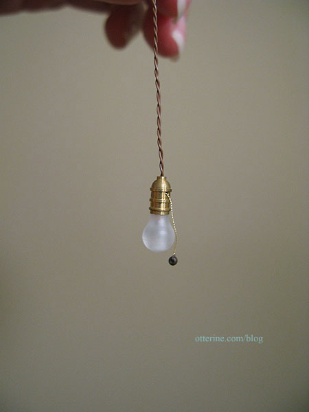
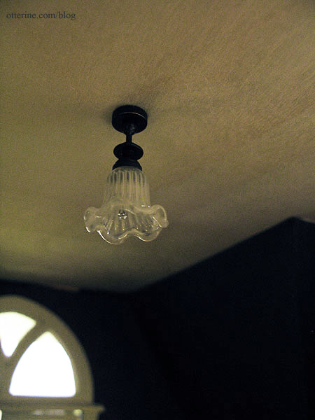
I bought two Lighting Bug lamps for the attic. One is the hanging kind with the pull chain. Love these! There will be more of these in my future builds. :D
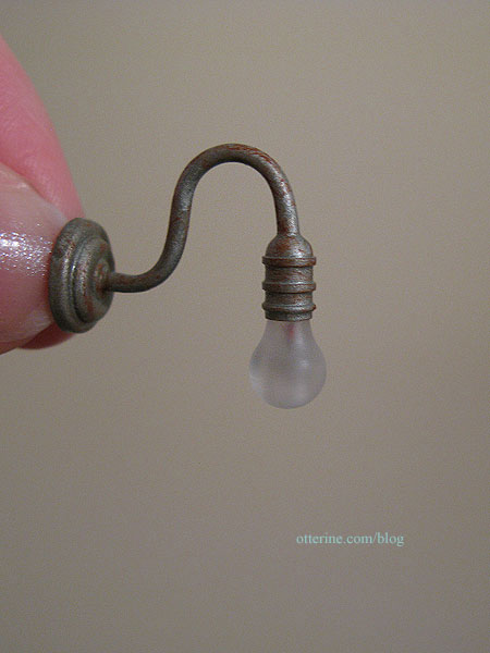
The other is a similar fixture with the bare bulb, but it has a wall fitting.
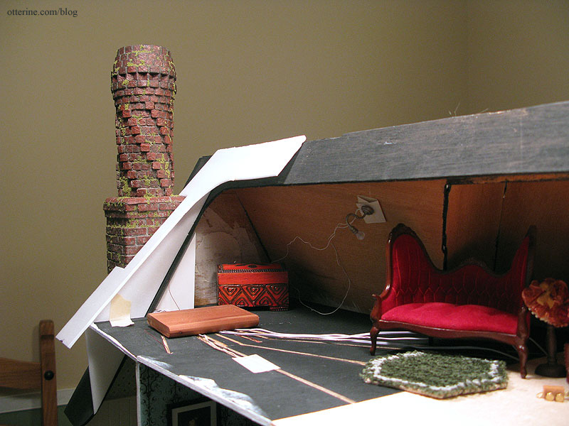
On the left side of the attic, there will be the interior portion of the chimney currently only a foam core base. There will also be a faux trap door like the one in Baslow Ranch where the scrap wood is placed on the floor. I’ve positioned the light so grandma can see what she’s doing up there.
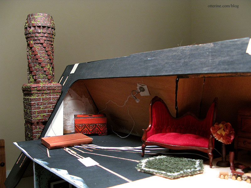
As I’ve said before, in my world, grandma is able to navigate those pull down attic stairs easily, walk about the attic without hitting her head and sit comfortably for hours in a space that doesn’t appear to have any airflow for the warmer months or heating for the colder ones.
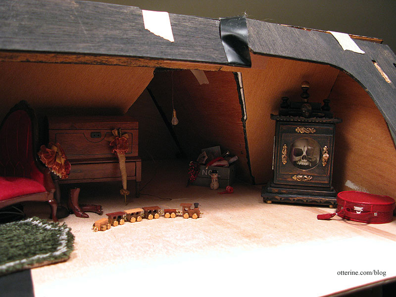
On the right side, there will be the forward storage area and Tony’s brilliant catacombs clock case. It’s up to you to decide who is in the case. :O I’ve put the hanging bulb at the opening to the front storage area. I think that will cast a nice glow into the space.
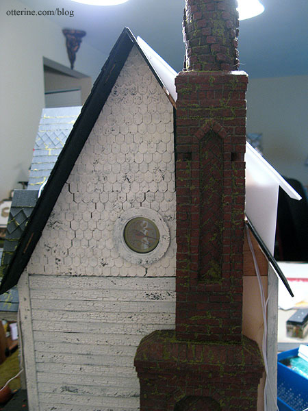
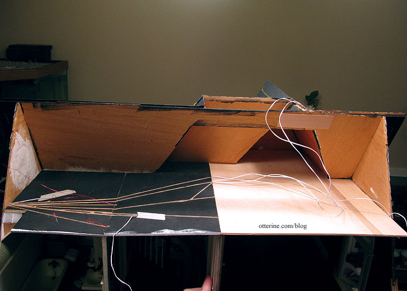
This is where the architectural issue comes into play. When I added to the ceiling boards in the back, I effectively eliminated the sloped ceilings on the second floor, except at the outer side gables. The bathroom vanity cabinet, hall table vignette and bedroom door would not have been possible had I kept the angled back walls that followed the slope of the roof.
However, when viewed from the side, these outcroppings are visible.
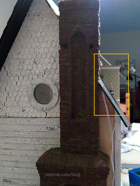
To remedy this problem, I’ve added a quick mockup cut from Cellfoam 88 (the same piece I used for the bedroom ceiling board – reduce, reuse and recycle!). This adds a triangular vertical wall that would be sided to match the house and an additional roof board to finish the back opening.
From the side, the bathroom wall is no longer visible. I think adding this outcropping makes architectural sense since it is in the back portion of the house and a viable renovation that could have been done at some point. It won’t be visible from the front, so it won’t detract from the Carpenter Gothic aesthetic.
I’ll have to do more wallpapering in the bathroom and bedroom to cover the new corners, but that should be straightforward enough. :D
I then cut the new pieces for the roof addition but won’t install them until after the back roof is on.
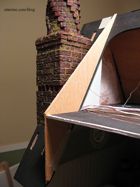
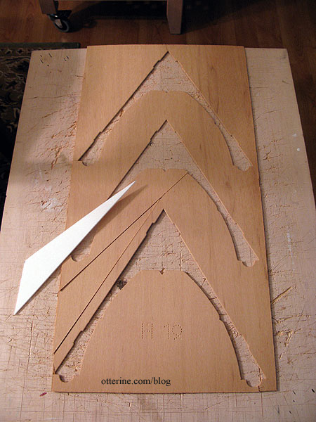
I used the spare wood from a Heritage part sheet that held the gable trims. :D Waste not, want not.
Categories: The Haunted Heritage
January 1, 2013 | 0 commentsThe Artist’s Studio – Tranquil bathroom
One of the best things about miniature builds is the fact that you can try all sorts of things you might not try in your real life home. This beautiful tile mural shower is so lovely, but it would likely be pricey to install and so specific that you might turn off buyers if you decided to sell your home. Of course, you wouldn’t worry about the latter if it was in the dream home you finally managed to achieve. :D
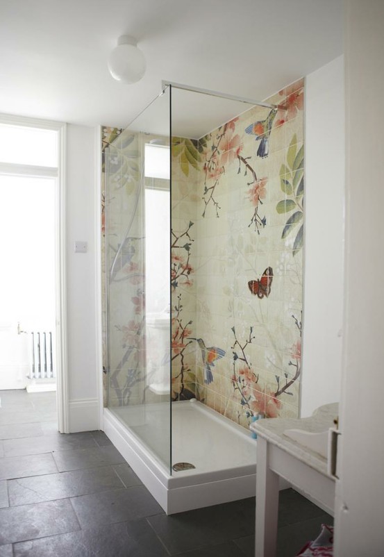
image from Fine & Country, original designer of the bath unknown I thought something as expressive as a mural shower would fit right in at The Artist’s Studio. If the original above came from an existing art source, I couldn’t find it after numerous image searches. If anyone recognizes it or knows of something similar, please let me know.
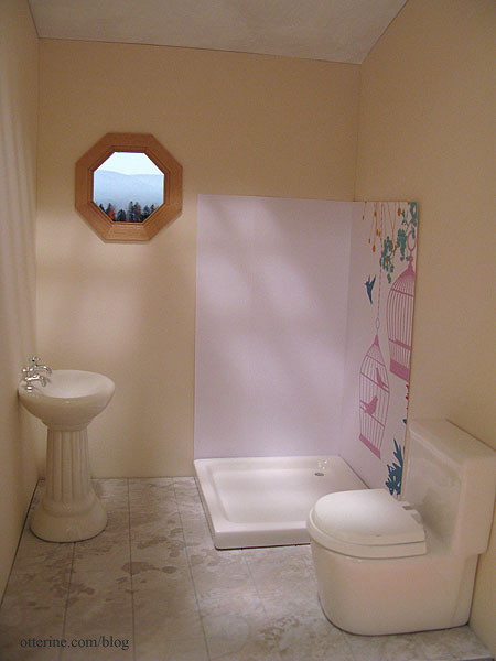
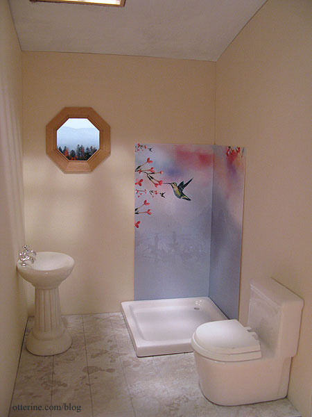
In the absence of being able to replicate that image in miniature, I did find some fun things along the way, from wallpaper borders to scrapbook paper to desktop wallpaper images. I printed the ones I found online and made color copies of the scrapbook papers to make mockups for your viewing enjoyment. The shower base from The Dolls House Emporium measures 3.5″ square, so the tile mural will be 7″ overall, with an inside corner.
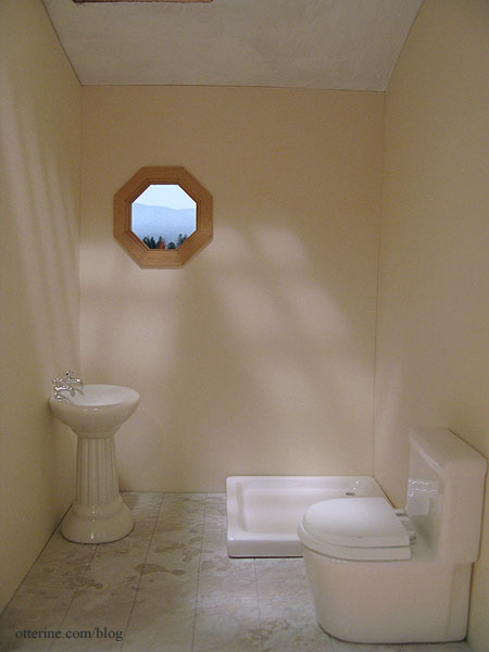
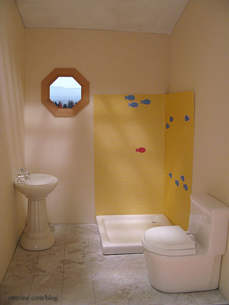
So you could get the full effect with the bathroom color, I cut the Canson Ivory drawing paper for the bathroom but haven’t glued it in place. I’m using a pedestal sink instead of the wall sink for now. I don’t know where the sink will end up on the inside wall, and I don’t want to mar the paper by taping the wall sink in place.
Option 1 – Fish-o-Rama
This is scrapbook paper called Turmeric by Jillibean Soup.
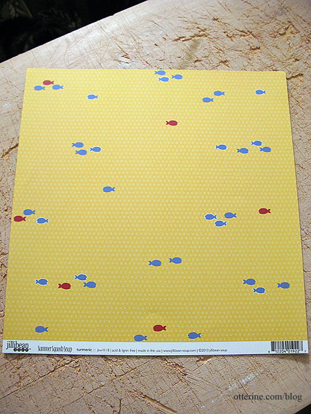
I moved the paper around until I found a fun grouping. The subtle dotted pattern doesn’t show in my color copy. It’s definitely quirky and cute, but even still, the fish seem too sparse on this small sampling.
Option 2 – La Cage aux Folles (the birdcage)
Has anyone seen the 1978 French film by that name? I just love it. The American version The Birdcage is good, too, but the 1978 film is simply awesome! :D Anyway, this is scrapbook paper called Hummingbird By Kaiser Craft.
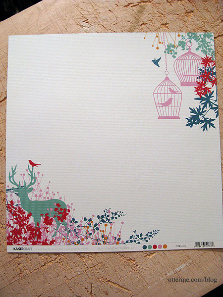
I used the upper right corner with the birdcage. Again, the color copy loses the subtle stripes in the background. With the cut, there’s a design on only one side and I’m not sure birdcages work with a shower. It would make a lovely wall mural in a regular room, though.
Option 3 – Hummingbirds in full color
This is a wallpaper border from Wallpaper – Inc. I’ve printed from the thumbnail, so it’s very blurry. You can get samples, and if I decide on this option that is what I will do. Maybe too out of scale.
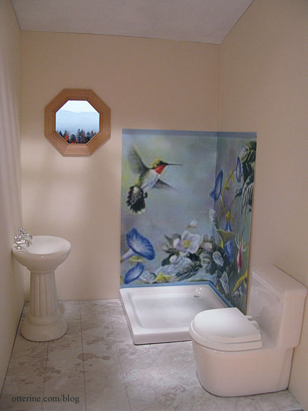
There are a few groupings along the pattern repeat, so this is another option. Seems too busy.
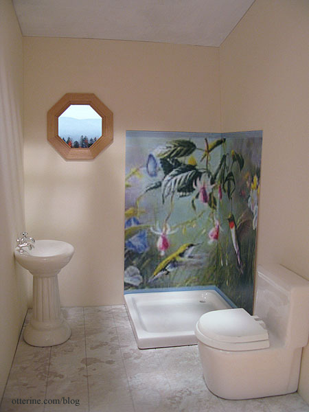
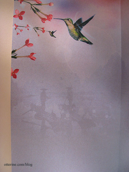
Option 4 – Chinoiserie inspired hummingbird
This is actually an iPad wallpaper. I miscalculated and made this mockup too small, but it works well enough to show the concept. The bird will be slightly larger when printed to the correct size, though it would be better if there were more flowers.
I like this one for its similar tone of the original, but I don’t know how I feel about those silhouetted boaters eyeing me in the shower. :O
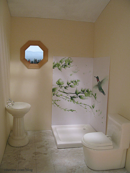
Option 5 – Hummingbird in green
This is a desktop wallpaper called Hummingbird on White from 1ms.net. This one is lovely for its simplicity, and the green goes so well with the Ivory paper. This is another close but not perfect solution. I wish more of the branches fit into the sample and that the bird’s wings were more defined.
Thoughts? Do you prefer any one over the others? Should I scrap these and keep looking? I might have to draw it myself. :D
———-
As this year comes to a close, I offer my sincere thanks for all the warm wishes and generous compliments you’ve sent my way. Being part of this worldwide community is another great thing about minis, and you’ve all brought so much happiness to my life! Happy New Year!!!! :D
Categories: The Artist's Studio
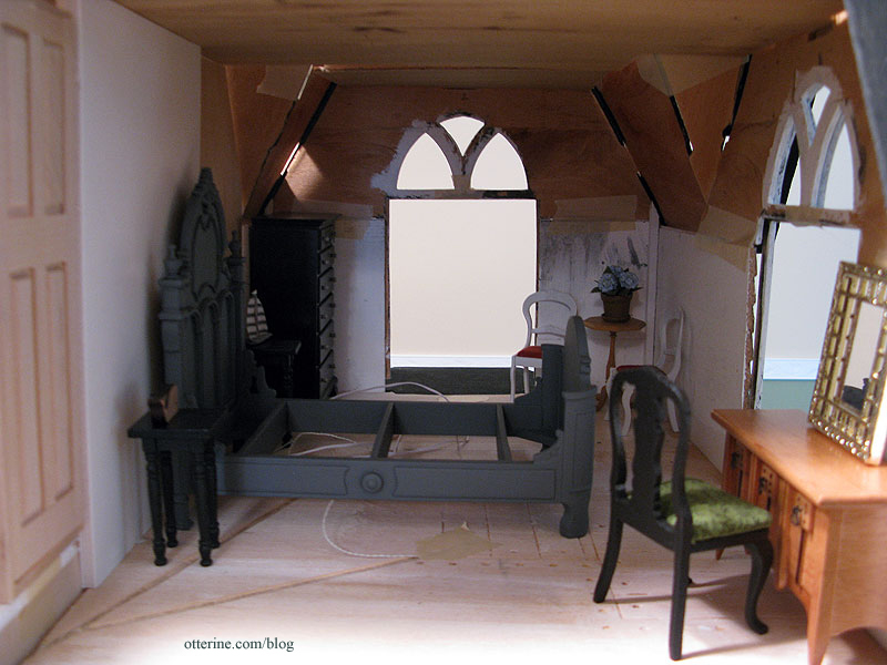
December 31, 2012 | 0 commentsHeritage – bedroom ceiling, part 1
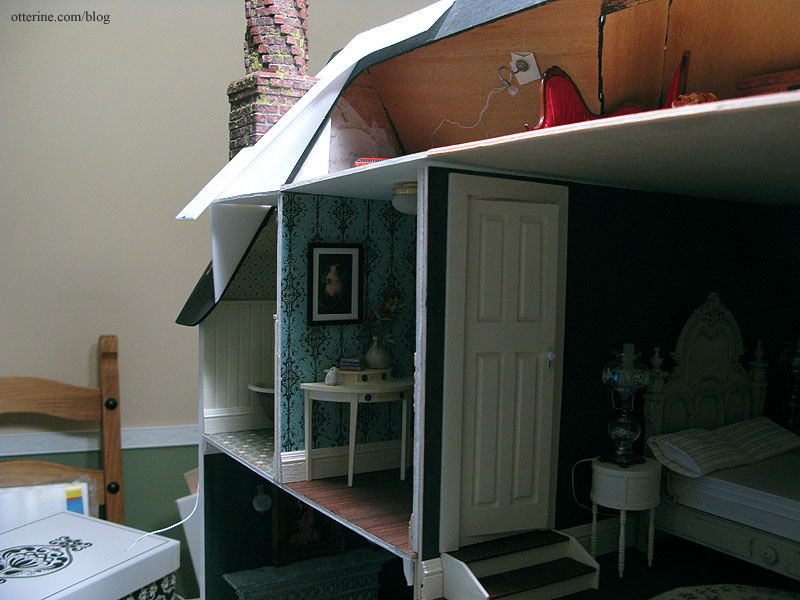
The original kit attic floor was a poor-fitting board to begin with, and it was pieced over the bedroom causing a noticeable seam on the ceiling. Additionally, since I added two walls on the second floor not originally intended as part of the house, I needed an attic floor that covered more area than the original. Trying to cut one board to span the entire house without having any fitting issues didn’t seem like something I wanted to attempt. So, I cut each ceiling board individually, having the seams over each new second floor wall.
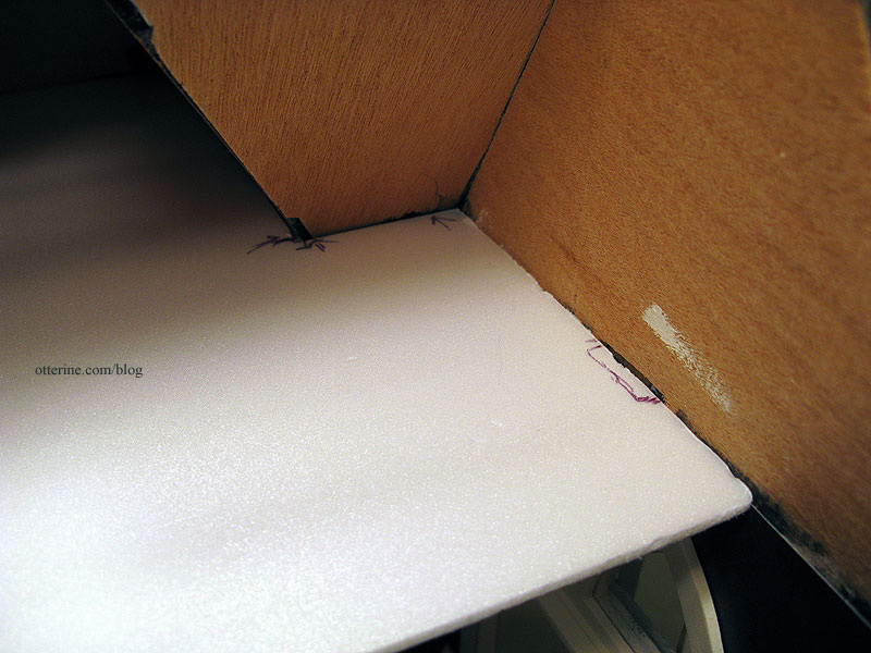
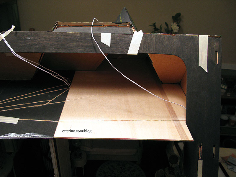
The bathroom ceiling had its wiring channels cut prior to installation. All wires lead to the outer wall and will be hidden inside the chimney. The notch on the left side is where the back roof piece sits.
To make a template for the bedroom ceiling, I used a spare piece of Cellfoam 88. It’s the same thickness as the plywood I would be using for the final board, and it was easy to cut and adjust. First, some rough measurements.
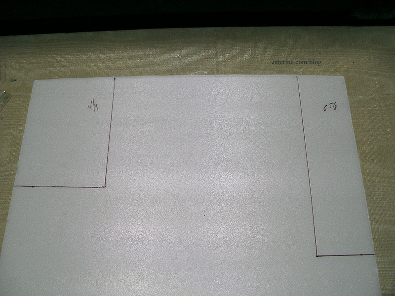
I snipped and adjusted. I was still off in the end, so I marked where I needed to add more. I also marked where the tabs should be. Since there were slots on the front and side, I figured I might as well use them.
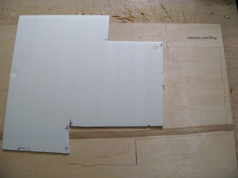
I traced the foam template onto a new piece of 1/8″ plywood and cut out the ceiling board. Here you can see my foam template was just of the front cuts. I projected the full length back from there.
Here are the notches I cut for the foyer light and bedroom table lamps previously installed.
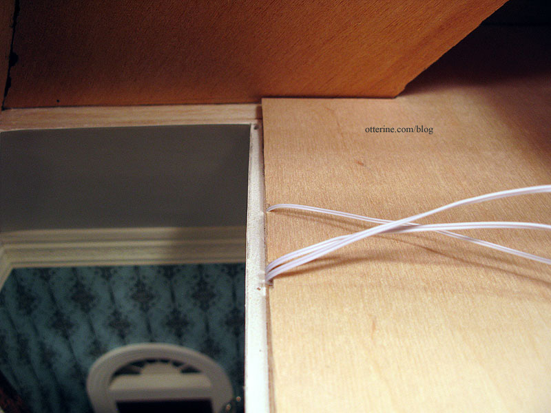
The hallway ceiling has been started, too, but it remains separate. It needs to be installed last since it is a snug fit between the two outer sections. Here are the hallway and bedroom boards in place.
I made minor adjustments until the new ceiling board fit…mostly. I have to tell you, this is the most lopsided board I’ve ever had to cut for a build. That ought to tell you just how out of square this house is. Even at that, it’s still not a great fit, and I cannot figure out where the rub is that’s causing the problem. So, it stays its 95% self, and I will add flat molding along the edges of the ceiling. Crown molding on all those angles makes my head hurt just thinking about it, so flat molding it shall be.
With the ceiling in place, I plugged in all the lights for the room. The lantern on the dresser is battery operated.
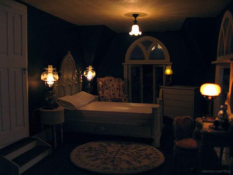
The Ray Storey ceiling fixture adds a good overhead glow to the room. I had thought about using a smaller, simpler ceiling medallion here with the fixture, but when I looked at the resin piece more closely I just didn’t like it. It was rough and uneven, and spending a lot of time to get it in paint-ready condition wasn’t something I wanted to do. Besides, this room has a relatively short ceiling so it’s probably not a good idea to lower the light fixture any more.
I had also thought about putting in a lamp over the comfy chair, but I think there is plenty of light in this room. Besides, grandma might just have a clip-on LED lamp for supplemental lighting just like I do for my needlework. Once I get the ceiling painted bright white, it will reflect more light as well.
I cut the notch for the back roof piece and carved the two remaining wire channels on the top surface of the bedroom ceiling board.
Part 2 here.
Categories: The Haunted Heritage
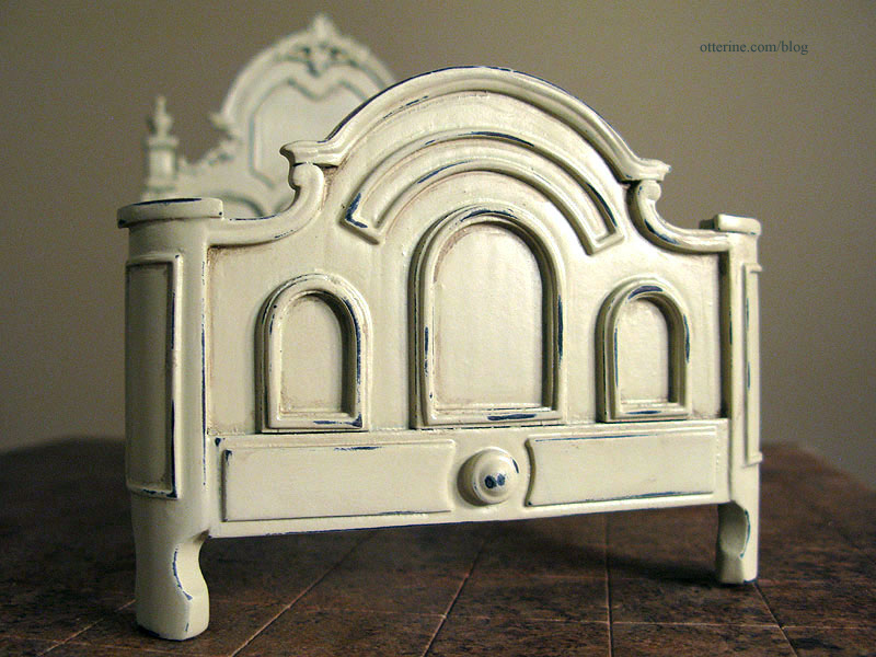
December 30, 2012 | 0 commentsBespaq bed makeover, part 1
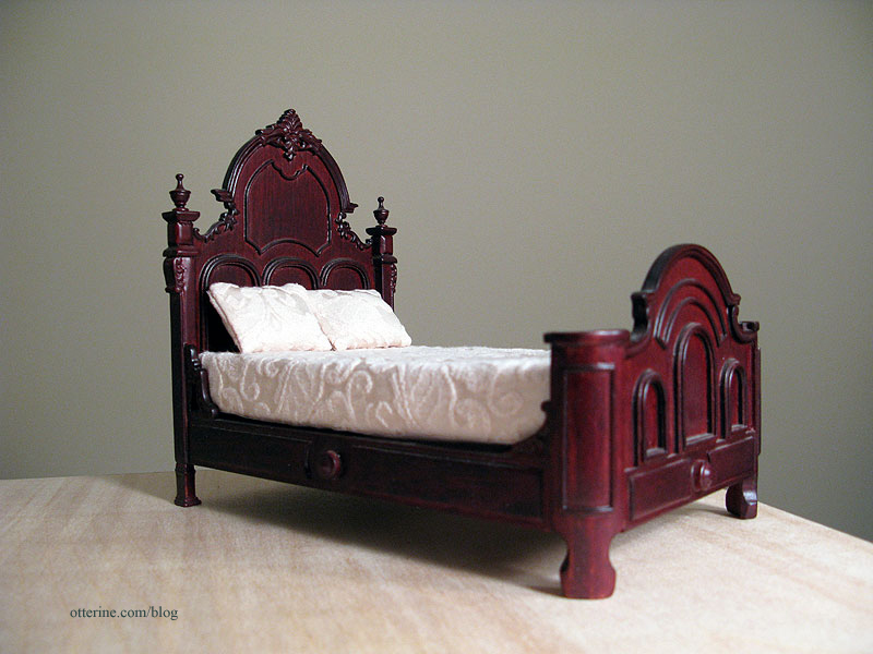
You might recall from my previous post, this is where the bed started. The finish was too dark and the bedding too large for scale.
I then primed it with grey spray paint to cover the red wood and varnish shine. Of course, I didn’t take a better photo of it in grey. :\
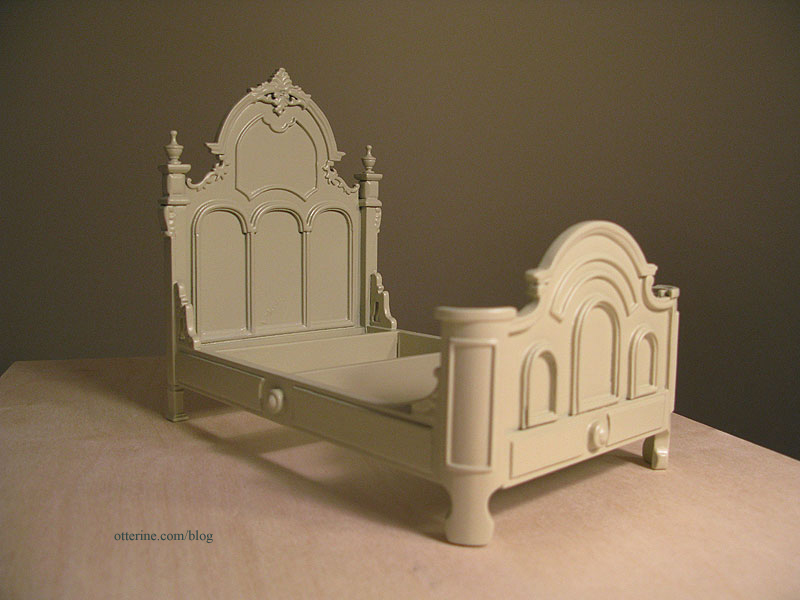
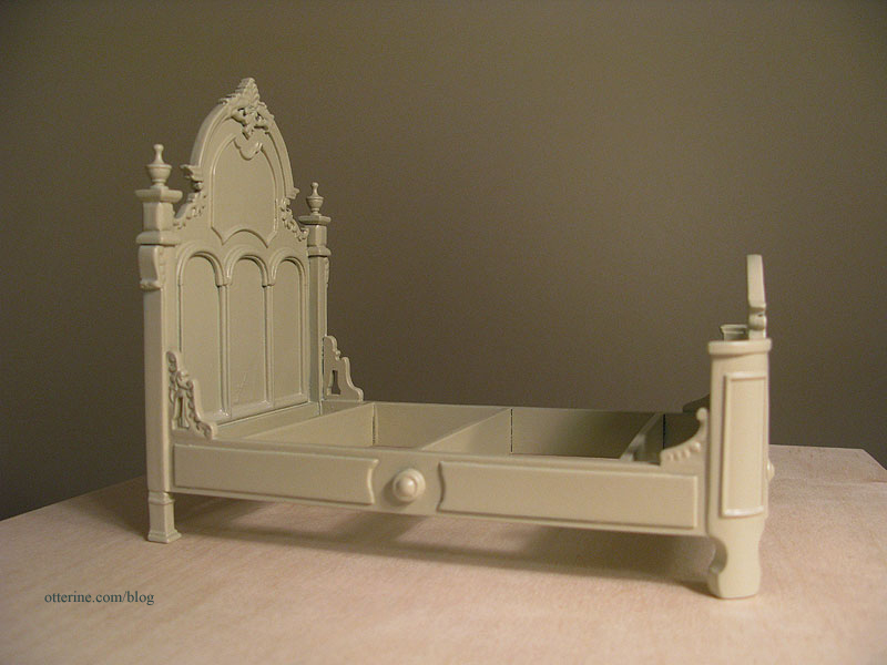
Here it is after a few coats of Krylon Almond in satin finish. :D We’re already getting somewhere!
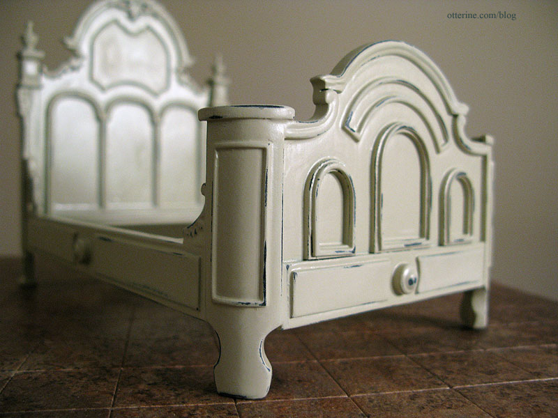
There are a few imperfections in the paint coverage, but those will be hidden by the bedding.
To age the bed, I removed some of the Krylon Almond satin paint using a sanding stick. I picked up a package of these at Hobby Lobby.
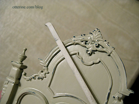
I went for a little less wear than my inspiration photo.
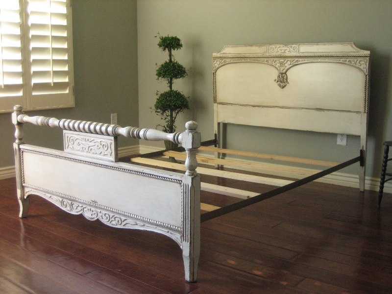
image from European Paint Finishes Detail of the wear patterns on the inspiration bed.
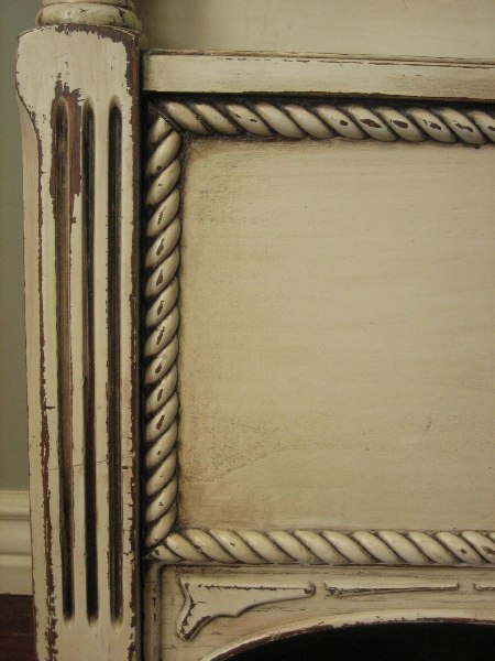
Detail of the wear on my bed. I wanted to emphasize the lines and details of the bed without overdoing it, especially since miniature finishes tend to work best when they are subtle.
I dry brushed some brown paint into the grooves and recesses, again using only a little. It added some nice depth.
I cut new foam core board pieces to replace the original mattress.
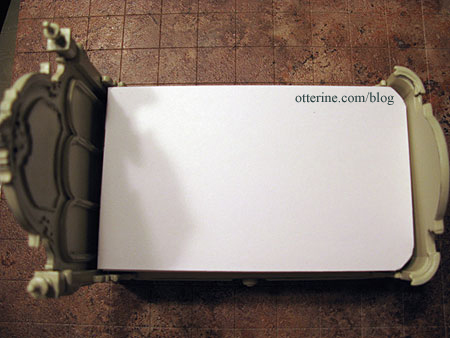
We’re ready for bedding!
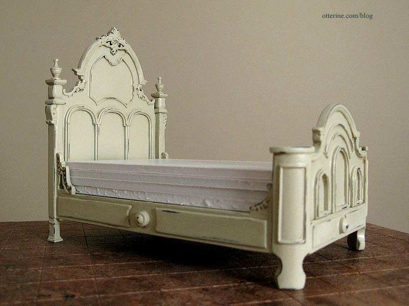
The bed looks somehow heavier now than it did in plain almond, don’t you think? :D
Categories: Furniture, The Haunted Heritage
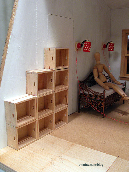
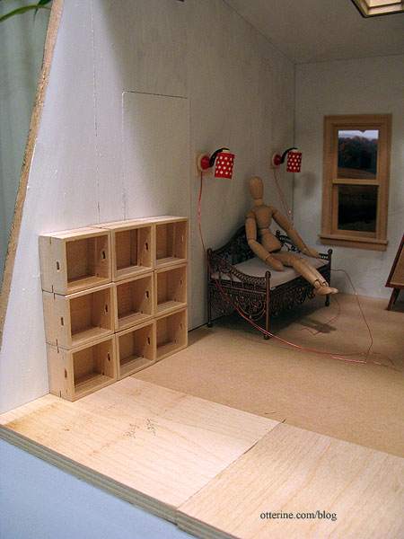
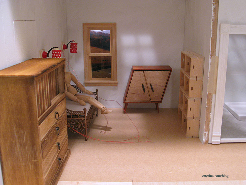
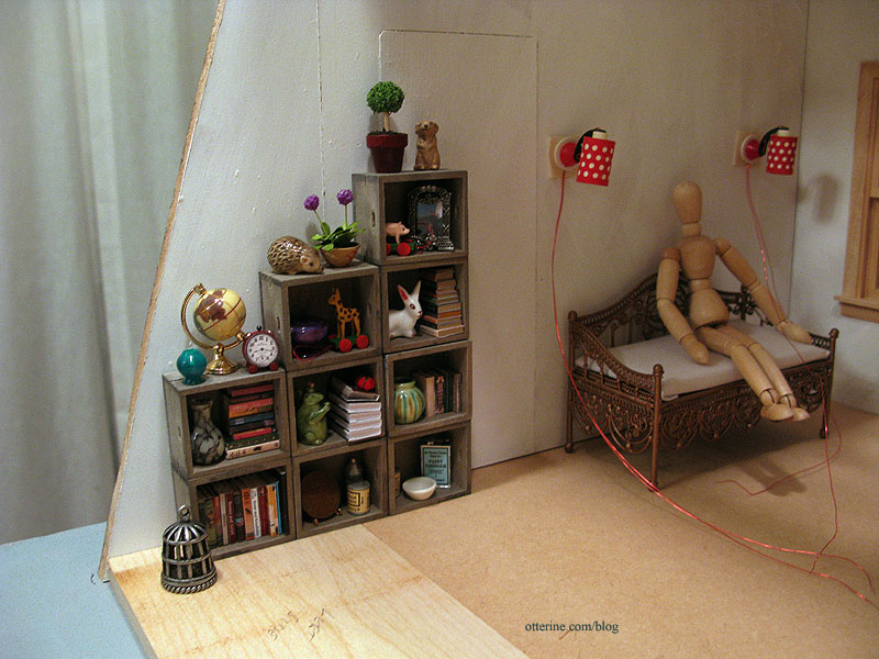
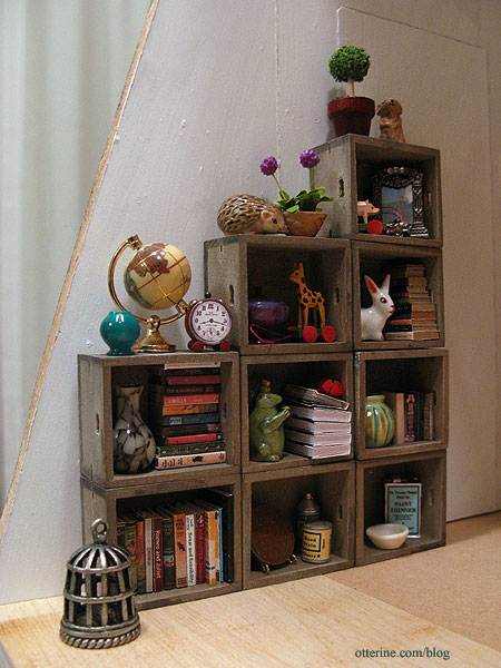
December 28, 2012 | 0 commentsThe Artist’s Studio – Rustic crate bookcase
Of course, I can never fit all the items I want into any particular build, so things get pushed out and saved for later. One item that I love for The Artist’s Studio is the unique rustic cabinet.
But, I’ve had this image in mind for the Studio all along, so out the cabinet must go! :\
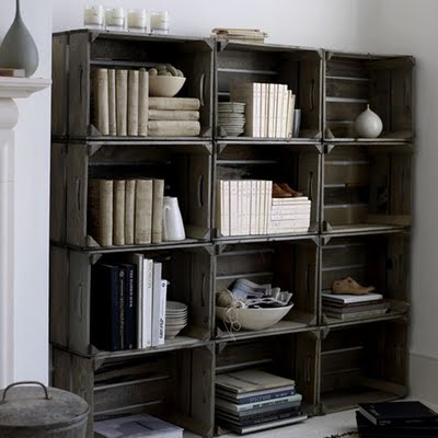
image from Recaptured Charm Could I have made nine identical crates? Yes, but why do that when Minimum World offers perfectly suitable ones already made? :D I bought these for $2 each instead of trying to make a bunch of identical crates, which would have taken days. With the angled front wall, I thought an offset stack would look best.
A set of nine in straight columns is not as interesting, and twelve (as shown in the original photo) wouldn’t fit in the allotted space without crowding the daybed.
For reference, here’s a narrow configuration in the main living area. Again, the full stack of twelve would not have fit.
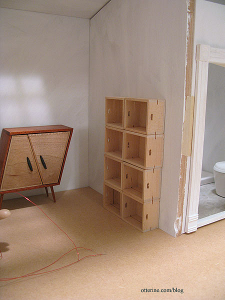
With the rustic cabinet in its original place, it’s just too crowded in my opinion.
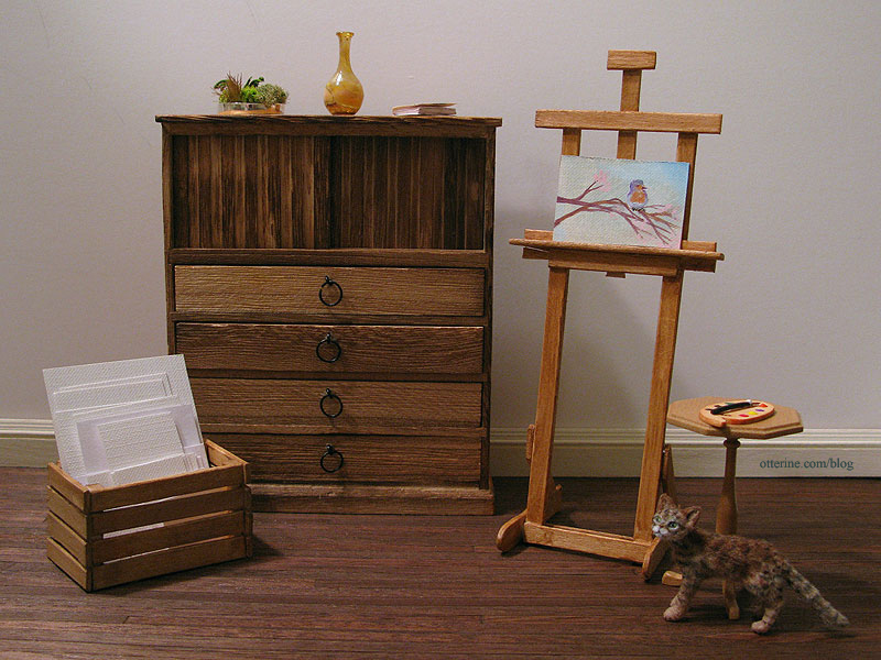
I stained the crates with two washes of grey, black and brown.
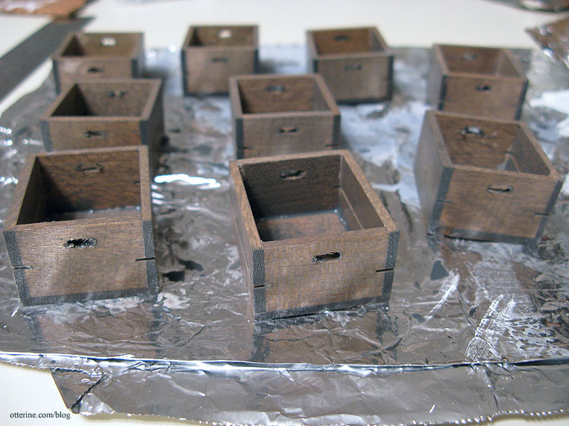
Already much better.

Once dry, I sanded them as needed. There was slopped glue around many of the seams, but that was easily masked by stuffing the shelves full. :D I put my wheat back penny in the bottom row for size reference.
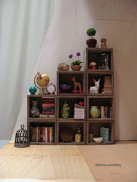
I’ll make some additional items appropriate for a studio, but I love the way they look so far with some minis I had on hand.
In fact, many of these items will have to stay…they just look so completely at home.
Categories: The Artist's Studio
December 27, 2012 | 0 comments


NOTE: All content on otterine.com is copyrighted and may not be reproduced in part or in whole. It takes a lot of time and effort to write and photograph for my blog. Please ask permission before reproducing any of my content. Please click for copyright notice and Pinterest use.