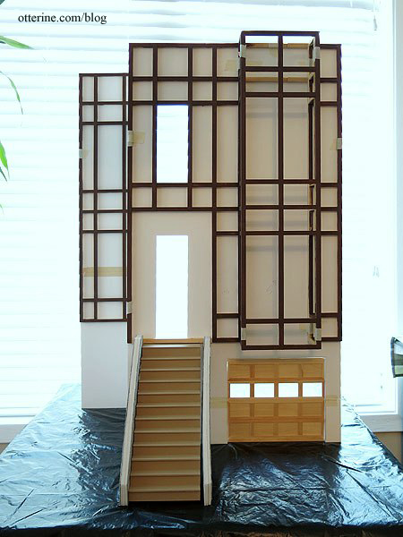
Continuing work on the timber grid. Since I plan to make the side addition in the same manner as the facade, I cut a foam core board mockup to configure the layout. After having some time to consider the overall construction, I added 1/4″ to the height of the facade, making the final measurement 17 1/4″ wide by 33 3/4″ tall. For the side addition, I made its front board 6″ wide by 33 3/4″ tall.
I started by marking the lower edge where the stone ends and the timber begins, 8 3/4″ from the ground. I also marked the center of the board.
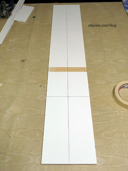
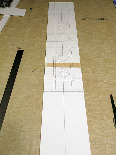
I used the timber grid for the main facade to trace the window locations on the side addition, centering the window openings.
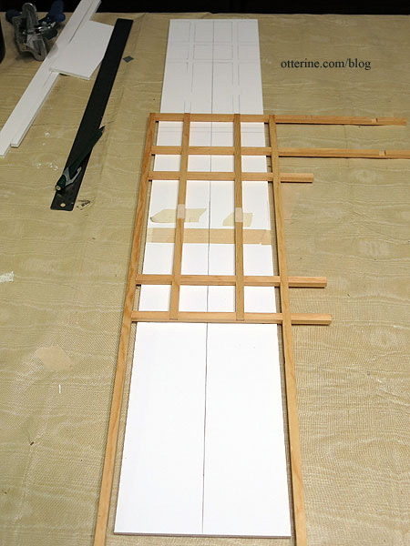
The side grid timbers will be 5/16″ wide as opposed to 11/32″ wide as on the facade, but I marked the entire original grid on the side board as a general guide.
I cut new timbers from 5/16″ basswood and notched the center pieces like the original to help keep the grid even and secure.
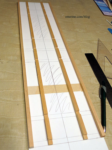
I cut the horizontals individually to fit, numbering them along the way.
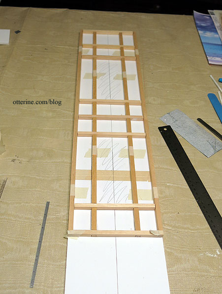
Since I will determine the remaining walls separately and don’t need either of these as a guide, I glued the grids together.
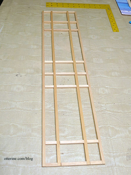
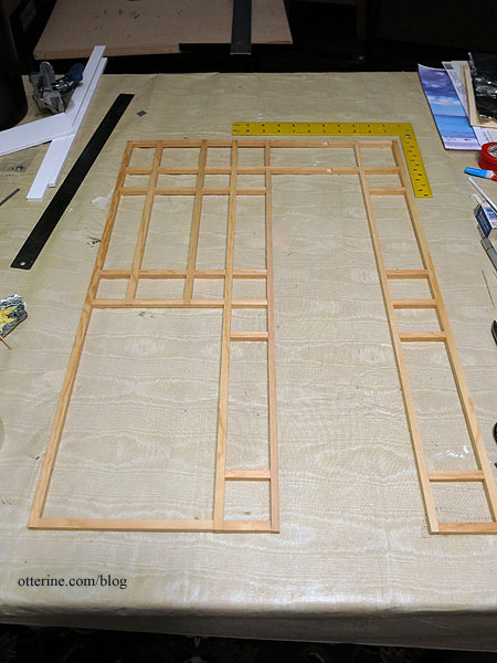
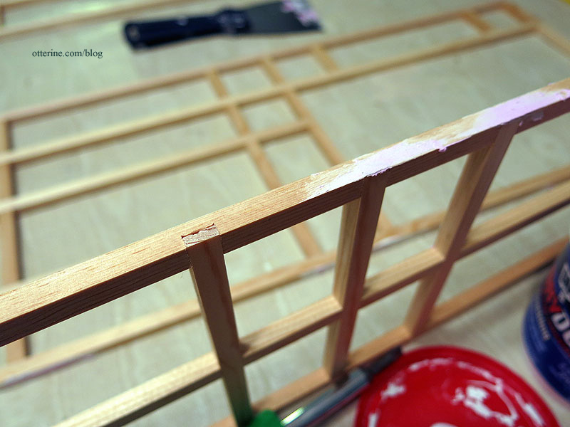
I spackled the areas where my joins weren’t as clean as I’d like. I also covered the notches on the sides.
Time for painting! This is Coffee Bean by Folk Art. I can’t stain the pieces since they are made from different types of wood and there is tape and glue residue all over them — some of this tape residue is from the original bundling of the beams. This basic brown will serve as the base coat for faux staining, so it’s fine that it’s rough and uneven for now.
I didn’t paint inside the grid other than a bit around the edges and inside where the windows will be. There are filler pieces for the enclosed spaces, and only 1/16″ will show of the sides. I also left the beam under the front door unpainted for now.
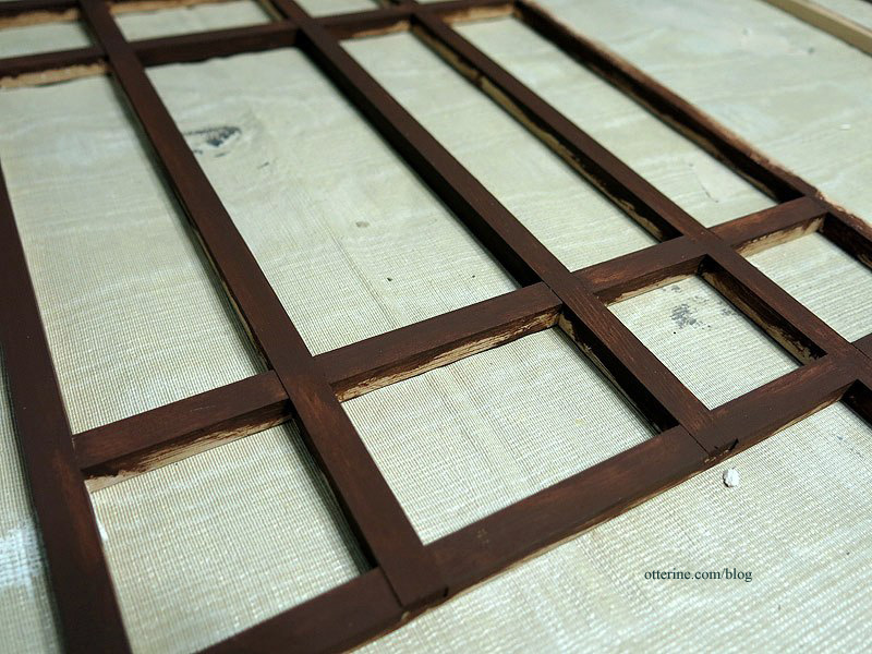
Here they are back in dry fit on the foam core board bases. The side grid layout is narrower than the one for the facade, but it matches well for style. It’s actually the same overall width as the bay window, so it’s also good for balance.
