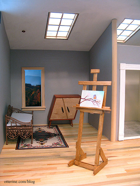
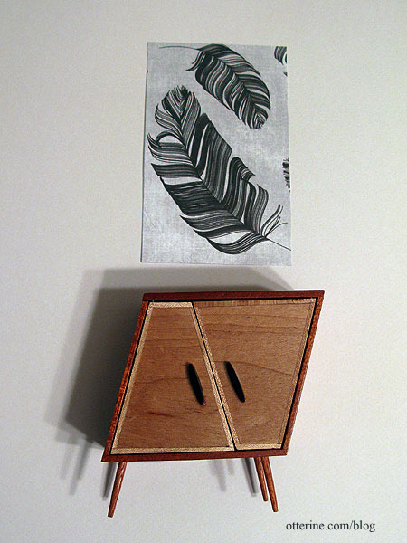
Today, I spent some time on the interior. I chose the darker of the two wallpapers – Daler-Rowney Dreadnought Grey. I tried both papers out with the whimsical cabinet by minisx2 and some scrapbook paper art I have planned for the space. The darker grey just set the pieces apart.
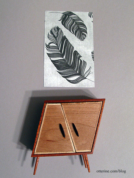
The lighter Canson Pearl Grey was too washed out in comparison.
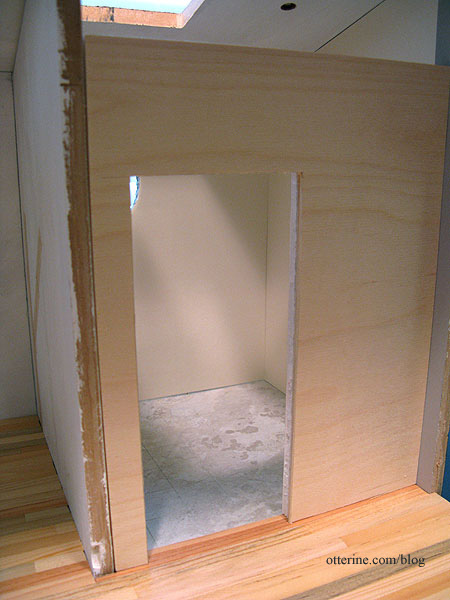
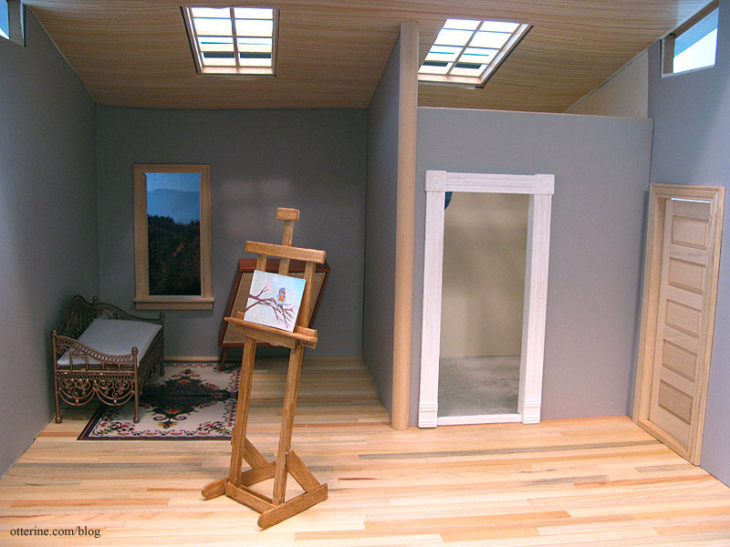
After putting the interior wall in permanently, my initial removable wall was no longer a good fit. I cut a new wall from 1/8″ plywood and 1/4″ foam core board. The two thicknesses glued together will be the size needed for a Houseworks door.
None of the wallpaper is glued in place yet since I have some lighting to work on first, but I tried out the wood ceiling with the new grey paper in place. I liked it well enough to cut the window openings for a more in depth mockup. I love the warmth and visual interest it adds.
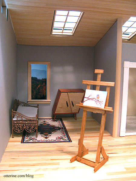
Since the bathroom wall will be removable, I’m going to finish the front edge of the dividing wall with 1/2″ wide half round trim. This will have the slightest overhang on either side of the 3/8″ thick wall and give some stability to the removable wall. It will also mask where the wallpaper ends on that removable wall.
For comparison, here is the Studio with a plain white ceiling.
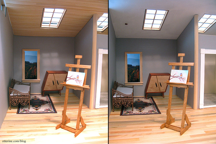
I’m sure some will like it better, but to me it seems too plain.
