
Watson Mill – tulips
What else could Gustav need for Watson Mill but tulips? Debora made me tulips for my birthday last year, and I have had them in mind for the Mill.
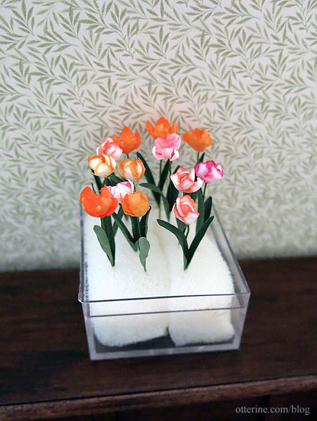
She offered to make some more, and they just arrived. :D So beautiful! Thank you, Debora!
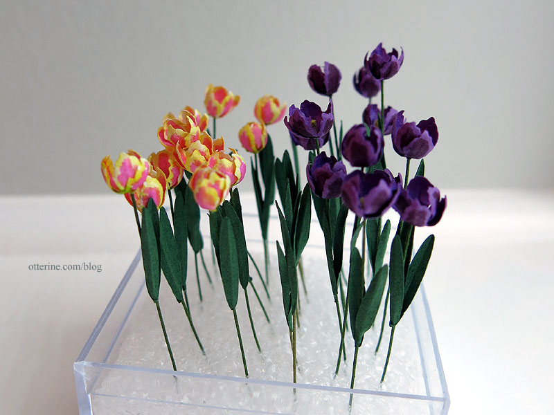
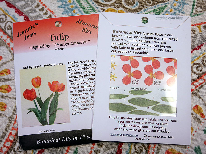
I have two paper kits, which will add another 6 tulips to the bunch.
Categories: Flowers, plants, and trees, Watson Mill
June 29, 2017 | 0 commentsWatson Mill – main room furnishings, part 3
Continuing work on the main room furnishings. Elizabeth suggested measuring the table height with Gustav in the seat, so that’s where I started in determining whether to cut down the table legs. I put the cabinet in the scene as well, since counter height and table height should have a slight difference. With the original legs, the table seems a tad high.
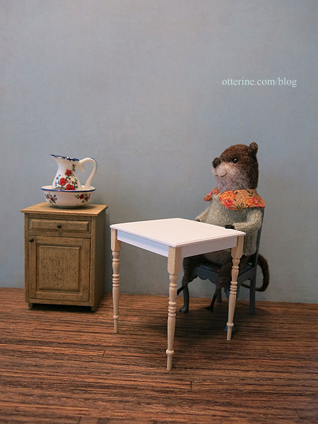
Since you can’t put the wood back on after cutting, I opted to place wood samples under the cabinet and chair to see how a 3/16″ reduction in the table legs would work. It seems a better proportion, and a modest 3/16″ reduction at the top of the legs would mean the table keeps its appealing tall, skinny profile for the most part.
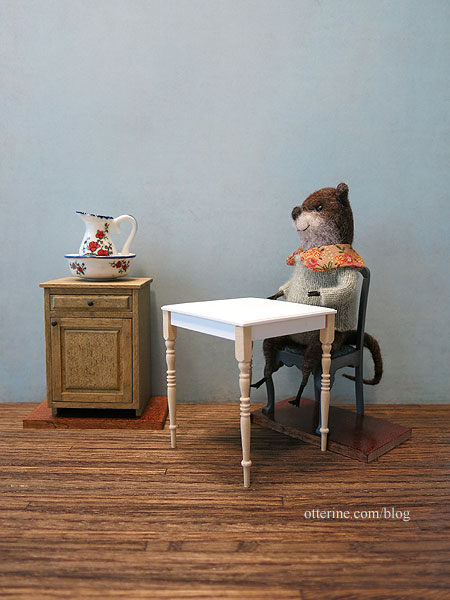
I needed to prep the table for whatever process I ended up using for the enamel tabletop design, which is likely to be delicate once applied. The less I have to handle the table after, the better. I started by wet sanding the top and discovered this is a very porous material, almost like cast plaster. I primed the entire piece with white craft paint and tidied up the glue spots from the manufacturer. The primer showed the flaws and air holes, so I filled and filed before giving it another coat of white.
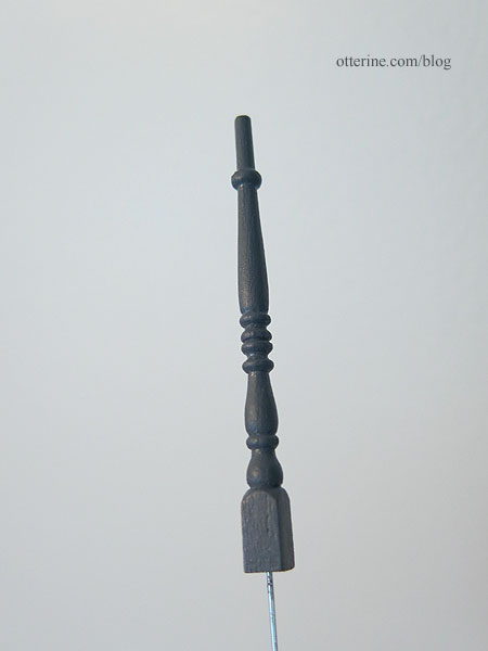
I masked and painted the apron with Zinc by Americana to coordinate with the chairs. I cut and painted the table legs, too, but left them separate so I could work on the tabletop without fear of breaking the legs.
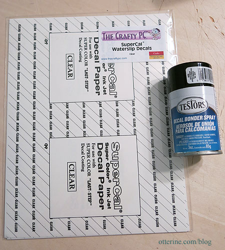
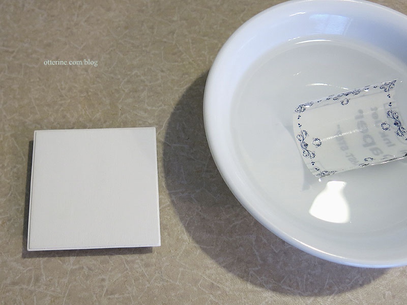
Time for the enamel tabletop. The material I opted for was water slip decal, using Testors Decal Bonding spray since I had that on hand.
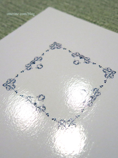
Because my design is so small, my intent was to cover the entire table with the film since there would be no way to cut around the tiny details. This should provide a uniform surface without a halo around the border design. It’s not easy to place a large decal. You have to give it a little more time in the bowl to loosen from the backing paper. Here it is on foam core board. It has a lovely gloss sheen on its own, but I wasn’t sure how delicate it would be without sealing. I opted for Testors Gloss Lacquer Overcoat since it had worked so well evening out over the Model T paint. Overall, the test sample was a success.
I then moved on to the final table.
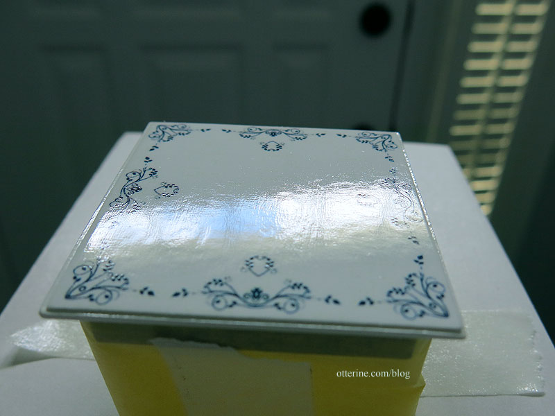
I probably should have sanded the surface more beforehand, but it was too late. Even after the gloss sealer, the cross-hatch painting imperfections showed through. I guess it’s just an old, well-loved tabletop. I always trust the happy accidents, and the surface is not very noticeable in photographs unless you try to capture it.
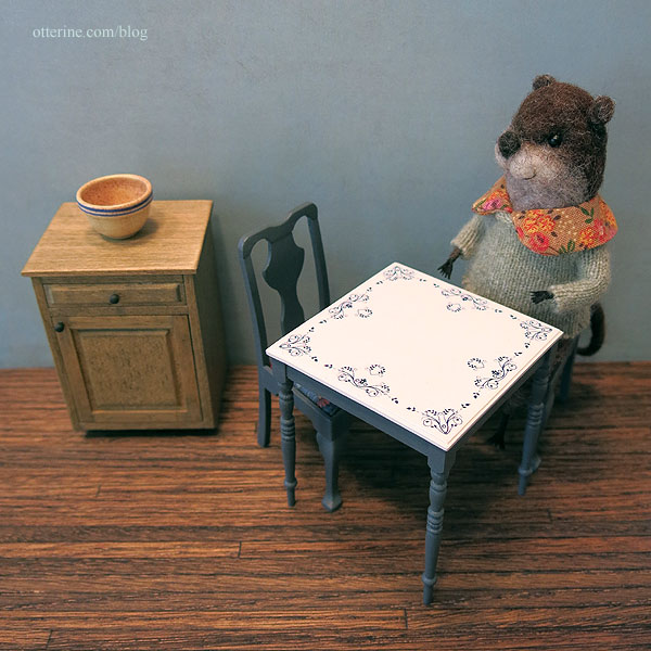
I glued the legs on with white glue supplemented with super glue gel so they would grab fast but remain movable for a few minutes. Once dry, I touched up the paint between the apron and the legs then tried out the final table with the chairs and Gustav. I think we have a winner! :D
Categories: Watson Mill
June 25, 2017 | 0 commentsWatson Mill – main room furnishings, part 2
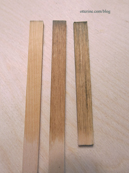
Continuing work on the main floor furnishings. I tried out some new Minwax stains I picked up at Lowes. This is Natural, Fruitwood and Driftwood (left to right) used on basswood scraps. Natural gives the grain a lift and a slight warm tone. I might use this on the circle library since it will seal the wood without changing the aspect much. Fruitwood is a lovely light color that coordinates well with Natural, so I will likely use this on the dumbwaiter and its cabinet. Driftwood has a green grey cast and works well with the grain.
I cut down the depth of the Houseworks 2″ kitchen cabinet by 1/4″ since it was a tad too deep and used Driftwood stain with satin varnish. The knobs are wood painted black. A beautifully rustic cabinet. :]
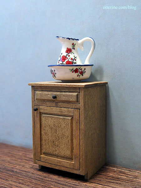
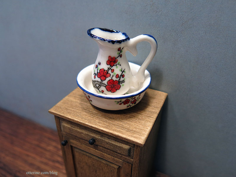
The pitcher and bowl are from my stash of minis. It’s a favorite that I had been hoping to use in the mill but it wouldn’t fit upstairs. Problem solved. It’s now a kitchen wash set.
I painted the kitchen chairs Zinc by Americana. What I like about this dark grey is the blue cast to it, which should go well with the enamel tabletop. I’ve been trying out processes for the tabletop, so more on that later. In case that doesn’t work out, it will still be a lovely color with a plain white tabletop. :]
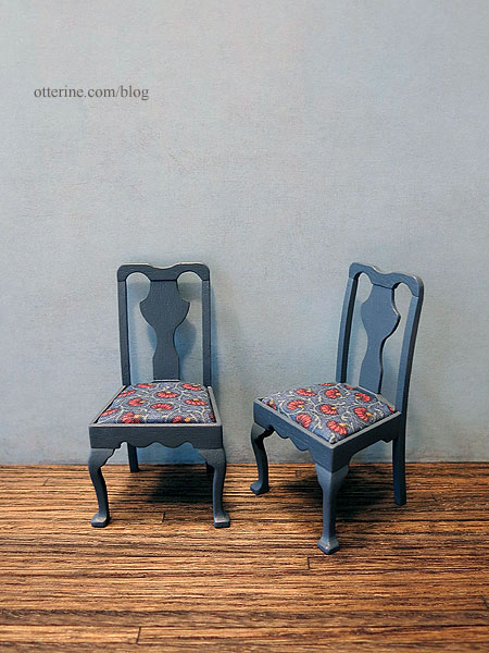
I finished with Delta Ceramcoat Satin Varnish and upholstered with a cotton print from my stash.
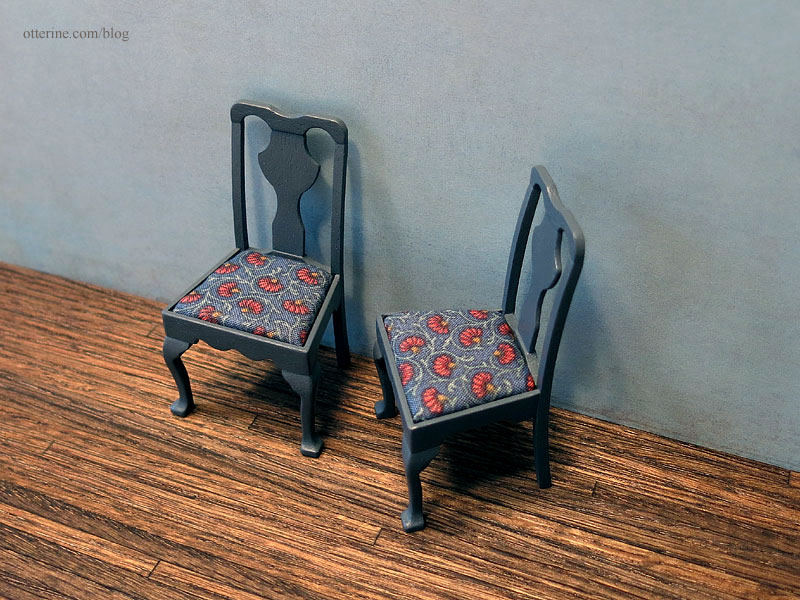
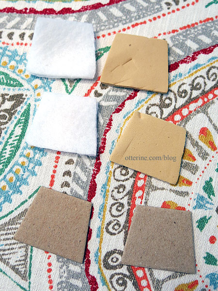
I replaced the damaged foam from the kit with two layers of white felt. The seats aren’t glued in since they fit well enough with tension alone. I can easily clean or replace as needed.
Categories: Watson Mill
June 23, 2017 | 0 commentsWatson Mill – foundation
It might seem strange to start the landscaping with the mill in dry fit, but this will help me visualize how the mill will look in the end. I want a relatively steep landscape for the mill, considering the base board is 20″ square. I used layers of 1/2″ thick builders foam. I used a freshly cut whole piece for the bottom layer, but the other layers were made from scraps to use up the scraps. I used Weldbond glue to attach the layers and then pressed it flat with magazines overnight.
I’m 95% sure I want to do a wood shake exterior on the mill. I made a support system from 1″ plywood strips, adding a couple spare pieces of mdf that will help hold it in place when I glue it later on.

I cut pieces for the increase in slope to the door and added a rounded step at the top. Some of this might change in the end, but it helps to have it roughed in for now.

These pieces will stay loose until later on so I can further shape them for the final landscaping.
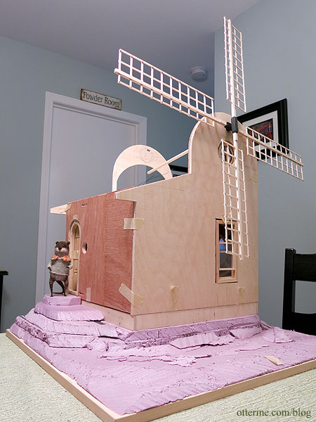
In the front, I want a bit of relatively flat land for some fun features to be revealed later. I think this is a good start, very tall and stately. :D

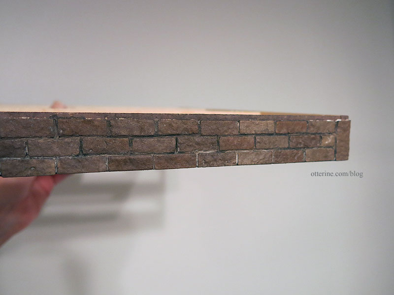
I had egg carton bricks on hand, so I didn’t bother to reinvent the wheel. Most of the time, I will measure my board and determine how many bricks across I need and adjust the measurements accordingly. It’s a small foundation, so I didn’t think it would matter much once landscaping is in. Since my bricks didn’t end well at the corners, I opted for corner stones cut to fit.

I chose brown based bricks instead of my usual brick red. :]

I started with an even brown base.

I then stippled on the other colors to create variations before sealing with Delta Ceramcoat Matte Varnish (which always dries shiny with how it is applied).

After it dried, I grouted with spackling.

I added a couple of dark brown and black washes to tone down the grout, then finished off with a spray of Testors Frosted Glass to dull the finish. There will be more aging during the landscaping process, but I love how it looks so far. You can still see the subtle color differences.
Categories: Watson Mill
June 16, 2017 | 0 commentsWatson Mill – enamel tabletop trials
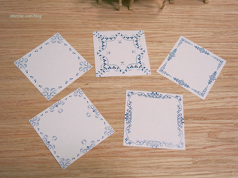
A Greenleaf forum member suggested enamel tabletops, so I scouted around the net looking at examples. It seemed a grand idea, so I printed some designs I thought would work best in blue, black and orange-red. These are just on regular paper for testing the look, but I have some ideas in mind for transferring the design onto the table.
I was leaning toward the blue, so most of them are shown in that color. I’m not showing every printed design here since I narrowed down further. I printed open center designs…
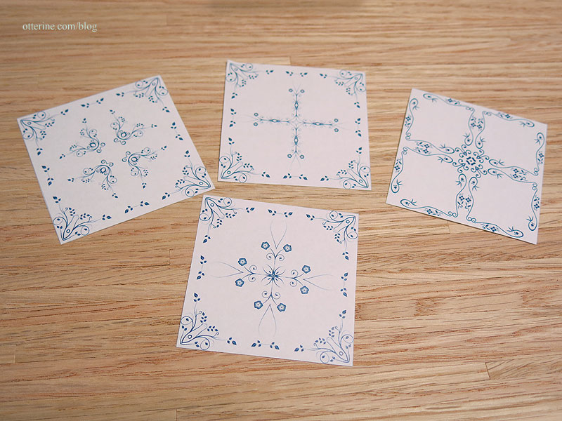
…and filled center designs.
The one shown in all three colors is the design that appealed to me most on paper.
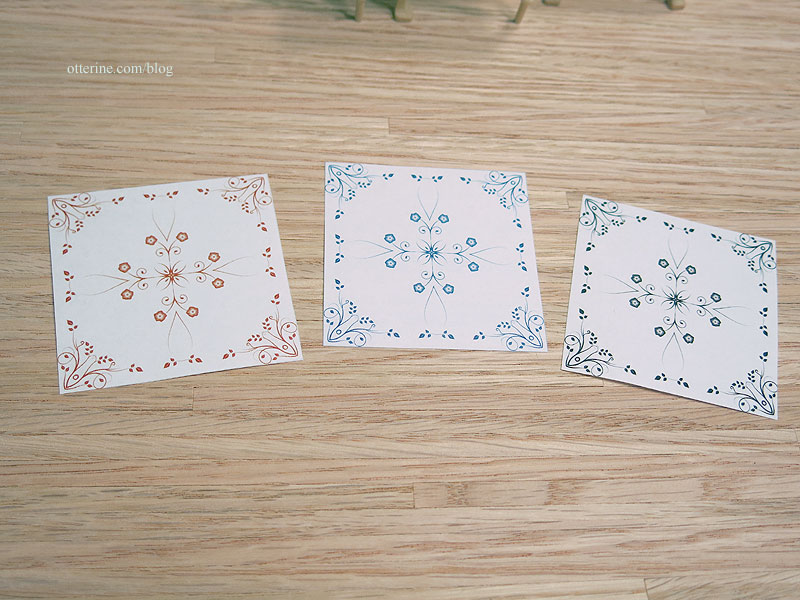
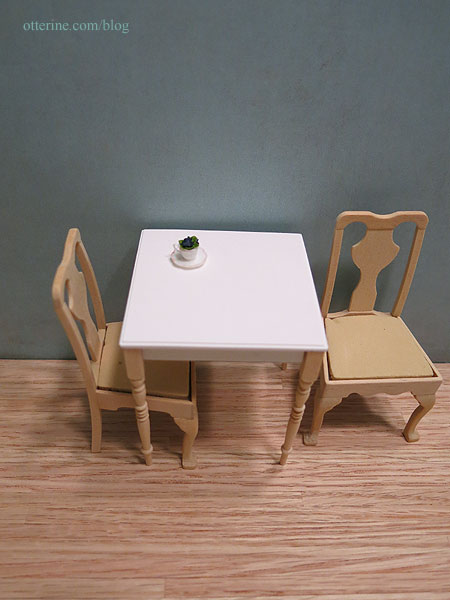
I made my notes on the pics as well. Granted, it is hard to tell with yellowish wood chairs, but you get the idea. The chairs and lower part of the table will be painted to coordinate best, even if that ends up being white with a coordinating color upholstery. I will also be toning down the red of the oak floors.
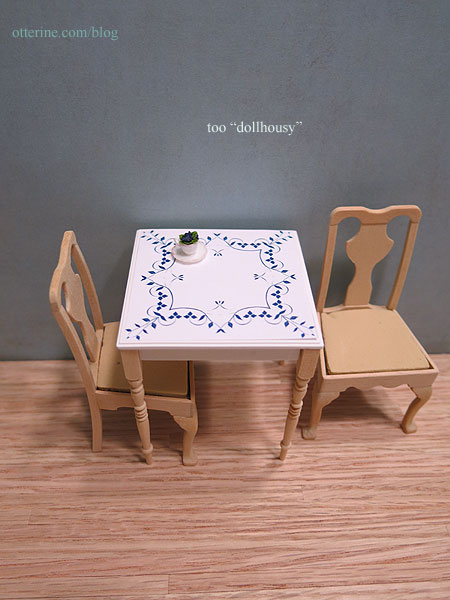
This one was too “dollhousy” to me. The design is rather bold and would compete with anything placed on the table.
This is more of a retro style than I wanted, though it has its appeal in the right setting.
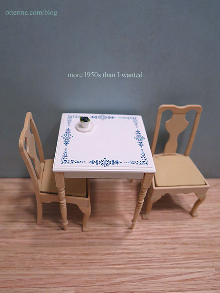
This one is the best of the open center designs. It’s delicate and complements the teacup flower made by Debora.
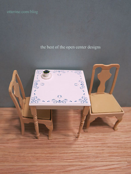
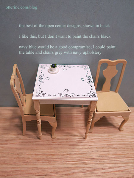
Here is the same design shown in black for comparison.
This one is delicate but rather busy.
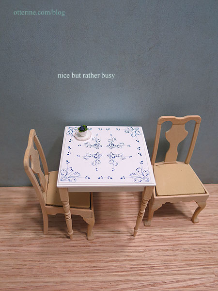
I had thought this one would work well from the paper printout, but it ended up being more “diner” than I wanted.
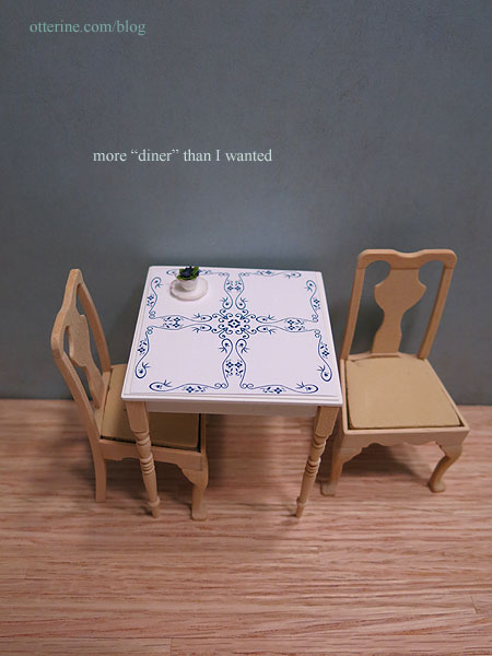
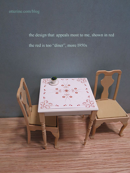
Here’s one showing the red. This is the design I like the most, but the red didn’t do it for me.
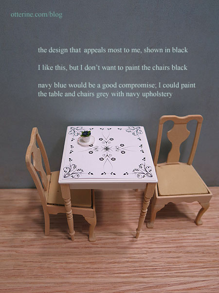
The black is almost there but a little stark.
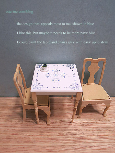
The blue is almost there but perhaps a little too light.
So in the final trials, I printed grey and navy blue tabletop designs. First, the open grey…a little washed out.
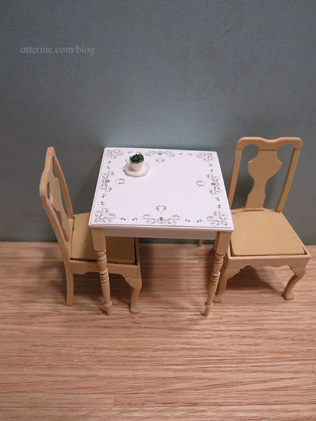
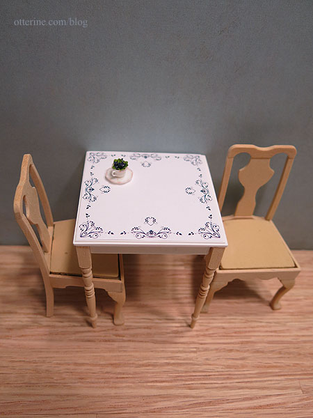
Open navy blue…ooooh, gorgeous!
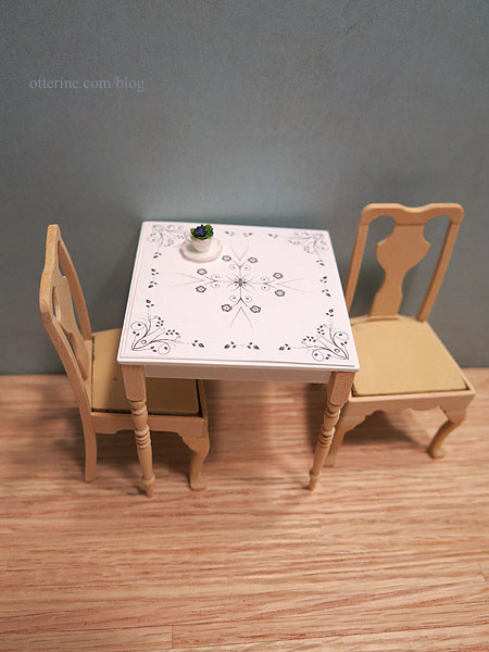
Filled grey…meh.
Filled navy blue…not as nice as the lighter blue before, and to me the open navy blue still has that beat. I love the open navy blue design because it will frame whatever is featured on the table.
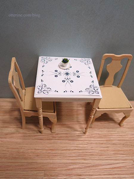
Update: finishing the table here.
Categories: Watson Mill
June 14, 2017 | 0 comments
NOTE: All content on otterine.com is copyrighted and may not be reproduced in part or in whole. It takes a lot of time and effort to write and photograph for my blog. Please ask permission before reproducing any of my content. Please click for copyright notice and Pinterest use.


