Continuing work on the insert wall. I am using scrapbook paper Happenstance – Fluke by The Paper Loft. It is flat paper, but it has a printed design that looks like old fresco. You might recognize it from the first floor of Watson Mill. Since I will have to trim around the removable wall insert and didn’t want a highly contrasting border, I bought Ceramcoat Waterfall to paint the door and trims. It should complement well without fading into the background or being overpowering. I haven’t cut the trims yet.
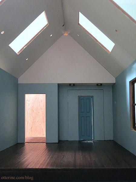
For the enclosed gable, I’ve opted for plain drawing paper. It’s not pure white, so it works well for the space without being too much of a contrast. Since I plan to have a warm white vaulted ceiling, I didn’t think a big blue triangle would look right.
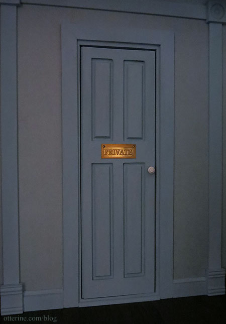
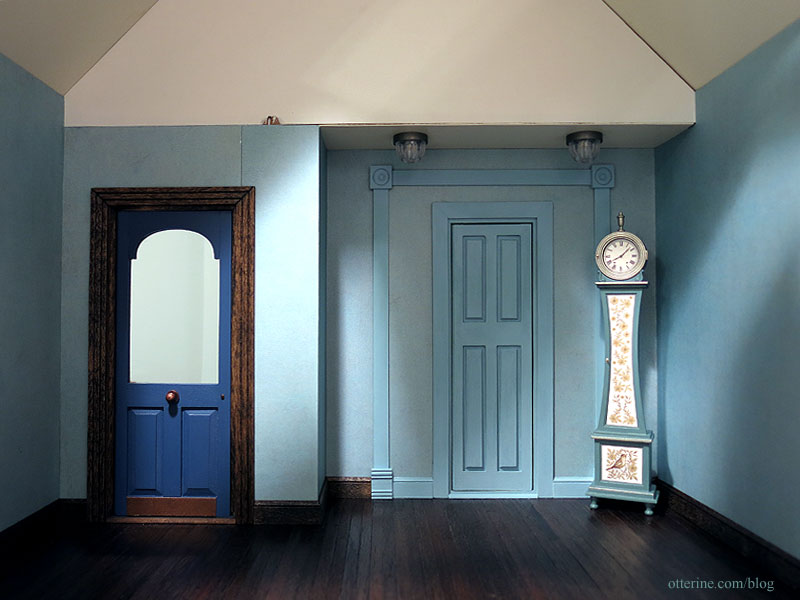
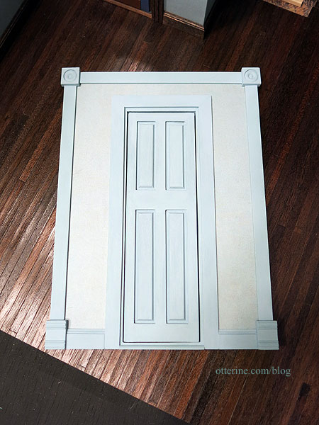
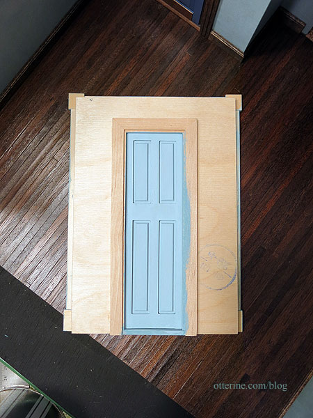
After mulling it over, I decided the Ceramcoat Waterfall paint was nice, but it was darker than I wanted once in place. I was trying to make the door blend more with the wall as if to say, nothing to see here. I mixed the Ceramcoat Waterfall with Ceramcoat Blissful Blue to get a lighter color. I painted over the base coat of Ceramcoat Waterfall, and the result was much closer to my original idea. For the trims, I started with a base coat of plain Ceramcoat Waterfall since I needed it all to match the door.
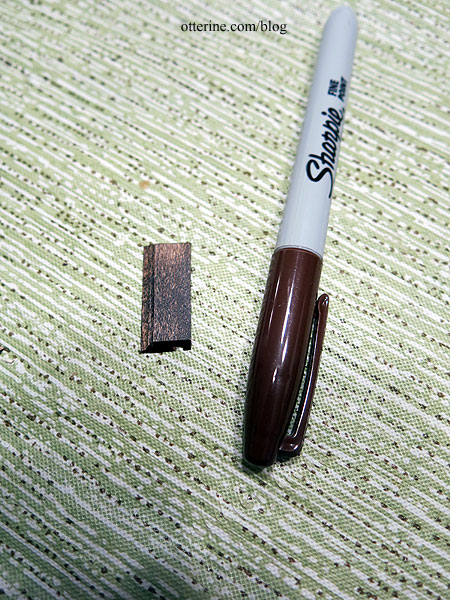
The baseboards around the room are Minwax Jacobean, so to disguise the mitres I used a dark brown Sharpie on the cut edges before gluing the boards in place.
I thought it might end up looking weird to have dark baseboards on the removable wall. Typically, when you’re painting a door the same color as the walls, the trims are also the same color. I didn’t want blue trims throughout, so I mixed the styles. Somehow, it works and looks relatively seamless.
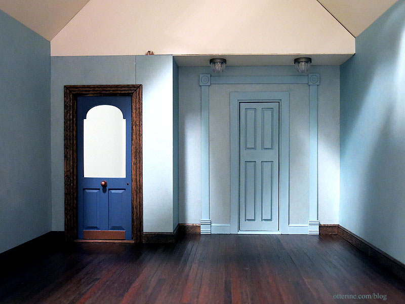
It will also fade more into the background once furnishings and the dark gable trims are added. It might not be the cleanest solution, but I just didn’t want dark trim to interfere with the line of sight when the structure is filled and I needed that large of an opening.
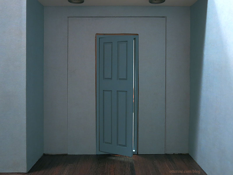
The wall is a tight fit, which is just fine. This won’t need to be removed often.
And, the back….
I added a brass plaque and white doorknob for final finishing.