
NOTE: All content on otterine.com is copyrighted and may not be reproduced in part or in whole. It takes a lot of time and effort to write and photograph for my blog. Please ask permission before reproducing any of my content. (More on copyright)
Categories:

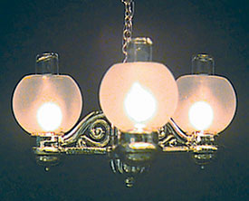
Chrysolite gaslight chandelier kit
The chandelier was plated in a brass finish, which is not to my taste.
I taped the pieces to a board and sprayed all the pieces flat black. The chandelier kit version I chose had replaceable bulbs but with white wires that were relatively thick. I used candle sockets with varnished wires instead.
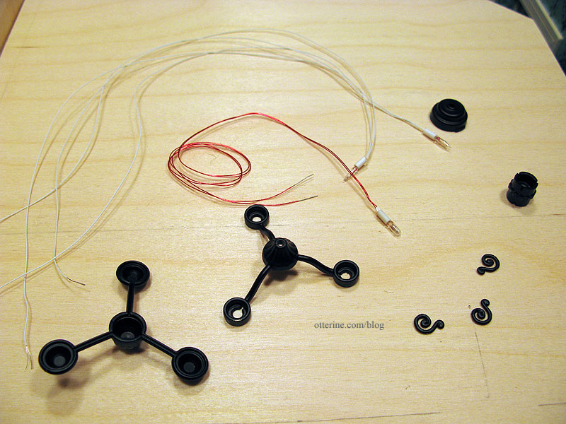
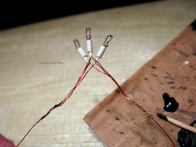
The sconces were very easy to put together, but this contraption took some doing. You basically cut two of the bulb wires short to attach to the longer third, twist all the wires together and feed this spidery assembly through the plastic pieces. Right. Soldering was suggested, but I’ve never done any soldering and certainly don’t have the supplies to do so.
I used shrink tubes to keep the wires together, but in fiddling with them some of the varnish came off the wires in places not covered by the shrink tubes. I bought a jar of liquid electrical tape some time ago but had yet to try it out. I figured this was the best time to test it out. I put a small dab on my “glue” board and applied it to the wire connections with a toothpick. There were no instructions on the bottle, mind you.
You’re supposed to feed half of the wires through the top channel and the other half through the bottom channel. After three failed attempts, I twisted the wires for each bulb together and fed them through the bottom channel.
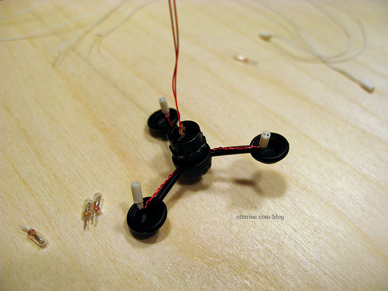
This meant I had to run the wires around the scroll details which were supposedly “snap in place” wire holders. I glued the scrolls in place.
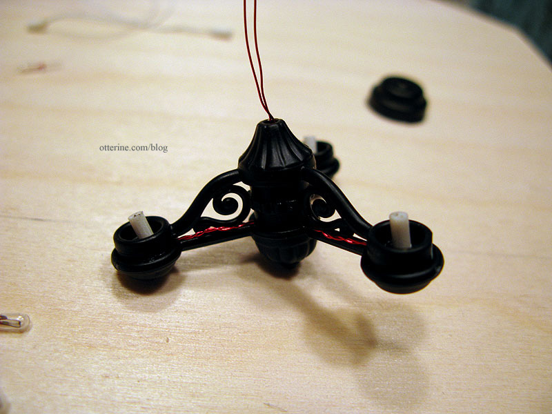
I’ll install the chandelier so the wires face the front wall. I’ll also paint them black to match as I had done for the wall sconces.
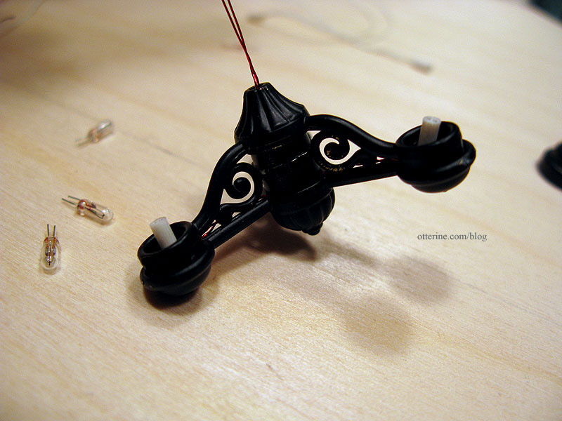
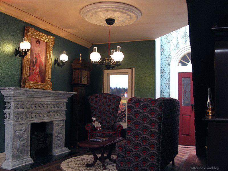
I tested the bulbs repeatedly during the process to make sure they were all working. They are temperamental, but they work! Here’s the chandelier in place without its chain, which is at the moment brass in color. I am going to attempt to spray paint it when I do the touch-ups on the chandelier paint.
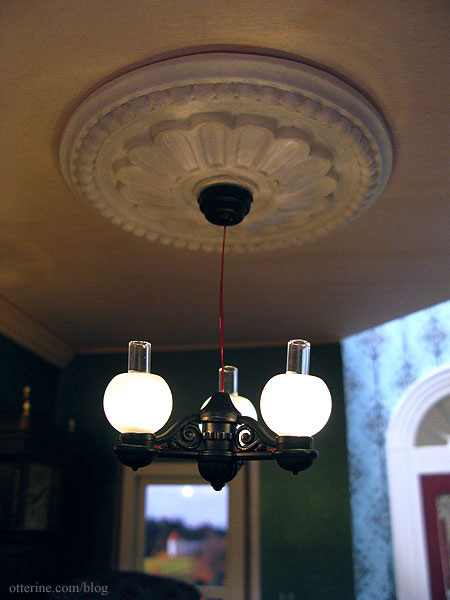
I love it with the large medallion!
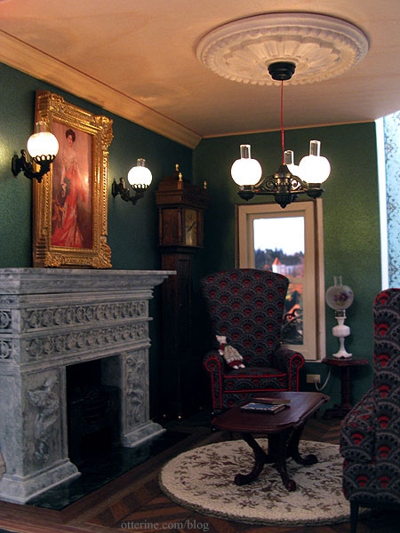
I placed a piece of large crown molding in for mockup purposes, too. The one I plan to use is about the same size but a little fancier.
I next added the chain to the chandelier, using half of the length provided in the kit.
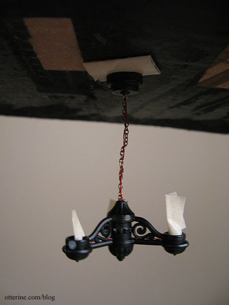
Once assembled, I suspended the fixture from a piece of cardboard and sprayed painted the chain and wires as well as a few of the areas marred by the construction process. I had a few areas of brass chain and red wire still showing, so I touched those up with black acrylic paint and a tiny paintbrush.
It’s a little crooked here, but the nice thing about the varnished wires is the fact that they are more rigid than the typical white wires. You can bend and position them, and they stay put. This helps combat the fact that this plastic chandelier is too lightweight for gravity to hold it straight.
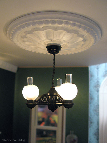
Painting the ceiling, medallion and crown molding all white really helped unify the look. I think it’s going to work really well for this room.
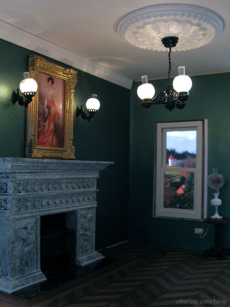
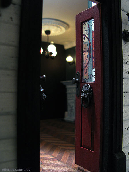
You can’t see much through the front door, but I like this photo. :D
Categories: The Haunted Heritage
March 10, 2012 | 0 commentsBeautiful Bespaq vanity and heart-shaped chair
Those of you who know me in real life know that I wear skirts and dresses 360 days a year, even in the dead of a Chicago winter. But, my home isn’t excessively girly or feminine. It’s more New England cottage meets French Country rustic.
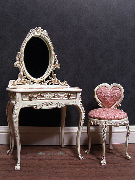
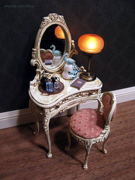
However, I am head over heels for this tiny, ultra feminine Bespaq vanity and heart-shaped chair. :D It’s from Small World Miniatures. I think they look wonderful against the Out of Time scrapbook paper by Recollections that I plan to use as wallpaper in the bedroom. The hand painted details are incredible.
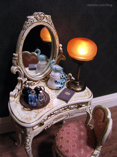
The vanity tray I made fits perfectly on one side with the C. Rohal peacock box and Art of Mini lamp on the other. Not much room for anything else besides a small book. At first I thought the lamp might be too big for the vanity, but I rather like it. It has a warm glow and the perfect vintage feel.
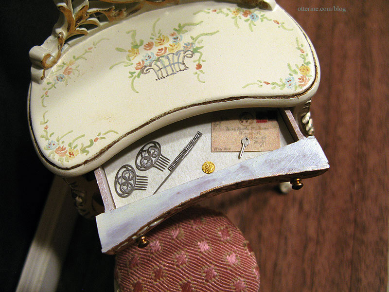
I’ve lined the drawer with pretty parchment paper and added a few things I had on hand. The laser cut hair combs are from The Dolls House Mall. The letter is just a paper cutout for now, but I’ll have to make a pretty opening envelop and letter for the drawer. The laser cut key is by le mini di Pierliugi, purchased at one of the Bishop shows. Grandma’s lucky gold coin is made by Phoenix Models.
The vanity and chair are the perfect pieces I was looking for and will be wonderful in the Heritage bedroom!
Categories: Furniture, The Haunted Heritage
March 8, 2012 | 0 commentsPretty things for grandma
I bought some new minis for grandma, and the first is a beautiful peacock box made by Cathy Rohal. The detailing is superb! So delicate. I think this will be for the vanity in the Heritage bedroom.
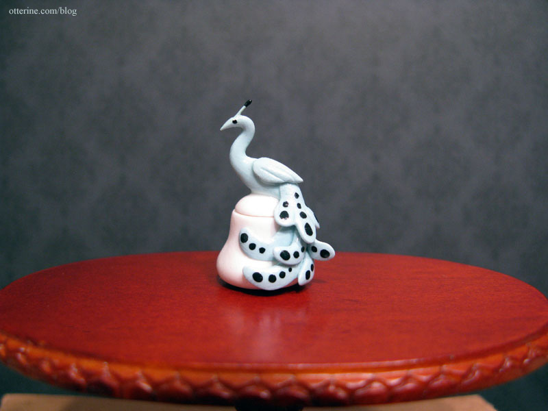
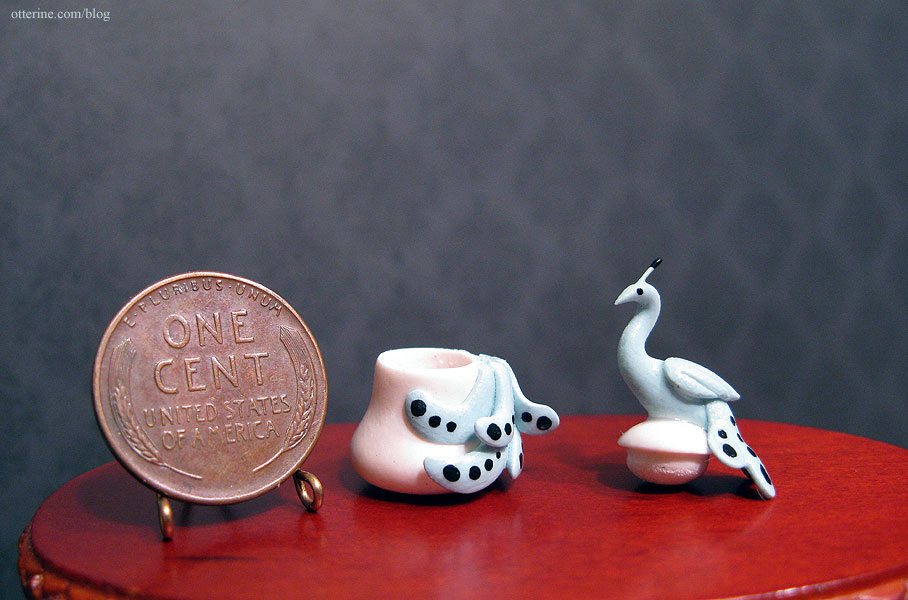
Yes, it opens!
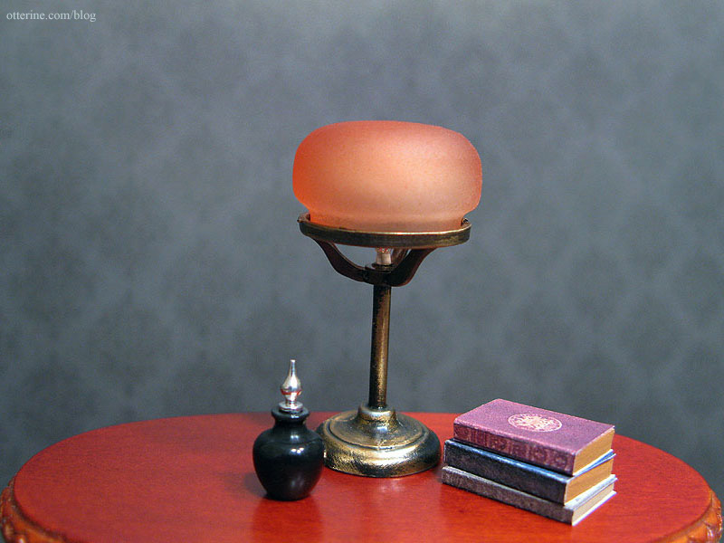
Another lovely vanity item is this black turned bottle with an aluminum stopper by CW Lubin. The gorgeous lamp is from Art of Mini, a perfect vanity light for the Heritage.
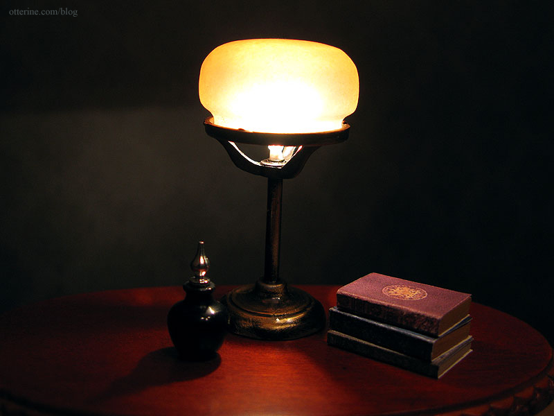
It’s currently a non-replaceable bulb, so I’ll swap that out for a replaceable socket before I install it.
I decided to make a small vanity tray in anticipation of a new bedroom vanity.
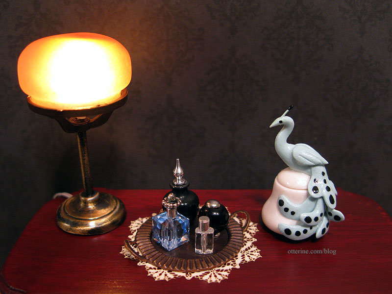
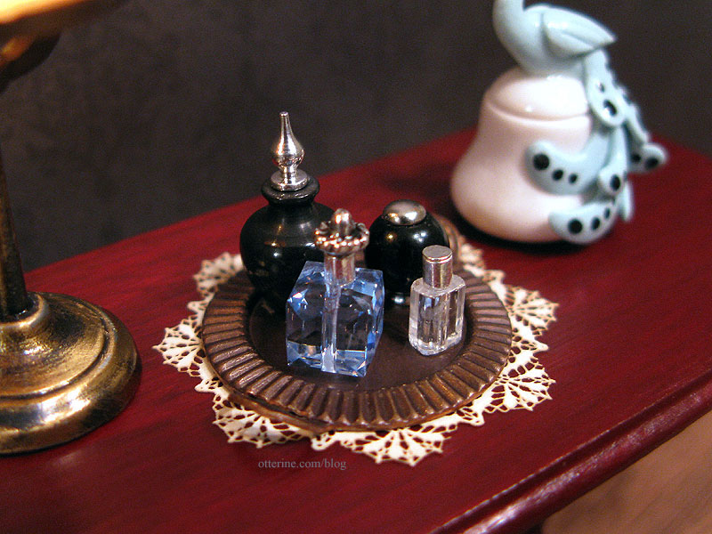
The tray is a jewelry finding that had been completely flat. I used pliers to bend the handles up. The blue crystal bottle has a silver crimp bead and a fancy head pin to make the topper. The round black bottle has an earring stud for a base and a brad as a lid. The clear bottle has a silver crimp bead and a flat head pin for the topper. Are all attached to the tray with mini hold wax.
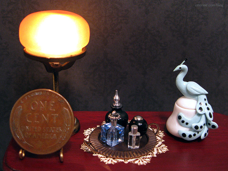
With a penny sitting on the table, you can see just how small the bottles are. :D
Categories: The Haunted Heritage
March 4, 2012 | 0 commentsHeritage – bedroom swinging windows, part 1
I admit to stalling on this part. The bay windows were 99% salvageable from the original kit pieces; only one window is glued shut for structural integrity and the other two work flawlessly. The kitchen side window and the front porch window both had to be replaced with Houseworks components because the original wood pieces were too far gone to save.
There were originally three swinging windows – one in the bathroom and two in the bedroom. Since I eliminated the one in the bathroom when I added the chimney, I had two left. The extra parts from the bathroom window assembly tipped the odds in my favor that I would be left with enough good kit pieces to get these to work without having to build my own from scratch.
Since the exterior of the house is old and weathered, I chose the worst looking parts for the outer portion of the windows. These have been sanded only once to remove the main splinters…there will be a lot more work done on the wood before I put it all together. I also have boards propping them in place that won’t be part of the final construction.
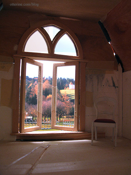
For instance, the one I have taped together in dry fit won’t close all the way…it will have to be displayed open at all times. That’s not necessarily bad, but I would rather have them work completely.
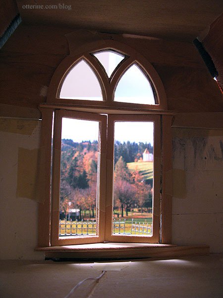
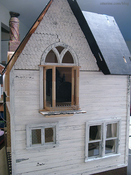
One of these windows opens over the front bay window on the first floor. While this isn’t really a balcony, I will be installing decorative railings so it will at least finish it off in a manner that looks finished.
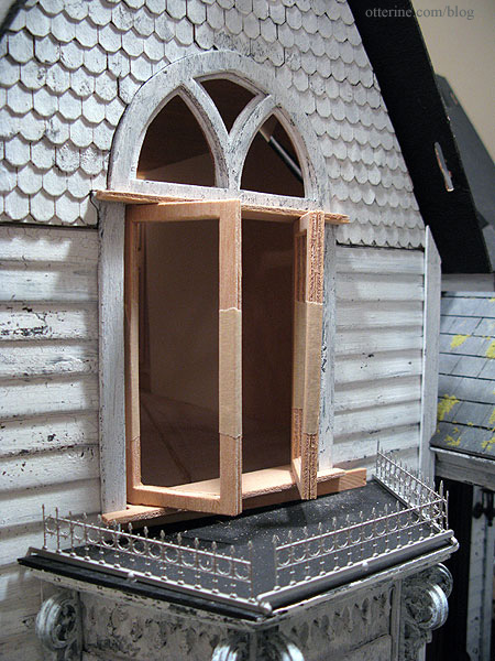
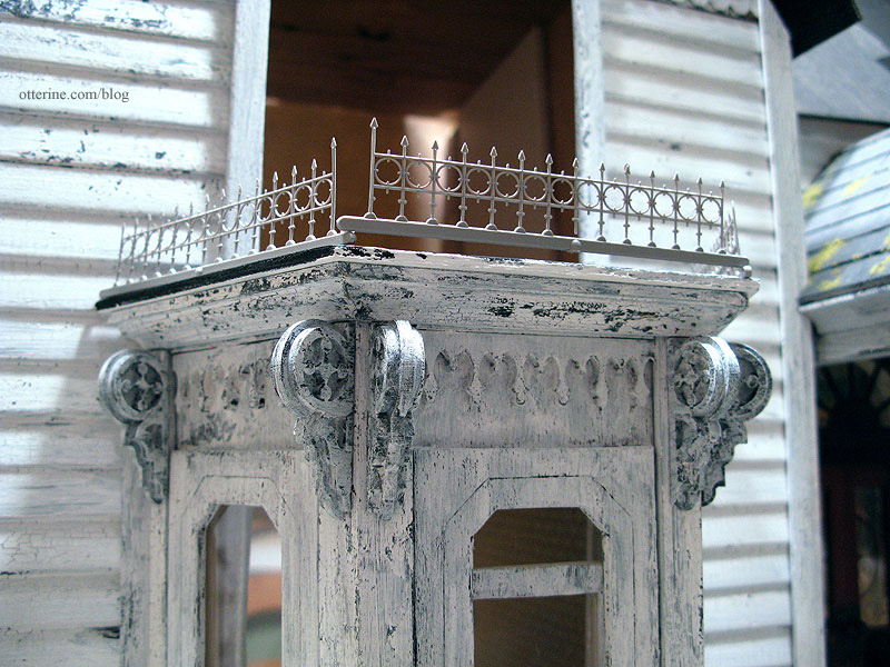
These are quarter scale widow’s walk railings by Grandt Line. I’ll cut them to fit, then paint and age them. They are very delicate but look suitable in scale for the bay window.
The other window, however, opens floor to ceiling with nothing outside but the ground one story below, leaving the possibility of grandma tumbling out the window! :O In the original kit design, this window was to be located in the open stairway, so the floor wouldn’t lead up to it. I moved the stairs to the middle of the house, which in turn caused a major problem with safety.
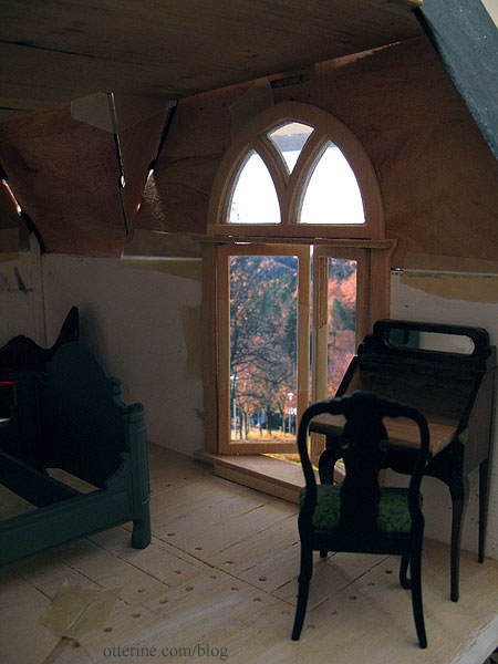
To make this a safer option, I could add a Juliet balcony. This is just a rough mockup with spare parts, but it shows the general idea.
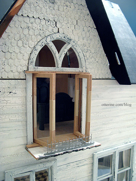
There isn’t a whole lot of room for the necessary support structure due to the first floor casement window if the bedroom windows are to swing out but it’s workable. Plus, it won’t detract from the interior view and seems a realistic option.
Categories: The Haunted Heritage
March 3, 2012 | 0 commentsMy 1920s inspired kitchen
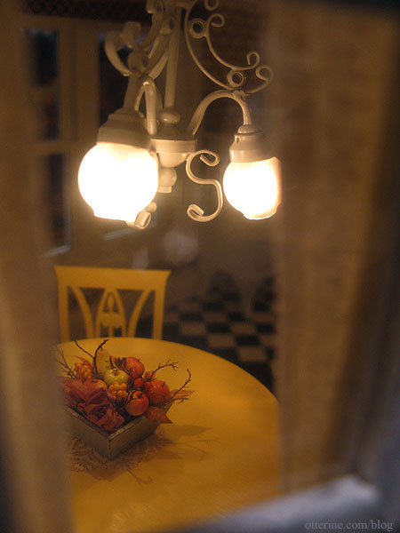
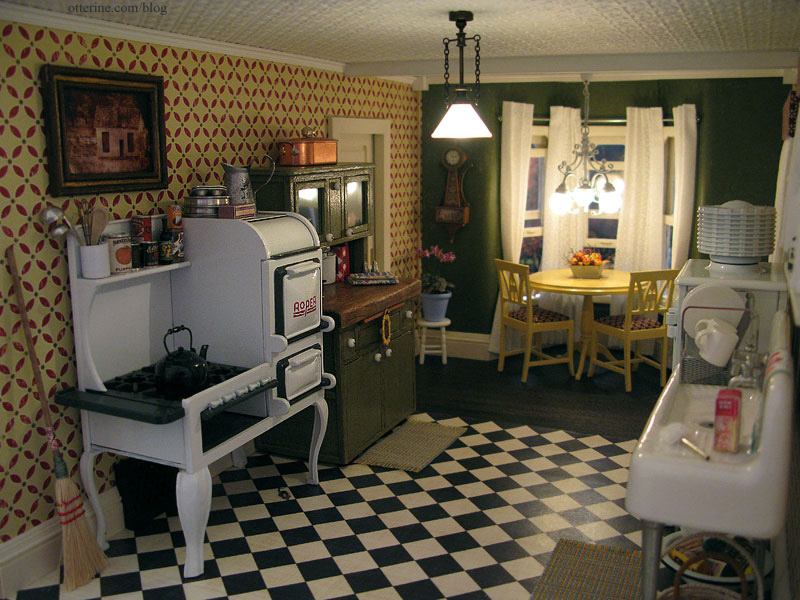
Before delving into the final push on the first floor so I can begin the second floor, I went through my stash of minis to fully set up the kitchen.
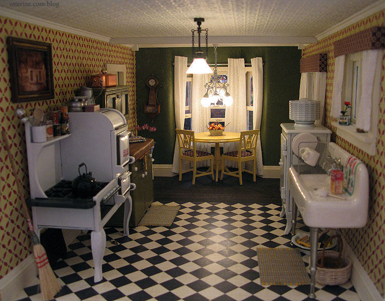
Grandma has been out in the garden again. :D
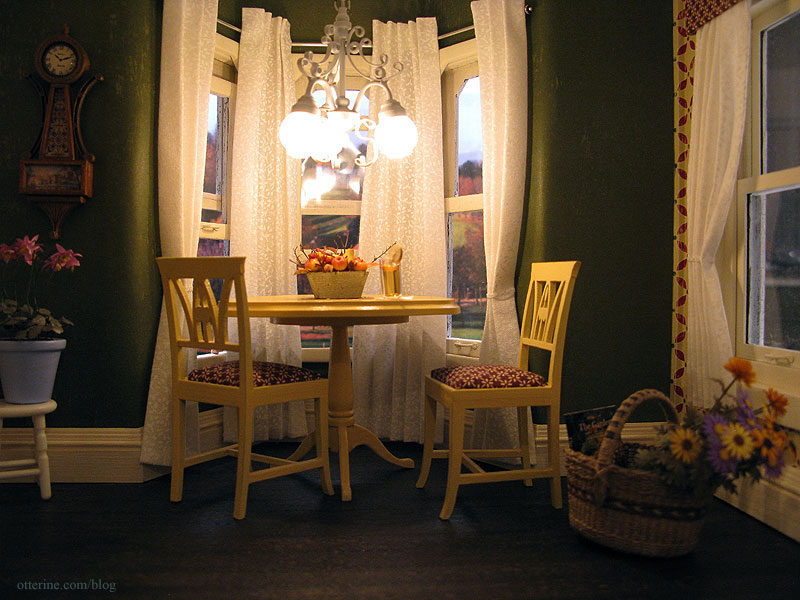
I tried to not clutter the room, but just a few added accessories really change the feel.
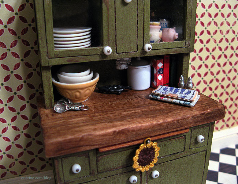
For the Hoosier cabinet, I had to set up the vignette outside of the kitchen to get a decent photograph.
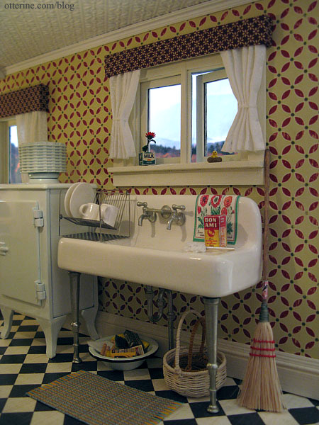
The kitchen sink is one of my favorite minis!
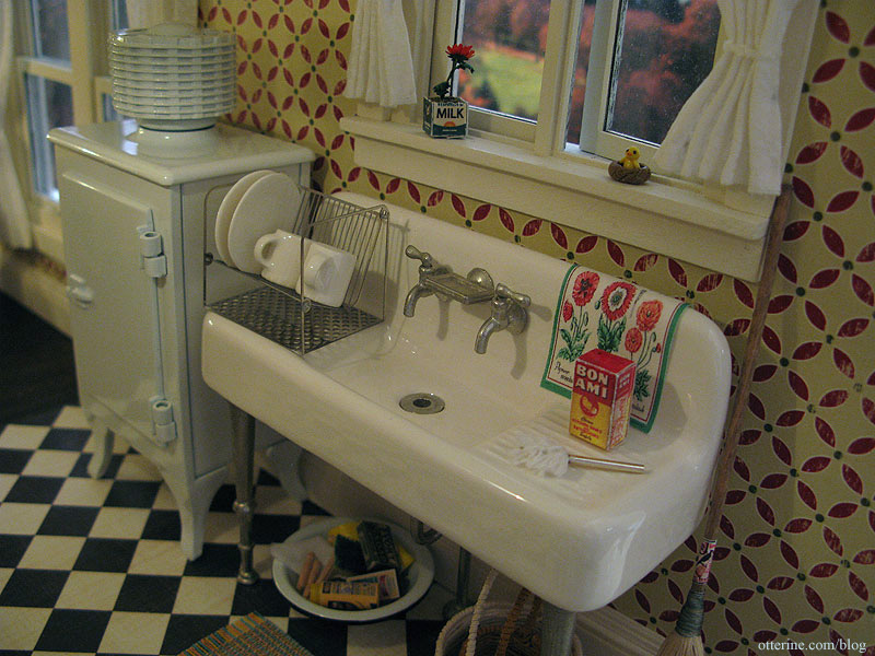
Grandma has her cleaning supplies and some extra baskets under the sink.
I love the way this room has come together. :D
Artist credits:
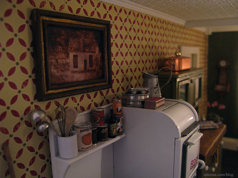
Hoosier cabinet by Keli; vintage photo art by Kelly; potted flowering plant by Michelle; autumn fruit basket by Hungarian Miniatures; tea towels – Marlene; white and brown baskets under the sink by Lyssa; aged silver pitcher on the range by Caterina; large basket by Lidi (Bonnie Lavish flowers assembled by me); tiny chick in the nest by Cathy Rohal.Categories: The Haunted Heritage
February 28, 2012 | 0 comments
NOTE: All content on otterine.com is copyrighted and may not be reproduced in part or in whole. It takes a lot of time and effort to write and photograph for my blog. Please ask permission before reproducing any of my content. (More on copyright)


