
NOTE: All content on otterine.com is copyrighted and may not be reproduced in part or in whole. It takes a lot of time and effort to write and photograph for my blog. Please ask permission before reproducing any of my content. (More on copyright)
Categories:

The Artist’s Studio – Wood stove, part 4
Continuing work on the wood stove. This is one of those instances where I knew I would be wiring the stove LEDs but did not plan ahead for it. Why? Who knows?!! But, all was not lost! It just took some extra steps.
I received the wider fire this week from Mainly Minis – a much better fit.
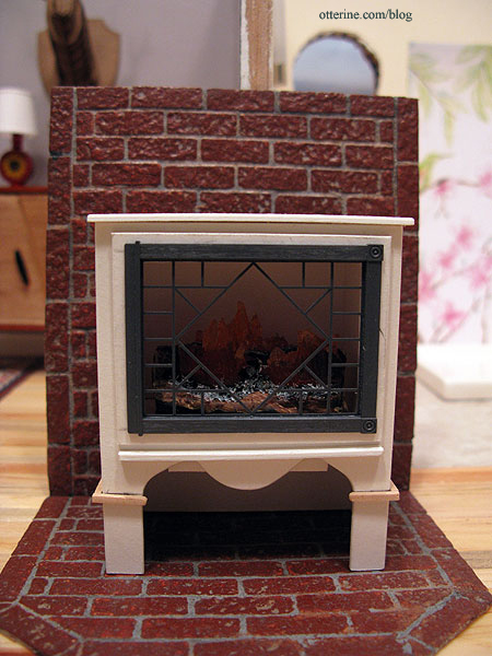
I drilled a hole in the back corner for the LED wires.
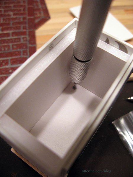
I used two orange flickering LEDs and a 3V battery adapter from Evan Designs.
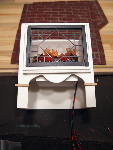
I put the brick surround and stove in place (neither is glued) to determine where the wires would hit the brick base.
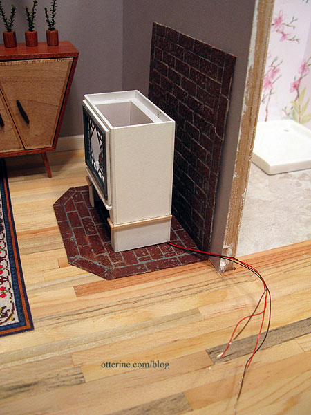
I marked the hole with a pencil onto the wood floor underneath.
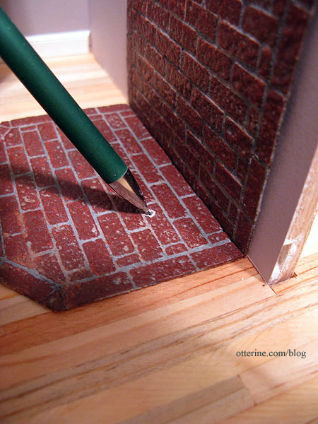
I dabbed some paint onto the wires to mark the optimal position where the wires should come up from the floor.
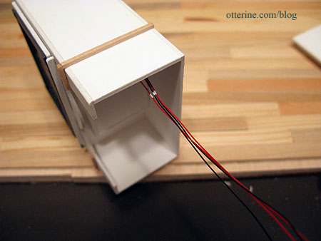
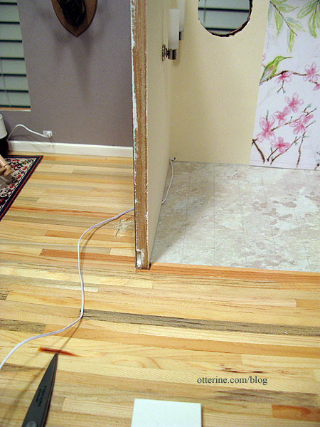
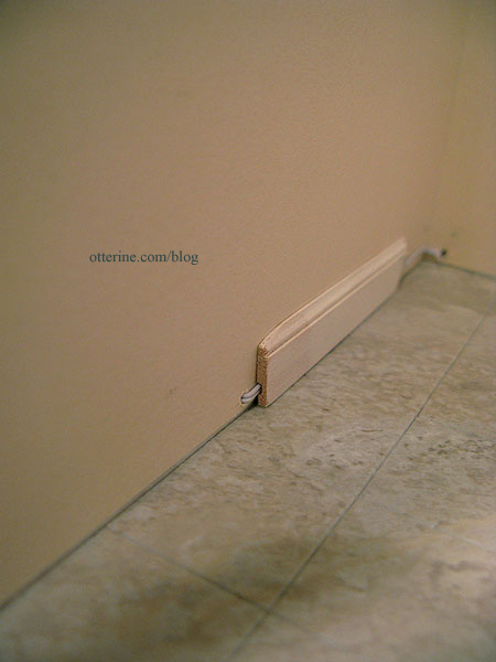
The wire will run under the brick surround, through the wall into the bathroom, behind the baseboard and out the back. I drilled a hole in the lower bathroom wall in the back, angled down so it would not mar the exterior siding.
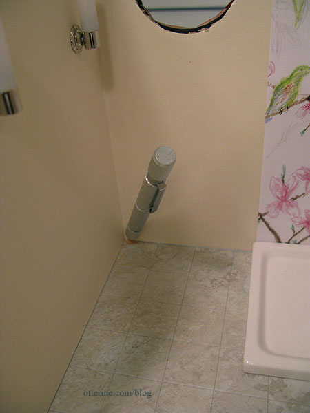
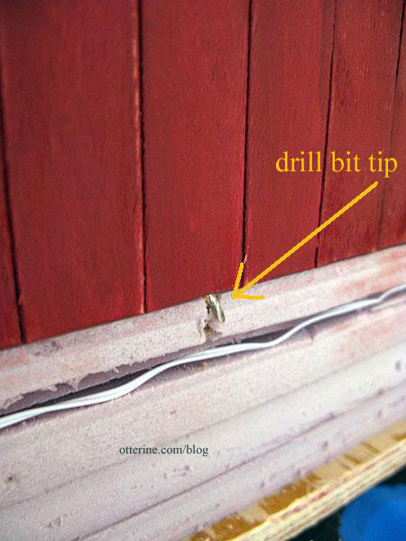
I fed a length of wire through the hole in the back wall and then through the hole drilled in the dividing wall. You can see where I started an indentation in the floor with my Dremel. This is where the wires sit under the brick surround.
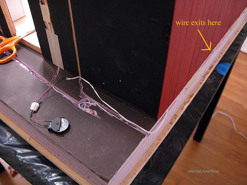
On the outside, the wire wraps around the back in the base foam and ends with the 3V battery adapter. I will build something to house the switch and battery – probably a firewood storage box. :]
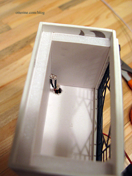
I made the hole in the stove large enough so the LEDs can be inserted from the bottom.
I twisted the LEDs slightly apart, then twisted the wires together based on color.
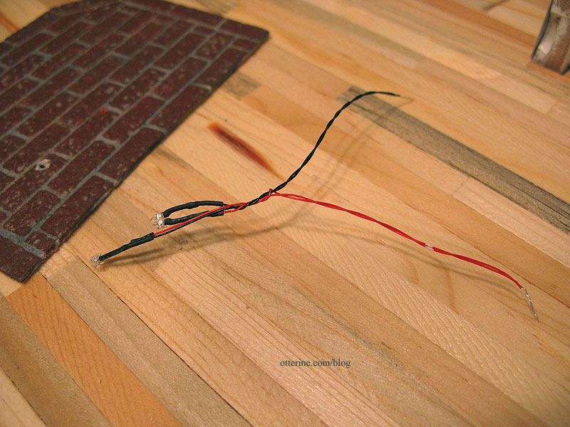
I tested the LEDs to make sure I was connecting to the right extension wire.
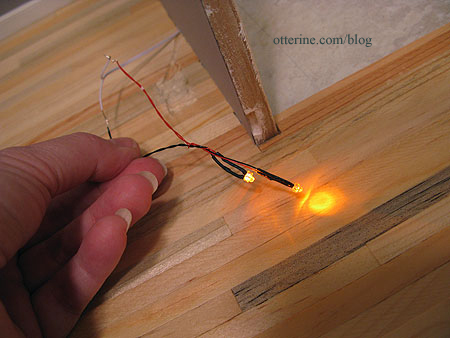
I used shrink tubing to attach the wires and then taped them into the indentation in the floor. The hole in the brick base is large enough to feed the LEDs through from underneath.
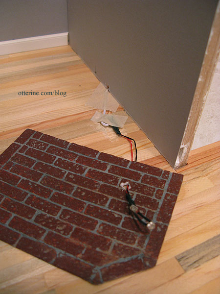
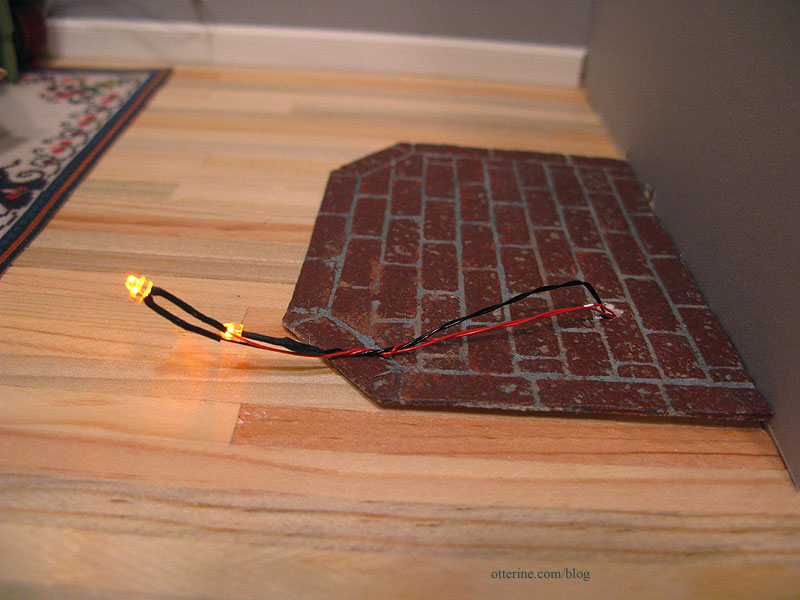
Test the LEDs again just to make sure, though I’m still not gluing the base in just yet. I don’t think there’s anything left to do first, but there’s no rush, either. :D You can see the paint mark for my optimal spot ended up being pretty close.
On the bathroom side, the wire fits into the groove in the baseboard (shown here using a scrap). Ingenious design for this baseboard! I wouldn’t use it exclusively since it holds one wire without any shrink tubing on it.
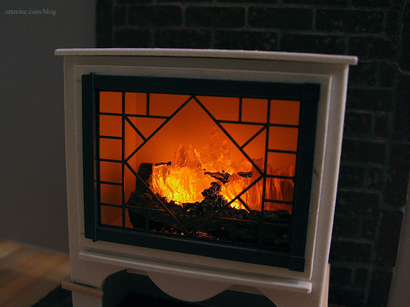
And, now we have a lighted, flickering fire.
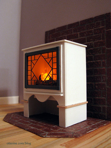
I do like this wider fire better.
Categories: The Artist's Studio
February 26, 2013 | 0 commentsThe Artist’s Studio – Hummingbird shower part 1
Since I wasn’t able to find suitable existing artwork for the shower mural, I’ve decided to draw the scene. Or, at least, attempt to do so. It has been a long time since I last did a drawing.
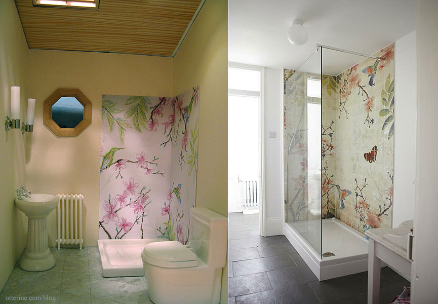
Using smooth Bristol paper, I marked an outline slightly larger than what I need for the shower surround. I viewed my inspiration photo and did a rough layout with colored pencil. I used a deliberately soft touch since I can always add more color but it is next to impossible to take color up later. My layout is busier than the original, and I eliminated the butterfly.

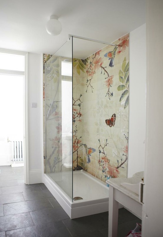
Here is my inspiration from Fine & Country.
This was the best existing artwork I could find; it’s from 1ms.net.
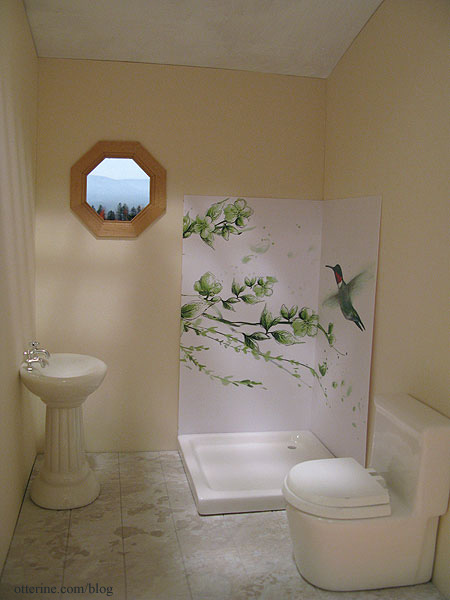
I made a color copy of my initial drawing to see if I liked it in place before working on the drawing any further. I added some height to the shower wall after seeing how short my original mockups were.
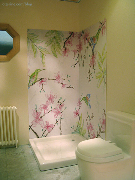
I think we’re getting somewhere.
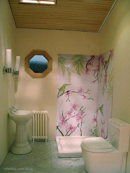
My drawing captures enough of the essence for me, so I’ll work on completing the drawing as is.
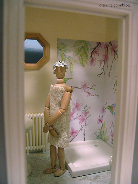
EEEEEEEEEK! Get out!!! :O
Categories: The Artist's Studio
February 25, 2013 | 0 commentsThe Artist’s Studio – Daybed, part 2
Just a quick update to show you the new daybed with its fresh coat of paint.
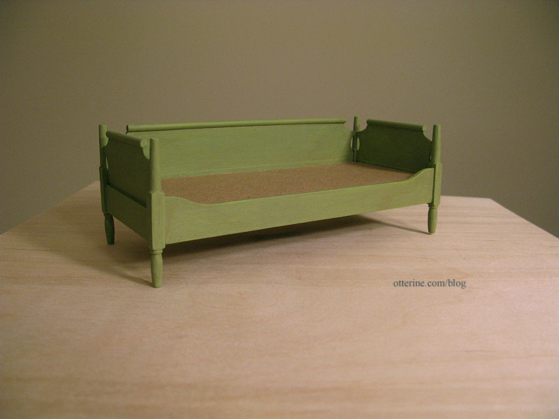
I started with a base coat of Foliage Green by Americana. It’s a bright lime green. I sanded and then followed it with a coat of the same green mixed with grey. I added a final glaze of green, grey and brown, most of which was wiped away.
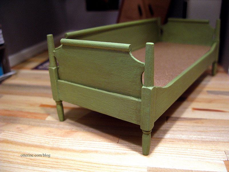
I wanted the daybed to look like a consignment store rescue – a little vintage but with a new lease on life.
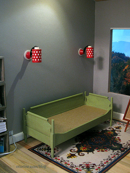
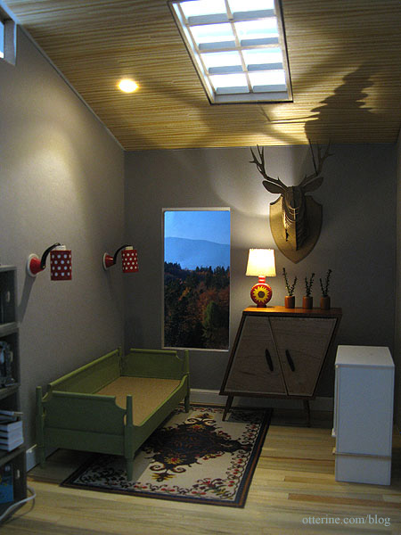
I think it looks lovely.
Categories: The Artist's Studio
February 24, 2013 | 0 commentsThe Artist’s Studio – Daybed, part 1
The daybed I’ve been using in The Artist’s Studio is one that I had in my collection and wasn’t necessarily meant for this space. I painted it burnished copper to coordinate better with the other furnishings.
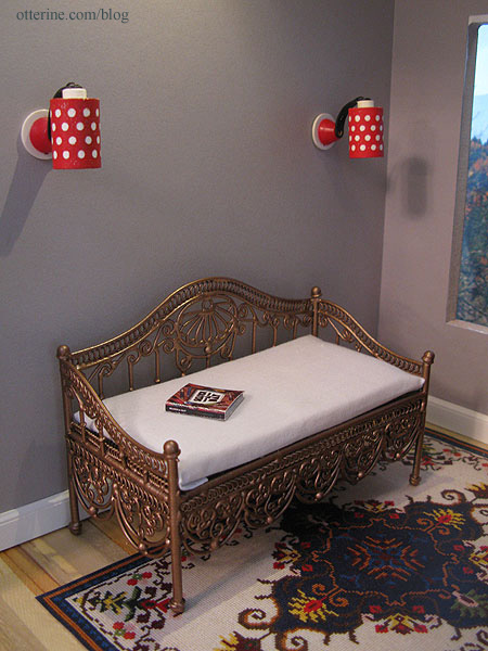
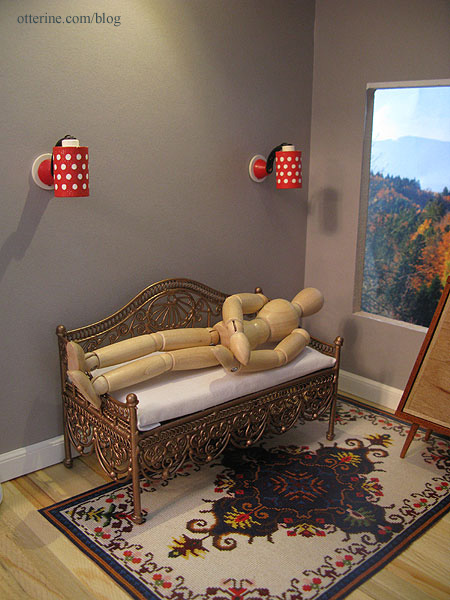
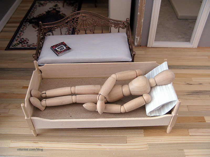
The problem with it is that even though it’s a good size for the room, it’s not really a daybed so much as a settee. My model can’t comfortably recline on it.
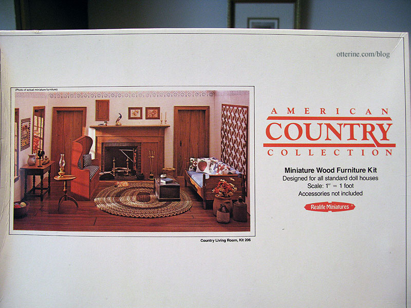
I have a sofa kit in my collection of furniture kits that might work better. It’s from the Realife Miniatures Country Living Room kit.
I’ve wanted to build this sofa for awhile now, so today I put it together. I’ve been spoiled by House of Miniatures and precision laser cut kits. The fit is sloppy in places, but paint will take care of that!
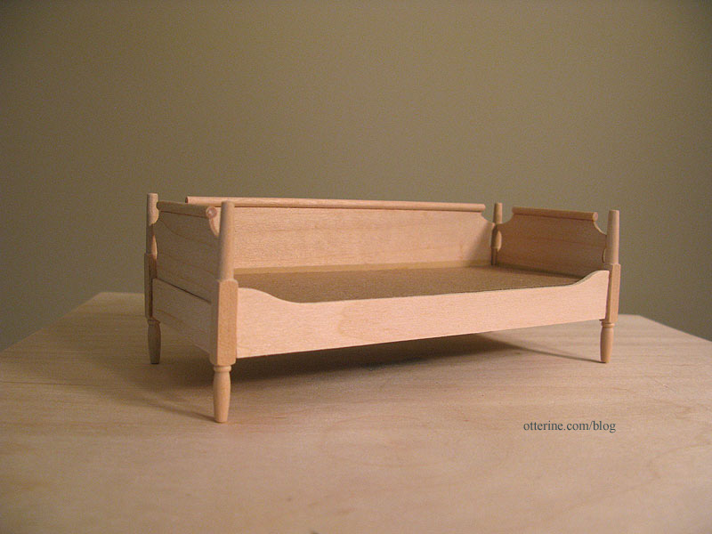
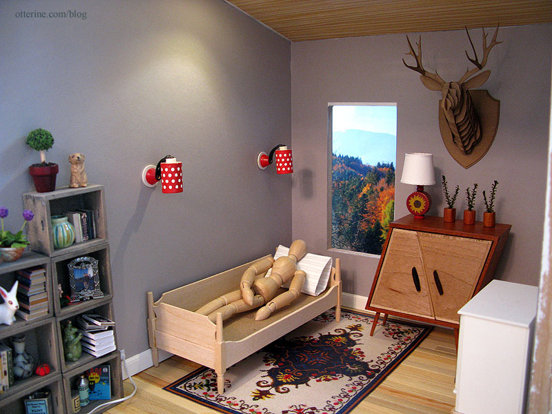
This sofa is lower but wider than the original settee, and my model seems much more comfortable.
It fits well in the space, too. :D
Categories: Furniture, The Artist's Studio
February 24, 2013 | 0 commentsThe Artist’s Studio – Wood stove, part 3
For the brick surround for the wood stove, I started by squaring up my rough paper template and marking the center of the floor and back pieces.

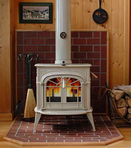
As a reminder, here is my inspiration from hearth.com showing a partial brick wall. Now that I study it, these might be brick colored stone tiles instead. But, I still like the look of it.
I cut egg carton bricks 1/4″ x 3/4″ – my usual choice for brick size. I started with the floor template since it has the cropped corners. I glued bricks to the template in a pleasing pattern, adjusting the template to fit.

Before going ahead with the inside brickwork, I tested the fit of the new shape of the floor template. Perfect! :D

I bricked the interior portion of the floor template and then completed the wall template. I checked the fit of both pieces in the Studio.

The red brick coloration in my inspiration piece looks so lovely that I decided to mimic that with my bricks using Liquitex Burnt Sienna. I grouted with Andi Mini Mortar and then touched up the paint and added a dark grey wash to darken the mortar.

I have the pieces held in place with mini hold wax at the moment. I need to install the stove lighting before I can glue the brick surround in place.

So far, the stove is working out well. :] I think those feet are crying out for a footstool. Haaaaaaaaa!

In other news, Jasper said he’s willing to help with the deck when I get to it. To that end, we’ve started with scroll saw lessons.

Categories: The Artist's Studio
February 23, 2013 | 0 comments
NOTE: All content on otterine.com is copyrighted and may not be reproduced in part or in whole. It takes a lot of time and effort to write and photograph for my blog. Please ask permission before reproducing any of my content. (More on copyright)


