The Artist’s Studio – landscaping base and vintage lighting
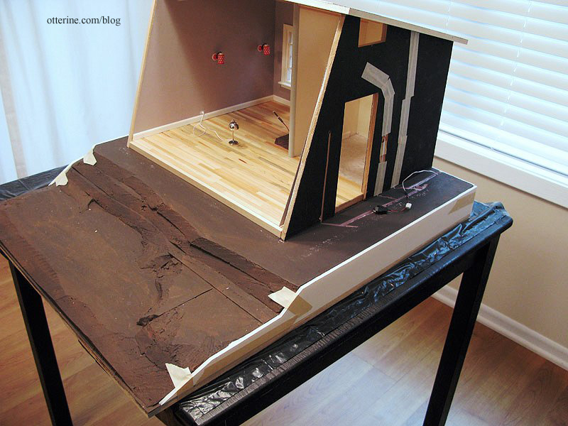
I eliminated one layer of builders foam after adding a piece of 1/2″ thick plywood for the base. I’ve glued the layers in place and sculpted in a rough hill. The extra bit on the right side will be for the walkway up to the deck.
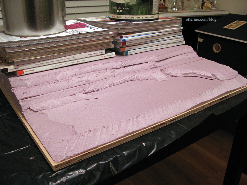
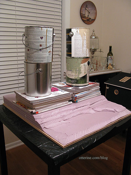
The plywood bowed upward in the middle, so I soaked the wood by running water over the board and then weighted the whole thing down to dry.
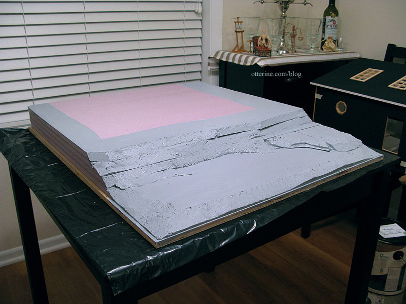
I gave the landscape a quick coat of gesso. The sides and back will be finished with faux retaining walls. I had the idea in mind already, but Lyssa’s fabulous Mt. Ollopa Lodge cinched it for me. :D The edge of the plywood base will have simple wood trim.
This light is an original Lundby red and white polka dot wall sconce that I removed my from childhood dollhouse. It shows its age, but I still think it’s great. This is what it looked like before rewiring.
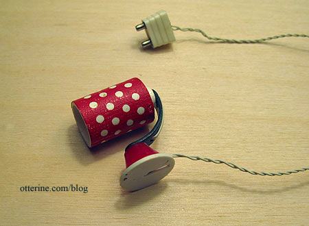
As luck would have it, I recently found two others on eBay in roughly the same condition. I will rewire those as well and use all three in the Studio. I think they’ll be marvelous vintage additions to the eclectic vibe I’m going for.
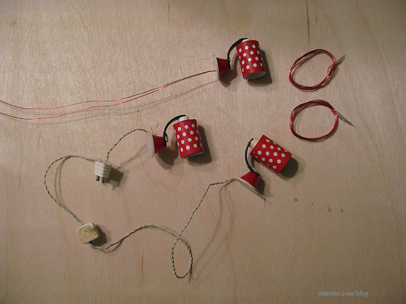
I prefer to use LEDs with long life or replaceable bulb units when I hard wire lights, but that wasn’t an option for these for a couple of reasons. First, the holes in the lamp where the wires feed were too small for the NovaLye LEDs I had on hand. I couldn’t use the ones from Evan Designs, because they have rectifiers along the wires (basically, little circuit boards). Those definitely wouldn’t fit. The screw type bulb socket I tried was too big, and the bi-pin bulb socket won’t work since there is no room inside the shade to manipulate the bulbs and the shade is not removable.
So, I am using the non-replaceable candle bulbs with varnished wires from the Chrysolite lamps I installed in the Heritage. Since those light kits came with removable shades, I switched the bulbs out for replaceable bulb candle sockets.
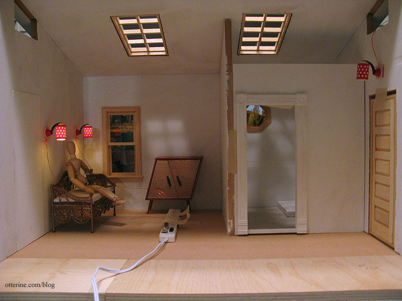
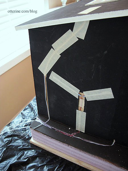
Additionally, these three lights will be installed on outer walls. What I will do is make the wire channels a little wider in one place so I can coil extra wire there. In case I ever need to replace the bulbs, I can remove the strip of siding on the outside and rewire it with a new bulb. It might sound like a pain, but it’s at least a plan. :DHere they are taped in place around the daybed.
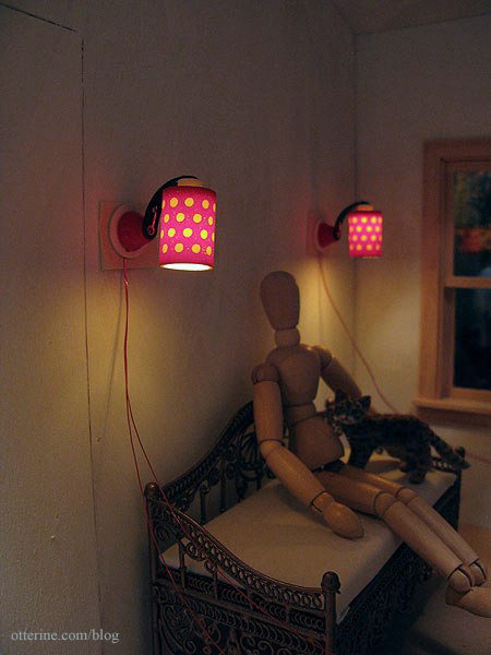
They are going to be fabulous mood lighting!
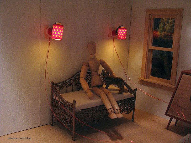
The other one will go above the front door.
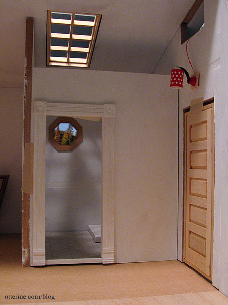
I love the way lighting transforms a miniature build even so early on. :]
Categories: The Artist's Studio
December 19, 2012 | 0 commentsThe Artist’s Studio – The Deck – introduction
The Artist’s Studio is a relatively straightforward build, though the window wall will certainly pose some challenges. The biggest challenge I’ve set for myself is replicating in miniature this beautiful deck from Trex.
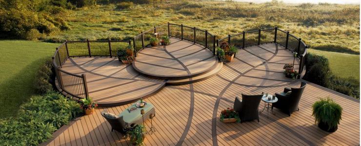
Of course, the real life version is larger in proportion than what I can build in miniature and still keep a reasonable base size. To that end, my deck will be more an “inspired by” build than a replica.
I started with a paper and foam mockup to get the general feel of the layout and size.
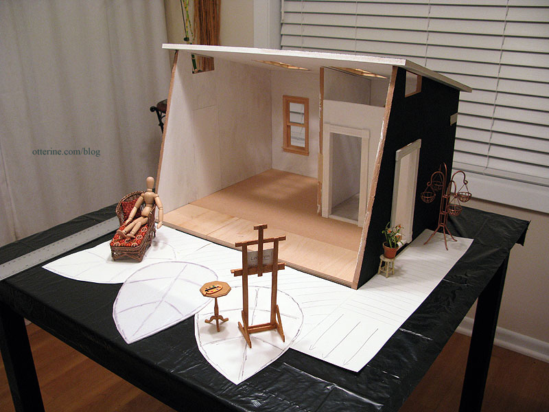
My baseboard needed to be around 24″ x 28″ to accommodate what I wanted.
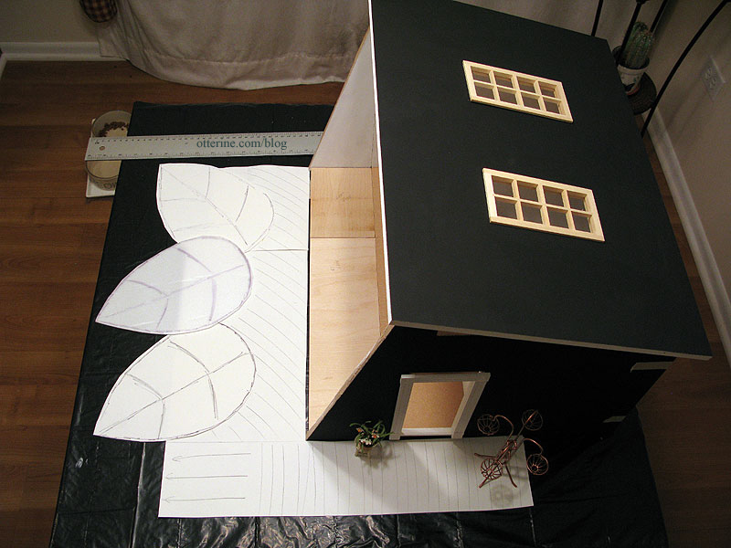
I then used the leftover builders foam from The Aero Squadron Lounge to build up the ground under the Studio and deck. The arrows on the right indicate steps that will follow the slope of the landscape.
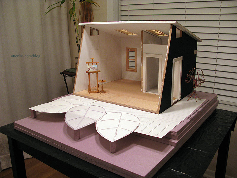
This initial layout had the lead edge of the deck 1 1/2″ off the ground. I have the option of cutting away one of the two foam boards in the front to make it a 2″ elevation instead. I now just need a wood base to hold it all.
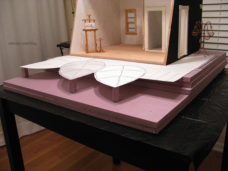
There will be a small area on either side of the Studio for landscaping but the building itself will sit on the back edge of the landscaping base.
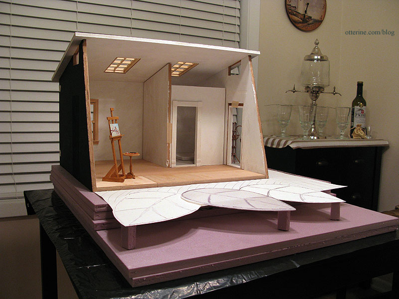
I consulted with Elga since she knows woodworking. She helped me figure out the best way to cut the various curves and suggested some types of wood. Looks like that jeweler’s saw class might come in handy after all…though I hear a few of you telling me I need a scroll saw. :D
Categories: The Artist's Studio
November 27, 2012 | 0 commentsThe Artist’s Studio – primed
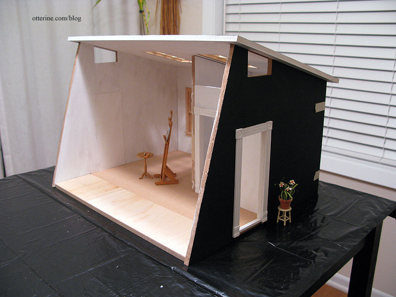
Continuing work on the structure. I primed the front and back of each board except the floor since that is still in the planning phase. I used white on the interior and black on the exterior. I always prime first one side and then the other in the same painting session to keep any warping to a minimum.
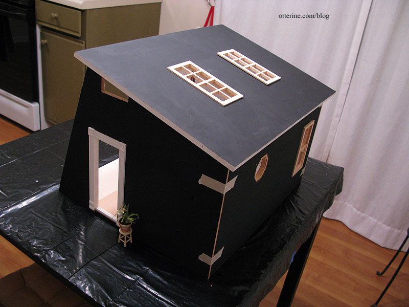
The white portion will need a second coat, but I also have to fill in the loft notches some more since the spackling shrank as it dried. The extra floor boards are in, too! :D
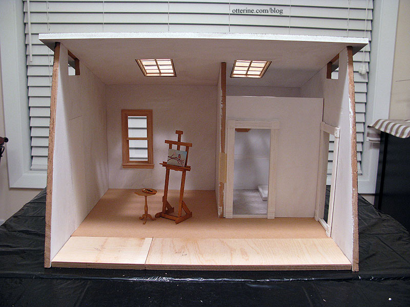
It might seem like I’m flying through this build, but this thing will stay in dry fit for some time. This is usually how my Spring Fling builds go…lots of prep and dry fit for months. The Studio will be glued together relatively early in the build, but there will be a lot of work to do besides.
I bought three papers for the interior, all drawing papers in large size sheets. The side walls are longer and taller than standard scrapbook paper sheets, so this will eliminate the need to piece the wallpaper. I have successfully applied wallpaper with seams before, but why bother if you don’t have to? And, solid papers tend to show seams more readily. I will be using the back side as the right side surface since the texture is softer.
I bought Daler-Rowney Dreadnought Grey as well as Canson Pearl Grey and Ivory. The ivory is for the bathroom and the greys are for the main hall and living area. I loved the Dreadnought Grey in the store but worried it might be too dark for the interior, so I bought the Pearl Grey just in case. I might use a two-tone treatment.
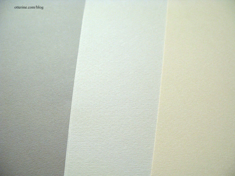
I think it’s rather fitting to use drawing papers for an artist’s studio, don’t you?
Categories: The Artist's Studio
November 25, 2012 | 0 commentsThe Artist’s Studio – modifications, part 2
Continuing work on the modifications. For the bathroom in The Artist’s Studio, I used Greenleaf vinyl tiles. I have split these before to do a diagonal layout, but I prefer the way they look when used whole, without splitting between the tiles. The drawback to this is sometimes these sheets have obvious large patterns that cross many tiles. I put the shower floor and toilet onto the full sheet of tiles to see where I could get the cleanest layout.
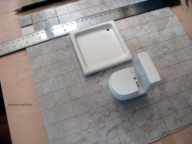
I split the tiles along these lines and cut through the paper backing. I tested out the fit while keeping the paper backing on for now. I won’t be ready to install the tile for some time.
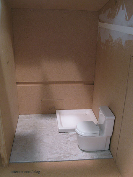
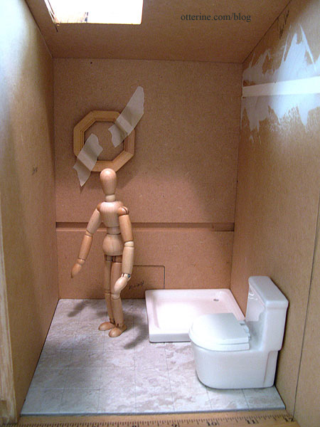
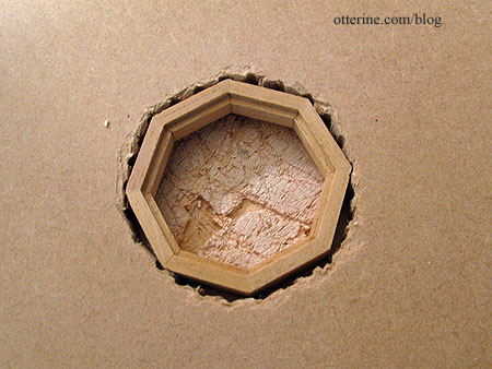
Another project for this long weekend was cleaning and organizing. When I went through the box of components, I found a Houseworks octagon window. I decided to use this in the bathroom for some visual interest. My model helped me determine a good height.
To make the opening, I drilled holes all around the template line. I’m using a power tool!!! :D
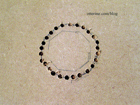
There were some excess splinters where the drill punched through on the back, so I cleaned them up with a straight blade…the kind you use to remove stickers from glass.
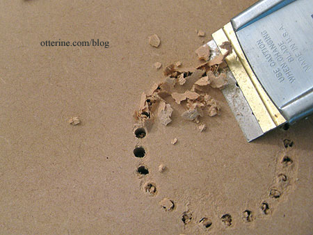
I then chipped out the sections between the holes, once around each side and then more where needed.
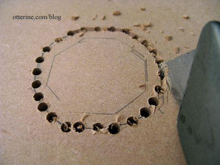
Hmm…the popped out insert kinda makes me want a Reese’s peanut butter cup. ;]
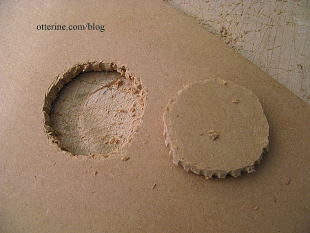
I cleaned up the hole with my utility blade and then checked the fit. Marvelous!
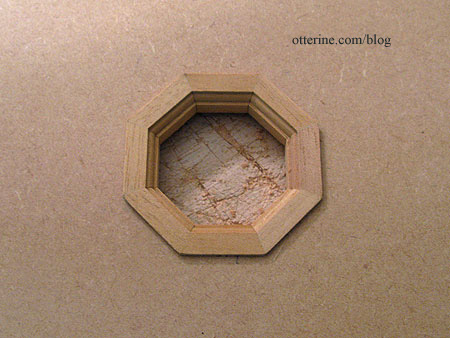
It’s a good snug fit, too, to keep the window aligned properly.
I filled in the original door opening with sheets of balsa and basswood since I had it on hand. I’ve put in a spare piece of foam for the front floor until I get the cut pieces of 3/8″ plywood back from my parents (they have better power tools). :D
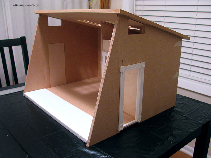
I cut the new door opening on the other side and made the removable bathroom wall from 1/4″ plywood.
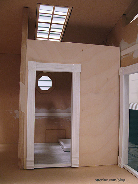
I glued in the plugs on the back wall and filled in the remaining loft support notch.
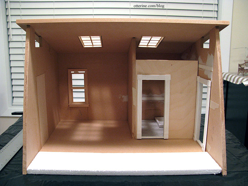
Next, I need to plan the deck so I can buy a piece of wood for the landscape base.
Categories: The Artist's Studio
November 24, 2012 | 0 commentsThe Artist’s Studio – modifications, part 1
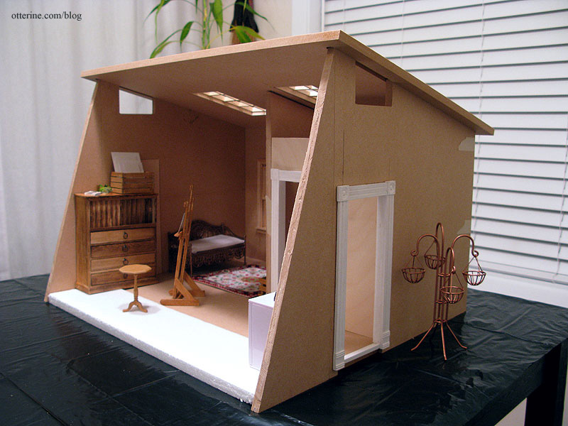
The Artist’s Studio structure is now 5 3/8″ shorter but still has a nice lofty ceiling height. I used the scrap piece from the back wall to cut two angled pieces for the front sides. The floor edge in the front is marked by tape. That filler piece needs to be cut still, as well as the outer door hole.
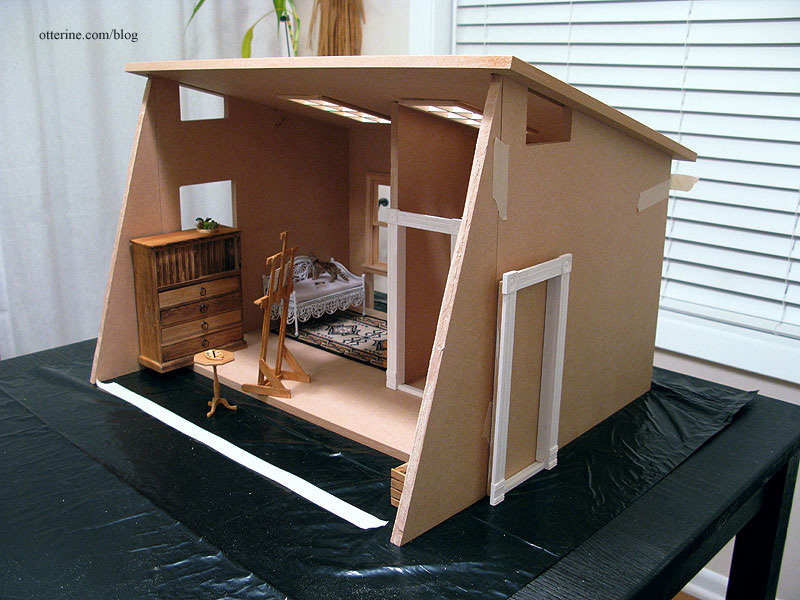
I kept the location of the skylight holes but made them larger to accept Houseworks 8-light windows. I also added a Houseworks working window in the living area. The remaining holes at the bottom of the back wall will be filled in. The two side openings at the top will be funky clerestory windows. :D
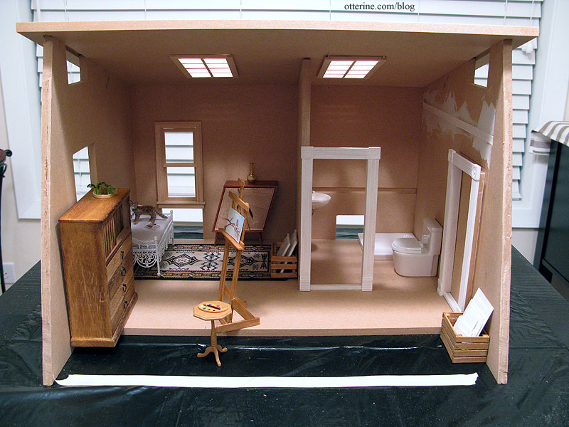
The door hole in the living area will be filled in completely…no window or door there.
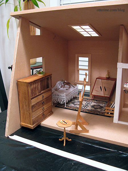
The position of the skylights will require a short front wall for the bath, but I’ve seen that done in structures with vaulted ceilings. This wall will be removable for access to the bath. I will add a small window to the bath toward the interior corner, with the sink moved to the interior wall to make room for the window. I’ve filled in the loft track on the side wall and will do the same for the track on the back wall.
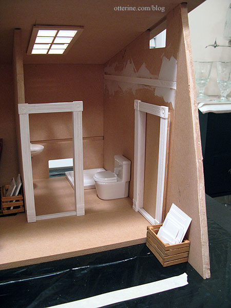
I’ve switched the daybed and the whimsical cabinet to showcase the cabinet. You couldn’t really see its fun shape on the side wall.
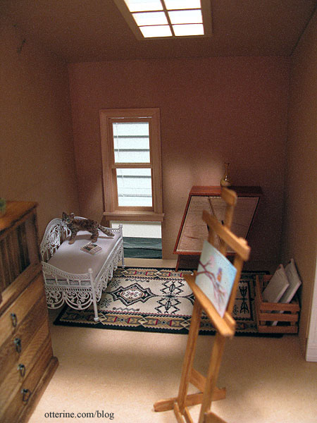
Categories: The Artist's Studio
November 18, 2012 | 0 commentsThe Artist’s Studio – introduction
I’m ready to announce my next building project: The Artist’s Studio made from the Loft kit from miniatures.com (this was their 2012 Creatin’ Contest kit).
I’ve wanted to make an artist studio since I began making miniatures in 2009 since I’ve been an artist all my life. I learned to paint with oils when I was very young, which is probably why I think of them as “finger paints” now. My grandma used to take me to art classes in the city when I would stay with her. I then moved to pastels and later in college learned to work with watercolors and acrylics. In between, I discovered a love of sewing and photography, so I’ve always had creative outlets in my life.
There are two great miniature art studios from which I drew my inspiration. The first is by The Thomases, who are masters of realism in miniature. Their Rooftop Artist’s Studio can be seen in the second gallery in this link. I love the siding but most especially the shape of the building itself. That wall of windows…sigh. I love the bare bones interior finishes…the rustic floor, exposed beams and wiring conduit.
A more recent build has the same siding, general shape and wall of windows. This one is Nell Corkin’s Summer Studio, created in tiny 1:144 scale. I love the similar qualities this build has to the one by The Thomases, but that garden setting really sends it over the top for me.
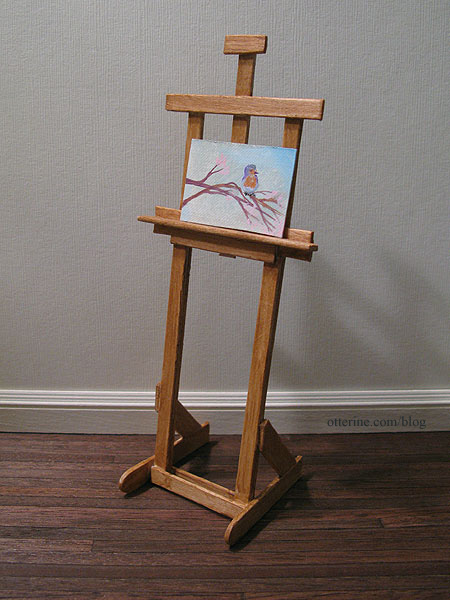
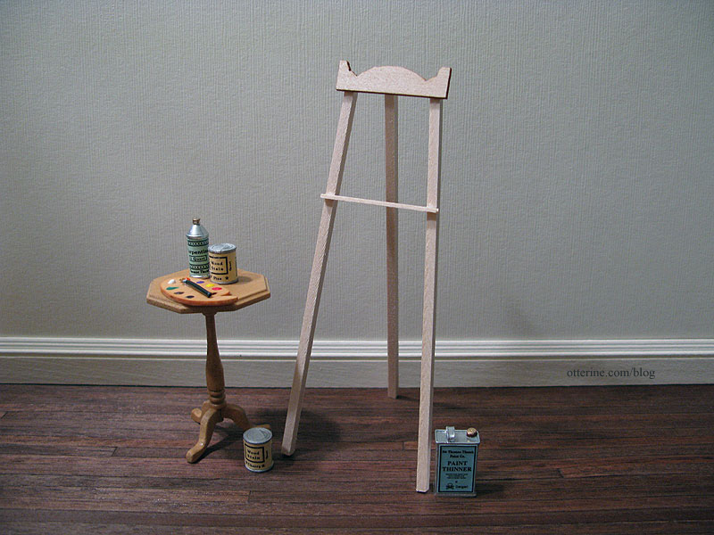
To start, I have already gathered a number of lovely miniatures to include in the build. First, Lyssa and I did a swap this past year. She sent me some of her wonderfully made artist miniatures including this easel and one of her lovely small paintings.
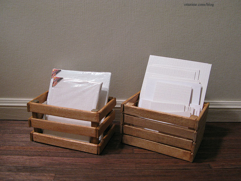
She made two crates of canvases and specialty papers.
I picked up an assortment of metal miniatures from Sir Thomas Thumb at the Bishop Show. The palette was a free gift at the 3 Blind Mice Show one year, and this second easel was a free gift at the recent Wee “c” Miniatures Show. The table is currently a refugee from the Newport but it might find a home here, too.
And, let’s not forget the whimsical cabinet by minisx2 on etsy. It’s just so fab!
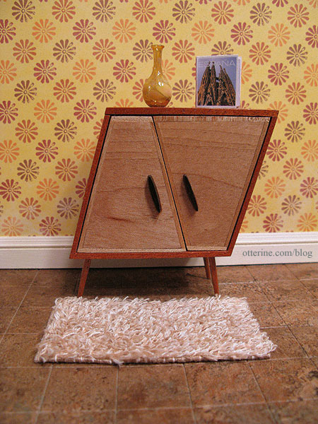
The vase and book were lovely gifts from Minismodernas. The rya rug was a gift from Glenda at Peppercorn Minis. The flooring is Greenleaf vinyl tile and the paper is 40’s Farmhouse by Recollections (Garage Sale theme). The paper and rug might end up in the project, too.
Or, I might go for a cleaner look with solid papers and let the structure and furnishings take the spotlight. The cabinet came from Daphne at A Miniature Obsession, and the plant on top is a gift from Fran at FranMadeMinis. Cora you met last week. :D
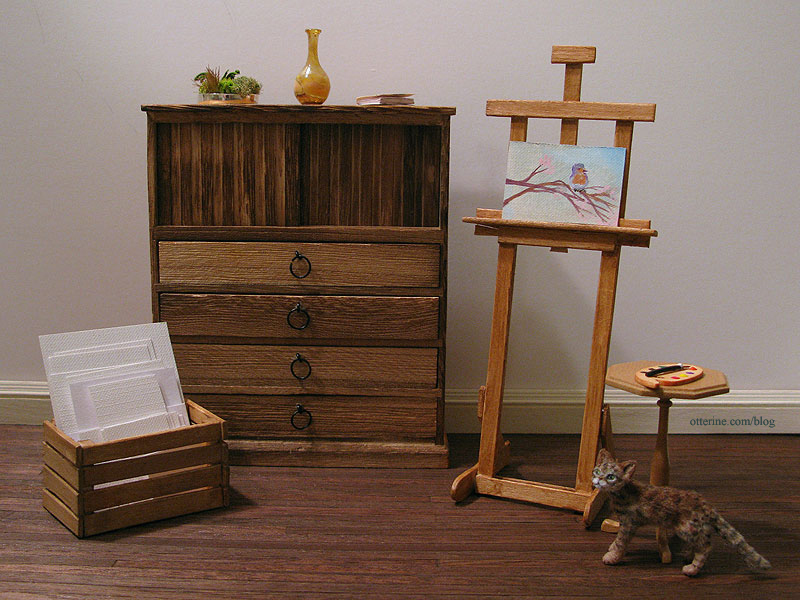
I have a lot more in my prep box, but I am going to keep it all under wraps and reveal as I work. I’ve got some killer ideas up my sleeve.
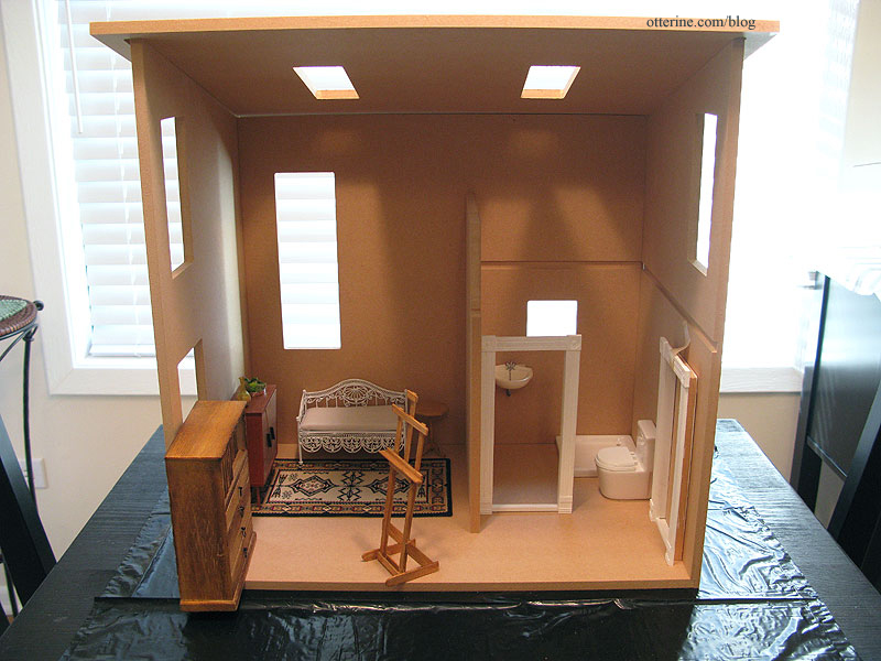
When I first saw the Loft kit, it immediately reminded me of the shape I wanted for the studio. Just a quick layout in dry fit.
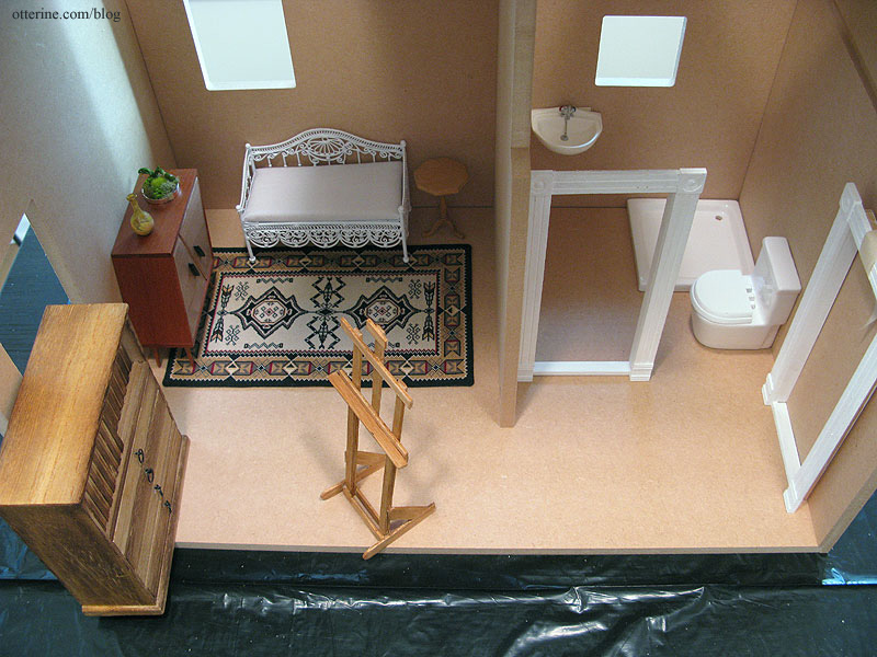
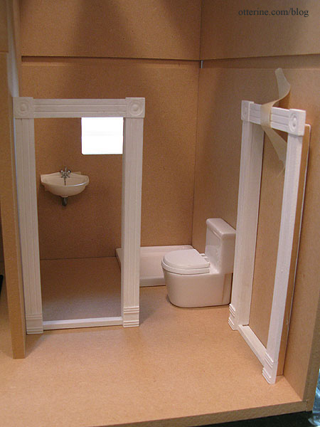
There will be a bathroom…
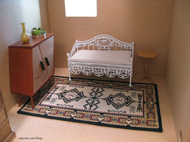
a living area (the Navajo rug won’t be staying, but there will be a rug here)…
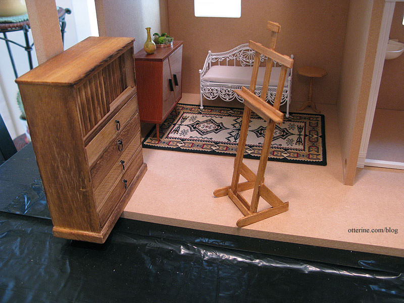
and a painting area. In making the angled front wall of windows, floor space will be added in the front.
There will be some alterations made to the kit pieces (including making the whole thing shorter) and we’ll be ready to break ground once the Heritage is complete, probably sometime in January 2013.
Why did I not build it this year to enter the HBS contest? Mostly time. I chose to build The Aero Squadron Lounge for the Greenleaf Spring Fling contest and had the Heritage still to finish. I’m also delaying The Brownstone to build the studio, because The Brownstone will require a lot of bashing like the Heritage. After the lengthy Heritage build, I need a relatively smaller build in between. Of course, I don’t know if the deck I have planned could be considered a smaller build.
However, there’s a new contest in the miniature community over at Little Victorian and entrants have until May 5 to finish and enter. That might cut it close for me, but I do have the long, cold winter ahead. So, why not? But, I won’t be keeping everything all secret for this one…you get to come along for the ride.
Now, who’s ready for a modern art studio?
Categories: The Artist's Studio
November 17, 2012 | 0 commentsBlue medallion rug – introduction
I found this beautiful rug on Jorge Cubells’s blog, and he was kind enough to upload a larger picture so I could stitch one for myself. I will be using colors very similar to his. I mounted a piece of 32ct Jobelan on a wood frame, and my threads are all from my existing stash…though I do need a better dark green than the one I have. The background will be ivory – DMC 712 – which I will do most of after the border and medallion are in place. I want to limit the chances of the ivory being soiled as I work on the darker designs.

Update 9-9-2012: I noticed a small issue with the pattern. It seems there is a column missing from the middle of the design on the pattern I downloaded, so there are two lines of stitching missing in my rug as I’ve stitched it. From Jorge’s photo, I see the violet flowers are uniform all the way around, but on my rug as I followed the chart, my middle violet flower is smaller than the two on either side…and the blue decoration in the border runs together where there should be a space between them. I realized it was off when I taped the pattern together but thought it was just a design element. It wasn’t until I looked at the photo of the finished rug again that I saw the pattern was off.
But, I am not starting over after 34.75 hours of work! Unless you are familiar with the original, you don’t even notice. Looking at my rug, nothing appears obviously off; it just differs from Jorge’s original. I still love it, and I am forging ahead!

Categories: Needlework - French knot rugs, The Artist's Studio
August 23, 2012 | 0 comments
NOTE: All content on otterine.com is copyrighted and may not be reproduced in part or in whole. It takes a lot of time and effort to write and photograph for my blog. Please ask permission before reproducing any of my content. (More on copyright)
Categories:

The Artist’s Studio – Retaining wall, part 1
I had left enough space around the builders foam to add a retaining wall. I think the retaining wall is a nice way to finish the edges since I built up the land in order to have the leaf deck.
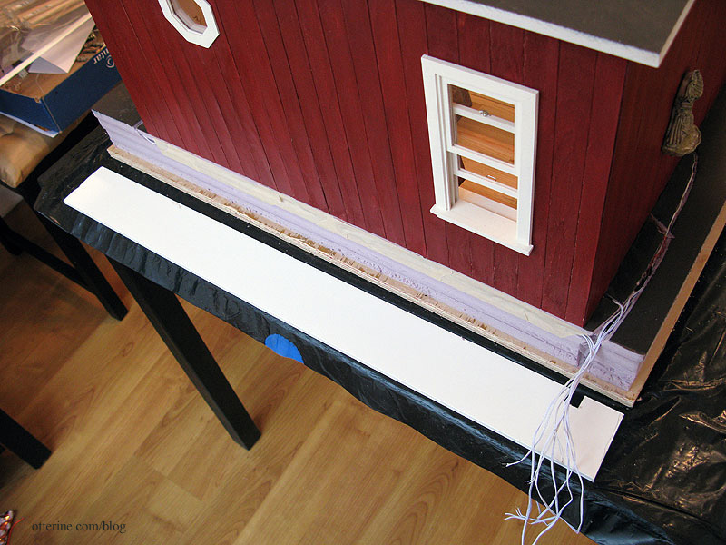
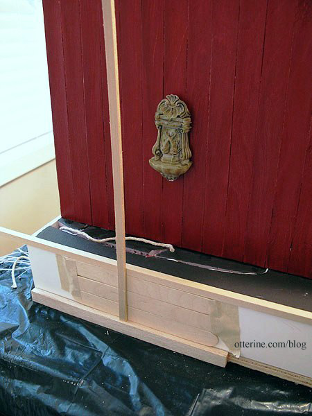
Since the foam layers are uneven, I cut strips of foam core board to act as filler and an even surface for the wood boards that will make up the retaining wall. Before gluing the foam core board in place, I added shims in a couple of places where needed to make the walls level. It already looks cleaner.
For the back piece, I cut a hole for the wires to exit the back.
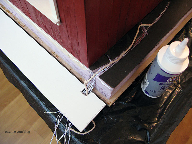
I added a length of twine from the back opening to the top side of the landscaping area. This will allow me to feed through any wires for landscaping lights I might want to add later, before the final landscaping covers this wiring channel.
I will add 1/4″ x 1/2″ trim wood around the base to finish the rough plywood edge. On top of this will sit three horizontal rows of planks. I’ll use Woodsies sticks that measure 6″ x 3/4″ x 1/16″. A box of 300 sticks was $5 before using my 30% off coupon. They have rounded edges, so each one will need to be cut.
On top of the horizontal planks, I’ll use 1/4″ corner trim. This will give the look of a solid beam on top of the wall. For the vertical posts, I will use 1/8″ x 1/4″ bass wood.
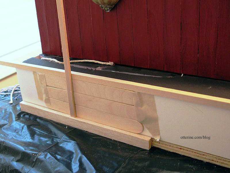
I need to pick a stain color, though I’m already thinking something dark so it won’t compete with the Studio or the leaf deck. Perhaps walnut….
Now it’s time to cut a whole mess of sticks!!! :D
Categories: The Artist's Studio
March 30, 2013 | 0 commentsArtist paper pads
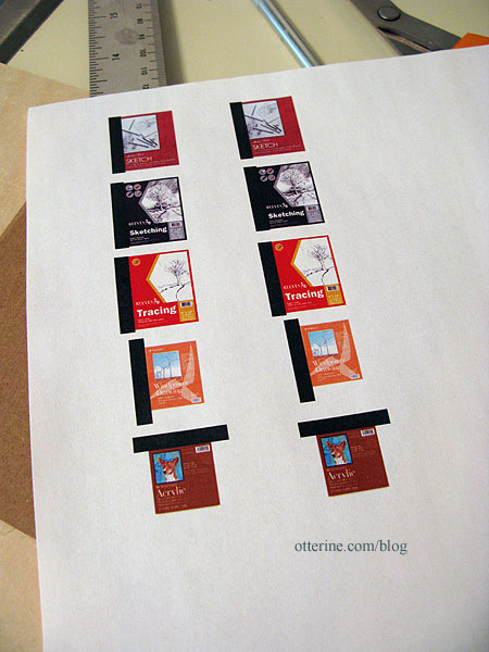
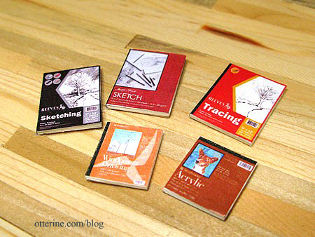
I found images of actual covers online and printed them with black rectangles on the binding edges. I always print two of each hoping to end up with one of each. :D
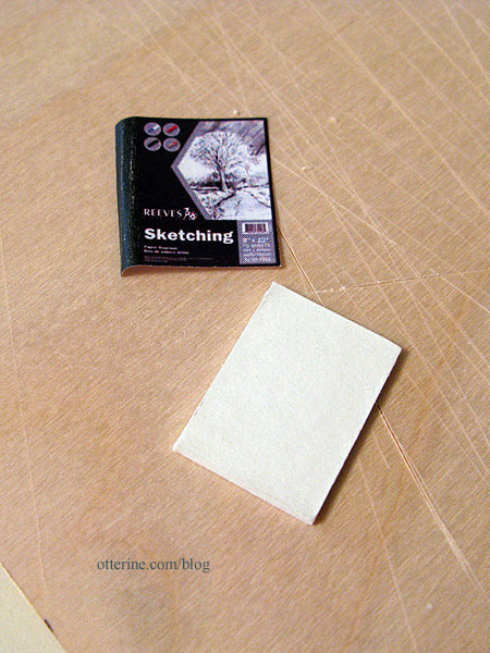
I cut white mat board to use as filler. I glued the covers onto one side of the mat board, leaving the black portion long and unglued.
I glued thin cardboard to the back of the mat board.
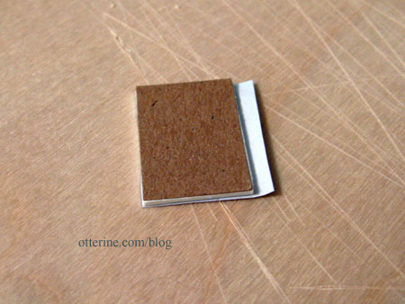
I folded the black portion over the edge and cut it to fit. Once glued in place over the cardboard, it gives the illusion of a bound edge. :]
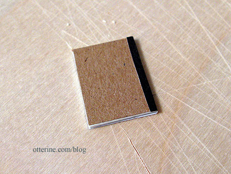
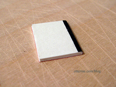
I’ve also seen them with a white backer, so if you don’t have thin cardboard you can skip that step.
I’ll make a number of other artist materials, but these are a good start.
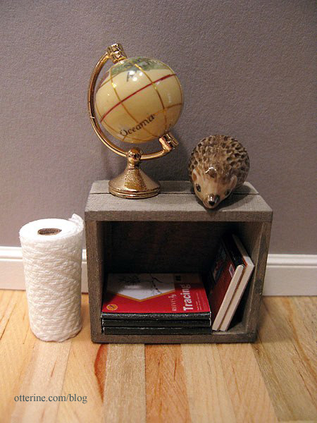
Into the crate they go. Lyssa makes the best paper towel rolls. :D
Categories: Miniatures, The Artist's Studio
March 24, 2013 | 0 commentsThe Artist’s Studio – Window wall, part 1
As a reminder, here are the two projects that inspired the basic shape of The Artist’s Studio: Rooftop Artist’s Studio by The Thomases, seen in the second gallery in this link and Nell Corkin’s Summer Studio, created in tiny 1:144 scale.
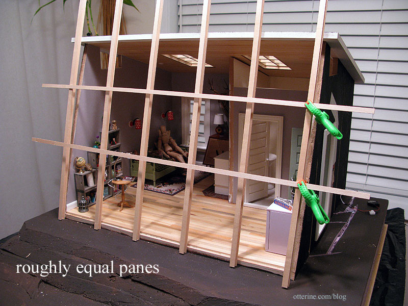
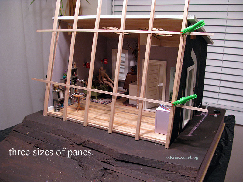
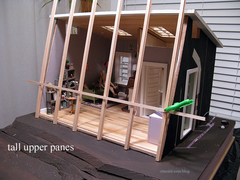
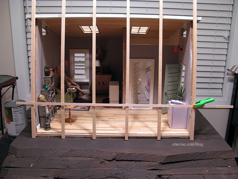
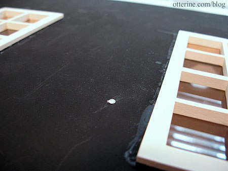
Using some spare strip wood, I mocked up four versions for the front window to see what worked best. These photos were taken before a lot of the recent work was completed, so it might look a little off. :D
Wide vertical sections with roughly equal panes
Wide vertical sections with three sizes of panes
Wide vertical sections with tall upper panes
Narrower vertical sections with tall upper panes
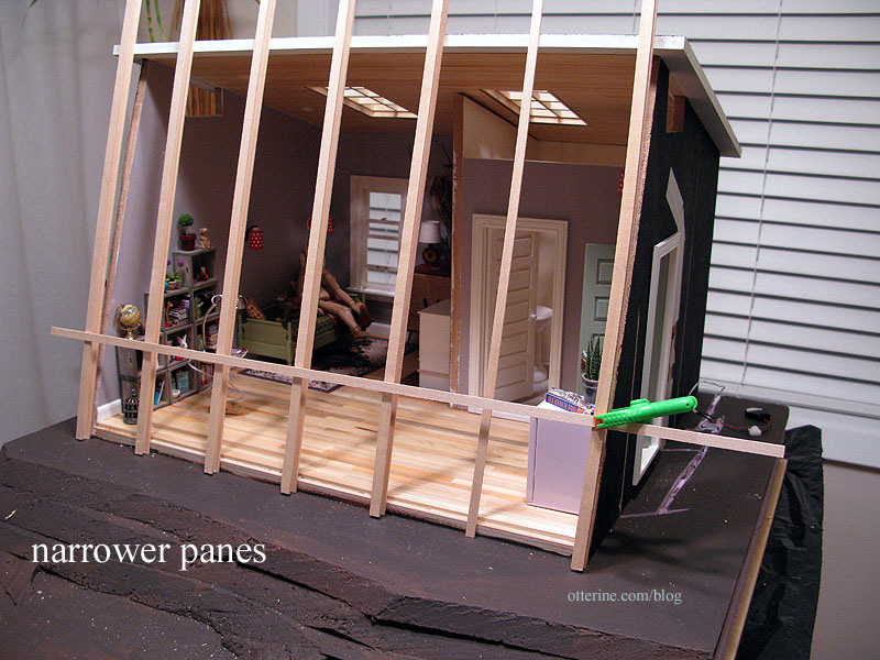
The building will be red, and I was planning on painting this window Warm White. This window will also be removable. I took a friends and family vote, and they chose the wide vertical sections with tall upper panes, and I concur! :D
I think it’s a good balance with visual interest without being overwhelming.
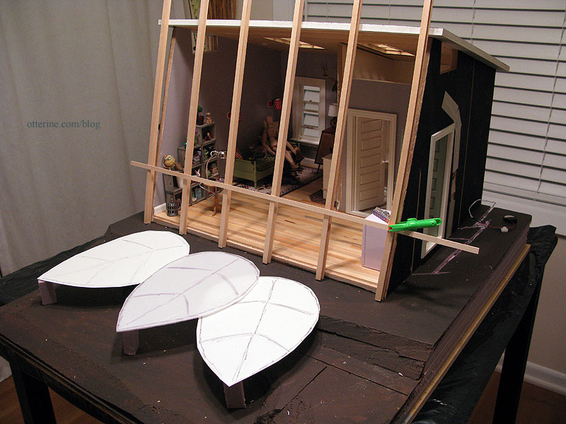
Now to actually build the thing… :\
Categories: The Artist's Studio
March 22, 2013 | 0 commentsThe Artist’s Studio – Firewood
I cut some firewood for the wood stove and walnut firewood box. There was an old farmhouse near my parents’ place in a local suburb. I don’t think anyone around here appreciates an old white farmhouse like I do. I suppose there could have been structural issues with this particular one, but I still think it’s a shame when a bunch of suburban cookie cutter McMansions take over old, beautifully detailed houses.
Anyway, they did save most of the trees on the lot but cut down the largest of them. I was horrified when they did it. Again, the usual thing around here is to cut down every old tree, build a house then plant new tiny trees. They cut this one down because they failed to take its location into consideration when planning the garage. I went over there after the damage was done and grabbed a branch from the ground.
That branch has been waiting for just such a project as the Studio…

I sawed tiny logs from the main branch with a tiny saw. :D The branch is quite dry, so I was able to just snap the smaller pieces apart.

I split the larger pieces using a chisel and rubber mallet. What interesting grain patterns! It smells good, too.

Some of these pieces will fit under the wood stove (pardon the primer).

I love the textures and colors.

Since the firewood box will hold the battery and switch for the wood stove and I don’t want to have to rearrange firewood each time, I made a fake wood stack that can be lifted out of the firewood box.
I added small scraps of walnut 3/4″ high to hold the wood stack above the battery and switch (not yet added).

I cut a flat piece of walnut smaller than the opening of the firewood box and set it inside.

I glued a stack of firewood to this new base and the logs to one another until I had a good layout.

I left four logs loose so I can arrange them on top at random. No one would be the wiser just looking at the firewood box. :D

Whenever I want to operate the switch, I just lift out the wood stack. It lifts out without the aid of tweezers, but my big hand blocking the view would have defeated the purpose of a photo. :D
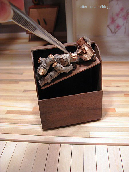
Here are all the pieces together.

A fitting memorial for a beautiful tree in front of a beautiful house, both of which are no more.
Categories: The Artist's Studio
March 18, 2013 | 0 commentsThe Artist’s Studio – Gluing ceiling board
Since the front opening trim had been cut and sorted, it was time to finally glue the ceiling board to the main structure. Scary to be completely out of dry fit! :O
I added one nail to help hold the dividing wall in place since my cut ended up being further off than I had hoped. I had drilled a pilot hole into the wall and ceiling board to keep the mdf from splitting.
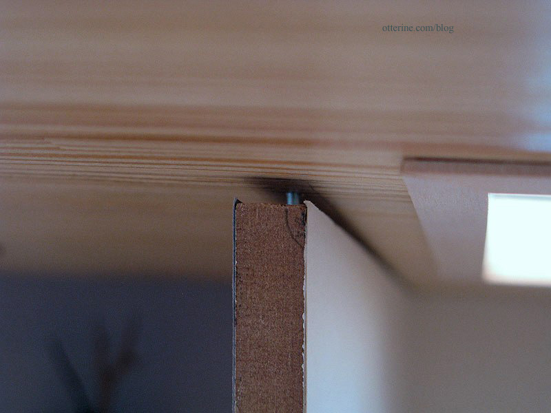
I wired the two recessed can lights. The roof is now ready for final finishing – just awaiting the shingles from the supplier.
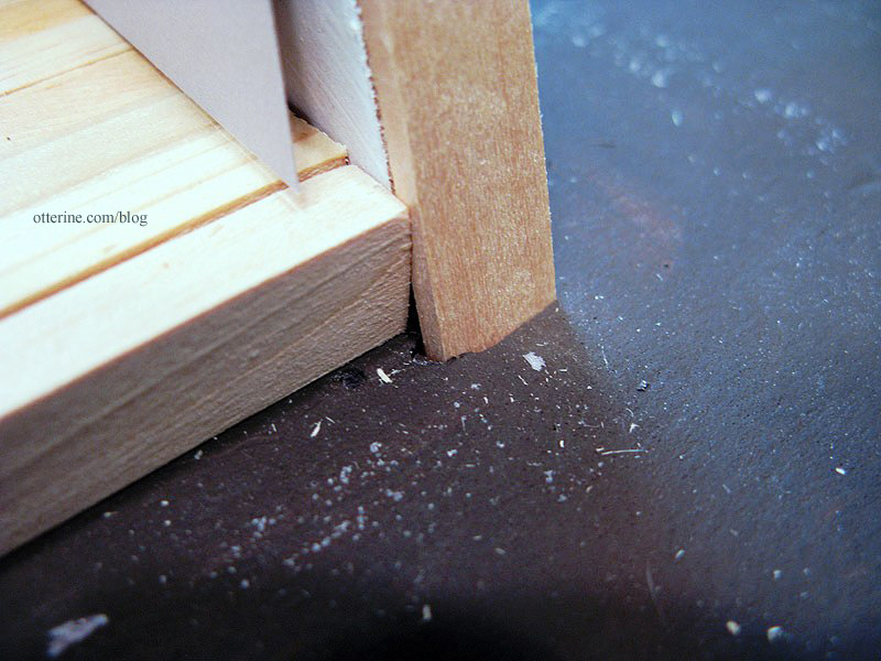
With the ceiling on, I tested fit of the front edge moldings. I knew they would be too long before I added the ceiling board. Instead of trying to sand or shave off a tiny bit, I just mashed them into the foam base until they fit under the ceiling. Haaaaa!
To finish the front opening along the top edge, I cut a strip of 1/2″ x 1/2″ balsa. I used balsa because I had it on hand, and my scroll saw made a clean cut through it without any crushing along the edges. :D
To make this piece level across the top of the ceiling board, I will need to mount the right front molding slightly away from the lead edge of the wall at the top. I’ll add a tiny shim in there when I glue it all in place. Interior trim will mask all of this madness.
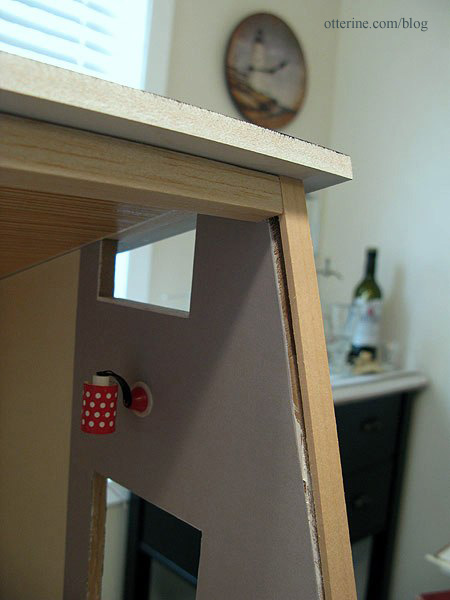
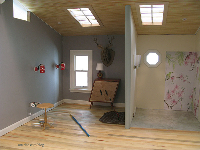
The structure will have a clean, finished look when viewed with an open front.
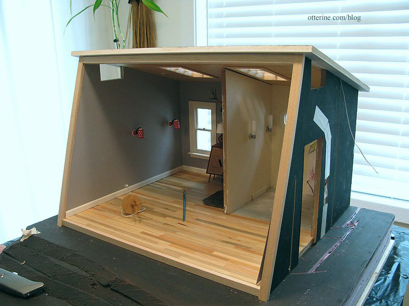
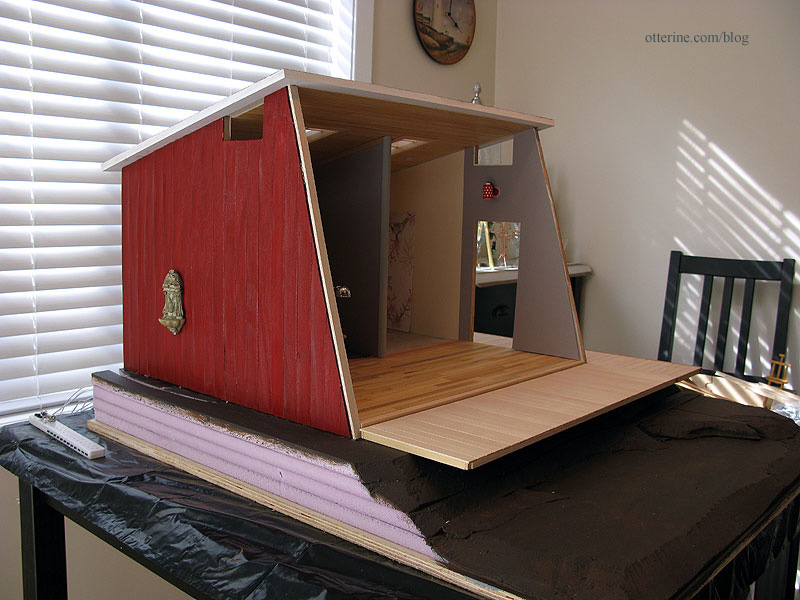
I glued the left siding template in place. The right side template needs to be recreated from the start. I failed to press it in time to dry after painting, and the wood has never straightened correctly since even with attempts to fix it. I sanded and sealed the left siding once the glue dried.
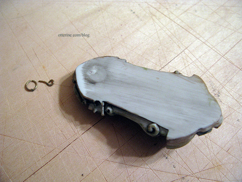
I snipped the bracket from the back of the water fountain and tacked it in place over the wiring access hole with mini hold wax.
I glued in the plain wood trim at the top edges of the dividing wall. You’d never know there was a gap. :D
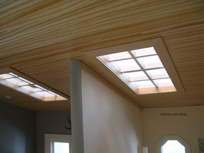
The main half round beam will remain removable with the front bathroom wall. It’s easily held in place with mini hold wax. I painted this Country Grey by Americana to match the paper instead of Warm White to match the trim. I thought a bright white vertical line in the middle of the Studio would be distracting.
Categories: The Artist's Studio
March 17, 2013 | 0 comments
NOTE: All content on otterine.com is copyrighted and may not be reproduced in part or in whole. It takes a lot of time and effort to write and photograph for my blog. Please ask permission before reproducing any of my content. (More on copyright)


