
The Artist’s Studio – Interior progress, continued
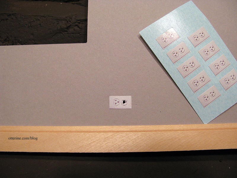
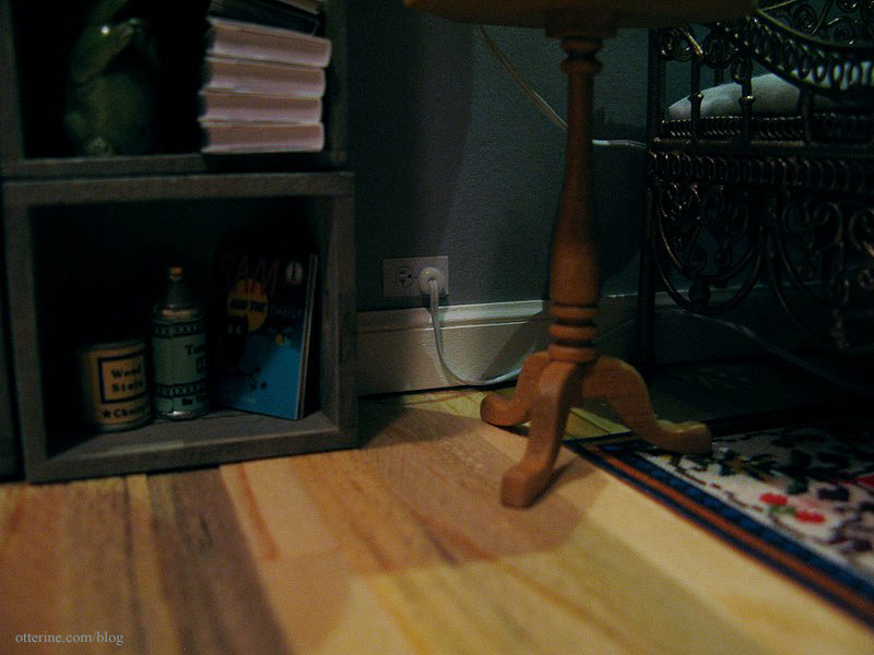
Continuing progress on the interior. Before I could install the wallpaper, I needed to make outlets for the two lamps that would be plugged into the walls. I usually make my faux outlets from wood, but this time I tried out the glossy printed ones from miniatures.com. They work well here since this is a more modern build.
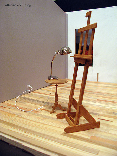
I decided to go with the silver lamp from The Dolls House Emporium, simply because it looked the most like a work lamp. I will build a taller table for it to work better with the easel.
I then glued in the wallpaper…always a test of patience. I also glued the Southern Pine flooring sheet to the ceiling board. I had to use four rows of boards from a second sheet to cover the entire ceiling.
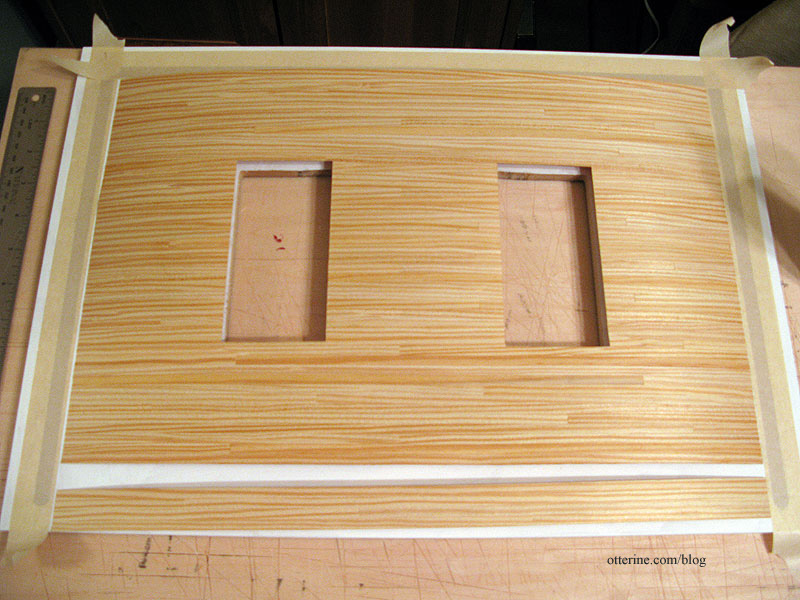
Once dry, I used the same Delta Ceramcoat satin varnish that I had used on the flooring. It warmed the wood tones slightly.
Just a quick note on why I initially wanted a natural wood ceiling and decided to stick with that idea. I guess I’ve considered this building to be an extra space built on a larger lot with a residence…like an efficiency apartment. So, it wasn’t built with the idea of its being a studio, per se, but a small retreat or guest cottage. Now, it is occupied by an artist, and the cozy warmth inside inspires creativity even if it’s not designed to be the most efficient artist studio with the best possible lighting and tons of storage.
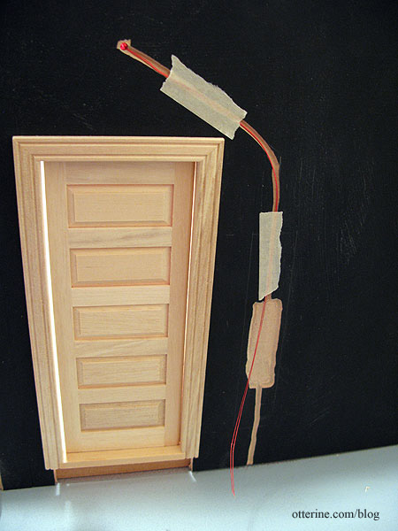
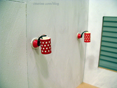
I installed the Lundby sconces in the living area. Since these will need to be removable for rewiring, they are held in place with mini hold wax. On the outside, I ran the wires through the channels to the open area. Since I don’t want the wires to stick to the tape keeping them in place, I added quilling paper to the tape.
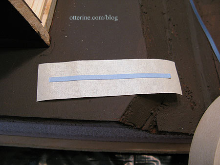
This will keep the wires in the channels but able to move freely in case of rewiring.
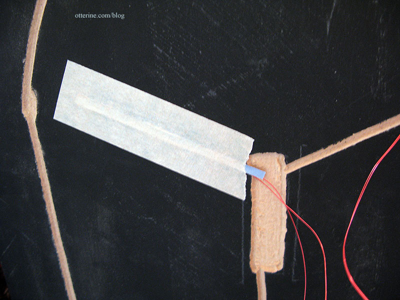
For the Lundby sconce above the door, I needed to glue in the wallpaper first. But, I can’t install the exterior coach lamp until after the siding is on the outside. But, I can’t install the siding until the ceiling is on and the recessed can light is wired. Oy.
So, I glued the part of the interior wallpaper that covers the Lundby sconce hole but left the lower portion free so I can wire the coach lamp later on.
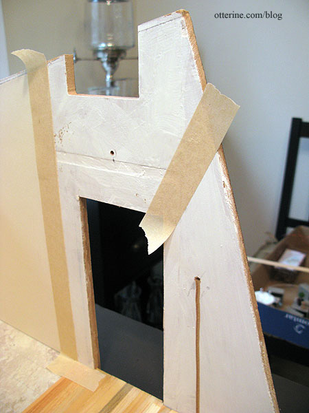
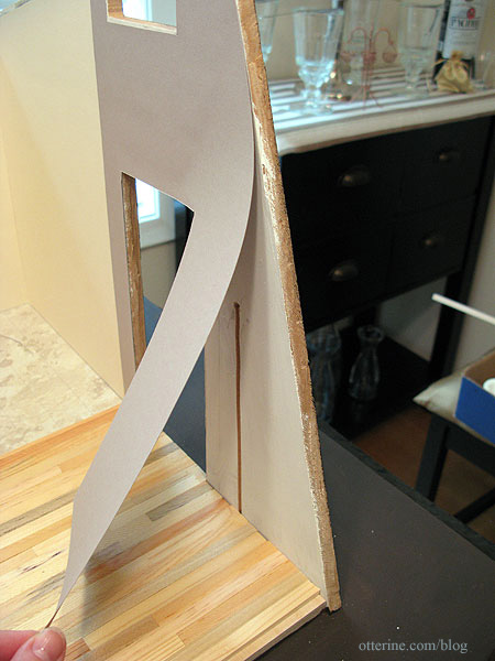
Since I had the wiring completed on the back wall, I decided to glue on the exterior siding template to see how easy it was (or not) to do. I spread Aleene’s Quick Dry glue on the back of the template and dotted it with dabs of super glue gel. I pressed it in place and taped it across. So far so good.
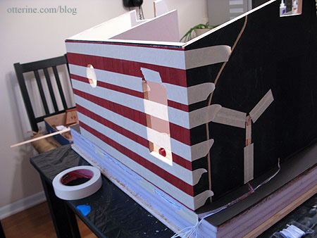
I painted the baseboard trim Warm White by Americana. Why that color and not true white? It’s softer, and I had an extra bottle of it from The Aero Squadron Lounge. Since the interior is still in progress, only the back and outer side baseboards are installed at this point. The outlet stickers worked very well.
I accomplished quite a lot over the long weekend.
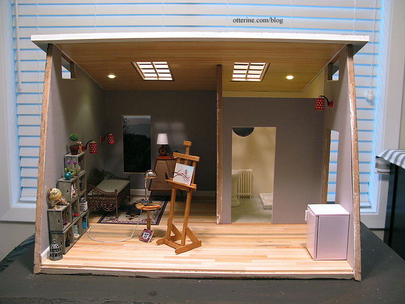
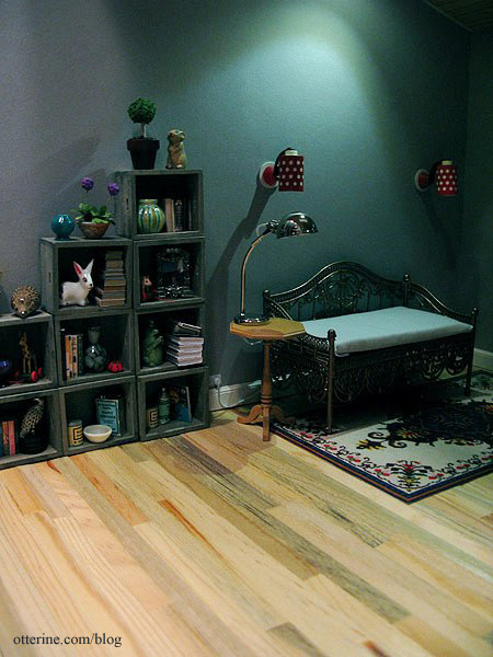
The work lamp can double as a table lamp by the daybed, too.
Categories: The Artist's Studio
February 18, 2013 | 0 commentsThe Artist’s Studio – Interior progress
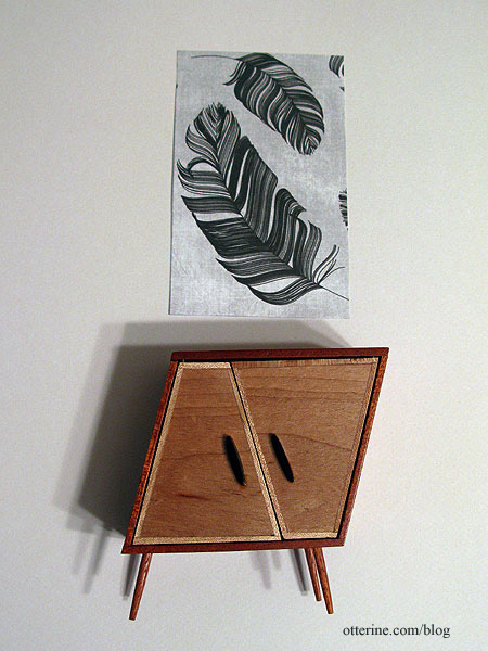
Today, I spent some time on the interior. I chose the darker of the two wallpapers – Daler-Rowney Dreadnought Grey. I tried both papers out with the whimsical cabinet by minisx2 and some scrapbook paper art I have planned for the space. The darker grey just set the pieces apart.
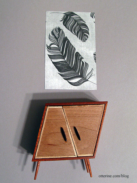
The lighter Canson Pearl Grey was too washed out in comparison.
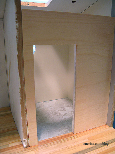
After putting the interior wall in permanently, my initial removable wall was no longer a good fit. I cut a new wall from 1/8″ plywood and 1/4″ foam core board. The two thicknesses glued together will be the size needed for a Houseworks door.
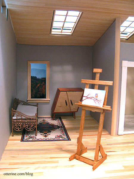
None of the wallpaper is glued in place yet since I have some lighting to work on first, but I tried out the wood ceiling with the new grey paper in place. I liked it well enough to cut the window openings for a more in depth mockup. I love the warmth and visual interest it adds.
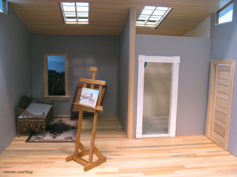
Since the bathroom wall will be removable, I’m going to finish the front edge of the dividing wall with 1/2″ wide half round trim. This will have the slightest overhang on either side of the 3/8″ thick wall and give some stability to the removable wall. It will also mask where the wallpaper ends on that removable wall.
For comparison, here is the Studio with a plain white ceiling.
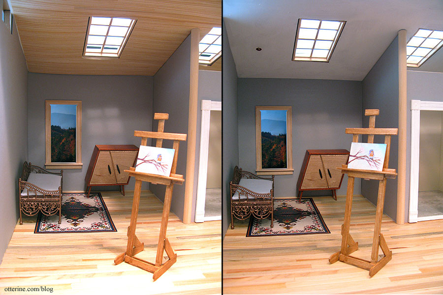
I’m sure some will like it better, but to me it seems too plain.
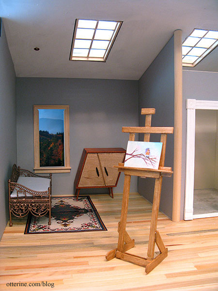
Categories: The Artist's Studio
February 17, 2013 | 0 commentsThe Artist’s Studio – Rustic wood siding
I had a lot of Corona Concepts 3/4″ birch siding strips leftover from Baslow Ranch. When Lyssa started working on her Mt. Ollopa Lodge earlier this year, she needed siding. I sent her what I had and didn’t think any more about it. When I started working on the Studio, I realized I needed the excess siding after all. I asked her if she had any left, and she did! So, some packages traveled back up to my place. There wasn’t quite enough, so I bought another package from Greenleaf.
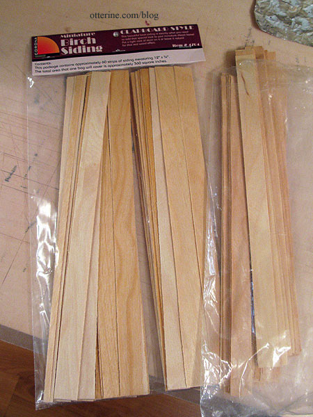
After putting in the wiring channels, I discovered that the recessed ceiling lights would have to be installed before the exterior siding, which is exactly the opposite of what I wanted to do. I prefer to mount siding when the walls are unassembled so I can press them flat to dry as needed. But, I had a lot of success using drawing paper templates for the Heritage attic walls, so that would be my solution.
Even though I am not ready to install the siding yet, I decided to work on the templates today. I bought a package of 12″ x 18″ black construction paper since the store I was at didn’t have larger sheets of colored drawing paper. I started with the back, and the 18″ wide sheet was exactly the measurement needed. I cut the shorter side down, taking into account that the ceiling board will cover the top edge. I cut out the window holes as well.
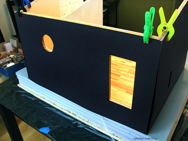
The two sides are slightly taller than the 12″ height of the paper, so I had to piece it at the very top.
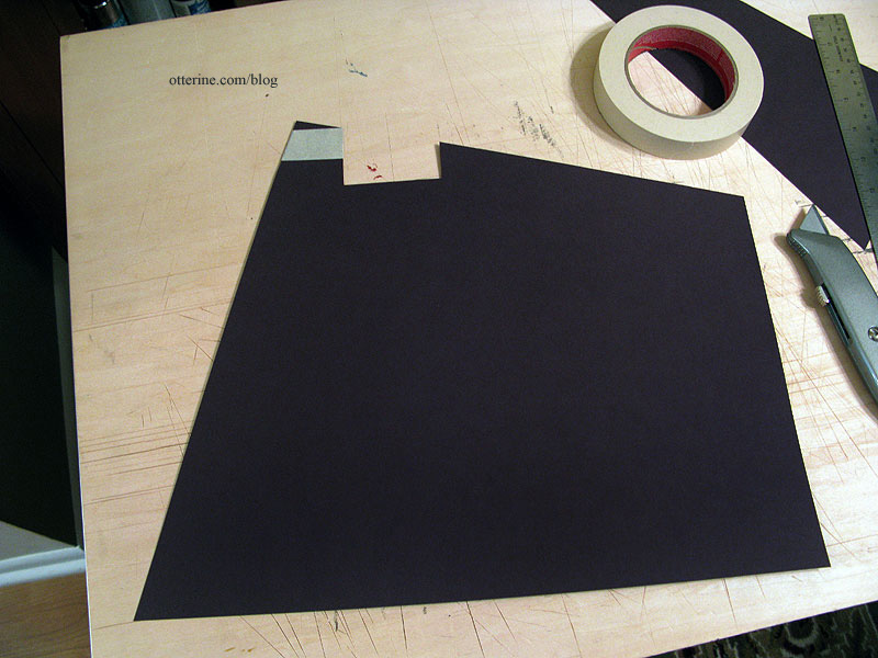
I cut around the openings for the exposed wires for the Lundby sconces. (For more on that, see this previous post.)
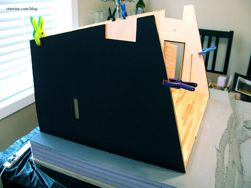
I did the same for the opposite side.
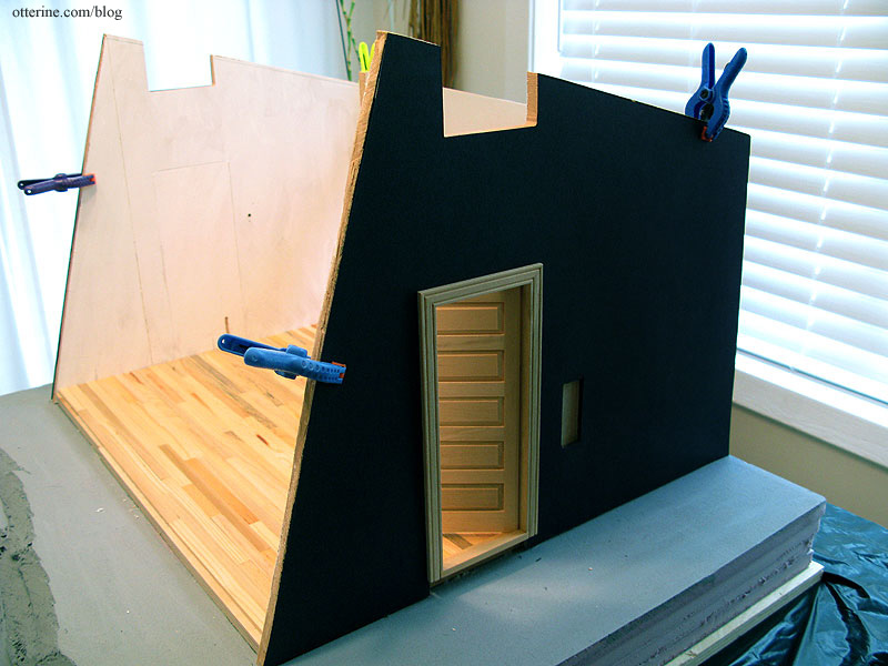
I had numbered the siding pieces for each side wall to use in order. These had been measured to fit up to the exposed wires. I used Aleene’s Quick Dry glue to attach the siding pieces to the paper template, covering any holes in the template for now. Even though I planned to paint instead of stain, I was still careful to keep glue off the exterior surface.
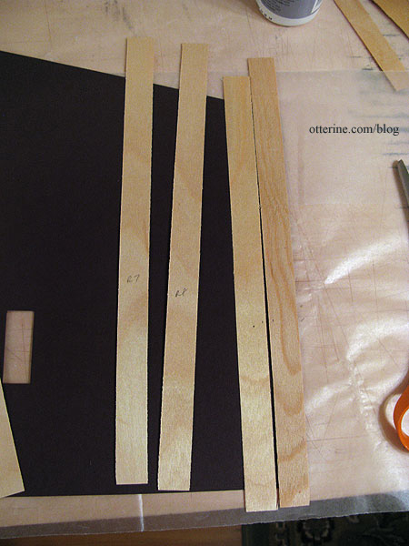
I pressed the templates flat to dry under magazines. Once dry, I cut the openings in each piece.
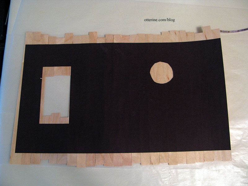
I tested the fit to make sure everything was working.
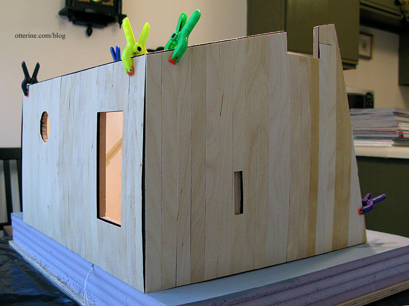
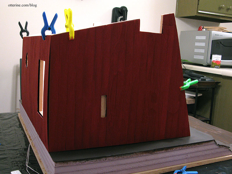
I chose Barn Red by Apple Barrel. It’s such a fine barn red. :D I painted two thin coats back to back.
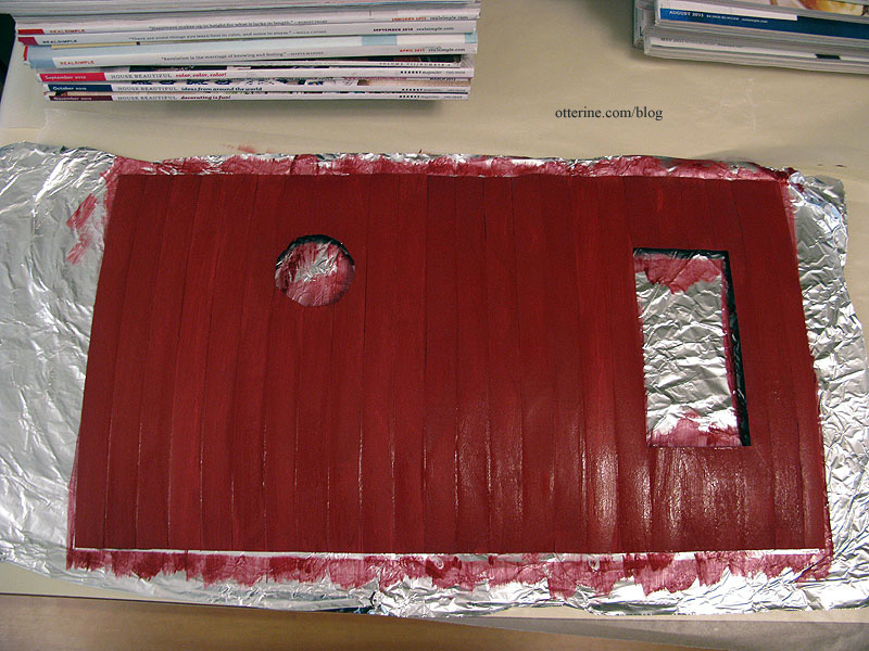
I left the sided templates uncovered to dry until the paint was no longer tacky. I then covered the templates with waxed paper and pressed them flat to dry with magazines. I’ll keep these unattached until later in the build.
Categories: The Artist's Studio
February 16, 2013 | 0 commentsThe Artist’s Studio – Rustic wood floor, completed
Lucille suggested using a template, so that is where I started with the rustic wood floor. I moved the boards I cut previously onto the kitchen counter.
I cut a template from regular drawing paper. I had used a darker color for the Heritage attic, but I didn’t feel like running to the store just for a piece of paper. I didn’t think much of the white paper would show ultimately.

I glued the boards in place with the template inside the Studio. I hoped it would make for a better fit. It was such a great fit that I had a hard time taking the assembled floor back out of the structure. :D

I sanded the boards with my Dremel Multi-Max oscillating tool, first using a medium grit paper followed by a fine grit paper.

The end result was a smoother surface, but I took Mike’s advice and left it a little uneven to keep the rustic beauty.

For finishing, I brushed on two coats of Delta Ceramcoat satin varnish. It warmed the wood slightly and gave it a subtle sheen.

I used a modest amount of glue to install the flooring since the thicker boards were relatively flat. Love it!

Categories: The Artist's Studio
February 15, 2013 | 0 commentsThe Artist’s Studio – Rustic wood ceiling
My idea for the ceiling in The Artist’s Studio was to have a wood plank surface here as well as on the floor. This is a mockup with a sheet of Southern Pine flooring propped in place. I would need to have finishing trim around the edges since it is just a fraction too short. I couldn’t use the same wood as the floor, because I didn’t have enough and I thought it was too variegated for a ceiling.
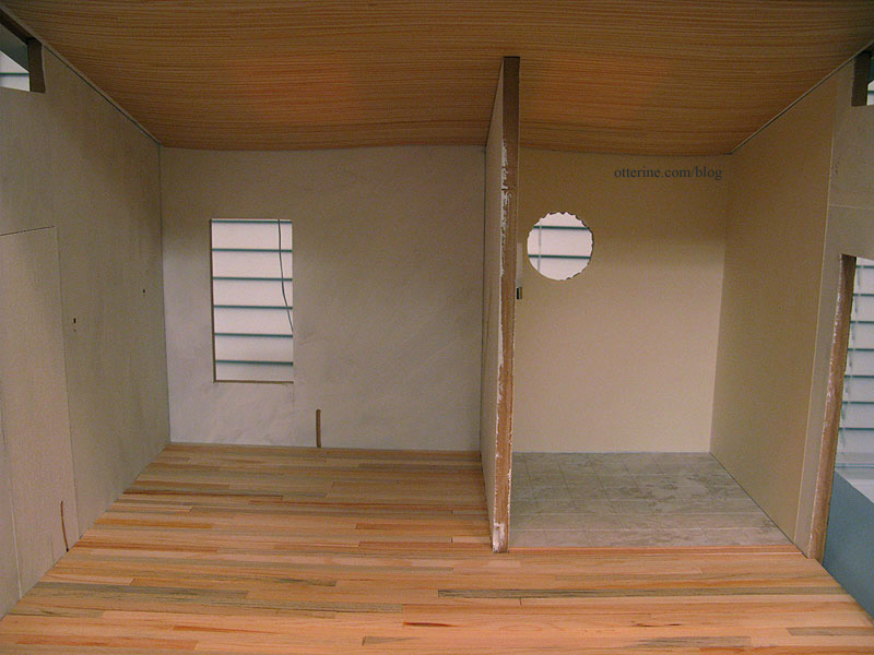
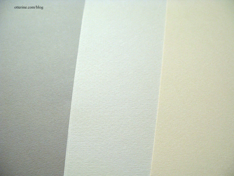
The walls in the living area will be grey – possibly two tones of grey: Daler-Rowney Dreadnought Grey and Canson Pearl Grey (shown here with Canson Ivory used in the bathroom).
I swear to you I am not making things up! There is such a thing as a natural wood ceiling in an art studio.

Here is a link to one that is more modern – by Olson Kundig Architects.
And, here is one that is more rustic – by rememberthewindow.wordpress.com.
Categories: The Artist's Studio
February 14, 2013 | 0 commentsThe Artist’s Studio – Rustic wood floor, part 1
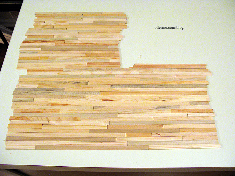
Now I can tell you why I had been searching for shoddy Dura-Craft trim wood. To make a rustic floor in The Artist’s Studio, of course! :D I love the variation in colors and texture.
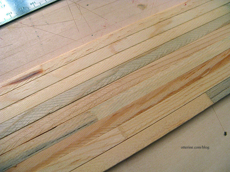
Alas, the Studio was too big for the minimal amount I was able to gather. A few people sent me some scraps, but it still was not enough. But, fear not!!! Mike has come to the rescue! I sent him some samples of the original wood, and he cut a whole bunch of random planks of poplar and pine for me using the originals for size reference.
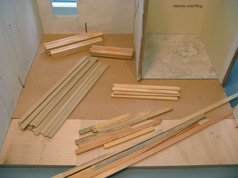
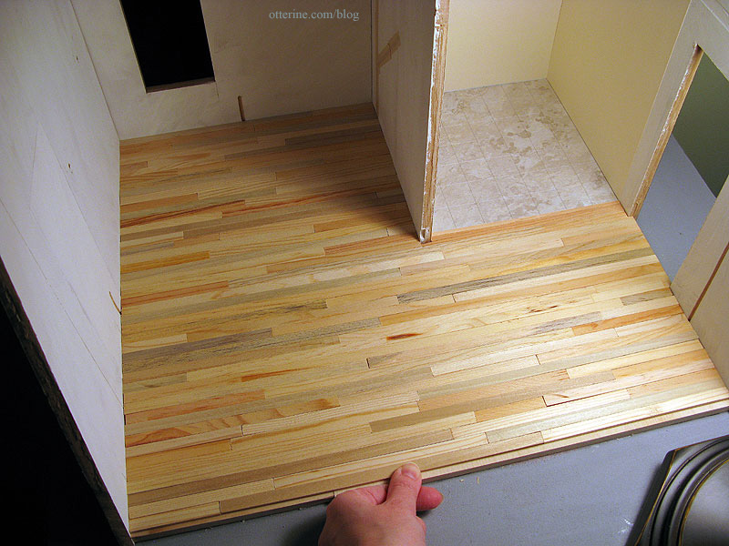
I will use my Dura-Craft boards mixed with his planks to blend the various colors. Most of the floor will be covered in the back left portion of the room, either with the stove platform, rug or furnishings, so most of the fancier Dura-Craft boards will be used toward the front. Here’s a quick random layout. I think it will be wonderful!
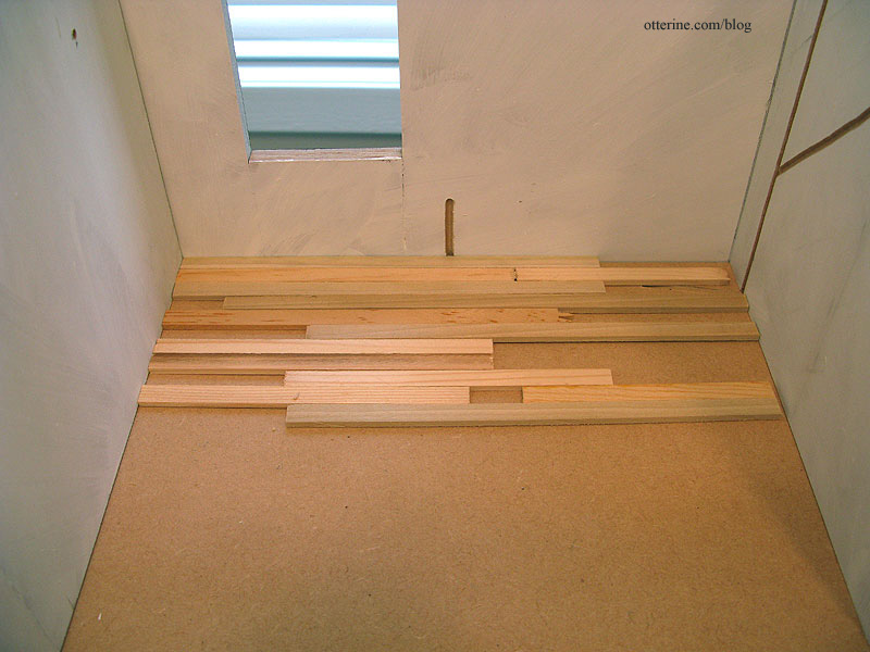
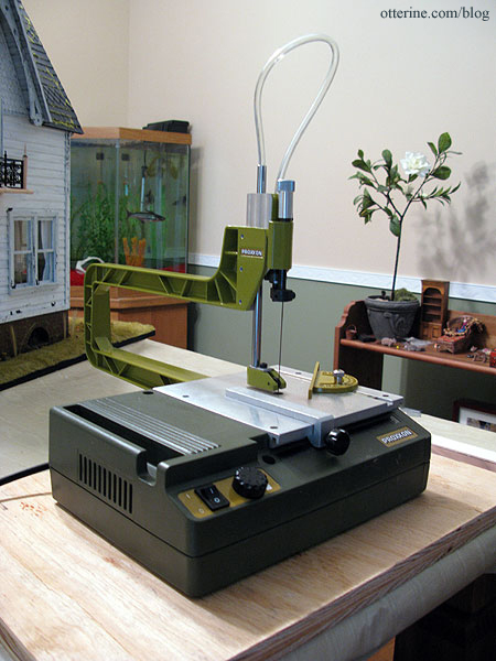
My scroll saw and I are getting acquainted quickly. I started cutting and placing the wood boards for the rustic floor. I’m doing my best to make it a random plank floor by using the various lengths Mike cut for me and then piecing end boards to finish each row.
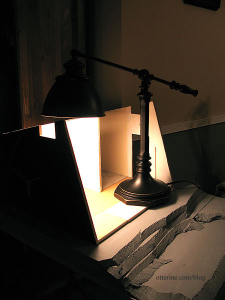
My scroll saw is clamped to the end of the dining room table (I just had an image of carving a Thanksgiving turkey with it…haaaa!). The Artist’s Studio, however, is set up in the breakfast nook in my kitchen. That setup seemed like a lot of back and forth work. I moved the Studio to the dining room, but the light isn’t the best in that area. So, I’m using my sewing lamp as a work light. Not quite to scale, is it?
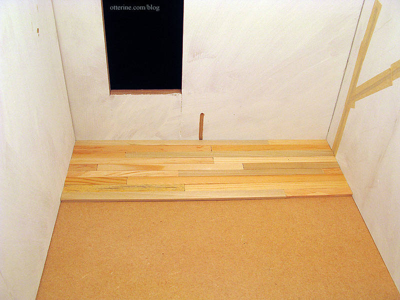
I decided to cut and place the entire floor without glue. I’m positive Mike sent me plenty of wood, but I wanted to see it whole before installing it permanently. Love it!
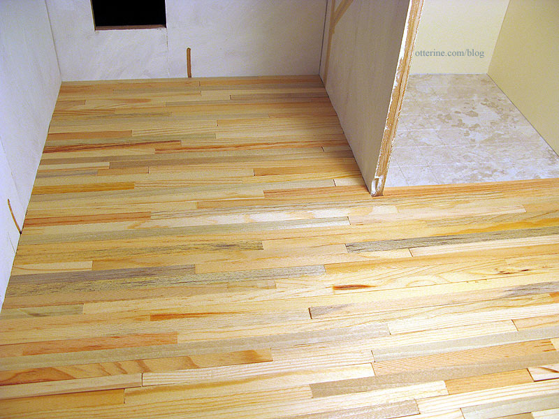
Toward the front, I interspersed the Dura-Craft wood I had at the start. I’ve left the very front edge uncovered and will finish that row once the whole floor is glued in place.
Categories: The Artist's Studio
February 11, 2013 | 0 commentsThe Artist’s Studio – construction begins
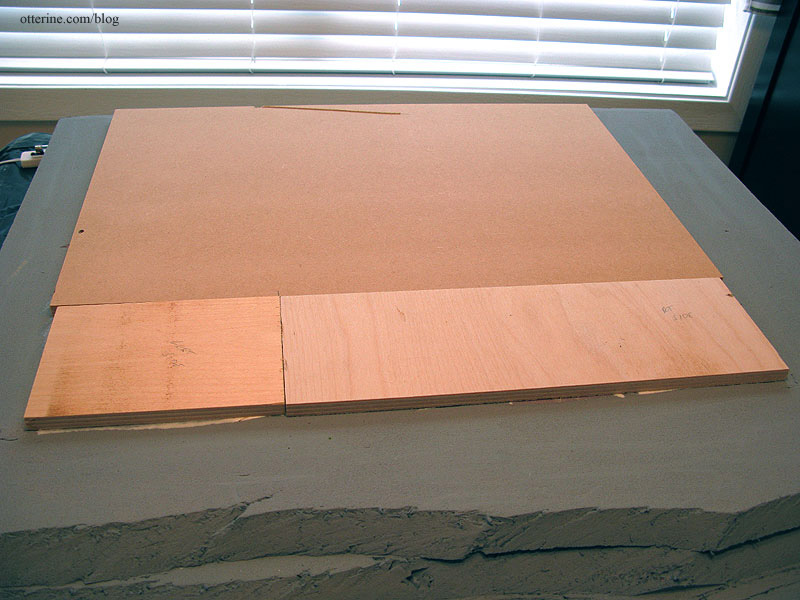
With the wiring channels and basic landscape board in place, I started by gluing the foundation to the foam base. The foundation consists of the original kit floor board and two additional pieces of 3/8″ plywood to make up the front floor addition. I have multiple pieces because I used scraps from my wood pile.
I then glued on the back and sides after tracing basic templates onto drawing paper. Even though there is no glue holding the ceiling board on, I used it to hold the shape of the walls since eventually it will need to fit onto them like a lid. I will also leave it on when I am not working on the build to combat any warping that might occur in the walls.
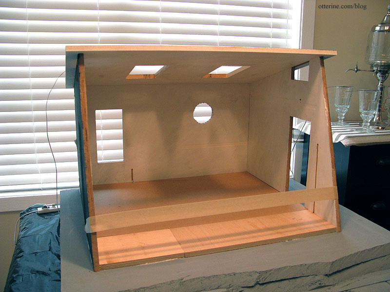
It’s strange to me to start gluing the walls in place since my builds are often in dry fit for months! I guess I did dry fit the structure awhile ago, so it’s not that recent a development.
Thus begins the chicken or the egg portion of the build. I need to install the bathroom sconces before I can install the living area flooring since the wires for the sconces will run underneath it. To install the sconces, I need the center dividing board and its wallpaper in place. To install that divider wall, I need the bathroom tile flooring in place. So, that’s where we start. :D
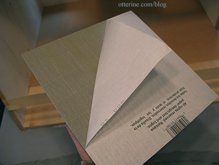
I unpeeled the paper from the tiles and used no additional glue. These are relatively heavy tiles and don’t lift or warp.
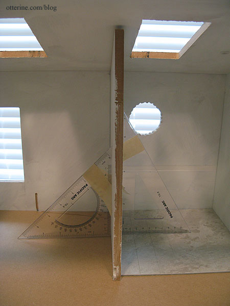
I then glued in the dividing wall, using two triangles to keep it square. The top cut wasn’t very precise, but I can easily mask this with ceiling trim later on. And, I do have a ceiling treatment in mind that will make up some of the difference besides.
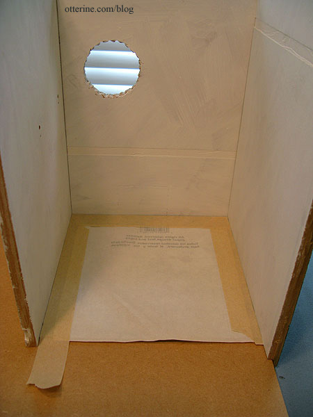
Once the glue dried on the dividing wall, it was time for the bathroom wallpaper: Canson Ivory drawing paper. I taped the paper backing over the tiles to protect them from the wallpaper paste.
I used Yes! paste to apply paper. Again, I didn’t worry too much about the paper along the tops of the walls since I will add ceiling trim later. Note: I no longer recommend Yes paste – I use Wallpaper Mucilage instead. Yes paste has problems with longevity.
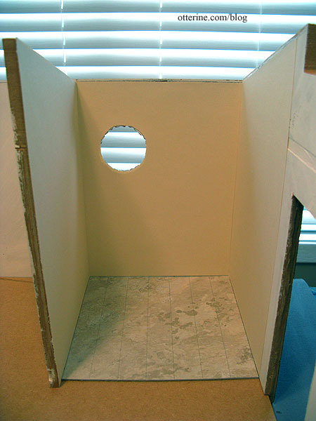
To find the holes for the sconces on the wallpaper side, I poked a sewing pin through the holes on the living area side.
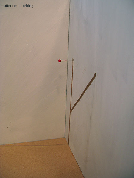
I glued the sconces in place and taped the wires into the channels.
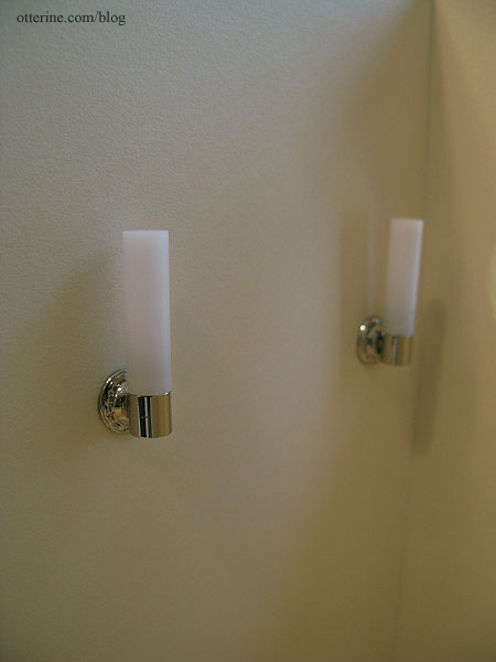
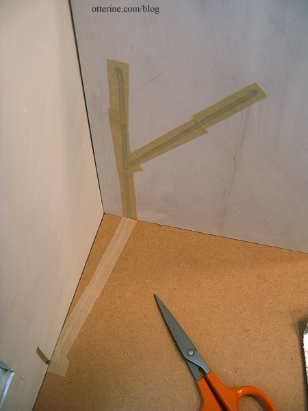
The wires come out of the foam under the structure. I will splice them together to work as a set later.
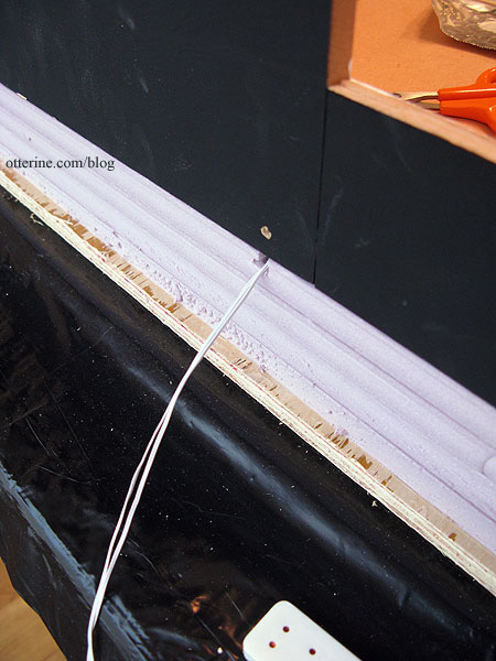
I have a few others things to share, the first of which is my new Proxxon scroll saw. Sexy, no? :D
Categories: The Artist's Studio
February 3, 2013 | 0 commentsThe Artist’s Studio – wiring channels
I showed you the lighting plan in an earlier post. Today, I used my Dremel Trio to put in the initial wiring channels, and it was quick work! :D
For the Lundby sconce by the entrance, I drilled a hole in wall so the wires would run down the exterior wall. As noted before, since I’ll be using non-replaceable bulbs, I need a backup plan in case I ever need to rewire these lamps.
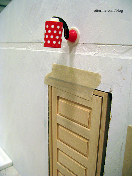
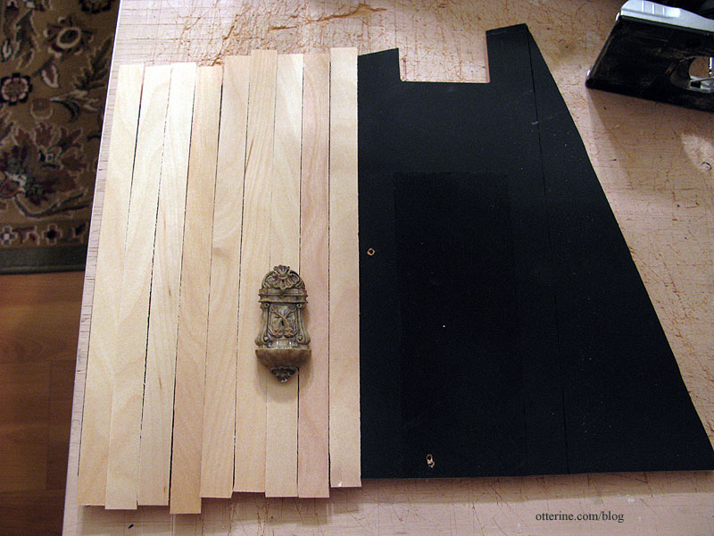
On the outside, I first measured the siding strips to determine where my open spot would be.
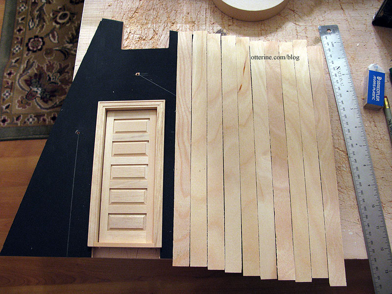
Since other siding strips might vary in width, I marked these in order so I could use them as is when I apply the siding.
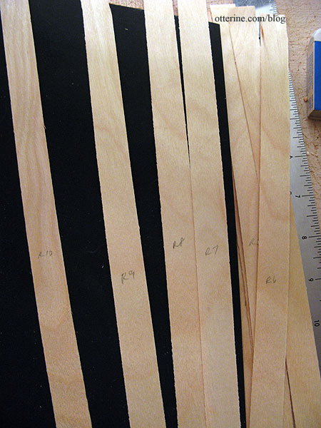
I made the usual wiring channel but routed an extra area where I can curl excess wires in case I need to rewire the lamp. I will leave this area uncovered by siding but hidden behind a fun exterior feature (to be revealed later). :D
For the two Lundby sconces in the living area, I did the same process.
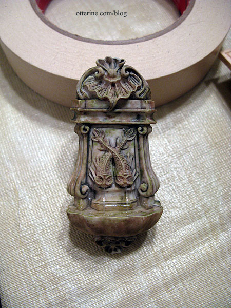
The exterior feature for this wall will be a water fountain.
This is a lovely piece from Barb’s Corner on eBay.
These wires will be joined to one end wire to work as a set, and the routed area will be covered by the fountain.
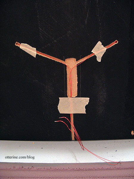
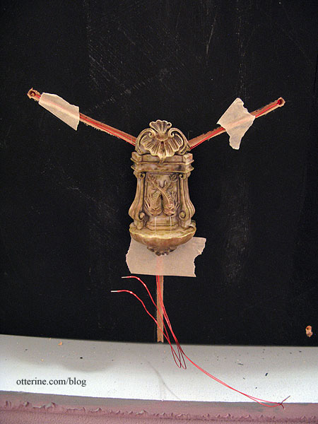
I made a channel on the exterior under the door coach light in case I want to add another small light on the interior side.
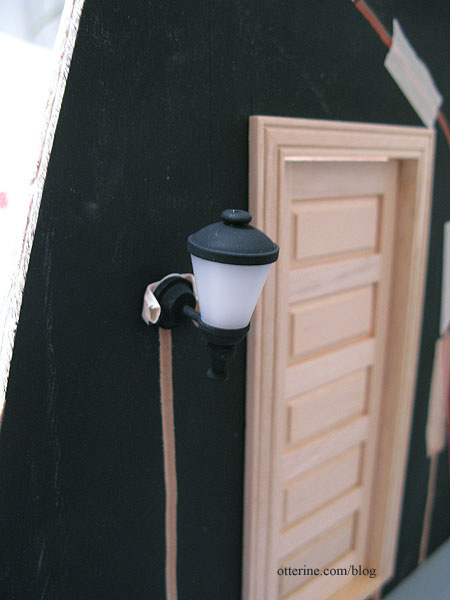
The wire for the door coach light will run inside. I drilled options to run the wire through the floor or through the wall to the outside.
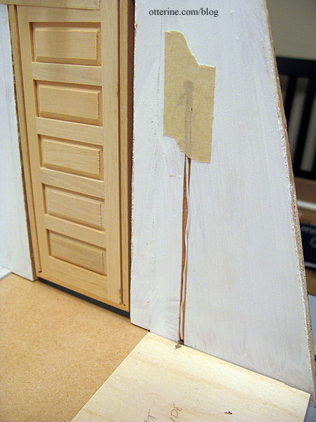
The bathroom sconce wires run through the wall to the living area side.
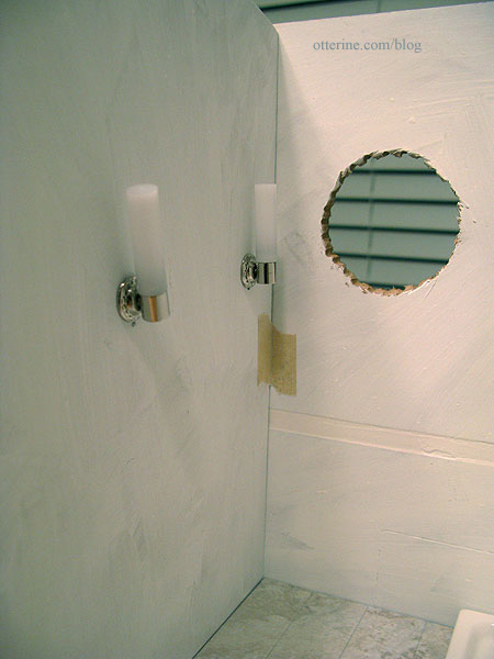
They will be wired as a set to work together, and the end wire will run out the back or through the floor (I drilled options for both).
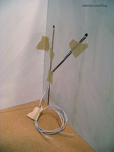
The sunflower lamp will have my usual faux outlet technique.
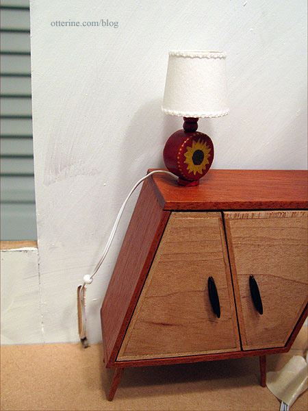
Whichever easel lamp I use, it will also have a wall outlet. You can see the channel on the side wall…again with options for the wire to go through the wall or through the floor.
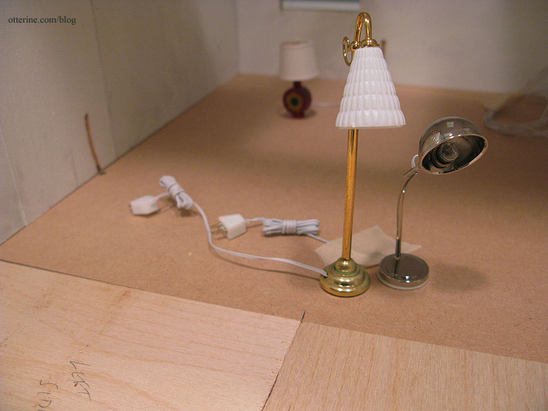
The recessed can lights require a larger drilled hole. I have a post on how to set these lights in place. The wiring channels for these run to the exterior side walls.
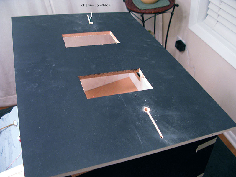
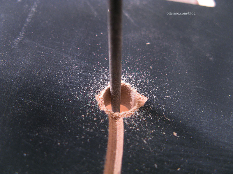
One of my lights wouldn’t fit, so I used a round needle file to adjust the hole.
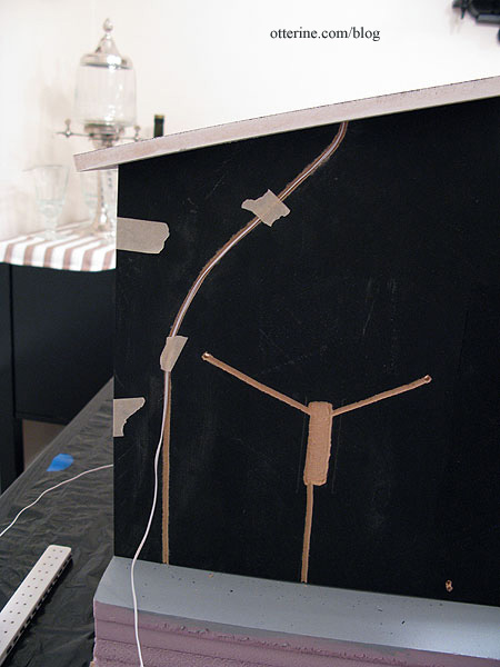
On the fountain side, I curved the channel around the sconce channels.
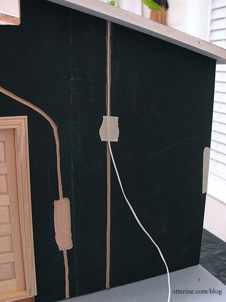
On the door side, I made a straight channel.
As I tested the fit of these particular wires, I realized the can lights would have to be installed before the exterior siding, which is exactly the opposite of what I want to do. I prefer to mount siding when the walls are unassembled so I can press them flat to dry as needed. But, I had a lot of success using drawing paper templates for the Heritage attic walls, so that will be my solution. I will make paper templates for the exterior walls and prepare the siding on those before gluing the templates to the walls near the end of the build. :D
Categories: The Artist's Studio
February 2, 2013 | 0 commentsThe Artist’s Studio – Wood stove – introduction
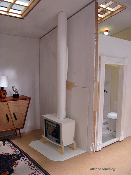
The Artist’s Studio is small but it needs a method of heating. I thought about simple radiators, but where’s the fun in that? Here’s my paper mockup of the wood stove for the living area. The bathroom will have a simple radiator.
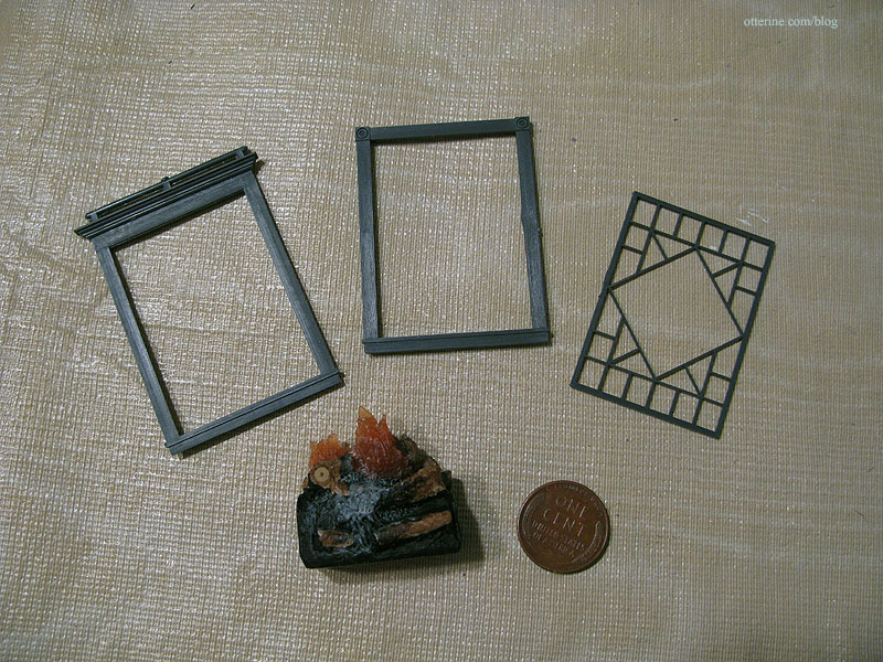
When I first started looking at wood stoves online, I liked the ones with decorative doors the best. I bought a Grandt Line O scale diamond pattern window (3743) to serve as the door. It comes in three parts, and I used two of the three to make the door. I also bought a small resin fire from Mainly Minis.
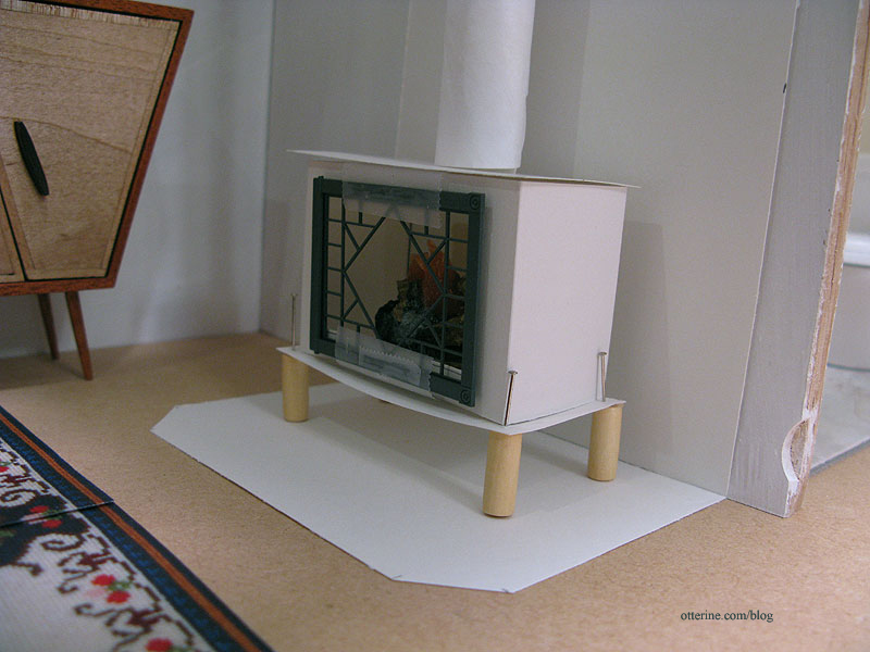
I made a quick paper mockup to test the overall stove size to fit the door and fire. I have the wood dowel from the original HBS Loft kit to serve as the stove pipe, but I rolled up a piece of paper for the mockup. I pinned on wood beads for the legs.
I think it’s a little short overall, so I plan to add a base for wood storage like this one from Charnwood.
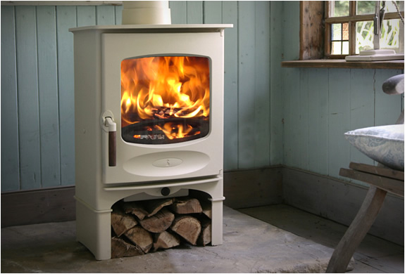
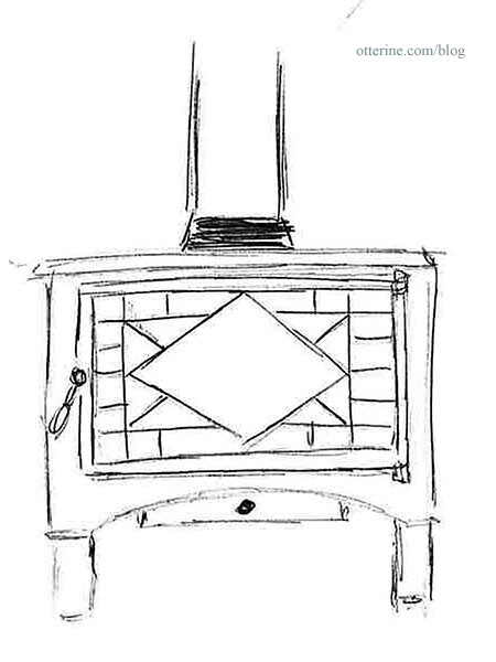
I like a the basic elements of the Charnwood stove, so I made this sketch for mine. I believe mat board will be the best material for the final stove. Kris at 1 Inch Minis does amazing things with mat board, and I’ve enjoyed working with it using her tutorials.
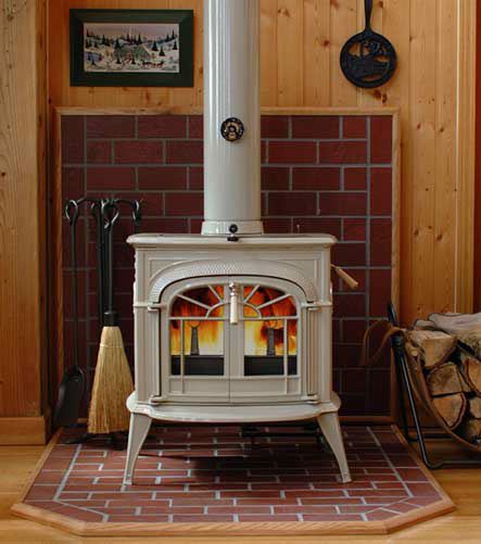
I had originally thought about bricking all the way up the wall in addition to the base under the stove, but then I saw this photo from hearth.com showing a partial brick wall. Love it!
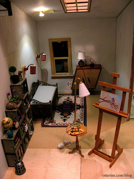
The stove rounds out the rest of the furnishings for the living area….nice and cozy! :D
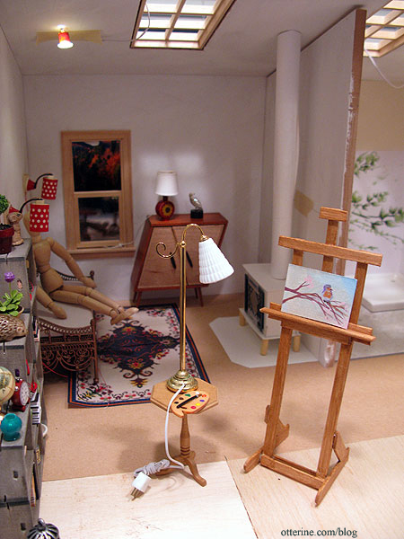
I also made a photocopy of the blue medallion rug I’ve been stitching to see if it will work in the space. I took two copies of the finished half and taped them together. I think there should be enough room for it here. No way would I put a white base rug in front of a wood stove or in a painting studio in real life, but in mini-land…it’s all good!
Categories: The Artist's Studio
January 15, 2013 | 0 commentsThe Artist’s Studio – lighting plan
With the new Dremel Trio in my possession, I can now cut wiring channels more precisely and quickly than by hand. I doubt I’ve seen the last of my handcut channels, mainly because plans change once a build starts. However, I am trying to put in the main channels I’ll need before assembly.
I plan to have two sconces by the daybed. As noted before, I rewired these Lundby lamps with non-replaceable bulbs.
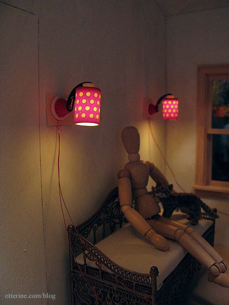
Since I’ll be using non-replaceable bulbs, I need a backup plan in case I ever need to rewire these lamps. I’ll rout out an area on the outside of this wall to curl excess wires as needed and will not cover this area with siding. I will disguise the bare patch with a wall fountain.
There will be a table lamp on the whimsical cabinet by minisx2. I have this sunflower lamp I made that might be a fun addition to the room.
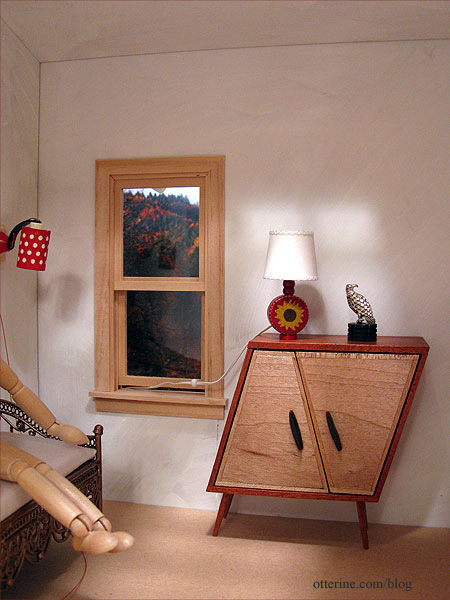
There will be either a floor lamp or table lamp for the easel area. This one is from The Dolls House Emporium. Painting and easel by Lyssa.
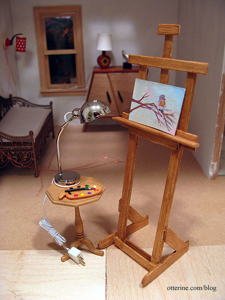
This one is from Dolls House Suppliers. You’ll notice that even though it is a floor lamp, I’ve still placed it on the table where it serves as an easel work light. It will need a new finish, though. :]
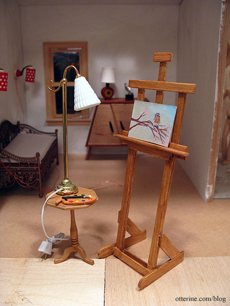
I bought this floor lamp before Monique wrote to tell me that she had found the other lamp I had been seeking. Once that one arrives, I’ll try it out, too. Whichever lamp I choose, it will need a wiring channel.
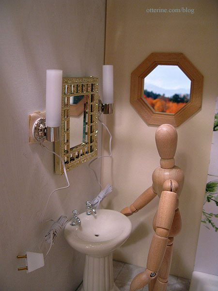
For the bathroom, I bought a pair of modern vanity lights from The DollsHouse Emporium. Their channels will merge into one on the living room side so they can operate as a set. The mirror is vintage Lundby, though I replaced the reflective glass with Darice mirror sheet. The mirror and pedestal sink are placeholders and won’t be in the final layout.
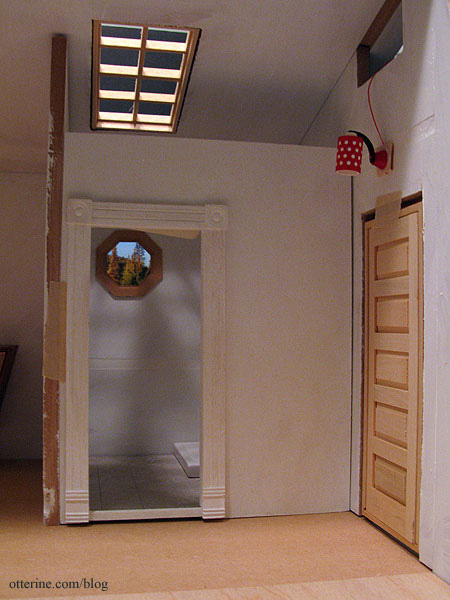
There will be another Lundby wall sconce with non-replaceable bulb above the front door. This channel is also on the outside, and I will add another fun feature to cover that hole.
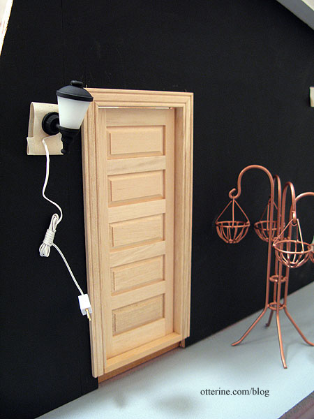
There will be at least one light on the outside, namely this modern coach lamp from Dolls House Suppliers by the front door. I might switch it to the other side of the door, though. Any other landscaping lights can be added later since the entire base is builders foam and channels can be cut easily at any time.
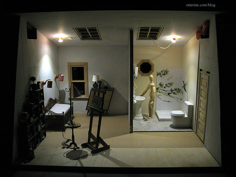
To finish off the build, there will be NovaLyte recessed can lights in the ceiling. They illuminate the whole build so well and complement the softer tones of the non-LED lamps.
Categories: The Artist's Studio
January 14, 2013 | 0 commentsThe Artist’s Studio – Tranquil bathroom
One of the best things about miniature builds is the fact that you can try all sorts of things you might not try in your real life home. This beautiful tile mural shower is so lovely, but it would likely be pricey to install and so specific that you might turn off buyers if you decided to sell your home. Of course, you wouldn’t worry about the latter if it was in the dream home you finally managed to achieve. :D
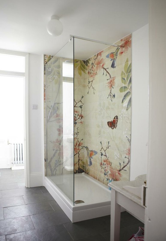
image from Fine & Country, original designer of the bath unknown I thought something as expressive as a mural shower would fit right in at The Artist’s Studio. If the original above came from an existing art source, I couldn’t find it after numerous image searches. If anyone recognizes it or knows of something similar, please let me know.
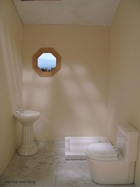
In the absence of being able to replicate that image in miniature, I did find some fun things along the way, from wallpaper borders to scrapbook paper to desktop wallpaper images. I printed the ones I found online and made color copies of the scrapbook papers to make mockups for your viewing enjoyment. The shower base from The Dolls House Emporium measures 3.5″ square, so the tile mural will be 7″ overall, with an inside corner.
So you could get the full effect with the bathroom color, I cut the Canson Ivory drawing paper for the bathroom but haven’t glued it in place. I’m using a pedestal sink instead of the wall sink for now. I don’t know where the sink will end up on the inside wall, and I don’t want to mar the paper by taping the wall sink in place.
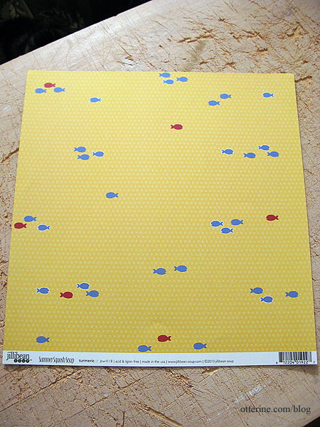
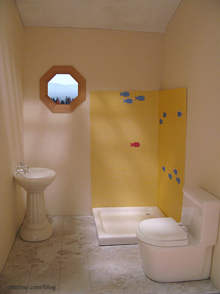
Option 1 – Fish-o-Rama
This is scrapbook paper called Turmeric by Jillibean Soup.
I moved the paper around until I found a fun grouping. The subtle dotted pattern doesn’t show in my color copy. It’s definitely quirky and cute, but even still, the fish seem too sparse on this small sampling.
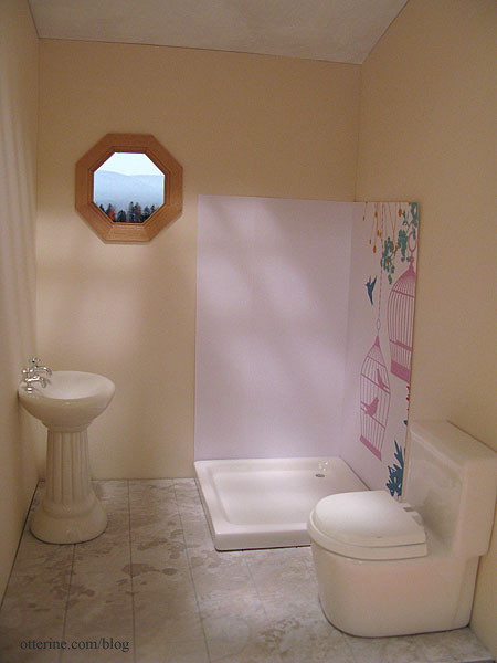
Option 2 – La Cage aux Folles (the birdcage)
Has anyone seen the 1978 French film by that name? I just love it. The American version The Birdcage is good, too, but the 1978 film is simply awesome! :D Anyway, this is scrapbook paper called Hummingbird By Kaiser Craft.
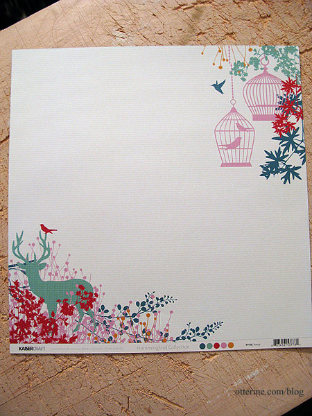
I used the upper right corner with the birdcage. Again, the color copy loses the subtle stripes in the background. With the cut, there’s a design on only one side and I’m not sure birdcages work with a shower. It would make a lovely wall mural in a regular room, though.
Option 3 – Hummingbirds in full color
This is a wallpaper border from Wallpaper – Inc. I’ve printed from the thumbnail, so it’s very blurry. You can get samples, and if I decide on this option that is what I will do. Maybe too out of scale.
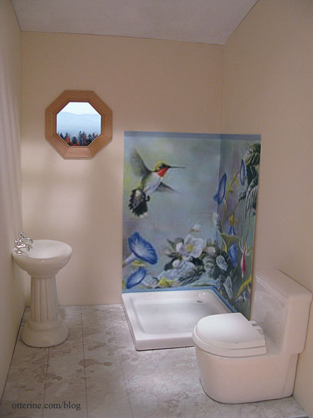
There are a few groupings along the pattern repeat, so this is another option. Seems too busy.
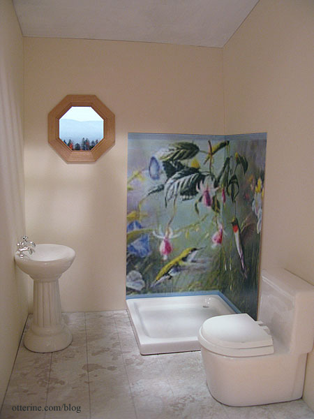
Option 4 – Chinoiserie inspired hummingbird
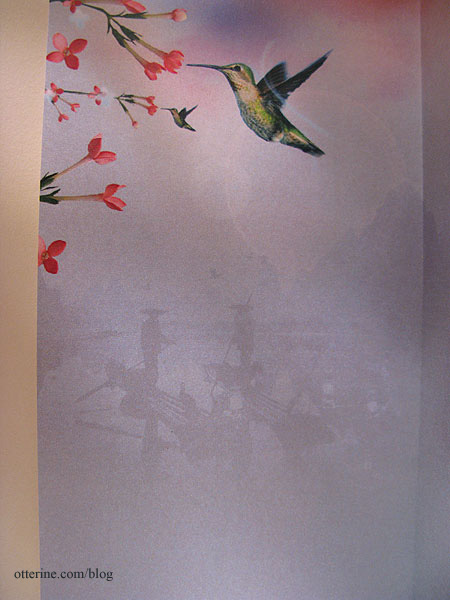
This is actually an iPad wallpaper. I miscalculated and made this mockup too small, but it works well enough to show the concept. The bird will be slightly larger when printed to the correct size, though it would be better if there were more flowers.
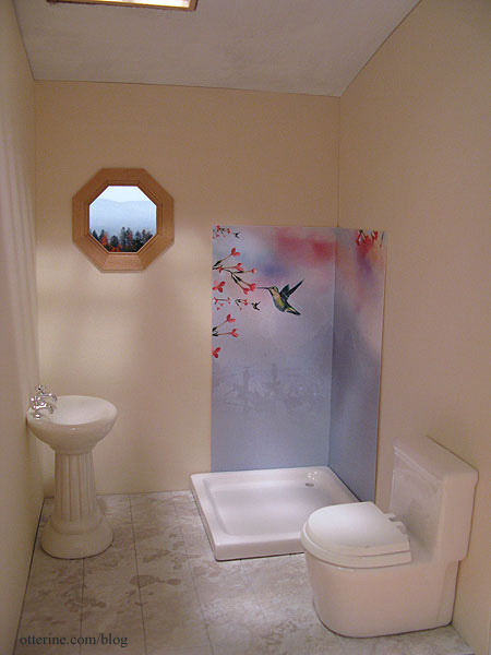
I like this one for its similar tone of the original, but I don’t know how I feel about those silhouetted boaters eyeing me in the shower. :O
Option 5 – Hummingbird in green
This is a desktop wallpaper called Hummingbird on White from 1ms.net. This one is lovely for its simplicity, and the green goes so well with the Ivory paper. This is another close but not perfect solution. I wish more of the branches fit into the sample and that the bird’s wings were more defined.
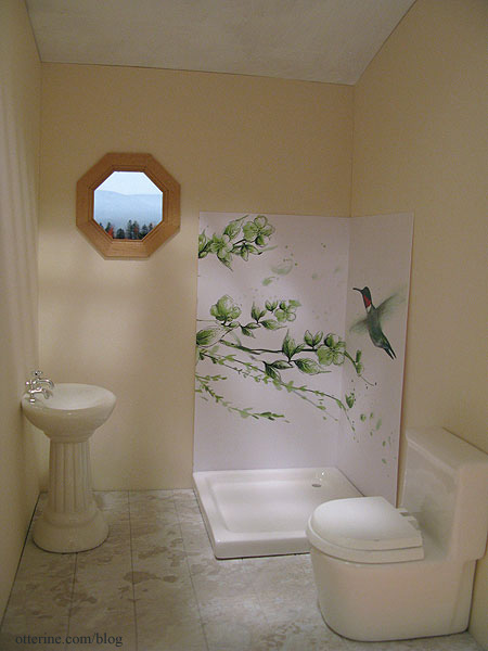
Thoughts? Do you prefer any one over the others? Should I scrap these and keep looking? I might have to draw it myself. :D
———-
As this year comes to a close, I offer my sincere thanks for all the warm wishes and generous compliments you’ve sent my way. Being part of this worldwide community is another great thing about minis, and you’ve all brought so much happiness to my life! Happy New Year!!!! :D
Categories: The Artist's Studio
December 31, 2012 | 0 commentsThe Artist’s Studio – Rustic crate bookcase
Of course, I can never fit all the items I want into any particular build, so things get pushed out and saved for later. One item that I love for The Artist’s Studio is the unique rustic cabinet.
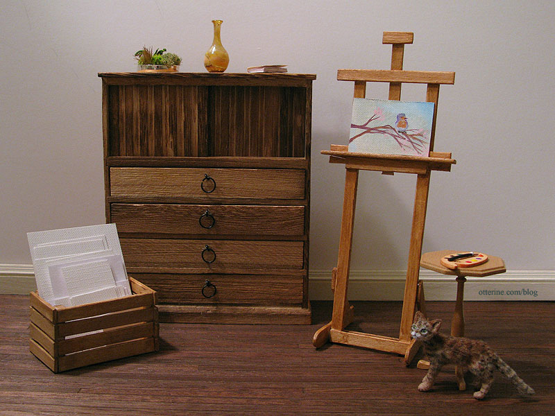
But, I’ve had this image in mind for the Studio all along, so out the cabinet must go! :\
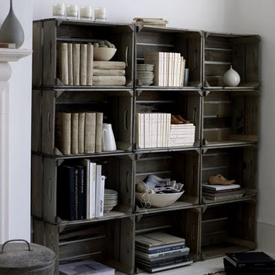
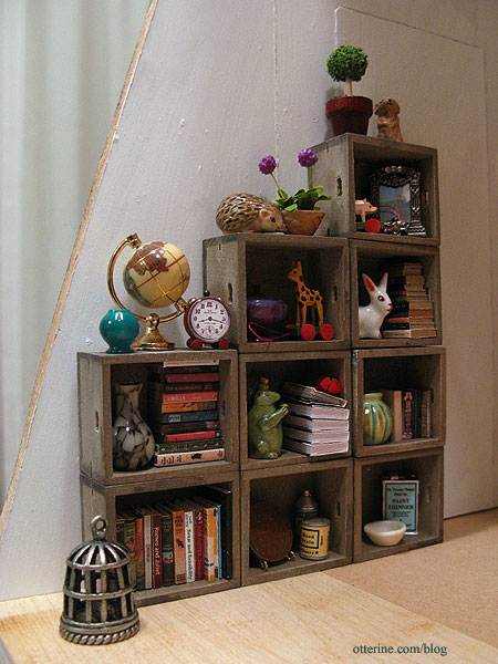
image from Recaptured Charm Could I have made nine identical crates? Yes, but why do that when Minimum World offers perfectly suitable ones already made? :D I bought these for $2 each instead of trying to make a bunch of identical crates, which would have taken days. With the angled front wall, I thought an offset stack would look best.
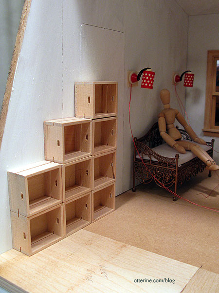
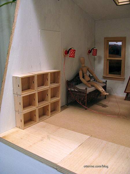
A set of nine in straight columns is not as interesting, and twelve (as shown in the original photo) wouldn’t fit in the allotted space without crowding the daybed.
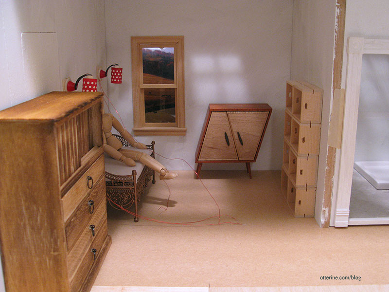
For reference, here’s a narrow configuration in the main living area. Again, the full stack of twelve would not have fit.
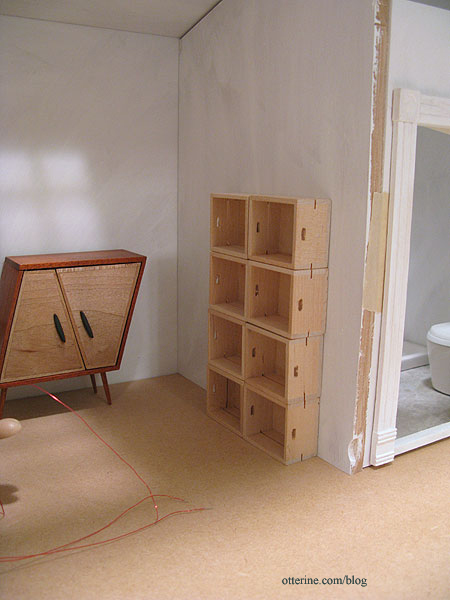
With the rustic cabinet in its original place, it’s just too crowded in my opinion.
I stained the crates with two washes of grey, black and brown.
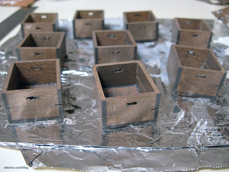
Already much better.

Once dry, I sanded them as needed. There was slopped glue around many of the seams, but that was easily masked by stuffing the shelves full. :D I put my wheat back penny in the bottom row for size reference.
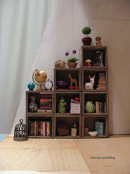
I’ll make some additional items appropriate for a studio, but I love the way they look so far with some minis I had on hand.
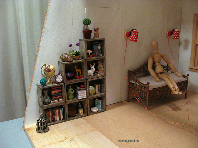
In fact, many of these items will have to stay…they just look so completely at home.
Categories: The Artist's Studio
December 27, 2012 | 0 comments
NOTE: All content on otterine.com is copyrighted and may not be reproduced in part or in whole. It takes a lot of time and effort to write and photograph for my blog. Please ask permission before reproducing any of my content. (More on copyright)
Categories:

Blue medallion rug – completed
I have finished binding the blue medallion rug, and it is ready to take its place in The Artist’s Studio.
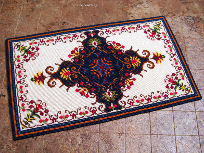
Cross-stitching time was 154.5 hours on 32 count Jobelan.

Final finishing took only a couple of hours. The final measurements are 7 7/8″ long by 4 5/8″ wide.
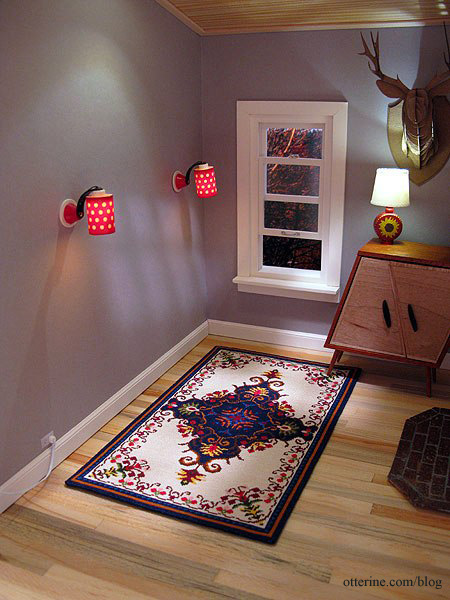
It fits well with the furnishings, though I will need to add feet to the daybed and whimsical cabinet to make them level.
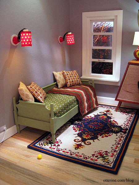
It’s such a striking design, which is what drew me in when I first saw it. The chart came from Jorge Cubells’s blog, though if you plan to make one for yourself, please write to Jorge for the half chart since the one listed on his blog is missing a column in the pattern. My final rug has this error, but it’s not noticeable.
Categories: Needlework - French knot rugs, The Artist's Studio
April 12, 2013 | 0 commentsThe Artist’s Studio – Clerestory windows
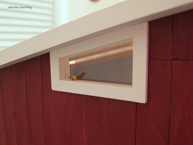
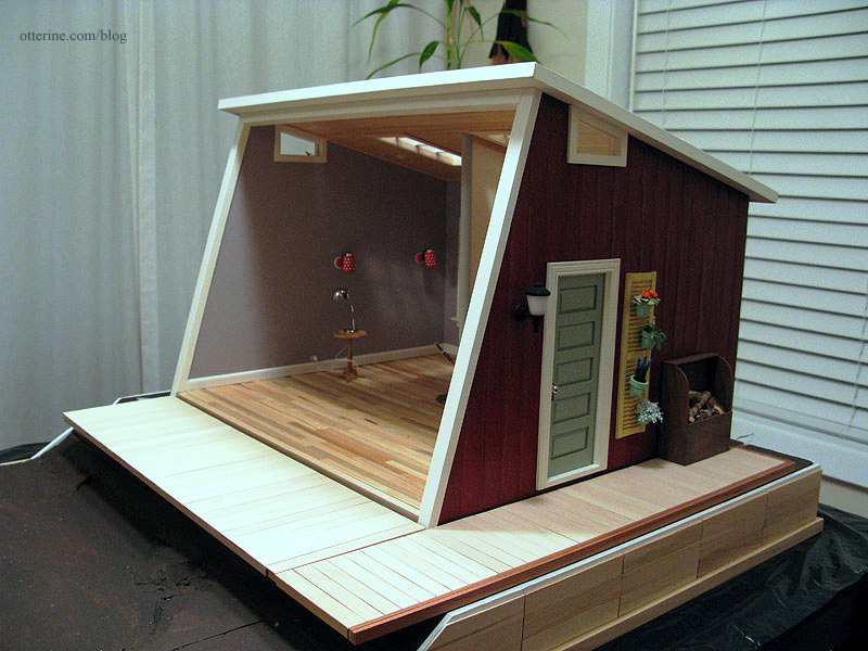
When I lowered the ceiling height of The Artist’s Studio, I had originally thought to fill in the lower portion of the original side windows. After a dry fitting of the roof in place, however, I decided I liked the odd shaped windows. A happy accident. :]
Of course, there are no readymade windows in this particular shape, so I would have to improvise. I had extra Houseworks 8-light windows, and they fit well in the existing hole. These are the same windows I’ll be using for the skylights. I marked where the window should be cut, leaving a little give for proper fitting.
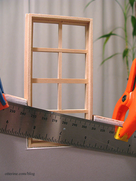
I used my scroll saw to cut along the lines and removed the interior pieces. I was able to cut both clerestory windows from one 8-light window.
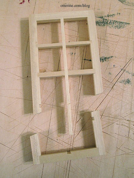
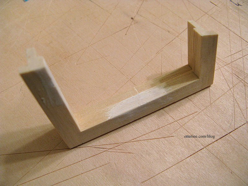
I tested the fit. You can see the pieces of strip wood I cut to fill in the groove in the ceiling over the window opening. This groove is what allows the roof board to attach to the walls. They aren’t glued yet, which is good since I need to adjust this one. :D
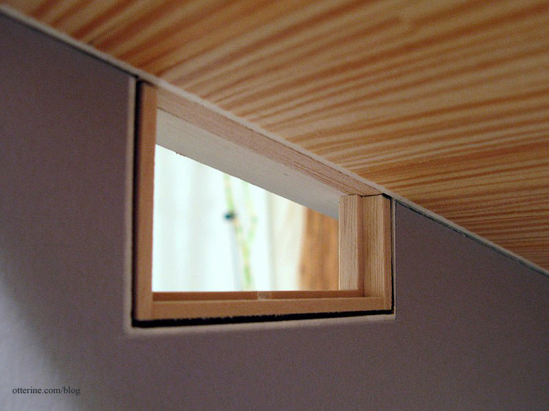
The removed interior pieces left cutouts in the outer frame. I used strip wood to make patches.
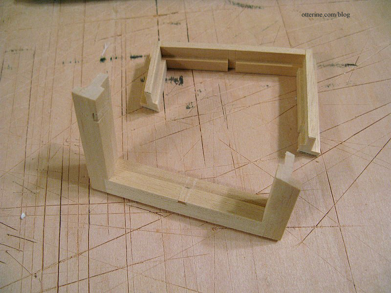
A little spackling added will give a smooth surface under the paint.
The acrylic sheet allows you to cut any shape or size window. These particular windows don’t come with acrylic inserts. I’ll leave the protective film on until I’m ready to install the windows.
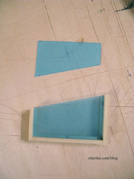
I tested the fit again.
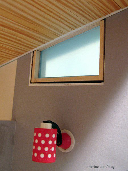
All good! :]
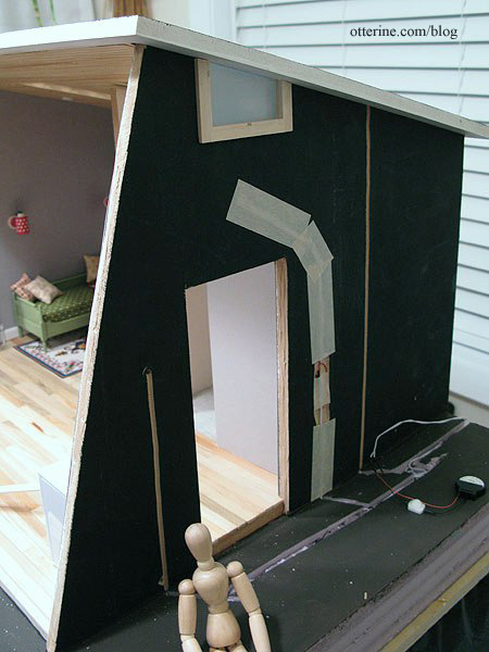
Once the eaves were finished, it was time to complete the windows and install them. I tested the fit with the eaves in place to see if any adjustments needed to be made. A little sanding, and the fit was snug.
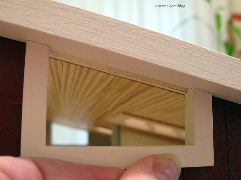
I cut 1/4″ strip wood to seal the top of the outer window and glued it in place. I cut another piece of 1/4″ strip wood to seal the top of the inner portion and glued it in place, making sure the acrylic could still slip out easily.
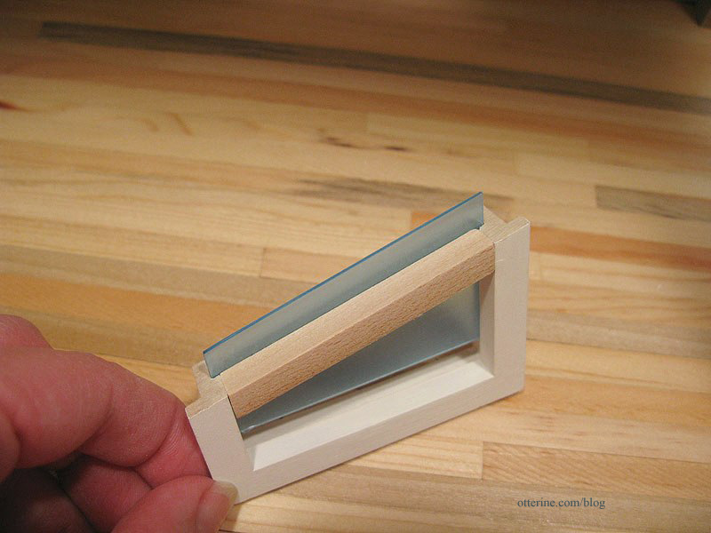
I checked the fit again…good. The reason for the overhang on the inside is that with the added siding on the exterior, the window is slightly inset when put in place.
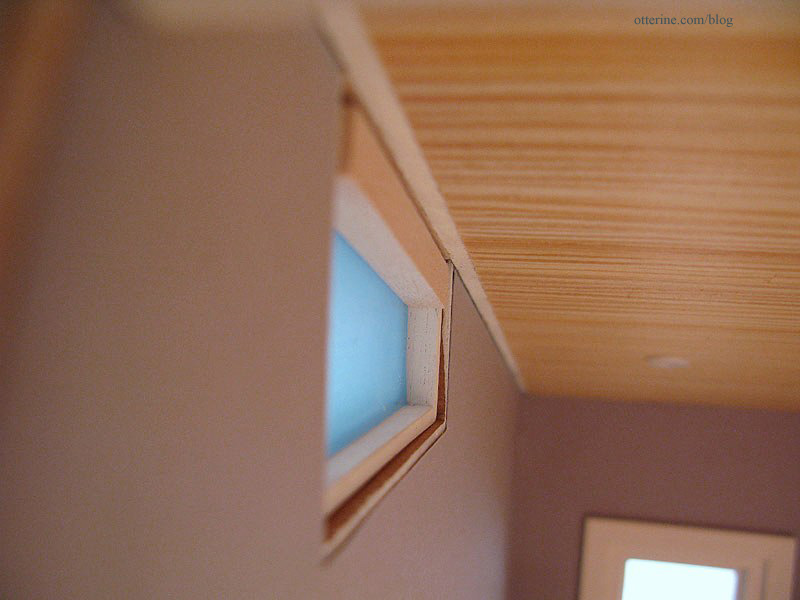
I added 1/16″ strip wood around the interior portion to make up the rest of the difference.
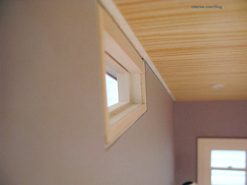
I painted the new parts then put the window inserts back in before gluing the windows in place, making sure they were snug against the eaves.
On the inside, I added plain bass wood trim sealed with varnish to finish the edges of the ceiling.
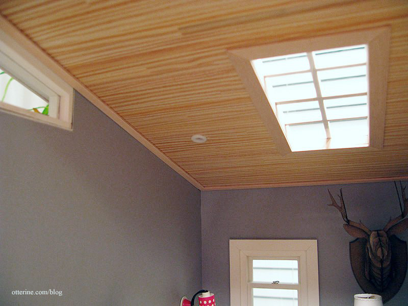
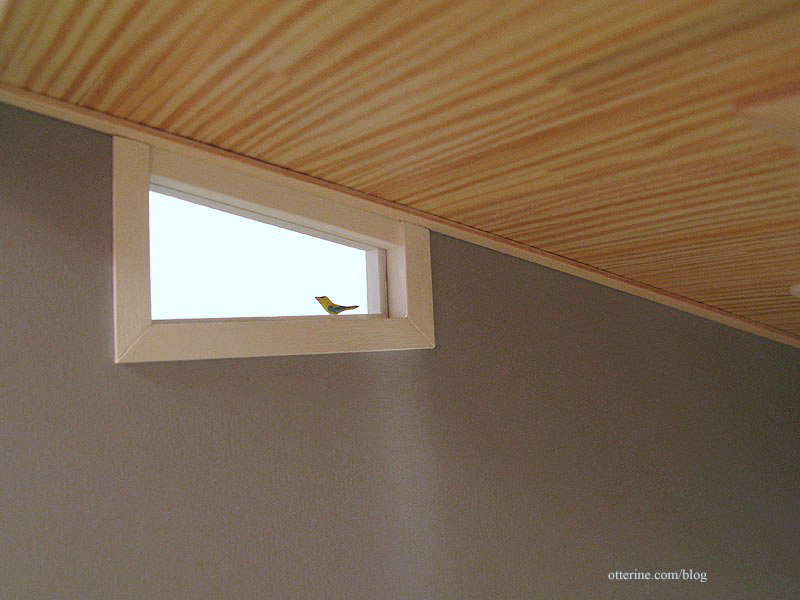
I cut interior trim for the clerestory windows and painted it Warm White.
I also cut the front opening interior trim and painted it Warm White.
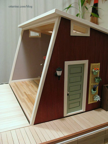
Trim takes a long time to finish, but it adds so much.
Categories: The Artist's Studio
April 10, 2013 | 0 commentsThe Artist’s Studio – Retaining wall, part 2
As noted in a previous post, the main part of the retaining wall will be made from Woodsies popsicle sticks that measure 6″ x 3/4″ x 1/16″. The back width of the base is 24″ so I marked the foam core board base in 4″ intervals.

Mike again came to the rescue! I needed 1/4″ x 1/2″ x 36″ strip wood, but the local stores carry only balsa in that length. It is too soft for base trim, so he sent me cut strips of poplar to finish the plywood edge. Unfortunately, I failed to tell him the amount needed so he sent only one board. While I awaited the rest, I used the single board to align the horizontal planks around the foam core base. I’ll add the base boards once they arrive.

I cut the Woodsies sticks to 4″ lengths and glued them to the foam core board base using the guidelines, starting in the middle. I used the Easy Cutter for the horizontal planks since the ends would be covered by the vertical posts.

I used a length of corner trim to align the tops as well. I’m awaiting my supply of this trim as well.

I made a small hole for the wires.

For the lead edges where the land descends, I kept the boards even, cutting the lines with a utility blade. I will build up the land to fill in the adjacent areas during landscaping.

I like the look of it so far.

Categories: The Artist's Studio
April 7, 2013 | 0 commentsThe Artist’s Studio – Eaves
Since I added some trim to the front of the Studio, the roof seemed off balance. I added a 3/8″ x 3/8″ strip of bass wood along the front edge of the roof board to make it more prominent in front.

To finish the eaves, I cut pieces of veneer to fit along the underside of the roof board. Instead of making board lines as I had done for the Heritage eaves, I opted for smooth soffits for the eaves. I think this makes for a more modern feel.
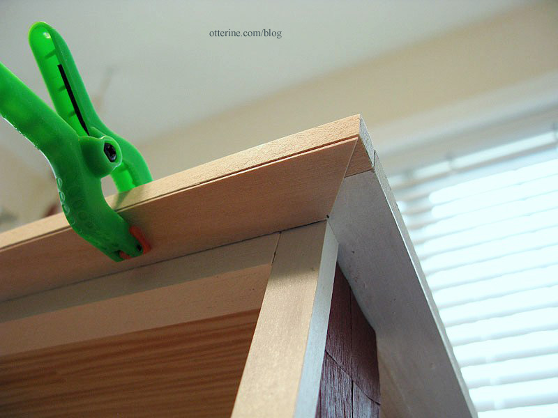
I cut angles at the corners to fit the pieces together.
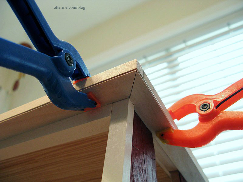
I cut bass wood strips to finish the outer edges of the roof board.
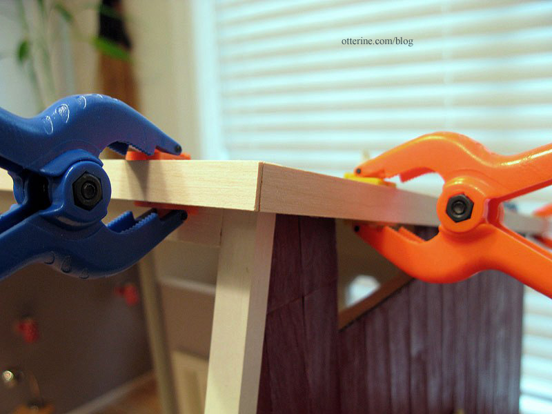
These eight boards create a good clean finish for the edges of the roof.
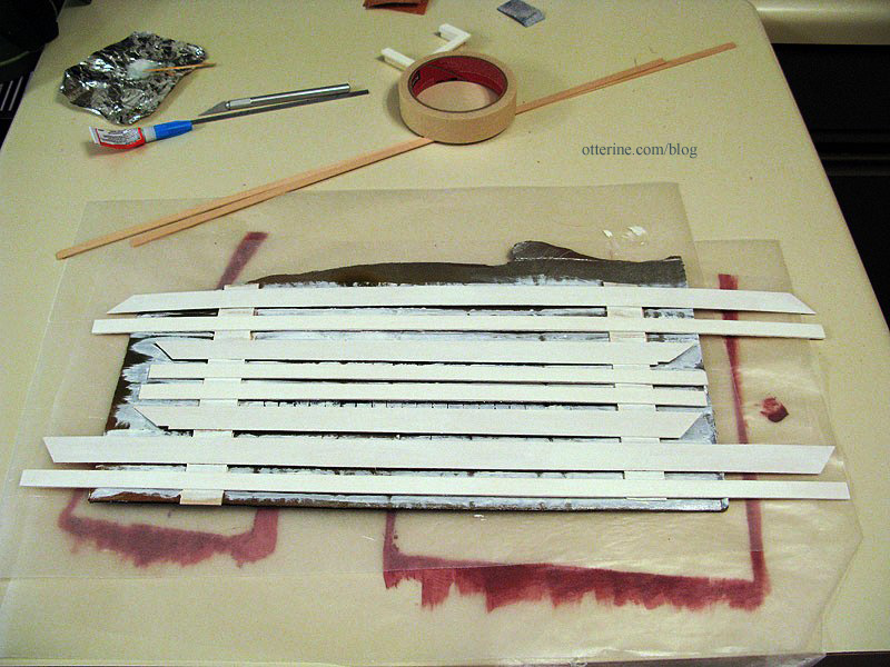
I painted the pieces with two coats of Warm White by Americana, a light sanding between coats. When I paint a grouping of boards, I tape them to a scrap of cardboard for easier painting.
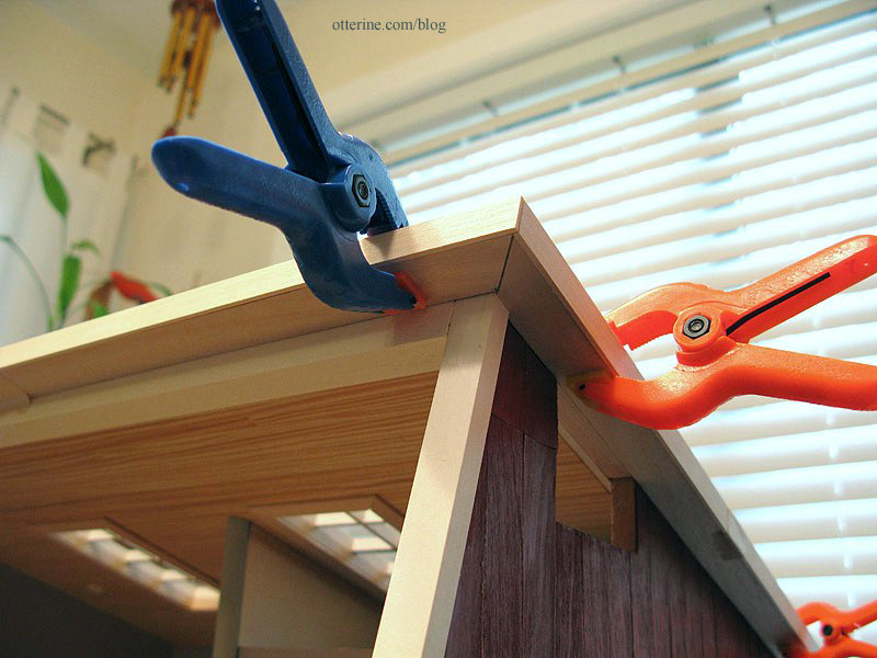
I then glued them in place and touched up any gaps with small dabs of paint.
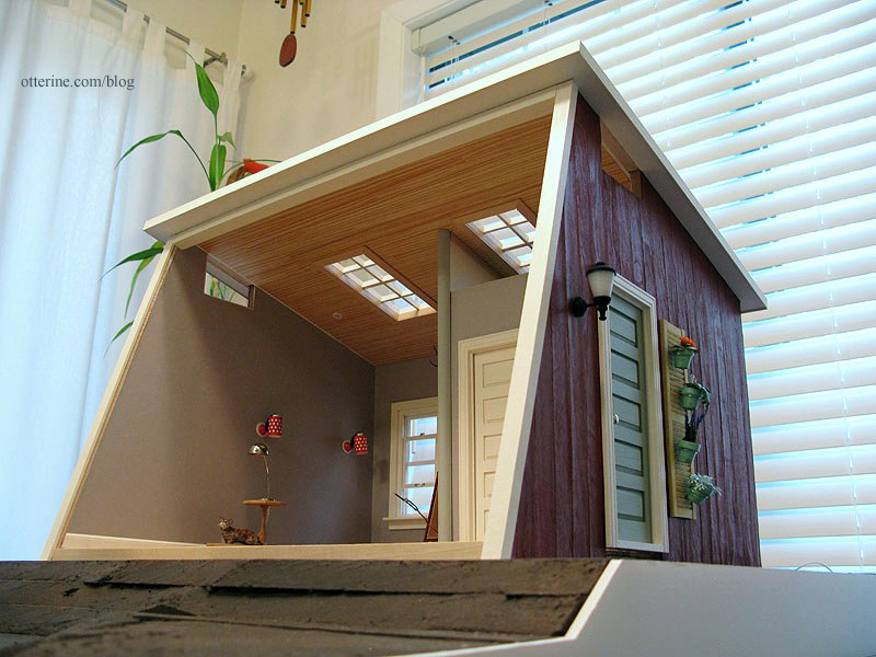
Categories: The Artist's Studio
April 6, 2013 | 0 commentsThe Artist’s Studio – Siding and trims
I finished the second right siding piece since the first attempt was so warped. I glued it in place, then sanded and varnished the surface.
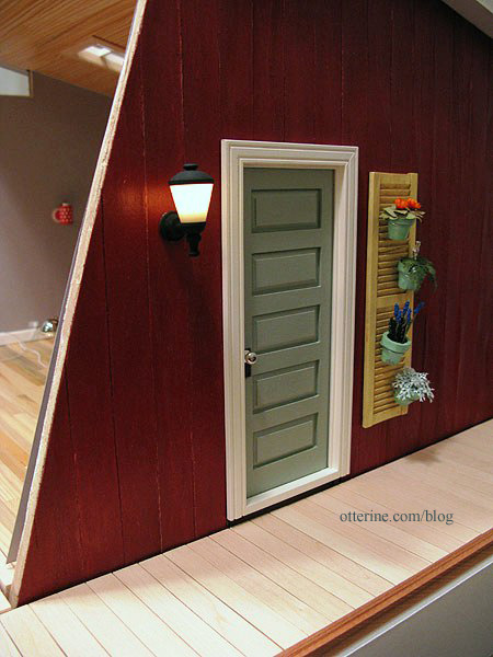
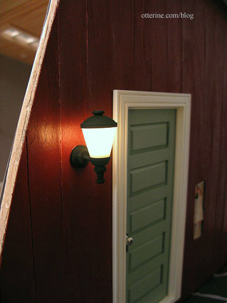
I added the coach lamp (the main door is still removable).
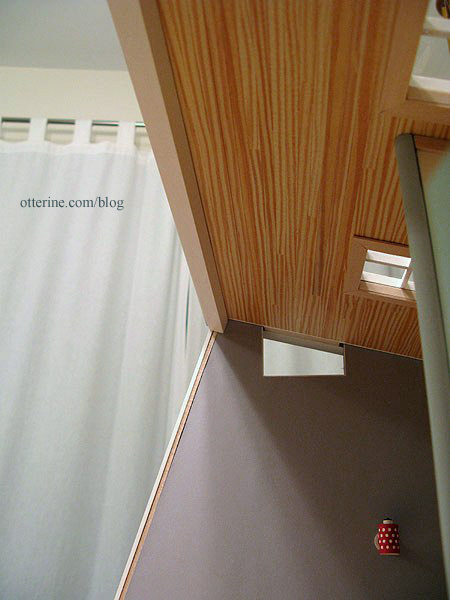
After finishing the wiring, I was able to glue the remaining piece of wallpaper on the interior.

I glued on the front edge molding and the large cross beam. These are painted Warm White with a finishing coat of satin varnish.
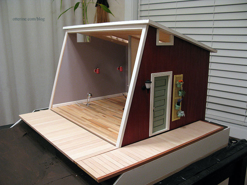
It creates a nice frame for the interior when viewed with an open front.

The cross beam creates a clean finish on the interior and will serve as a base for the front window wall
Categories: The Artist's Studio
April 1, 2013 | 0 comments
NOTE: All content on otterine.com is copyrighted and may not be reproduced in part or in whole. It takes a lot of time and effort to write and photograph for my blog. Please ask permission before reproducing any of my content. (More on copyright)


