
The Artist’s Studio – The Deck, part 1
Before I can work on the front wall of windows, I need to work on The Deck. This is going to take some serious engineering. The deck will fit into the slope of the landscape and be only partially supported by firm ground around the building itself. You might recall my previous mockup.
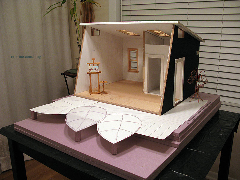
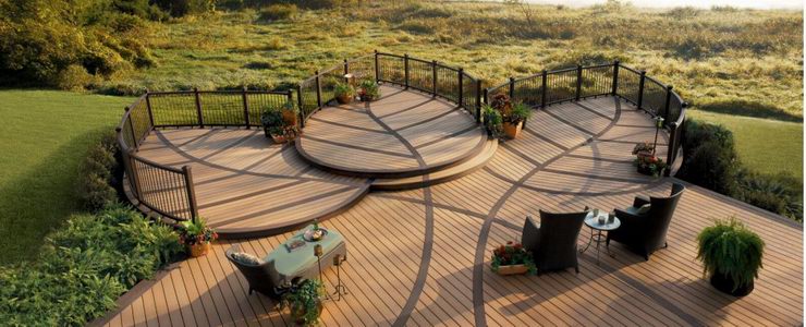
Image from Trex I’m going to do a bit of reverse engineering here since while the deck needs to be solid, it doesn’t have to support actual weight other than a mini chaise or easel. I figured the simplest approach would be to build the surface of the main and side portions first and then create the framing that would support this surface. From there, I would create each leaf separately and attach those to the main deck.
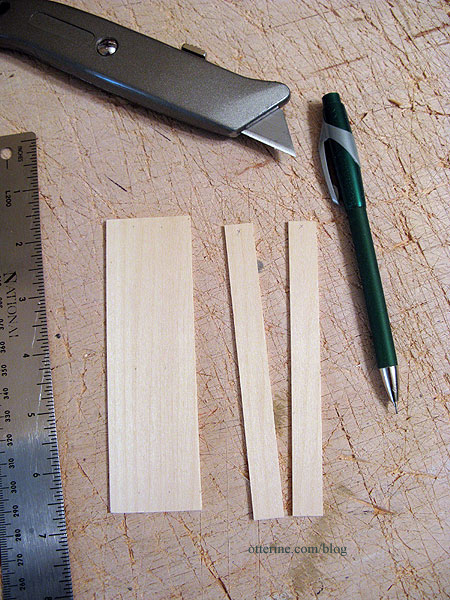
I bought five sheets of basswood by Revell measuring 1/16″ x 3″ x 24″ for the lighter boards. I will use walnut for the vein detailing and outer accent. I bought the sheets to cut my own boards instead of the precut strips because I find that the brand of basswood the stores around here carry is always so fuzzy. These sheets by Revell are less so and easily sanded smooth. And, I have a good eye for measurement when cutting by hand.
I cut lengths of 5″ and then measured 1/2″ intervals. I put an X on the back so I would know which side to face up. These Revell stickers came off the wood easily, but I didn’t want to risk having future finishes react differently due to any glue residue.
I applied a length of double sided tape to the landscaping board for planning purposes. Without some sort of adhesive, one small bump would lead to resetting every board. Uh…no. Using a T-square, I lined up my individual boards and pressed them to the tape.
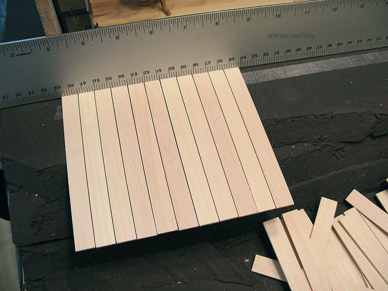
There are 35 boards for the main deck.
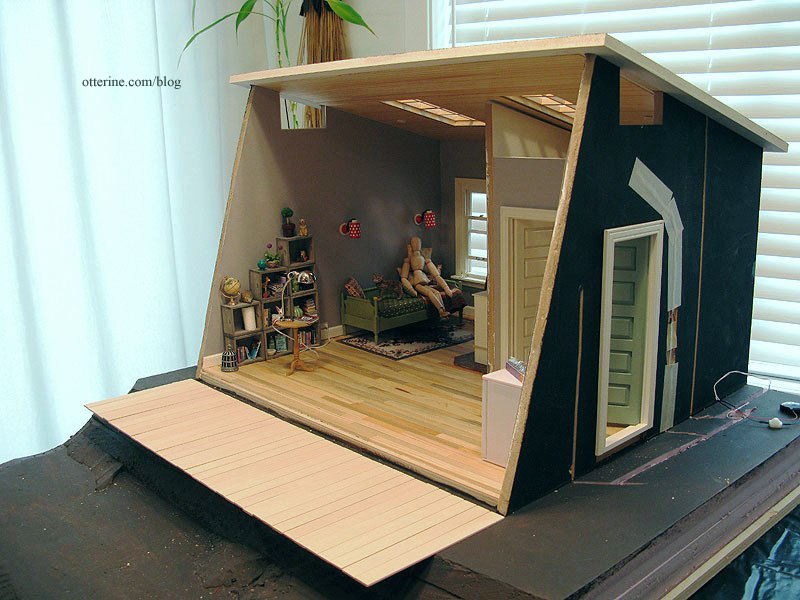
The main deck can be shifted to the side in either direction depending on the fit needed to join the side deck.
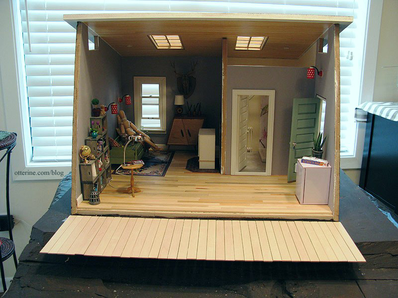
For the side deck, I had to add a small piece of cardboard to support the boards during the mockup phase. It won’t be part of the final framework.
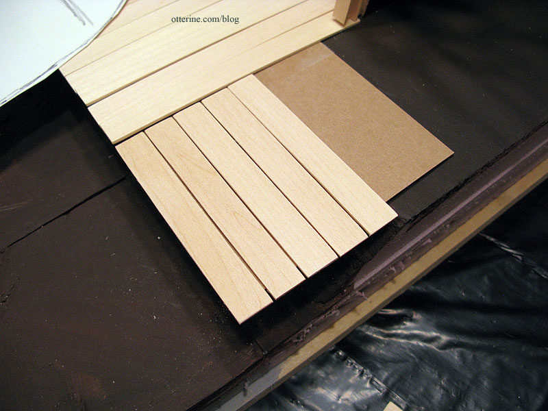
These pieces measure 1/2″ x 3 1/2″ and begin at the forward edge of the main deck. There are 37 of these boards. I continued them far past the door so there is room for the firewood box that will hold the wood stove switch. Plus, that means I can use scraps of landscaping materials instead of buying new.
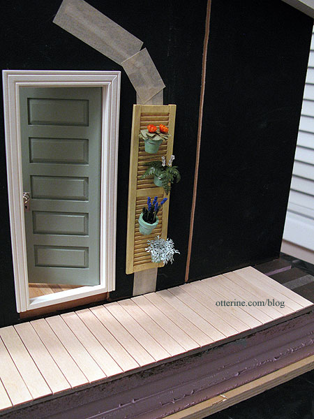
You can see the space between the top of the boards and the lower edge of the door. This will allow plenty of room for the framework, and I may or may not need a front step under the door. We shall see.
With the leaf mockups in place, it’s starting to look like something.
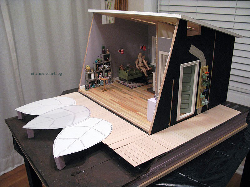
There will be steps in the open area in front of the side deck.
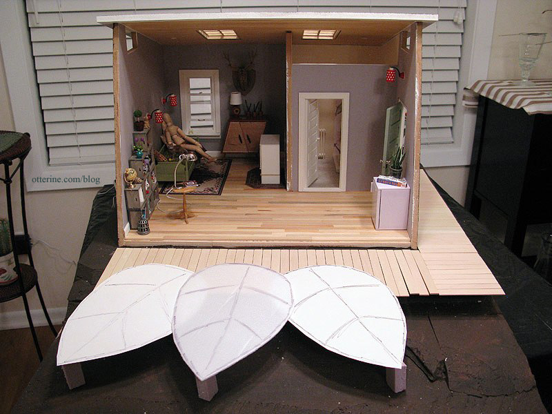
Next up, building the frame for the main and side decks. In the meantime, I’m still trying to wrap my head around the framework for the leaves. :O
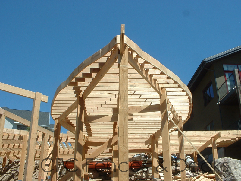
image from CFC Fences & Decks Categories: The Artist's Studio
March 5, 2013 | 0 commentsThe Artist’s Studio – windows and doors
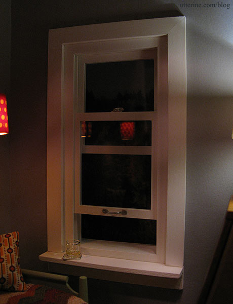
I painted the living area window Warm White by Americana. Before painting, I added trim to the window since it was built for a depth of 1/2″ but the walls are only 3/8″ thick. Before installing the window, I sanded the siding and added satin varnish. It’s a subtle change, but I like it!
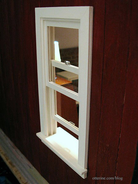
I added a corner trim sill to the interior since the precut interior trim never seems to fit right and I wanted a place to display minis…like a good Scotch after a day’s worth of painting. :D Ahhhh….
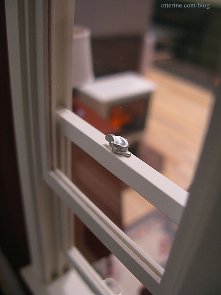
The window handle is by Houseworks and was originally brass. The window sash lock is by Realife Miniatures – vintage stock purchased from another member on the Greenleaf forum. This was also brass now painted silver.
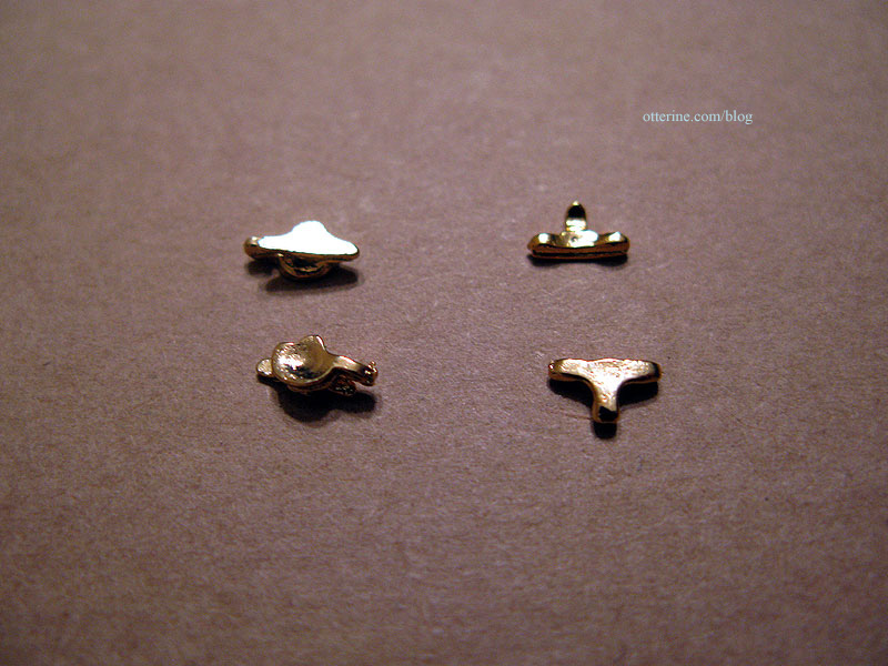
They are wonderfully detailed. I had to look one up to see how it worked since I have different mechanisms in my home. The locks come in pairs – just like the real deal – here I’m showing the tops and bottoms of two pairs.
Since this is a working window and there’s not enough room on the window to install both pieces, I used only the one with the round lever. I glued it so that it would not interfere with the window operation while still looking like it might just work.
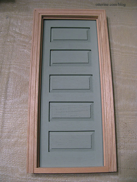
The exterior door is painted Slate Green by Americana and won’t be installed until after the siding is up. The door knob and keyplate are chrome pieces from Clare Bell Brass. I wish I could find more of these. I used satin varnish only on the exterior door (inside and out) and the exterior door trim. I didn’t like the matte finish on the green, and I thought the exterior door frame should match in sheen. I liked the matte finish on the remaining windows, interior door and trim, so I left them as is after painting.
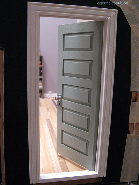
I had added trim to both doors to block out the light around the inside. It’s a simple and subtle change that makes for a more realistic door jamb.
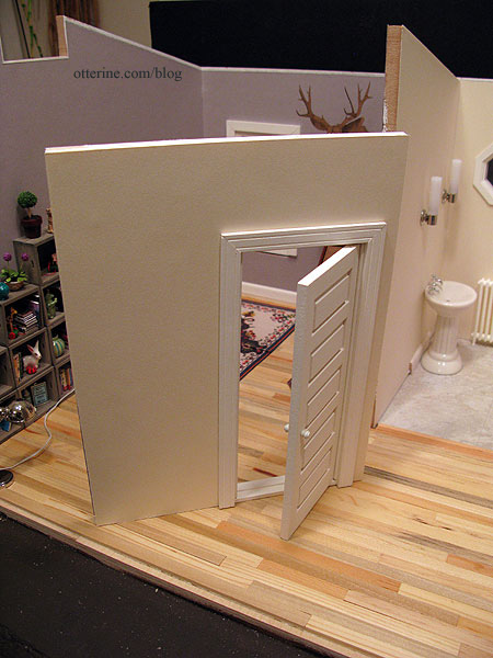
I had to flip the direction of the bathroom door. This door has a simple white knob. The removable wall is papered on the bathroom side with Canson Ivory paper. I added the door trim to the interior side but still need to finish the top edge of the wall.
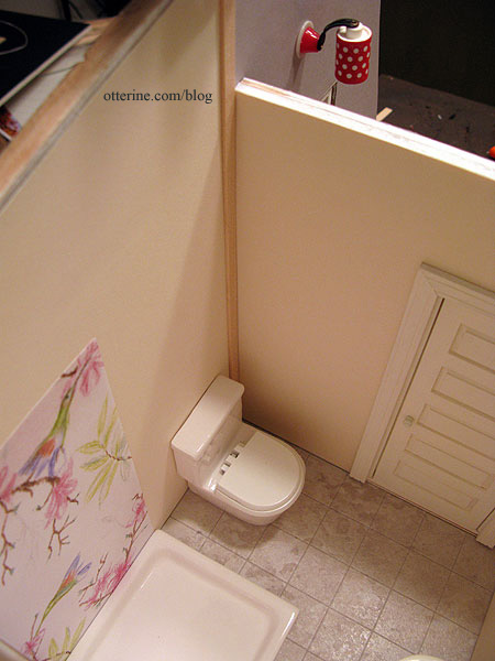
Since the left wallpaper seam is larger than I had hoped and will show when viewed through the window or skylight, I’ll add a length of trim from floor to ceiling. This will also help align the removable wall when it is in place.
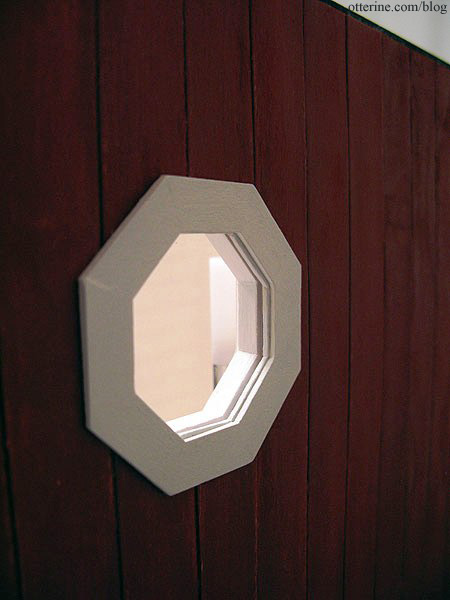
I installed the octagon window technically backward. Considering one wouldn’t be looking at the back of the Studio most often, I thought the routed detailing would be best served sitting on the interior. :]
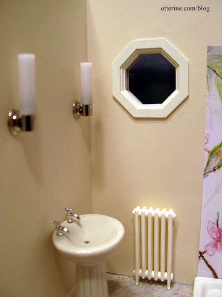
With the addition of the siding, the wall was thicker than the depth needed. I added a cardboard octagon cut to fit.
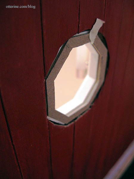
I glued this piece to the now exterior trim, then painted it to blend.
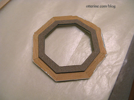
Now there’s a seamless fit for the trim on the exterior.
There are other posts on the clerestory windows and skylights. Doors and windows take a lot of time, but I think it’s starting to really come together on the inside.
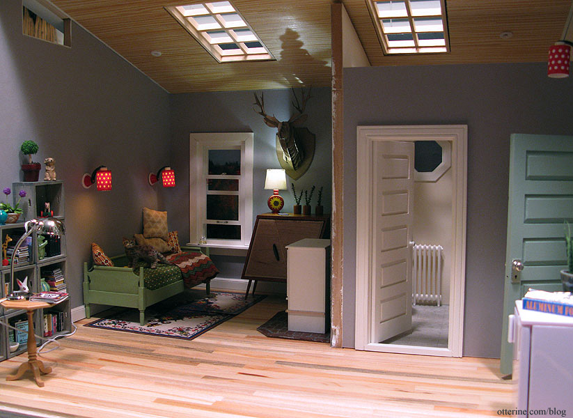
Can you feel the cool breeze coming in through the window?
Categories: The Artist's Studio
March 3, 2013 | 0 commentsThe Artist’s Studio – Shutter garden
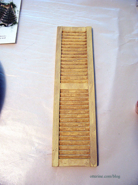
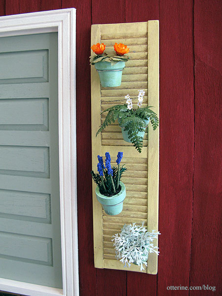
To hide the open wires on the door side of the Studio, I painted a Houseworks shutter to make a vertical garden. The base coat was Lemonade by Folk Art followed by two washes of Asphaltum and Slate Grey both by Americana. The idea came from this image of a shutter holding flower pots. I found the image on pinterest, but I think I’ve traced the original source to here.
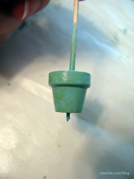
I painted some wood pots with Robin’s Egg Blue by Joann followed by a wash of Foliage Green by Americana, also with a satin varnish.
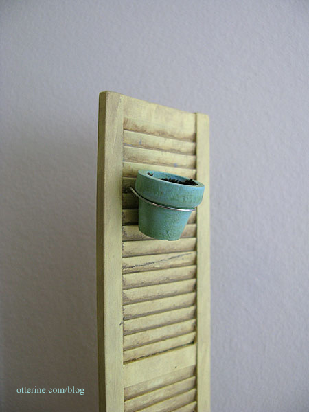
I used jewelry wire to attach the flower pots to the shutter, using a pin vise to make small pilot holes and attaching the wire holders with super glue gel.
Here is the siding propped in place showing the hole to access the wires.
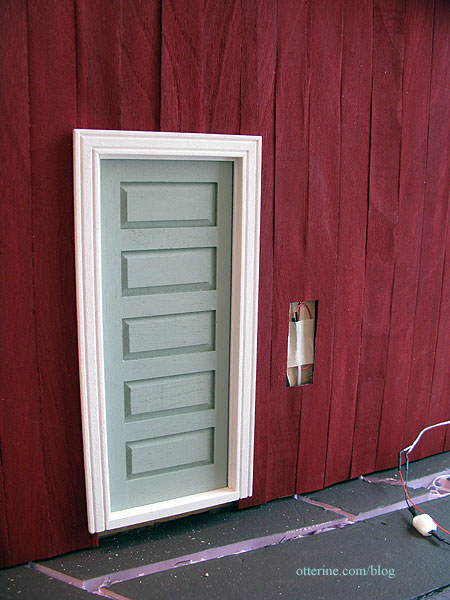
And, with the completed shutter garden held in place with mini hold wax.
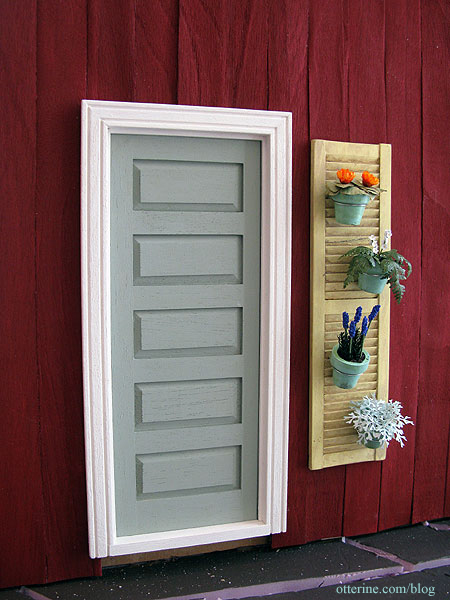
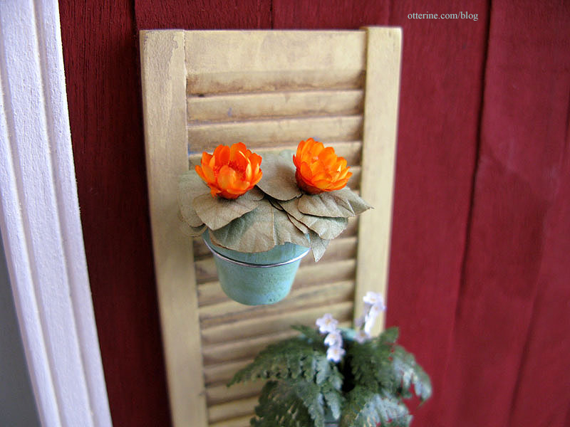
I made the plants and flowers to add to the pots. I had leftover Bonnie Lavish leaves from the sunflowers I put together. I added some orange dried flowers for a pop of color.
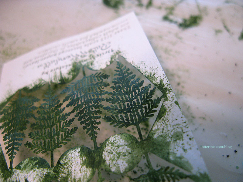
I painted a laser cut fern kit by Jeannetta Kendall with a variety of greens followed by a satin varnish on the darker of the two sides.
I shaped some impatiens purchased at one of the local mini shows from Small Talk (no web address). I colored the middle with a yellow pencil. I added the impatiens to thin stems of floral wire and set them into the leaves.
I had some leftover lavender stalks and Erica moss from The Miniature Garden, when I had made the plants for The Aero Squadron Lounge.
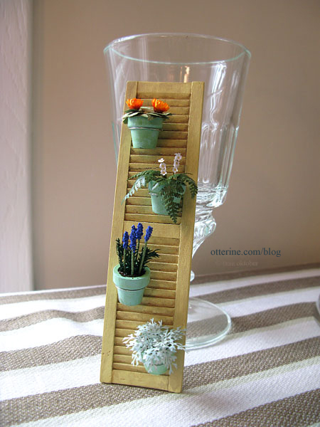
The last plant is a dusty miller by Bonnie Lavish. All of the pots are removable.
These would make lovely party favors or place cards, no? :D
Categories: The Artist's Studio
March 2, 2013 | 0 commentsThe Artist’s Studio – Daybed, part 3
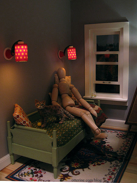
The daybed looks as though it has a deep base to hold the proper support for a twin mattress, but the cardboard liner sits near the surface.
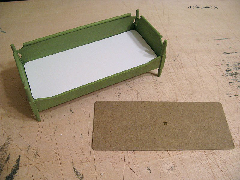
I replaced this piece with white cardboard and covered it with cotton to give the appearance of box springs set into the base.
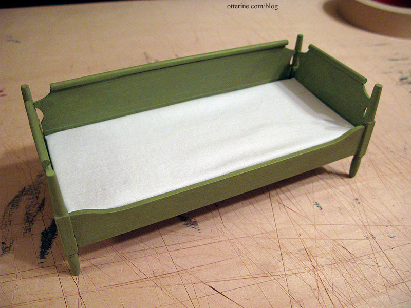
I cut two layers of foam core board and glued them together to form the mattress. I made the foam core pieces smaller than the cardboard to allow room for the bedding fabrics.
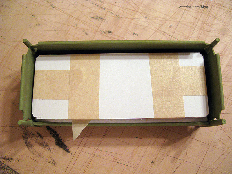
I covered the mattress with millinery batting.
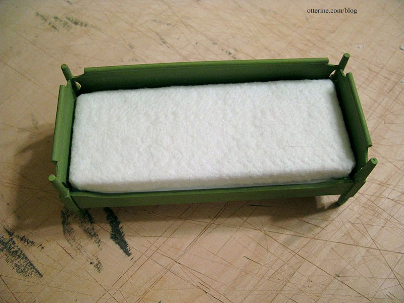
I made sheets from pretty cream fabric with light brown leaves.
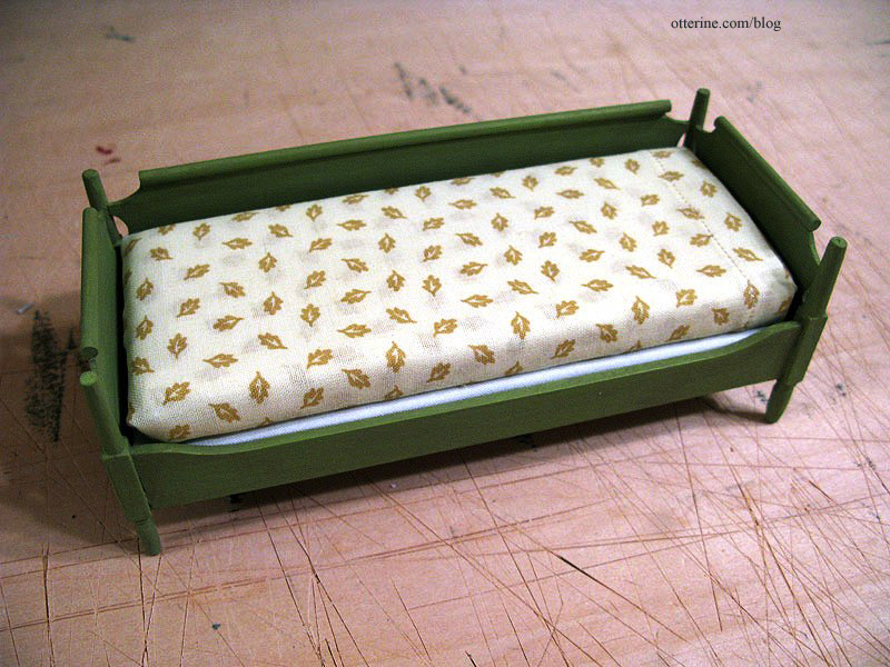
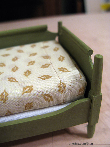
I stitched the detailing around the top. Even though the stitches are out of scale, I like the finished look.
I made a coverlet from printed cotton Sarah sent me. I wasn’t sure about using green for the green bed, but it was the best out of all the fabrics I tried. It’s understated yet fun. I made a white bed pillow with bead stuffing and covered it with a pillowcase made from the same cream fabric as the sheets.
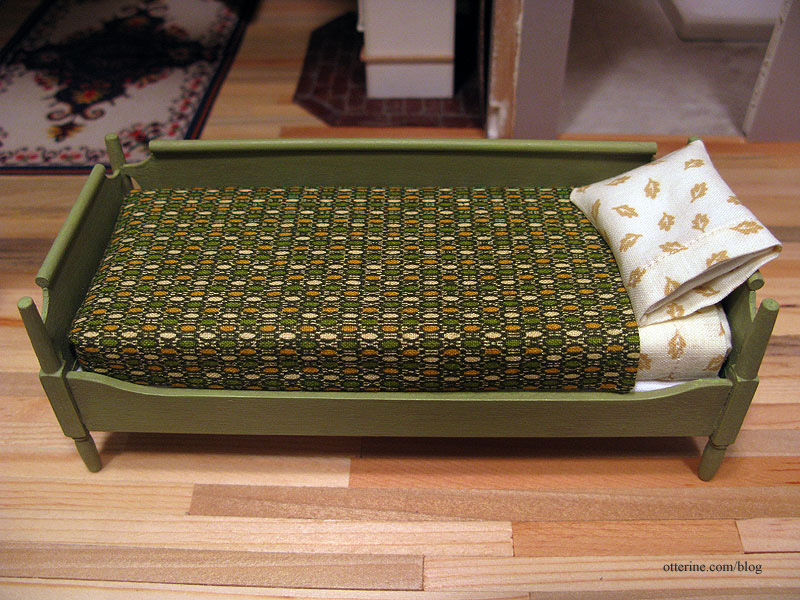
The bedding is all glued in place, so it is permanently turned down for sleeping.
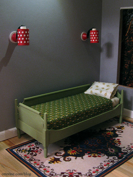
To disguise this fact when I want to show it with throw pillows, I’ve used a fine afghan from Mary at Roslyn Treasures. There are decorative throw pillows to lean on as well.
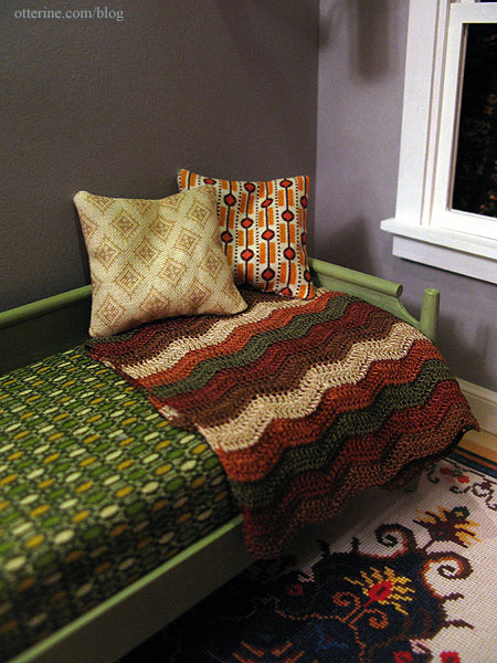
I think the colors and patterns all work well together without seeming like it was intentionally put together.
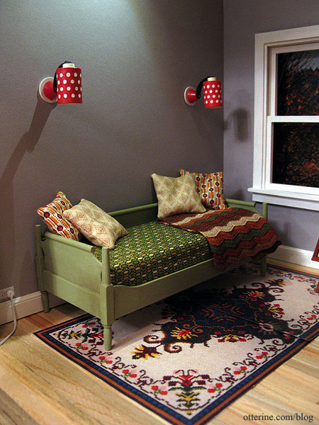
When the bed is made into a sofa, the sleeping pillow hides out in the cabinet by minisx2. :D
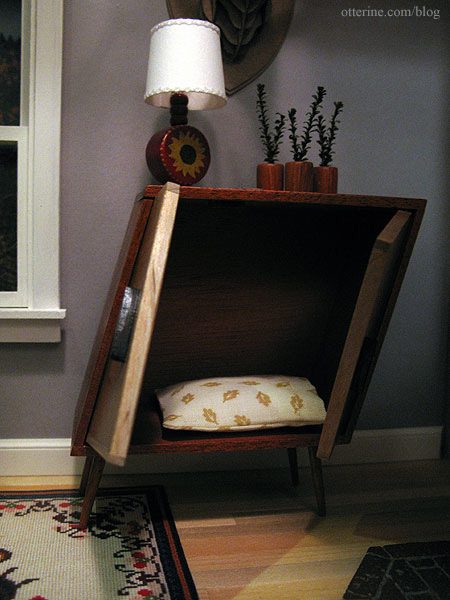
There will be more items in the cabinet eventually.
Categories: The Artist's Studio
February 28, 2013 | 0 commentsThe Artist’s Studio – Wood stove, part 4
Continuing work on the wood stove. This is one of those instances where I knew I would be wiring the stove LEDs but did not plan ahead for it. Why? Who knows?!! But, all was not lost! It just took some extra steps.
I received the wider fire this week from Mainly Minis – a much better fit.
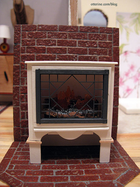
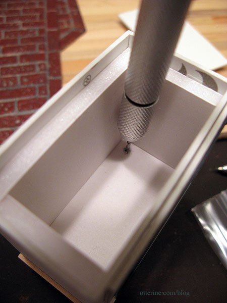
I drilled a hole in the back corner for the LED wires.
I used two orange flickering LEDs and a 3V battery adapter from Evan Designs.
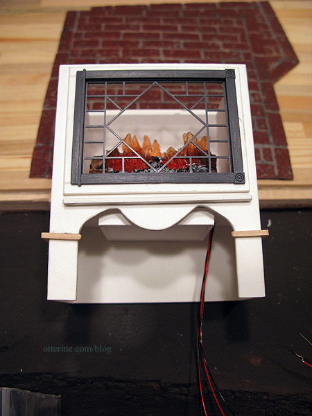
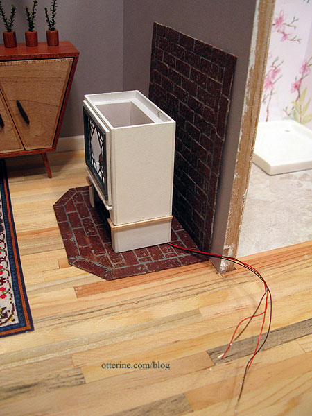
I put the brick surround and stove in place (neither is glued) to determine where the wires would hit the brick base.
I marked the hole with a pencil onto the wood floor underneath.
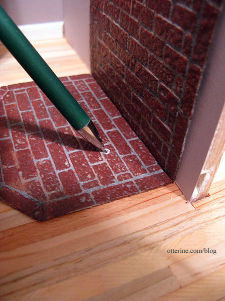
I dabbed some paint onto the wires to mark the optimal position where the wires should come up from the floor.
The wire will run under the brick surround, through the wall into the bathroom, behind the baseboard and out the back. I drilled a hole in the lower bathroom wall in the back, angled down so it would not mar the exterior siding.
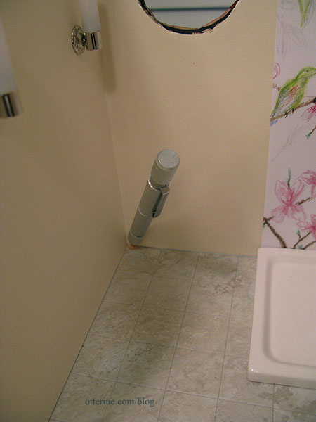
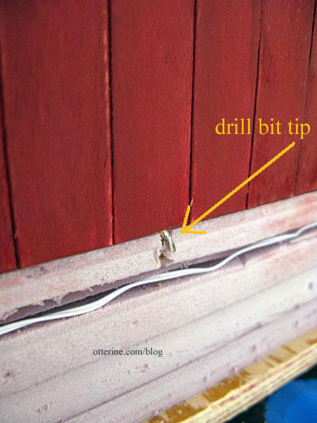
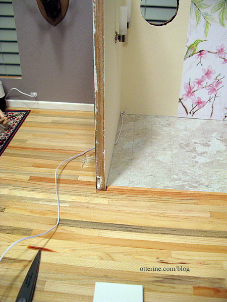
I fed a length of wire through the hole in the back wall and then through the hole drilled in the dividing wall. You can see where I started an indentation in the floor with my Dremel. This is where the wires sit under the brick surround.
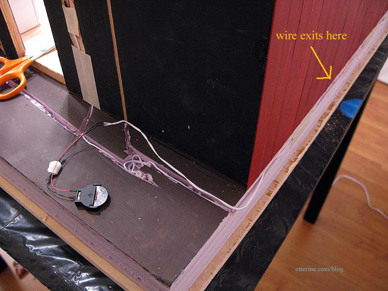
On the outside, the wire wraps around the back in the base foam and ends with the 3V battery adapter. I will build something to house the switch and battery – probably a firewood storage box. :]
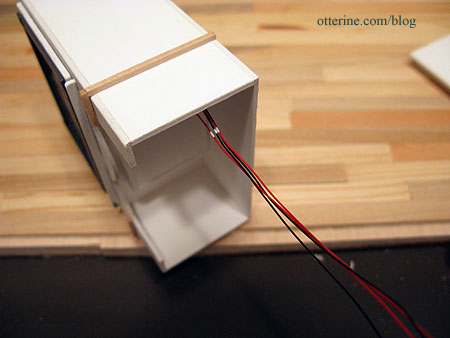
I made the hole in the stove large enough so the LEDs can be inserted from the bottom.
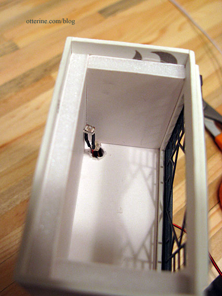
I twisted the LEDs slightly apart, then twisted the wires together based on color.
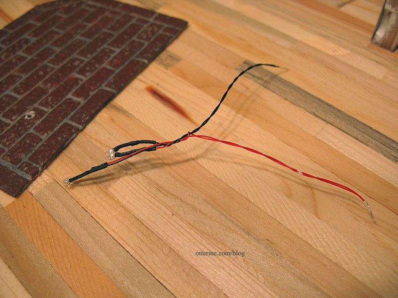
I tested the LEDs to make sure I was connecting to the right extension wire.
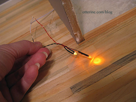
I used shrink tubing to attach the wires and then taped them into the indentation in the floor. The hole in the brick base is large enough to feed the LEDs through from underneath.
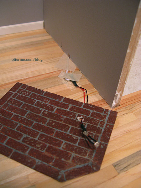
Test the LEDs again just to make sure, though I’m still not gluing the base in just yet. I don’t think there’s anything left to do first, but there’s no rush, either. :D You can see the paint mark for my optimal spot ended up being pretty close.
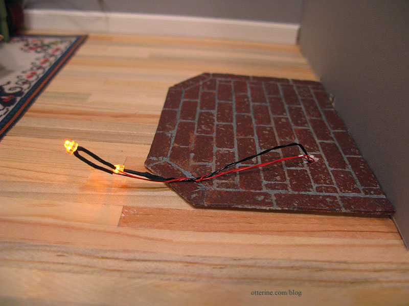
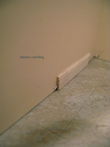
On the bathroom side, the wire fits into the groove in the baseboard (shown here using a scrap). Ingenious design for this baseboard! I wouldn’t use it exclusively since it holds one wire without any shrink tubing on it.
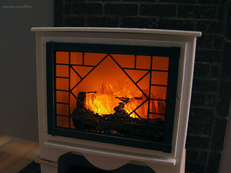
And, now we have a lighted, flickering fire.
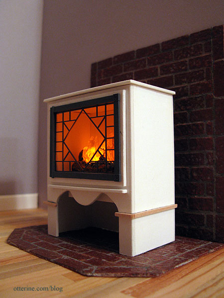
I do like this wider fire better.
Categories: The Artist's Studio
February 26, 2013 | 0 commentsThe Artist’s Studio – Hummingbird shower part 1
Since I wasn’t able to find suitable existing artwork for the shower mural, I’ve decided to draw the scene. Or, at least, attempt to do so. It has been a long time since I last did a drawing.
Using smooth Bristol paper, I marked an outline slightly larger than what I need for the shower surround. I viewed my inspiration photo and did a rough layout with colored pencil. I used a deliberately soft touch since I can always add more color but it is next to impossible to take color up later. My layout is busier than the original, and I eliminated the butterfly.
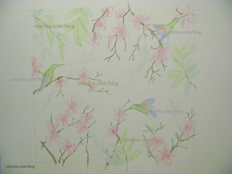
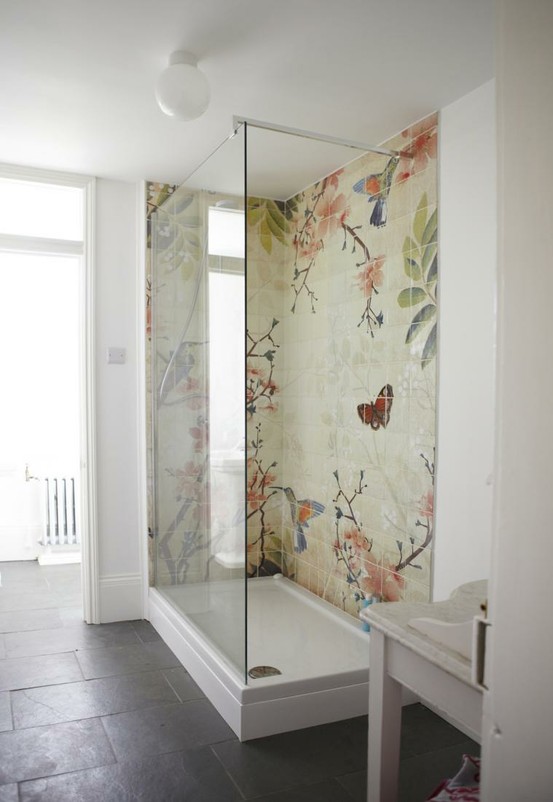
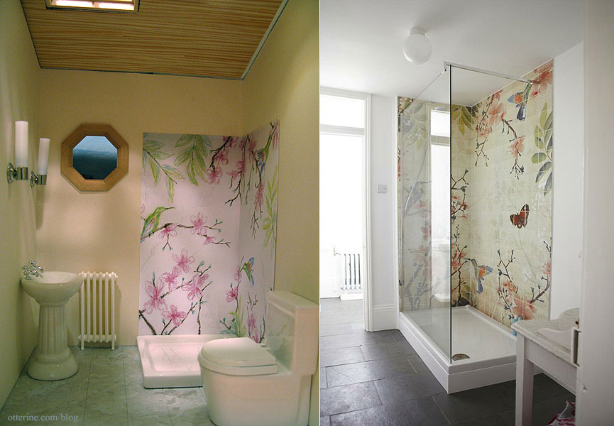
Here is my inspiration from Fine & Country.
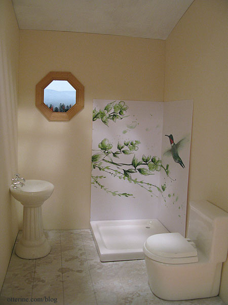
This was the best existing artwork I could find; it’s from 1ms.net.
I made a color copy of my initial drawing to see if I liked it in place before working on the drawing any further. I added some height to the shower wall after seeing how short my original mockups were.
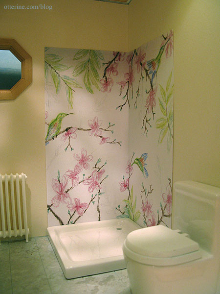
I think we’re getting somewhere.
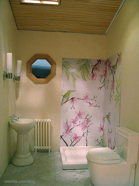
My drawing captures enough of the essence for me, so I’ll work on completing the drawing as is.
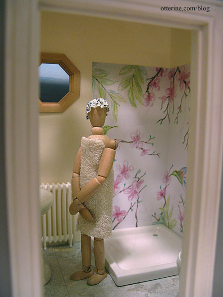
EEEEEEEEEK! Get out!!! :O
Categories: The Artist's Studio
February 25, 2013 | 0 commentsThe Artist’s Studio – Daybed, part 2
Just a quick update to show you the new daybed with its fresh coat of paint.
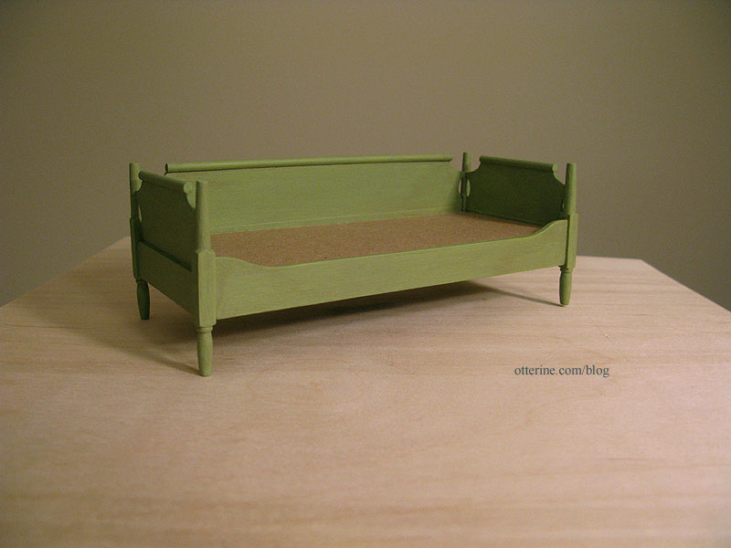
I started with a base coat of Foliage Green by Americana. It’s a bright lime green. I sanded and then followed it with a coat of the same green mixed with grey. I added a final glaze of green, grey and brown, most of which was wiped away.
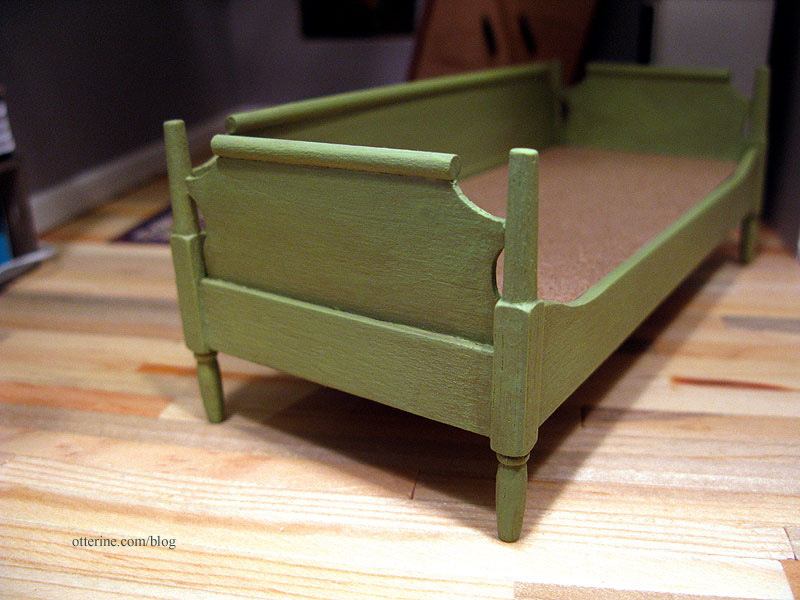
I wanted the daybed to look like a consignment store rescue – a little vintage but with a new lease on life.
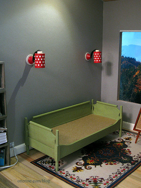
I think it looks lovely.
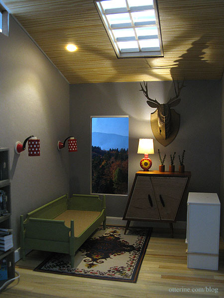
Categories: The Artist's Studio
February 24, 2013 | 0 commentsThe Artist’s Studio – Daybed, part 1
The daybed I’ve been using in The Artist’s Studio is one that I had in my collection and wasn’t necessarily meant for this space. I painted it burnished copper to coordinate better with the other furnishings.
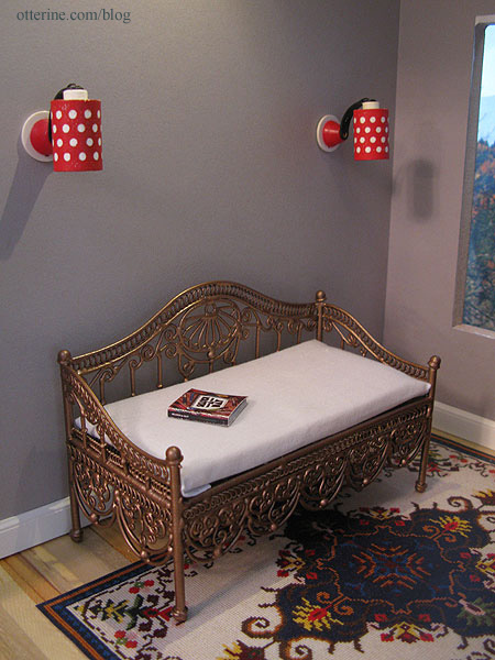
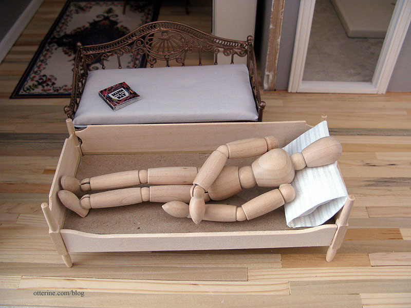
The problem with it is that even though it’s a good size for the room, it’s not really a daybed so much as a settee. My model can’t comfortably recline on it.
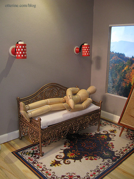
I have a sofa kit in my collection of furniture kits that might work better. It’s from the Realife Miniatures Country Living Room kit.
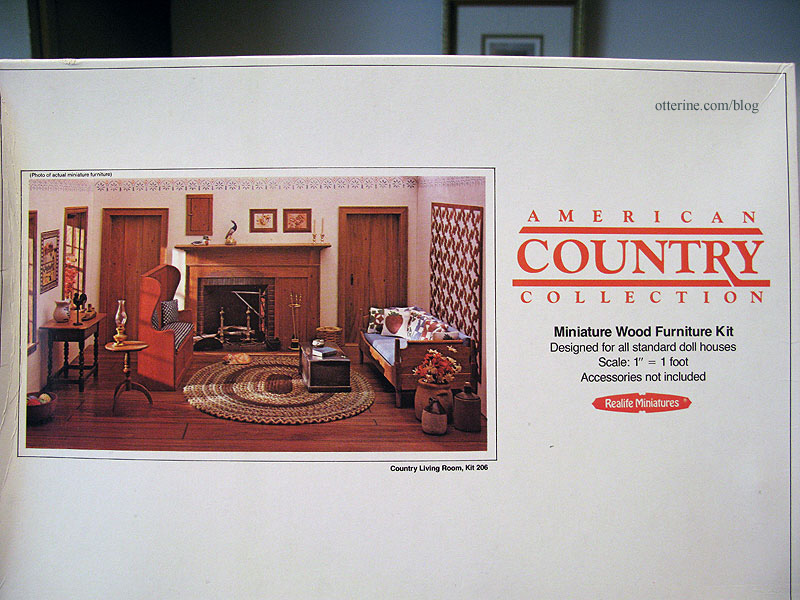
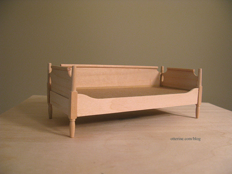
I’ve wanted to build this sofa for awhile now, so today I put it together. I’ve been spoiled by House of Miniatures and precision laser cut kits. The fit is sloppy in places, but paint will take care of that!
This sofa is lower but wider than the original settee, and my model seems much more comfortable.
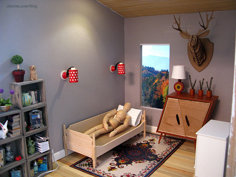
It fits well in the space, too. :D
Categories: Furniture, The Artist's Studio
February 24, 2013 | 0 commentsThe Artist’s Studio – Wood stove, part 3
For the brick surround for the wood stove, I started by squaring up my rough paper template and marking the center of the floor and back pieces.

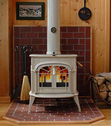
As a reminder, here is my inspiration from hearth.com showing a partial brick wall. Now that I study it, these might be brick colored stone tiles instead. But, I still like the look of it.
I cut egg carton bricks 1/4″ x 3/4″ – my usual choice for brick size. I started with the floor template since it has the cropped corners. I glued bricks to the template in a pleasing pattern, adjusting the template to fit.

Before going ahead with the inside brickwork, I tested the fit of the new shape of the floor template. Perfect! :D

I bricked the interior portion of the floor template and then completed the wall template. I checked the fit of both pieces in the Studio.

The red brick coloration in my inspiration piece looks so lovely that I decided to mimic that with my bricks using Liquitex Burnt Sienna. I grouted with Andi Mini Mortar and then touched up the paint and added a dark grey wash to darken the mortar.

I have the pieces held in place with mini hold wax at the moment. I need to install the stove lighting before I can glue the brick surround in place.

So far, the stove is working out well. :] I think those feet are crying out for a footstool. Haaaaaaaaa!

In other news, Jasper said he’s willing to help with the deck when I get to it. To that end, we’ve started with scroll saw lessons.

Categories: The Artist's Studio
February 23, 2013 | 0 commentsThe Artist’s Studio – cardboard deer mount
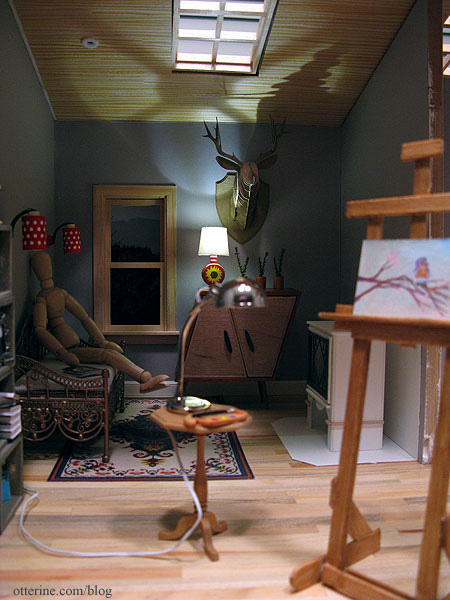
One of the fun things about making The Artist’s Studio is that I get to put interesting things in it. An artist needs inspiration and what better way to do that than to surround oneself with unusual works of art?
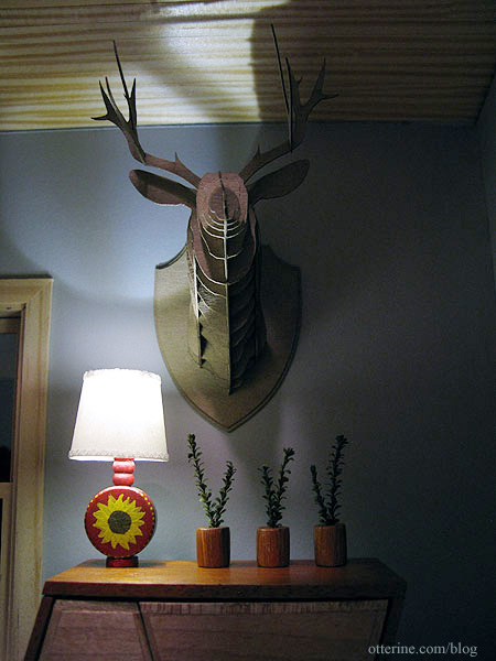
This cardboard deer head was made from a laser cut kit from Amazing Miniatures. It was very easy to assemble. I didn’t use glue other than to attach the two plaque pieces together and to hold the deer to the plaque. The rest is fitted together using the laser cut slots in the design.
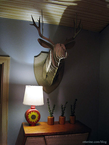
It adds a certain novelty to the Studio, don’t you think? :D
Categories: Miniatures, The Artist's Studio
February 22, 2013 | 0 commentsThe Artist’s Studio – Wood stove, part 2
Continuing work on the wood stove. I glued the back and sides around the foam core base. I cut another piece of foam core for the top and taped in place (no glue yet).

I added the foam core lining to the sides and back. I tested my small fire, and it still looks like there is a lot of space on either side.

I borrowed the fire from The Aero Squadron Lounge, which is glued to its holder, and it seems a better fit side to side.

I cut a thin frame for the window to make the door.

I glued the window into the frame, using super glue gel to attach the diamond insert. I will use the scrap of mat board to cut an acrylic window for the door later in the build.

I glued the front to the stove, still leaving the upper foam core piece separate.

I added a thin layer of spackling along the joins to smooth any small gaps.

I cut a top for the stove and glued it to the top foam core piece.

This will now serve as a locking lid for the stove. I can’t glue it as a solid unit until I get the stove painted and the flickering LED installed.

I added thin wood trim around the base and a narrow ledge under the door for detailing. I’m still thinking about whether I want to hinge the door or just glue it on with faux hinges. I’m planning to use a battery operated flickering LED for the fire, so I shouldn’t have to access the interior. Right now, I have it held on with mini hold wax. I will paint it separately, either way.

I added a lower tray made from foam core covered on the sides with mat board. I am guessing that detail on the original might be a tray that collects ashes?

I will use the round dowel that came with the HBS Loft kit to serve as the stove pipe, but I am going to wait to cut it until after the stove is finished and I have the final placement marked in the Studio. I might leave it whole and cut an opening in the ceiling, using the extension above the roofline as a chimney. Seems Cora has figured out where the warmth is coming from.

Yeah, I love it so far! :D

Categories: The Artist's Studio
February 20, 2013 | 0 commentsThe Artist’s Studio – Wood stove, part 1
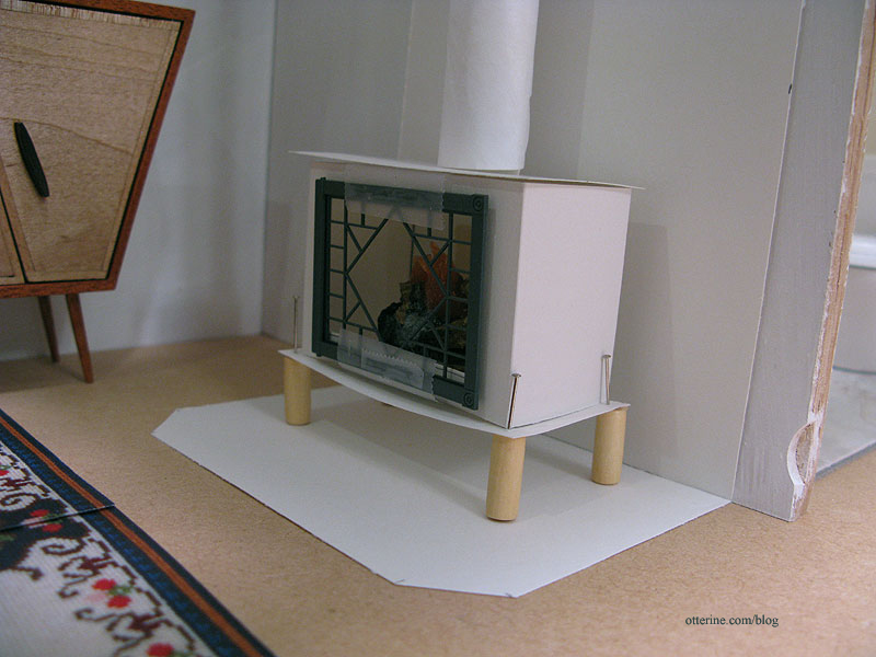
Here’s a quick reminder of my wood stove, shown in (very rough) paper mockup form.
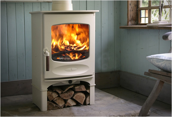
This stove from Charnwood is my main inspiration.
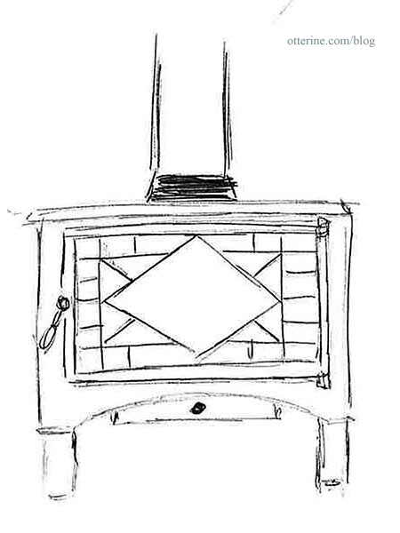
And my sketch for the version I plan to make.
Inspired by the work of Kris at 1 Inch Minis, I’ve opted for mat board. Since I am using a Grandt Line O scale diamond pattern window (3743) to serve as the door, I started there. I traced around the inside of the door frame and then marked the outline for the front.

I used circle templates to make the lower curve detailing. I added a little height to this piece since my mockup was too short in relation to the furnishings. This includes the wood storage area on the bottom. My stove measurements ended up being 1 15/16″ wide by 3″ tall.

Hello, lovely scroll saw! ;D

I don’t have a lot of practice cutting curves on the scroll saw…in fact, this was my first! So, the two sides were a little uneven. I flipped the cutout over and traced the outline onto the opposite side.

I used files and a sanding stick to even out the design. I also sanded the edges slightly to make it more rounded as though it were shaped from metal. Mine is a little fancier than the inspiration piece, but it will work well with the fancier door I have planned. I cut the back to match the front, leaving off the curved detailing.

I measured the depth required to hold the small fire from Mainly Minis and cut two pieces the same height as the front and back using this measurement as the width.

I cut an interior base to fit inside these four pieces from foam core board. I wanted a sturdy base to hold the fire inside the stove. I marked the line where the foam core shelf will sit inside the stove.

I tested the stove for fit in the room, and it looked good overall. I won’t need to adjust the brick surround much.

I think I need to switch this small fire with the wider fire I usually use, though. :D There’s a lot of space inside the stove, so I think I’m going to start by lining the sides and back of the interior with foam core.

Categories: The Artist's Studio
February 19, 2013 | 0 comments
NOTE: All content on otterine.com is copyrighted and may not be reproduced in part or in whole. It takes a lot of time and effort to write and photograph for my blog. Please ask permission before reproducing any of my content. (More on copyright)

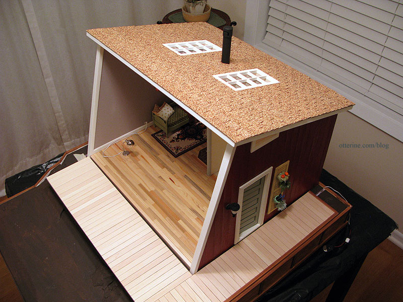
The Artist’s Studio – Shingles and chimney
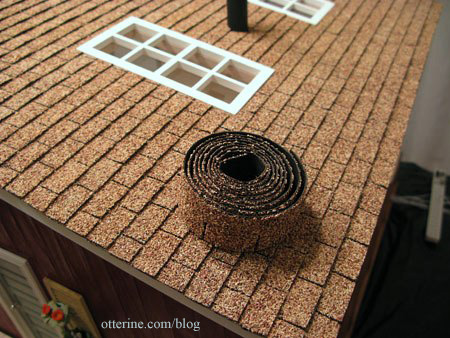
I was able to find two packages of Desert Tan rectangular shingles at All Small Miniatures, a brick and mortar dollhouse shop about an hour from my home. I had called local stores to see if anyone had them in stock, and the woman at All Small Miniatures had exactly what I needed. She was gracious enough to hold them until the weekend when I could drive out to get them. Meant to be! :D
Of course, while I was there, I had to look around…and other minis jumped into my shopping bag before I left. Anyway, on to shingling!
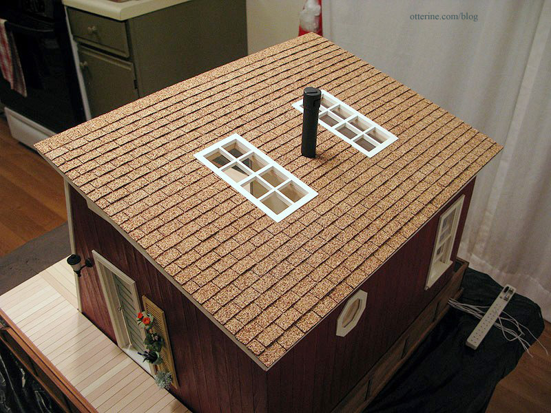
I used Quick Grip to attach these to the roof board. Easy peasy.
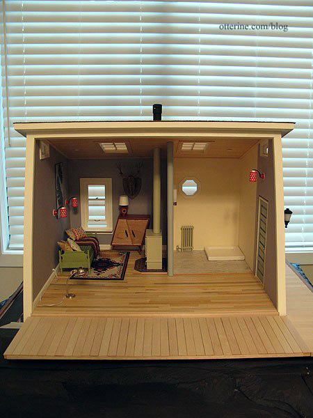
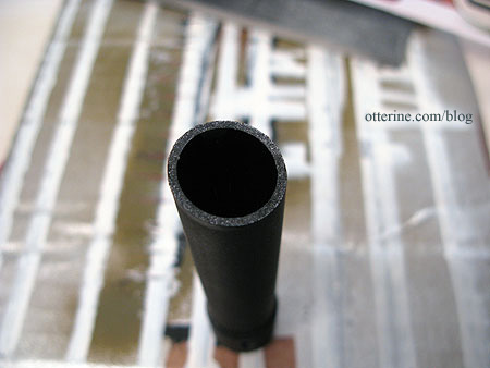
The chimney is made from bits and bobs. I had used a similar setup for Baslow Ranch. I tried to attach the chimney in the same spot as the wood stove, lining up the two visually.
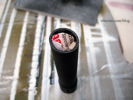
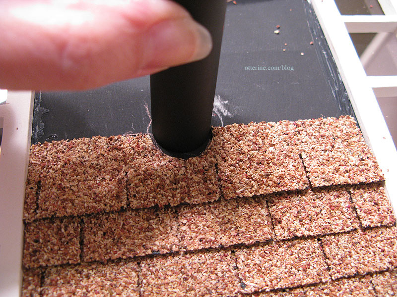
I super glued the chimney parts together and then spray painted it flat black. Since the chimney is hollow, I added a crumpled bit of newspaper inside to increase the gluing surface.
I cut the shingles around the pipe.
It’s a nice, seamless finish. :]
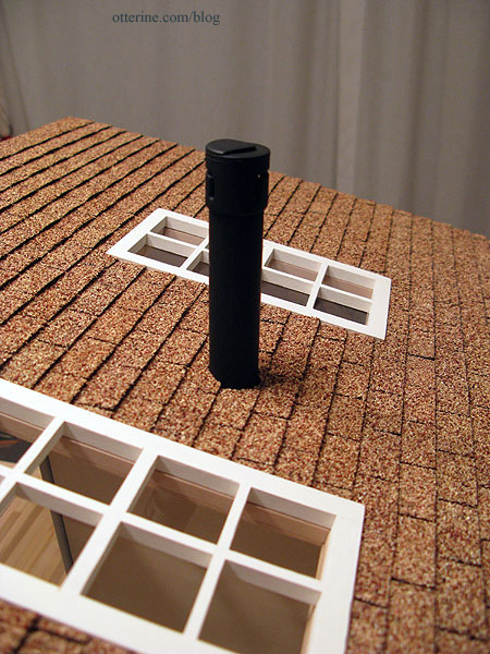
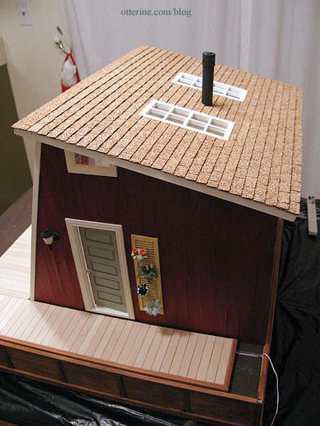
The desert tan is a great color with the red and walnut base.
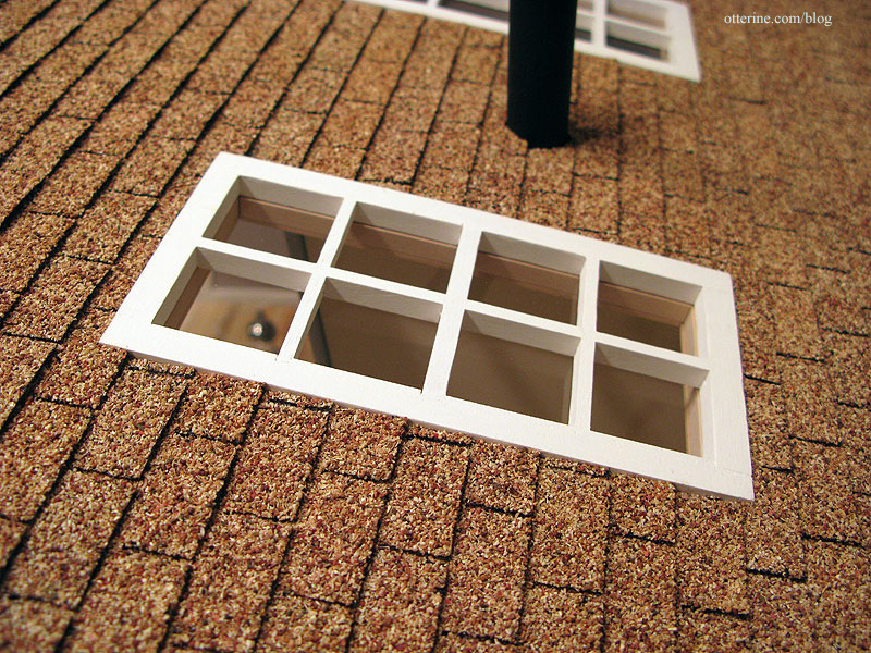
The skylights are perfectly set into the surrounding shingles.
I had a little left over in the end.
I want to offer a special thank you to Lori at Happily Ever After for taking the time to check if she could get the shingles for me. Thank you to Lolly’s for also being so helpful. And, thank you to Fran for letting me know about a new product at miniatures.com – laser cut paper shingle strips that you paint with stone spray paint to get the color you want. It would have been a great second choice!
Categories: The Artist's Studio
April 17, 2013 | 0 commentsThe Artist’s Studio – Hummingbird shower part 3
I did a little prep work and sampling before forging ahead with the tile mural. First, I photographed my original hummingbird and flower drawing and then manipulated it in PhotoShop to lighten and sharpen since some color loss and blurring occurs in printing.
There are a few ways I figured I could make the tiles. I could cut out individual tiles and paste them to a board with “grout lines” in between. The problem I foresaw with this method was matching the precise lines of the drawing and getting the grout lines even. Also, I would have to cut my tiles slightly smaller since the overall dimensions of the drawing were exact to the shower stall size I wanted.
I opted for an easier and just as effective method: making gridlines in PhotoShop. I made my gridlines the lightest of greys, just to make them fall into the background slightly. Plus, even white tile grout isn’t bright white in real life. I also made sure there was a gridline in the very center where the mural would break at the corner of the shower.
I made three test prints, the first of which had 14 half-inch tiles across with grout lines 10 pixels wide.
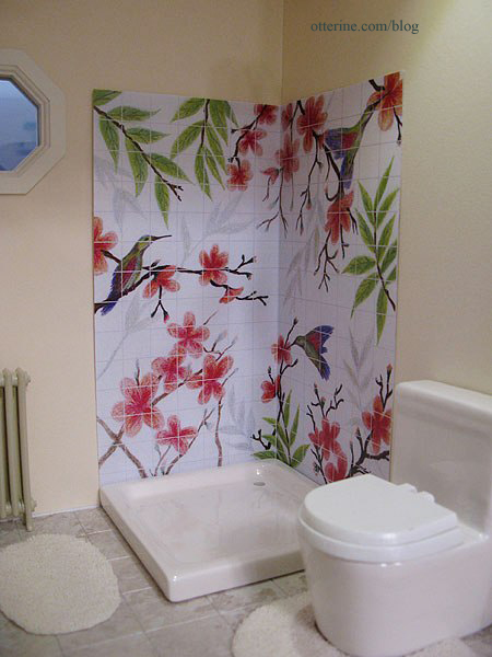
The second has the same half-inch tiles but with 5 pixel-width grout lines.
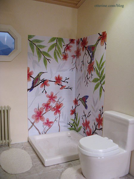
The third is done with quarter-inch tiles and 5 pixel-width grout lines.
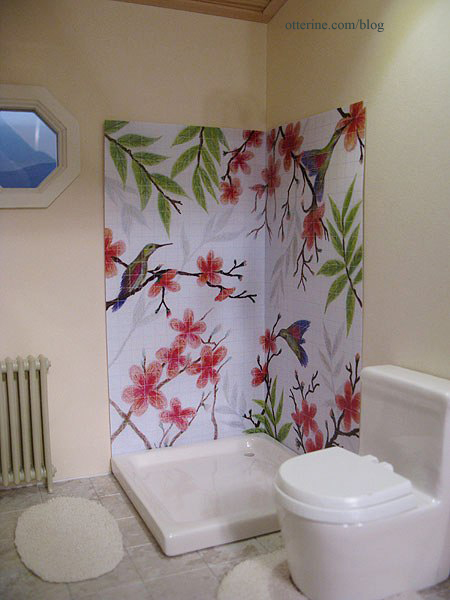
The half-inch tiles are the clear winner to me since they achieve the tile look in a realistic manner without detracting from the image the way the busier quarter-inch tiles do. The 5-pixel lines for the half-inch tiles seem better in print (in person anyway), but I will do a trial run of the next step using both samples to see which works better in the end. I don’t want to go through the whole process just to have the lines disappear for being too thin.
Categories: The Artist's Studio
April 16, 2013 | 0 commentsThe Artist’s Studio – Wood stove, part 6
I finished up the wood stove, and I am ecstatic about how it turned out! :D When I last wrote about it, I had cut the stove pipe and primed the pieces.
I sanded the pieces once the primer was dry and sprayed them Krylon Satin Almond. I sanded once between the final color coats as well. I didn’t go with high gloss since that often looks unrealistic in mini.
I cut a piece of acrylic sheet to fit the front opening.
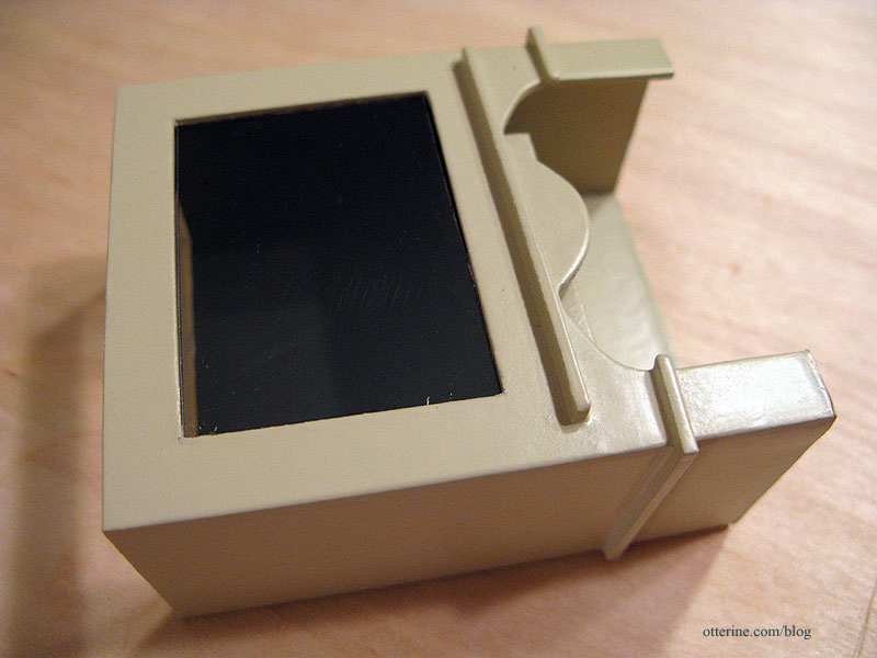
This fits using only tension, but I didn’t want to risk it coming loose. I cut a larger piece of acrylic to fit behind this piece.
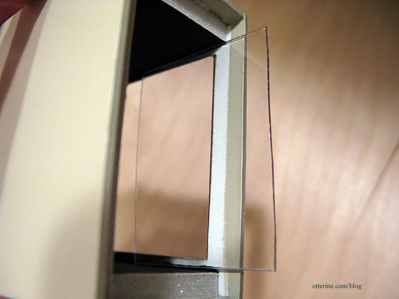
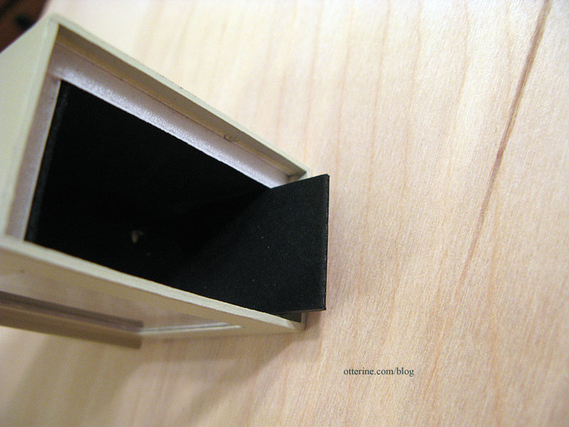
It is held in place with two pieces of black mat board glued inside.
I then glued the door in place, added a round head pin for the bottom tray latch and fashioned a knob from a jewelry finding and flat head pin. While I was painting, the delicate parts of the door grille broke. I cut part of the design away to salvage the piece. It still looks like a planned design. Crisis averted! The stove pipe has a pin in the bottom that holds it in place on the stove.
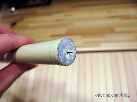
It’s a little crooked here since there’s nothing to hold it straight.
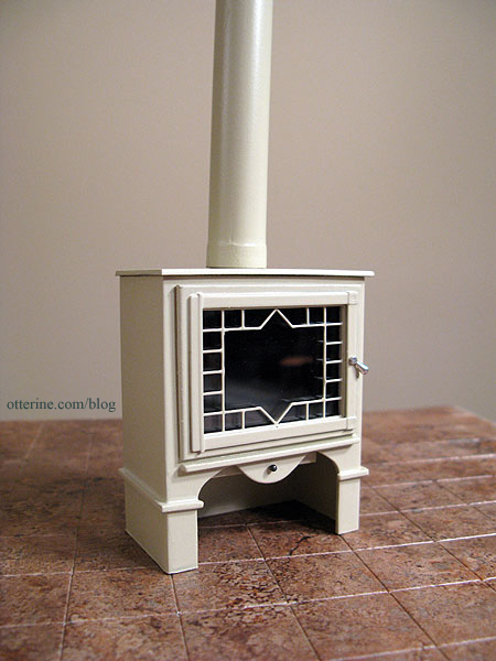
As a reminder, here is my inspiration piece from Charnwood.

Inside the Studio, I glued in the brick hearth and trimmed it with 1/16″ x 1/16″ bass wood. I was able to add in the surrounding baseboards as well.
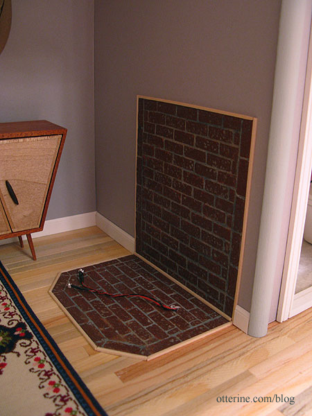
Here is my inspiration from hearth.com showing a partial brick wall.

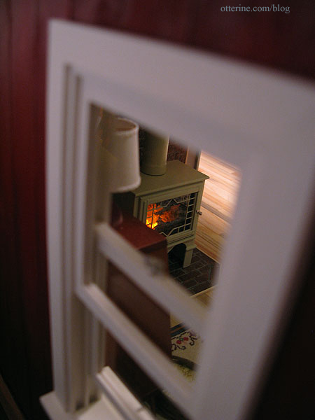
I fed the flickering LEDs into the stove and then into the resin fire. I put on the lid and set the stove in place. The stove pipe fits against the ceiling and holds the stove in place with tension alone. This is good in case I ever need to take it back out. :]
And, here it is! Love! As much as I adore red stoves, I’m so glad I went with the almond.
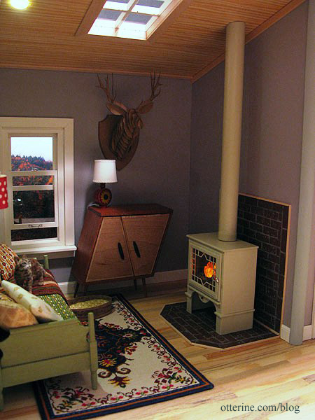
The firewood under the stove is one of my favorite details.
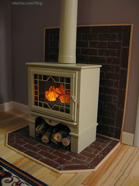
Looks cozy inside. :D
Categories: The Artist's Studio
April 15, 2013 | 0 commentsThe Artist’s Studio – Retaining wall, part 3
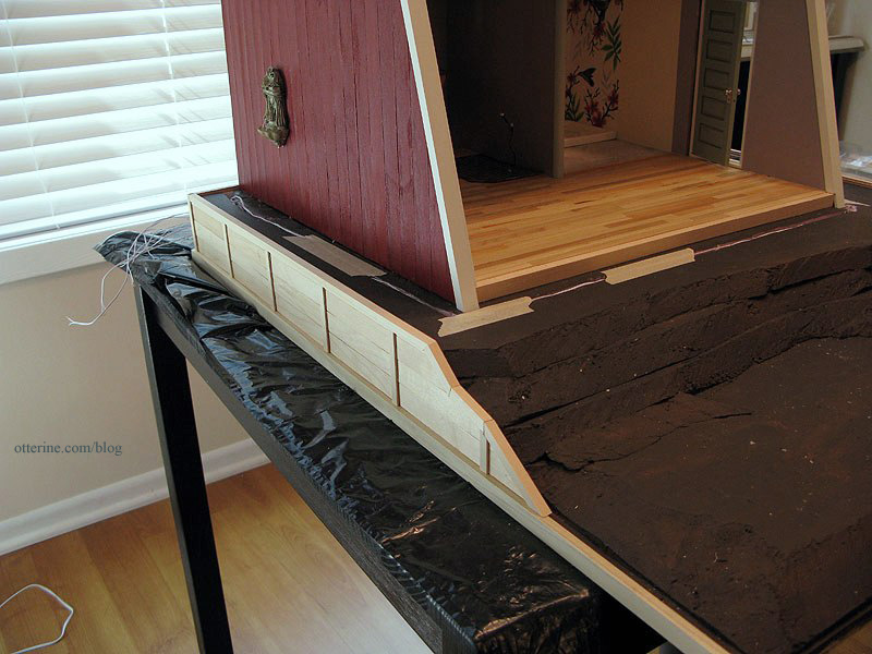
With the horizontal boards in place on the retaining wall, I glued the surrounding base boards from Mike. The next step was adding trim wood to finish the sides and back. I added 1/4″ x 1/16″ strip wood above the horizontal Woodsies planks. I then added various widths of trim around the top edge. For the back, I used some old Dura-Craft trim since it was the only wood I had on hand that fit in the space. It’s slightly different in color than the rest, but it won’t show in the end.
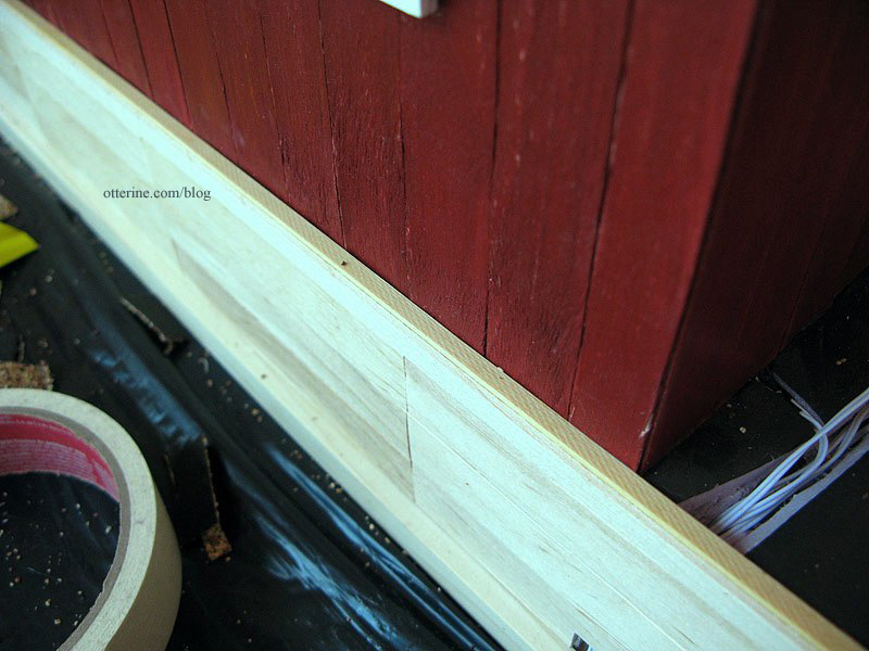
For the right and left sides, I used 1/8″ x 1/8″ trim up to the front drop of the retaining wall.
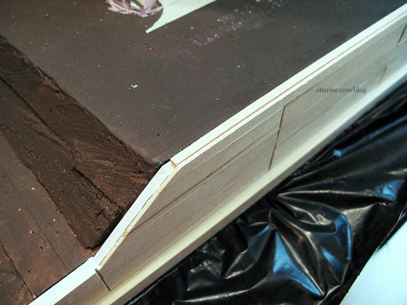
Over these edges, I added corner trim. I continued down the front of the retaining wall, cutting the angles with my scroll saw. They aren’t the cleanest joins, but they won’t be obvious once stained.
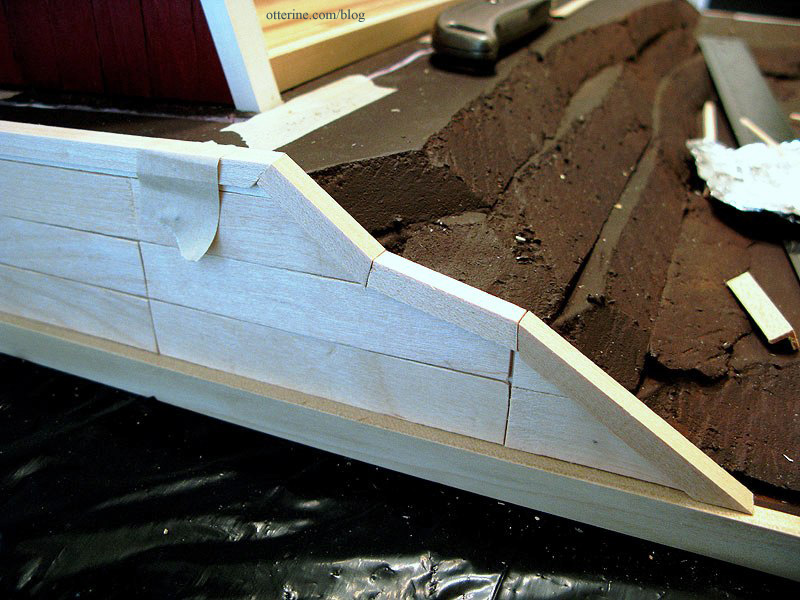
For the two rear corners, I added corner trim to finish the edges. I’ll add something decorative to finish the top corner later.
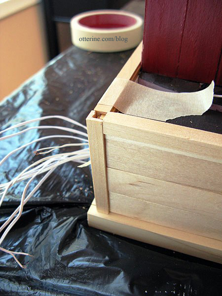
I cut vertical posts from 1/4″ x 1/16″ strip wood and glued them over the seams between the horizontal boards at 4″ on center intervals.
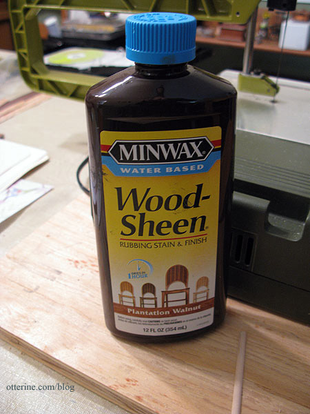
I stained the retaining wall with Minwax Wood-Sheen rubbing stain and finish in Plantation Walnut. I had purchased this on clearance awhile ago, and it works well. :]
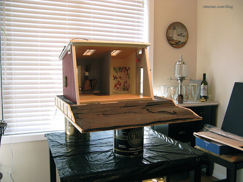
I propped the Studio up on paint cans so I could apply the stain evenly around the base. The front board will be stained separately and added after landscaping.
I taped off the wires in the back to keep from getting stain on them.
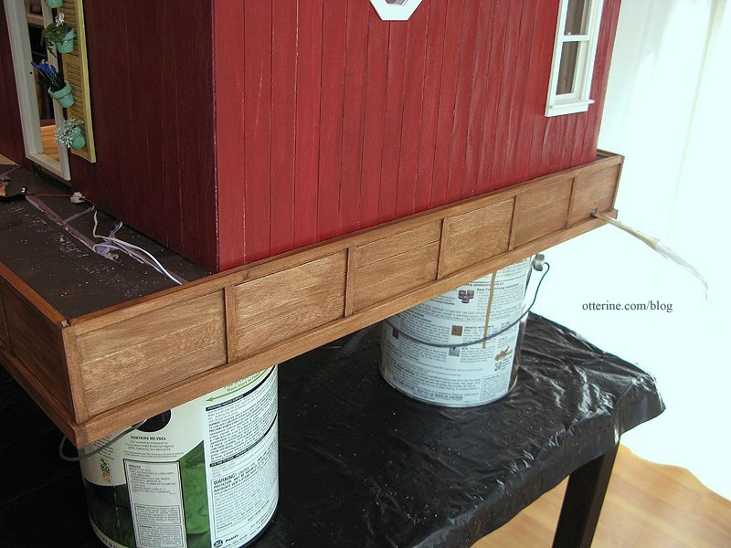
The walnut is a great color with the red. (Yes, I’ve started shingling the roof.)
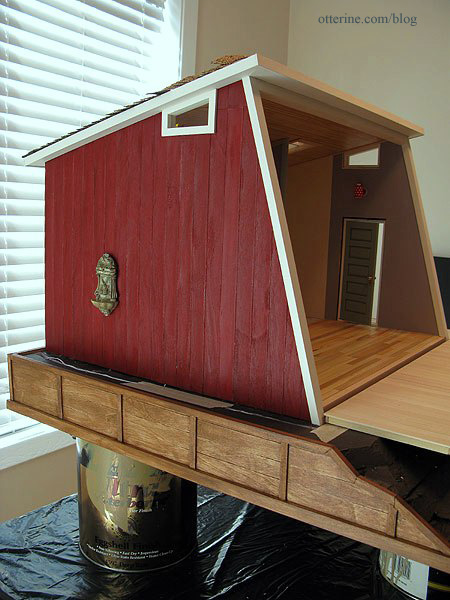
And, it will coordinate well with the walnut trim around the deck.
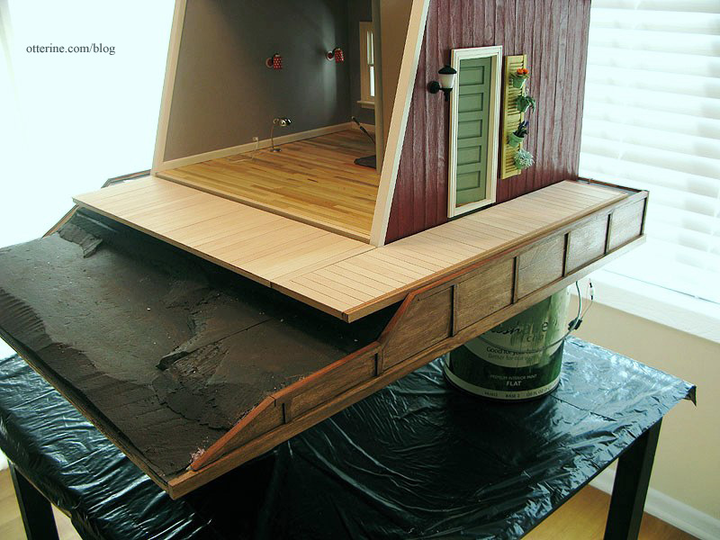
Categories: The Artist's Studio
April 14, 2013 | 0 commentsThe Artist’s Studio – Hummingbird shower part 2
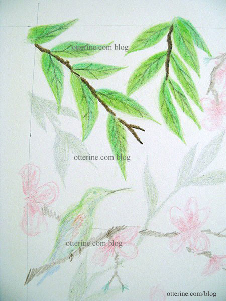
Since my initial sketch worked well for concept and composition, I’ve started filling in the final colors. I started with the leaves since I’m rather out of practice for drawing and they are the simplest part of the design.
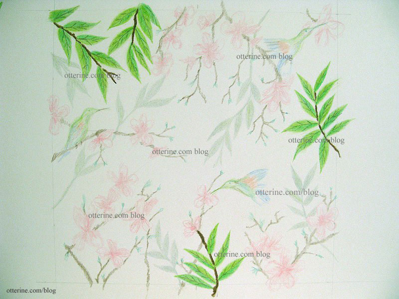
Here’s the initial sketch for comparison. I’m coloring right over the previously drawn areas.

I did all of the leaves, including the shadowy branches, at the same time. This gave me a better chance of having them turn out similarly. If I did a portion of the drawing in one sitting and then another later, my technique, pressure or lighting might be different. Once I have the drawing filled in completely, I can go back and make shading adjustments.
I started working on the flowering branches. Since I knew I wouldn’t be able to draw them all in one sitting, I decided to move around the drawing. If the remaining flowers end up looking a little different, at least they won’t be concentrated in one part of the drawing.
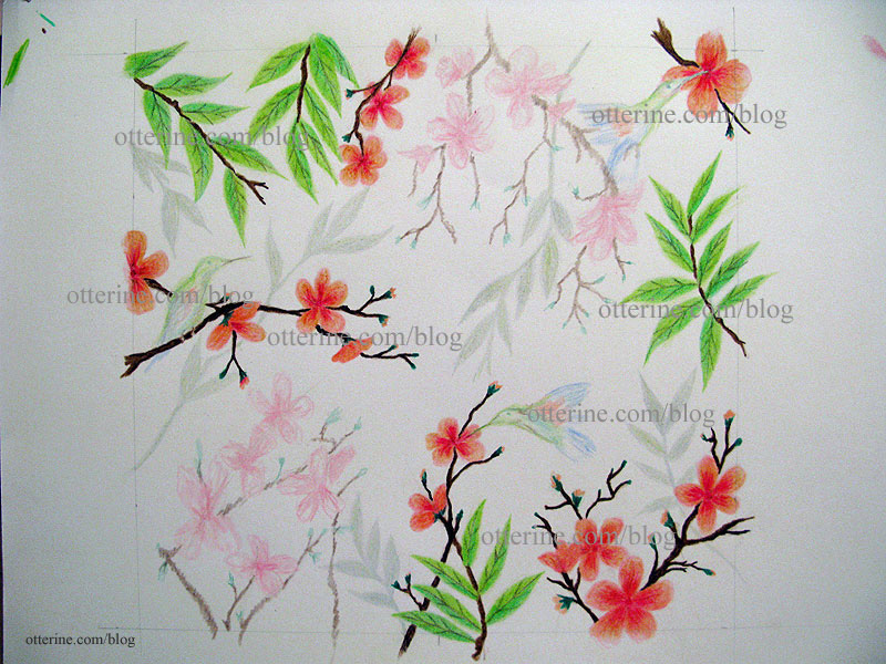
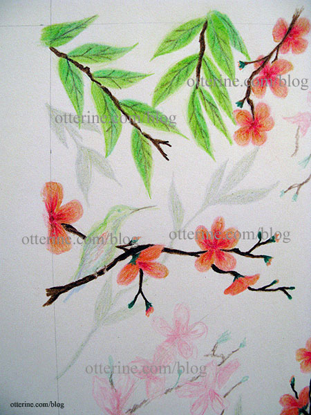
My flowers are more orange-pink than pure red pink like the inspiration art. I like that, though. Besides, once this drawing is scanned, printed and manipulated to look like tile, the colors will likely be more subdued than the original drawing. See I left room for tiny bird feet?
I finished the remaining flowers, though this time I went with a lighter touch. This brings the first flowering branches forward and gives some depth to the drawing.
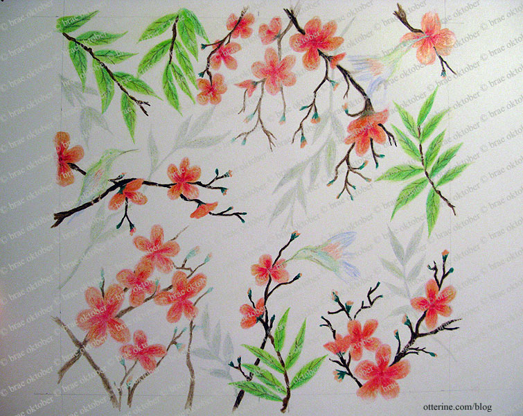
I decided to just wing it (ha) and draw the birds right on the drawing without a practice run. The drawing for the mural is now complete.
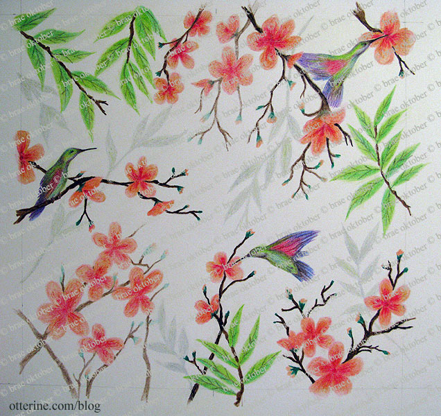
I did look at real life hummingbird pictures but continued the soft artistic feeling of the flowers and leaves in drawing the birds. They are colorful and turned out better than I had expected.
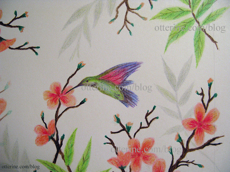
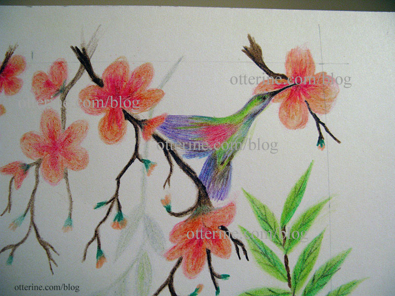

I made a quick scan and printout for mockup purposes. The end print will be softer than this one, but I love it!
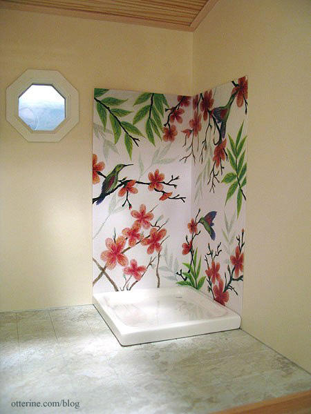
Next up — turning it into tile.
Categories: The Artist's Studio
April 13, 2013 | 0 comments
NOTE: All content on otterine.com is copyrighted and may not be reproduced in part or in whole. It takes a lot of time and effort to write and photograph for my blog. Please ask permission before reproducing any of my content. (More on copyright)


