
The Artist’s Studio – Siding and trims
I finished the second right siding piece since the first attempt was so warped. I glued it in place, then sanded and varnished the surface.
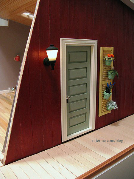
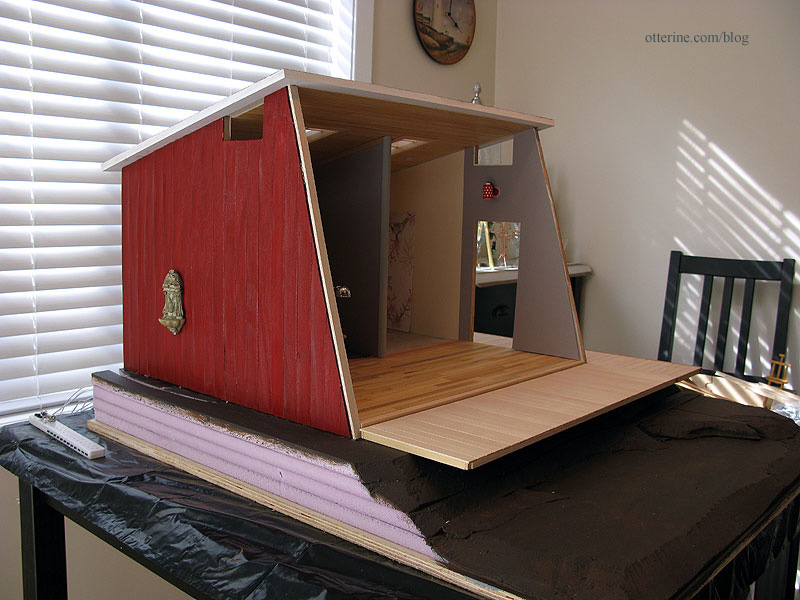
I added the coach lamp (the main door is still removable).
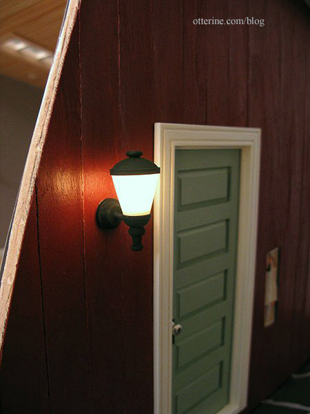
After finishing the wiring, I was able to glue the remaining piece of wallpaper on the interior.

I glued on the front edge molding and the large cross beam. These are painted Warm White with a finishing coat of satin varnish.
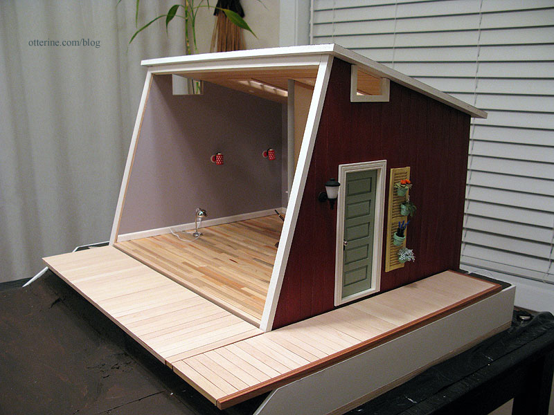
It creates a nice frame for the interior when viewed with an open front.

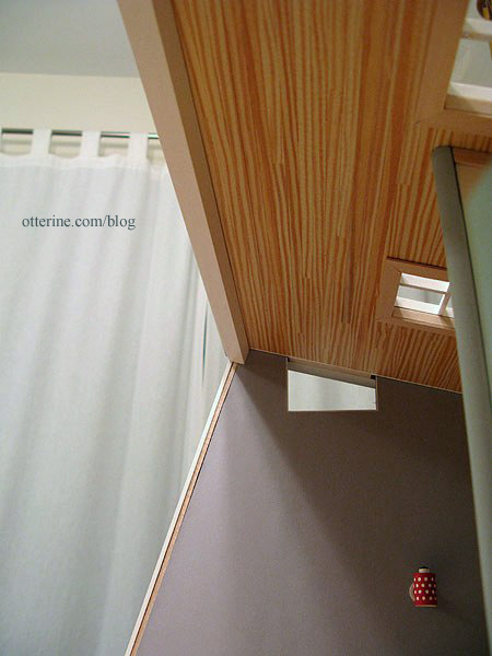
The cross beam creates a clean finish on the interior and will serve as a base for the front window wall
Categories: The Artist's Studio
April 1, 2013 | 0 commentsThe Artist’s Studio – Retaining wall, part 1
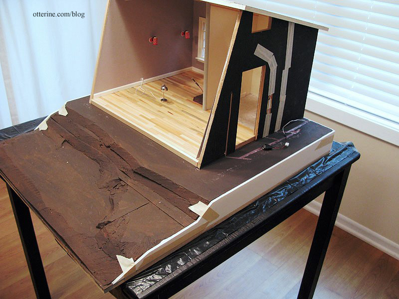
I had left enough space around the builders foam to add a retaining wall. I think the retaining wall is a nice way to finish the edges since I built up the land in order to have the leaf deck.
Since the foam layers are uneven, I cut strips of foam core board to act as filler and an even surface for the wood boards that will make up the retaining wall. Before gluing the foam core board in place, I added shims in a couple of places where needed to make the walls level. It already looks cleaner.
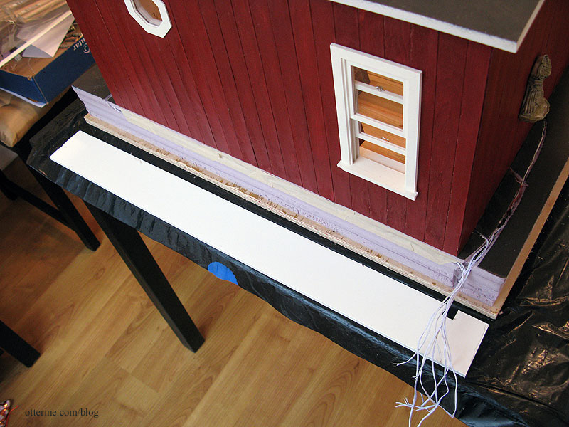
For the back piece, I cut a hole for the wires to exit the back.
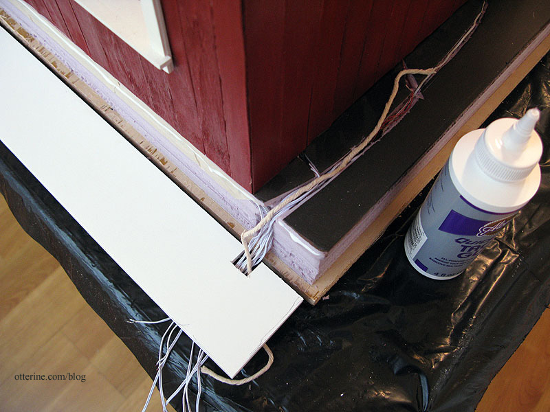
I added a length of twine from the back opening to the top side of the landscaping area. This will allow me to feed through any wires for landscaping lights I might want to add later, before the final landscaping covers this wiring channel.
I will add 1/4″ x 1/2″ trim wood around the base to finish the rough plywood edge. On top of this will sit three horizontal rows of planks. I’ll use Woodsies sticks that measure 6″ x 3/4″ x 1/16″. A box of 300 sticks was $5 before using my 30% off coupon. They have rounded edges, so each one will need to be cut.
On top of the horizontal planks, I’ll use 1/4″ corner trim. This will give the look of a solid beam on top of the wall. For the vertical posts, I will use 1/8″ x 1/4″ bass wood.
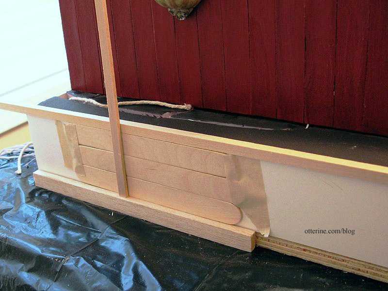
I need to pick a stain color, though I’m already thinking something dark so it won’t compete with the Studio or the leaf deck. Perhaps walnut….
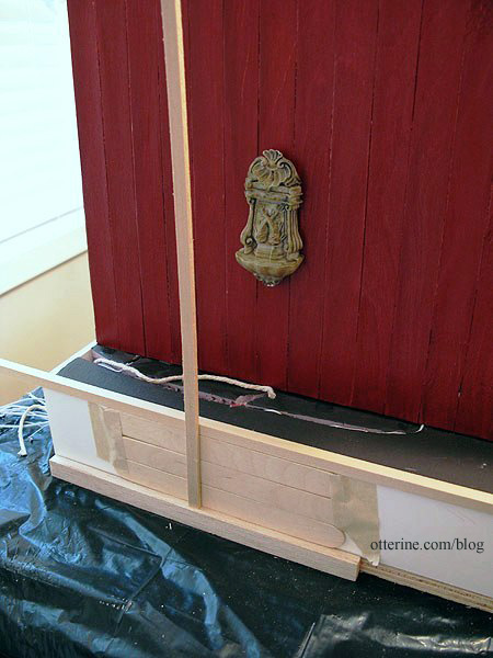
Now it’s time to cut a whole mess of sticks!!! :D
Categories: The Artist's Studio
March 30, 2013 | 0 commentsArtist paper pads
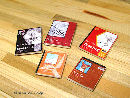
I found images of actual covers online and printed them with black rectangles on the binding edges. I always print two of each hoping to end up with one of each. :D
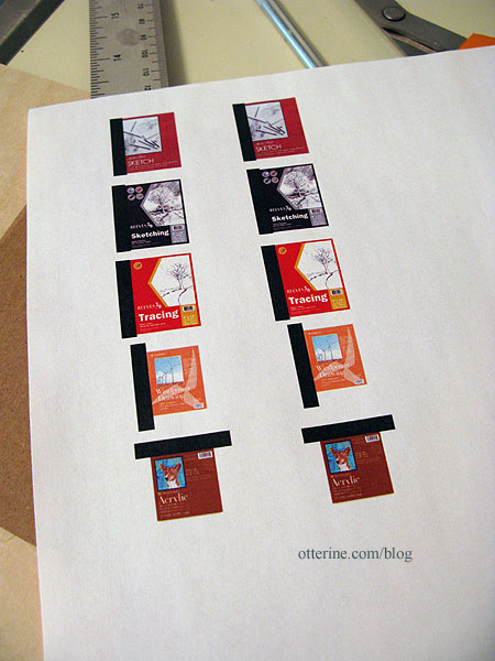
I cut white mat board to use as filler. I glued the covers onto one side of the mat board, leaving the black portion long and unglued.
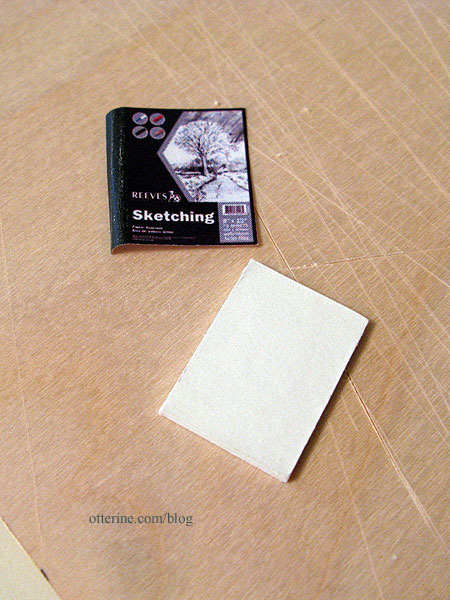
I glued thin cardboard to the back of the mat board.
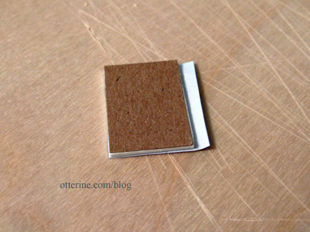
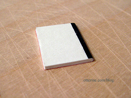
I folded the black portion over the edge and cut it to fit. Once glued in place over the cardboard, it gives the illusion of a bound edge. :]
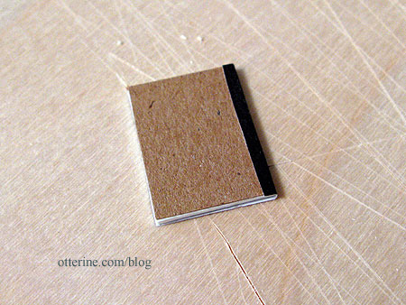
I’ve also seen them with a white backer, so if you don’t have thin cardboard you can skip that step.
I’ll make a number of other artist materials, but these are a good start.
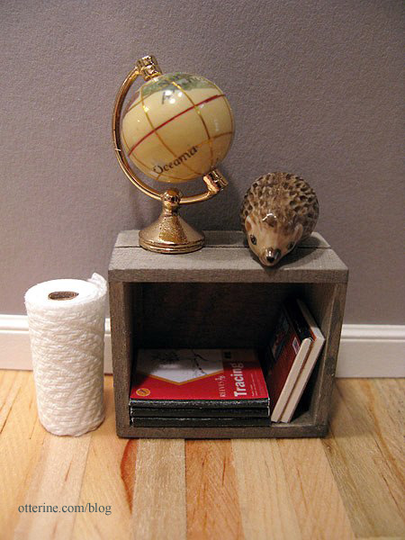
Into the crate they go. Lyssa makes the best paper towel rolls. :D
Categories: Miniatures, The Artist's Studio
March 24, 2013 | 0 commentsThe Artist’s Studio – Window wall, part 1
As a reminder, here are the two projects that inspired the basic shape of The Artist’s Studio: Rooftop Artist’s Studio by The Thomases, seen in the second gallery in this link and Nell Corkin’s Summer Studio, created in tiny 1:144 scale.
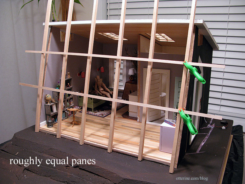
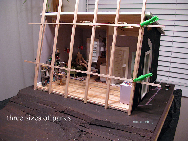
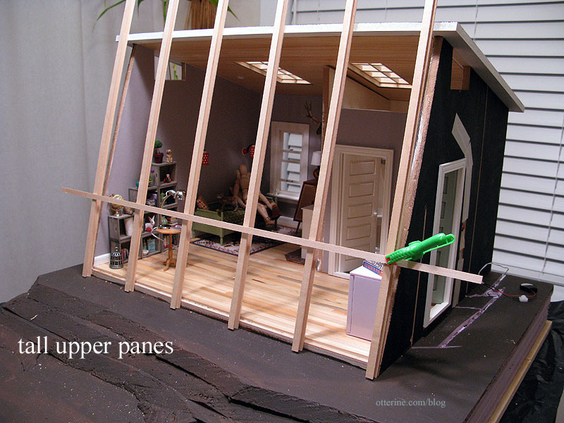
Using some spare strip wood, I mocked up four versions for the front window to see what worked best. These photos were taken before a lot of the recent work was completed, so it might look a little off. :D
Wide vertical sections with roughly equal panes
Wide vertical sections with three sizes of panes
Wide vertical sections with tall upper panes
Narrower vertical sections with tall upper panes
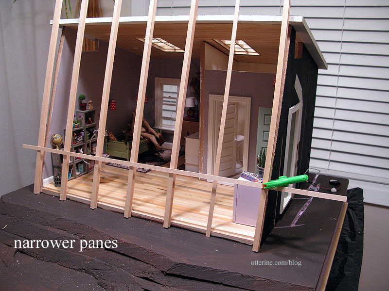
The building will be red, and I was planning on painting this window Warm White. This window will also be removable. I took a friends and family vote, and they chose the wide vertical sections with tall upper panes, and I concur! :D
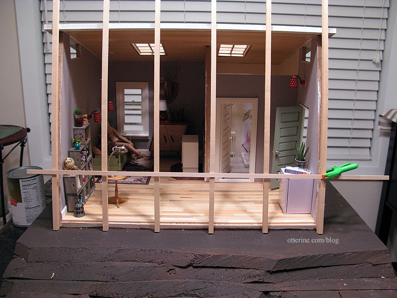
I think it’s a good balance with visual interest without being overwhelming.
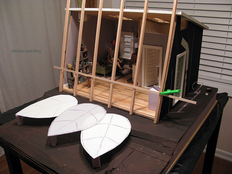
Now to actually build the thing… :\
Categories: The Artist's Studio
March 22, 2013 | 0 commentsThe Artist’s Studio – Firewood
I cut some firewood for the wood stove and walnut firewood box. There was an old farmhouse near my parents’ place in a local suburb. I don’t think anyone around here appreciates an old white farmhouse like I do. I suppose there could have been structural issues with this particular one, but I still think it’s a shame when a bunch of suburban cookie cutter McMansions take over old, beautifully detailed houses.
Anyway, they did save most of the trees on the lot but cut down the largest of them. I was horrified when they did it. Again, the usual thing around here is to cut down every old tree, build a house then plant new tiny trees. They cut this one down because they failed to take its location into consideration when planning the garage. I went over there after the damage was done and grabbed a branch from the ground.
That branch has been waiting for just such a project as the Studio…

I sawed tiny logs from the main branch with a tiny saw. :D The branch is quite dry, so I was able to just snap the smaller pieces apart.

I split the larger pieces using a chisel and rubber mallet. What interesting grain patterns! It smells good, too.

Some of these pieces will fit under the wood stove (pardon the primer).

I love the textures and colors.

Since the firewood box will hold the battery and switch for the wood stove and I don’t want to have to rearrange firewood each time, I made a fake wood stack that can be lifted out of the firewood box.
I added small scraps of walnut 3/4″ high to hold the wood stack above the battery and switch (not yet added).

I cut a flat piece of walnut smaller than the opening of the firewood box and set it inside.

I glued a stack of firewood to this new base and the logs to one another until I had a good layout.

I left four logs loose so I can arrange them on top at random. No one would be the wiser just looking at the firewood box. :D

Whenever I want to operate the switch, I just lift out the wood stack. It lifts out without the aid of tweezers, but my big hand blocking the view would have defeated the purpose of a photo. :D
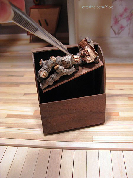
Here are all the pieces together.

A fitting memorial for a beautiful tree in front of a beautiful house, both of which are no more.
Categories: The Artist's Studio
March 18, 2013 | 0 commentsThe Artist’s Studio – Gluing ceiling board
Since the front opening trim had been cut and sorted, it was time to finally glue the ceiling board to the main structure. Scary to be completely out of dry fit! :O
I added one nail to help hold the dividing wall in place since my cut ended up being further off than I had hoped. I had drilled a pilot hole into the wall and ceiling board to keep the mdf from splitting.
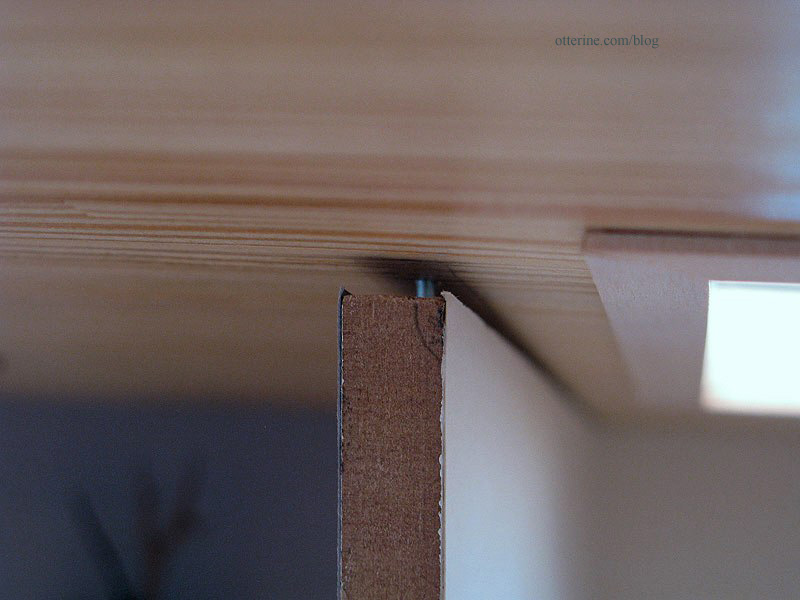
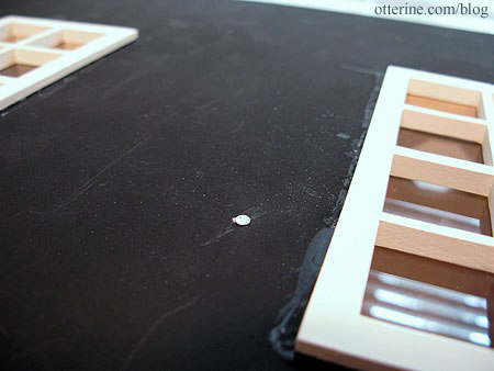
I wired the two recessed can lights. The roof is now ready for final finishing – just awaiting the shingles from the supplier.
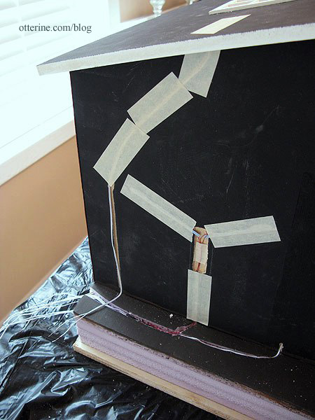
With the ceiling on, I tested fit of the front edge moldings. I knew they would be too long before I added the ceiling board. Instead of trying to sand or shave off a tiny bit, I just mashed them into the foam base until they fit under the ceiling. Haaaaa!
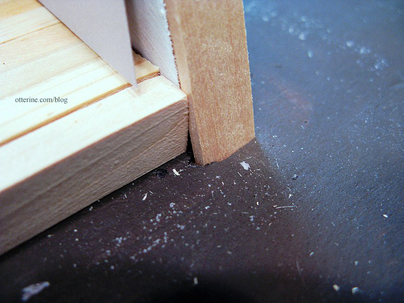
To finish the front opening along the top edge, I cut a strip of 1/2″ x 1/2″ balsa. I used balsa because I had it on hand, and my scroll saw made a clean cut through it without any crushing along the edges. :D
To make this piece level across the top of the ceiling board, I will need to mount the right front molding slightly away from the lead edge of the wall at the top. I’ll add a tiny shim in there when I glue it all in place. Interior trim will mask all of this madness.
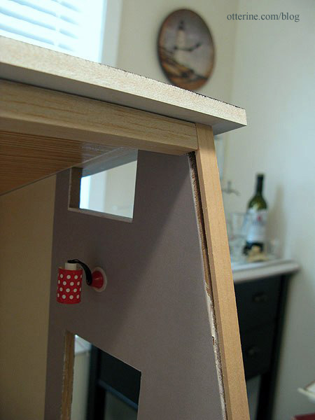
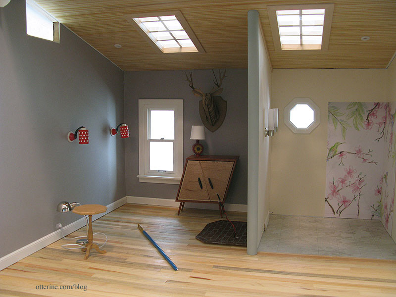
The structure will have a clean, finished look when viewed with an open front.
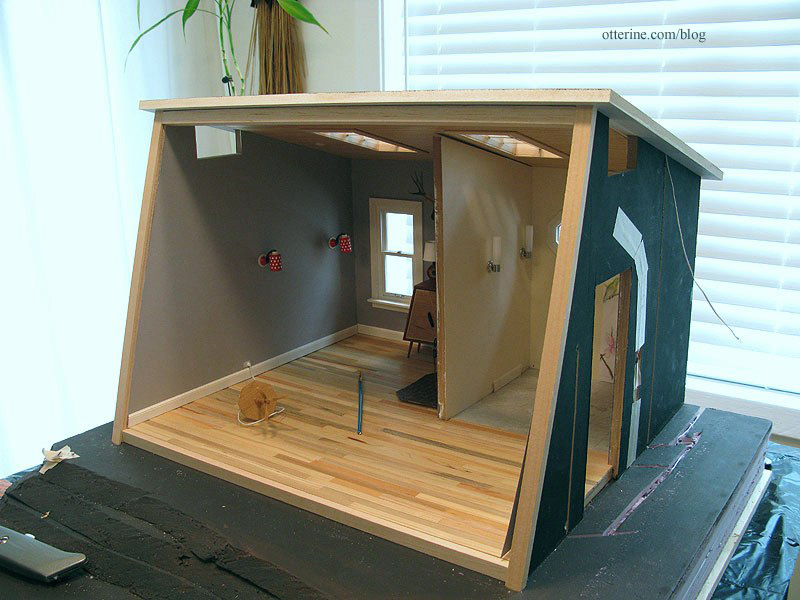
I glued the left siding template in place. The right side template needs to be recreated from the start. I failed to press it in time to dry after painting, and the wood has never straightened correctly since even with attempts to fix it. I sanded and sealed the left siding once the glue dried.
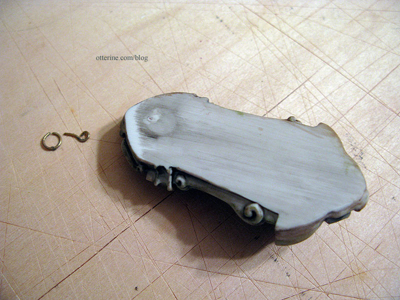
I snipped the bracket from the back of the water fountain and tacked it in place over the wiring access hole with mini hold wax.
I glued in the plain wood trim at the top edges of the dividing wall. You’d never know there was a gap. :D
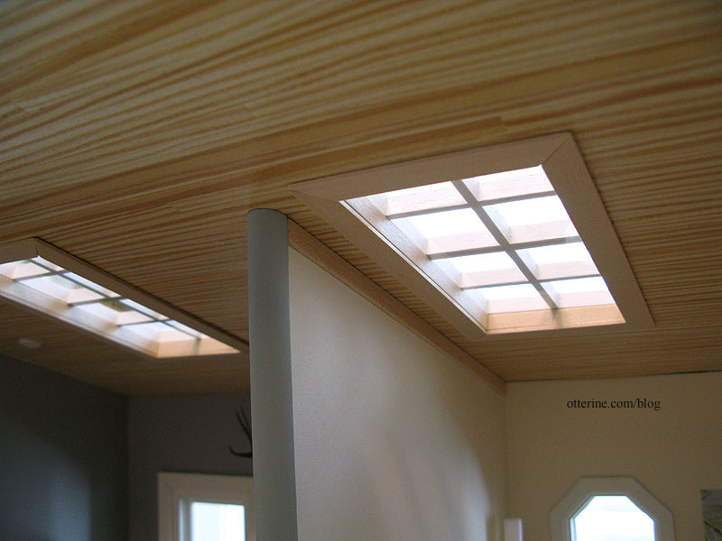
The main half round beam will remain removable with the front bathroom wall. It’s easily held in place with mini hold wax. I painted this Country Grey by Americana to match the paper instead of Warm White to match the trim. I thought a bright white vertical line in the middle of the Studio would be distracting.
Categories: The Artist's Studio
March 17, 2013 | 0 commentsThe Artist’s Studio – finishing front edges
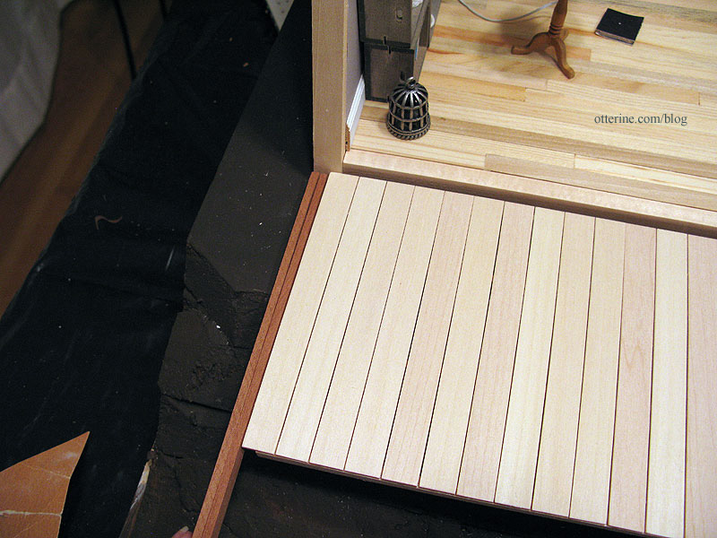
Who knows why the Studio is uneven along the front edge of the floor even though the walls measure the exact same depth. Perhaps the individual floor boards are misaligned overall. It’s nothing that can’t be fixed.
To finish off the front edge of the floor, I used window/door frame strip wood from Manchester Woodworks. It’s used to make windows and doors. It measures 3/8″ by 1/2″ and fits over 3/8″ wood cleanly.
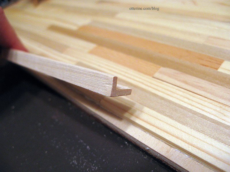
The frame wood blends well enough with the wood floor and gives an even surface to attach the main front deck.
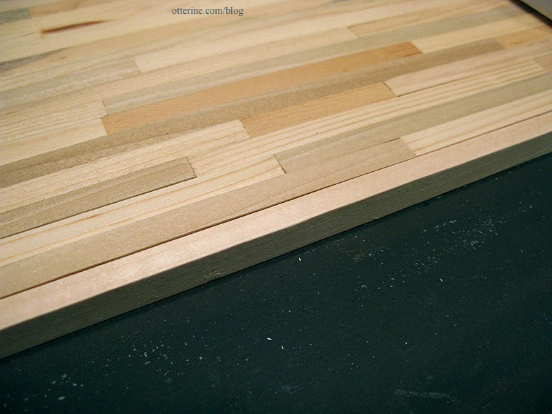
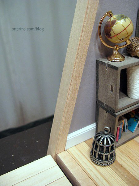
I used the same frame wood to finish the front edge of the right front wall. The trim extends 1/16″ past the front edge.
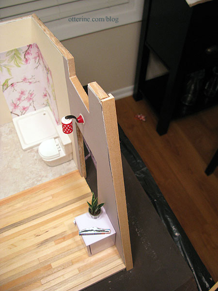
As noted before, the left front didn’t match up to the right, so I added a 1/8″ thick strip of balsa to build up the wall.
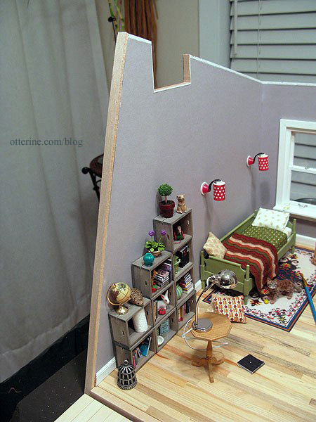
Now the frame wood sits on top of this shim and extends 1/16″ past the front edge.
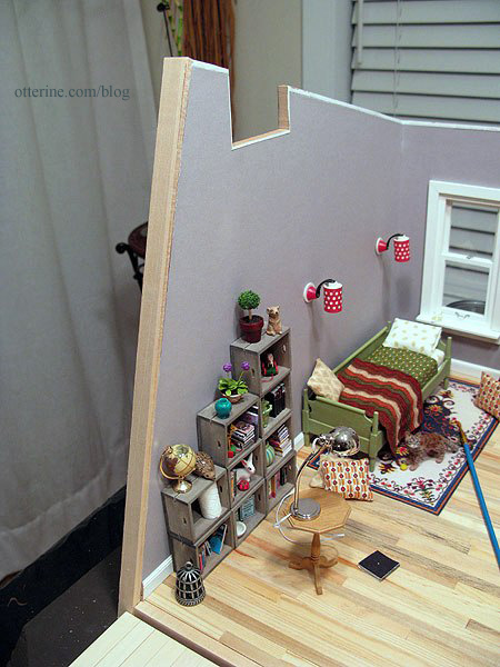
The main deck and side deck sit around the frame wood.
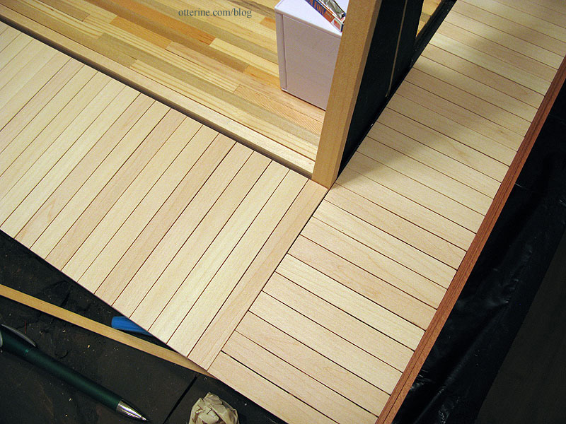
Between the edge of the building and deck, a strip of walnut fits in the gap. I’ll cut a full strip to fit.
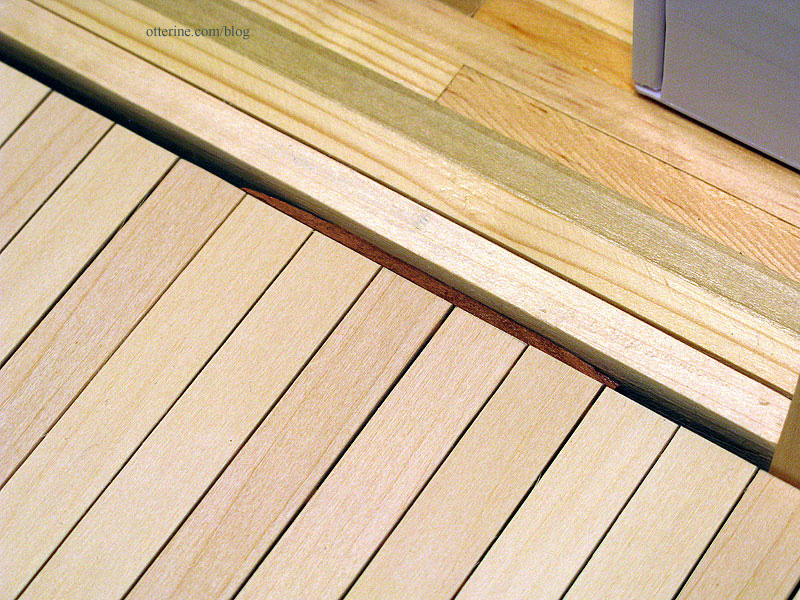
On the right side, the double layer of walnut trim wood makes the deck flush with the side wall. It all fits now! :D
On the inside, trim wood will finish the lead edge of each wall.
Categories: The Artist's Studio
March 16, 2013 | 0 commentsThe Artist’s Studio – Skylights
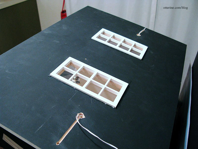
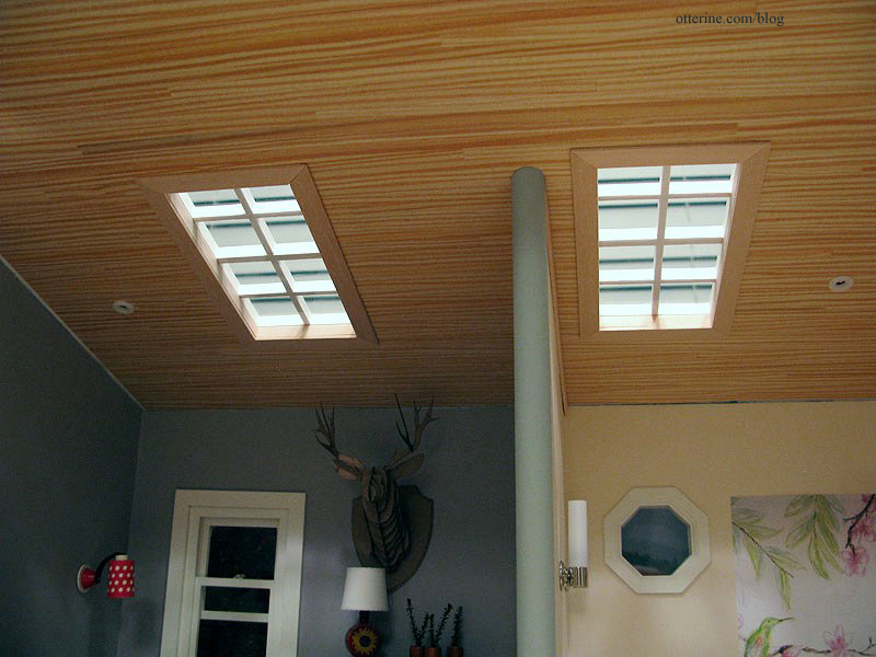
I used two Houseworks 8-light windows for the Studio skylights, though I had to widen the original openings in the ceiling to fit them. I painted the exterior portion Warm White by Americana. I put the board on a towel to keep the painted windows and wood ceiling from being scuffed as I worked.
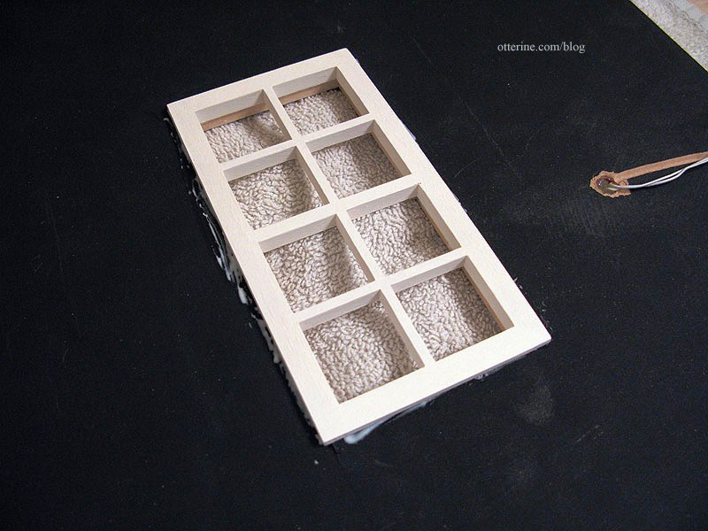
The windows don’t come with window inserts, so I cut inserts from acrylic sheet.
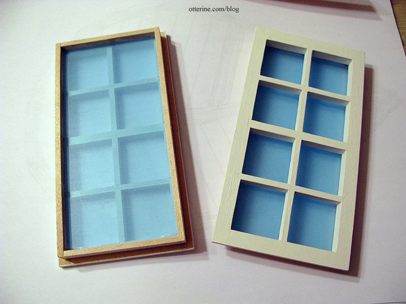
To hold the window insert in place, I framed the interior with strip wood. This was easiest to do before installing the ceiling board permanently. I left it natural to blend with the ceiling treatment. I sanded the wood smooth and sealed with satin varnish before cutting the pieces to fit.
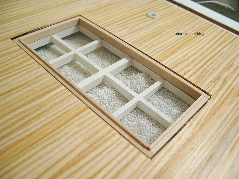
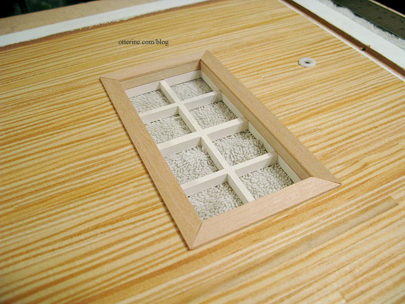
I then added flat trim around the window openings, also natural with satin varnish. I tried to cut them as best as I could with the Easy-Cutter. Being that there is no paint to disguise the slight gaps at the corners, I’ll just have to live with it. I suppose a little wood filler might help…I’ll have to pick some up next time I’m at the hardware store.
From the outside…
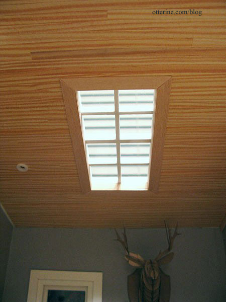
And, from the inside.
I have the half round trim for the dividing wall cut and painted; the trim that will hide the gap above the wall is also cut and sealed. Neither is installed yet.
Categories: The Artist's Studio
March 12, 2013 | 0 commentsThe Artist’s Studio – Wood stove, part 5
Continuing work on the wood stove. For the stove pipe, I used the wooden dowel that came with the HBS Loft kit. I measured against the outside wall to get the precise angle the pipe would hit the ceiling and used my scroll saw to make the cut. The scroll saw has a nifty angle guide for just these types of cuts.

I tested the fit in the Studio to determine where the pipe would rest on the top of the stove. I made this cut with the scroll saw as well. There’s another guide that can be tightened anywhere along the surface for straight cuts.

Looks like it worked! :D

Using 1/4″ art tape, I made a lower collar for the pipe. This will add a little visual interest to the top of the stove.


I put cardboard to block the door opening for painting, curling some excess behind the scrap to hold it in place.

I cut another piece for the top. It doesn’t have to be precise since I will paint the interior by hand.

I sprayed all pieces primer grey.

I had attempted to start with an undercoat of flat white, but it didn’t really take. It bled through the grey in some areas, but this is just the first coat of primer anyway. Once this dries, I will do a fine sanding and await another suitable day for spray painting the final color.

I’ve also painted the Chrysnbon radiator for the bathroom. I first sprayed it primer grey and then covered that with Krylon Satin Almond. It’s a not a perfect finish, which is actually pretty great for a radiator. I’ll do a bit more aging once this paint dries, too.

My plan is to have the stove Satin Almond as well. But, if all else fails, there’s always powder-coated black to mask the imperfections!
Categories: The Artist's Studio
March 10, 2013 | 0 commentsThe Artist’s Studio – The Deck, part 3
Continuing work on The Deck. To finish the outer edges of the side deck, I used dark trim wood from my stash. This is definitely Dura-Craft wood, but I am not sure from which kit or if it is walnut (I think it is). It’s close in color to the wood I plan to use for the leaf portions of the deck and using existing materials will keep the cost down.

I love the play of light and dark, and it was such a simple design element. I didn’t trim the main deck yet, since I want to finish the leaf sections first.
The leaves. After a lot of deliberation, I decided to use the same reverse approach I did with the main and side decks. I would form the surface boards first and then work on a supporting framework. Beyond that, I thought developing the walnut outlines and center veins, then cutting the individual boards for the interior portions would be the simplest approach.
I started by redrawing my leaf shapes. My mockup had used rough sketches and cutouts. I used a 5 7/8″ diameter lid, which was close to my original mockup size, to make one end of the leaf.

I marked a point the length of my original mockup (9 1/4″). Digging into my art supplies for a flexible curve, I created a gentle curve first on one side and then the other.

I cut the leaf out and made two more leaves from this one.

I marked the outline 3/8″ inside the outer edge. Since my deck is smaller in proportion to the original and this will be my first major scroll saw endeavor, I kept the center veins soft — just enough to give a sense of movement without overly complicating matters. :D They are also 3/8″ wide.

On a new sheet of paper, I measured from the bottom and marked 7/16″ intervals. I was planning on 3/8″ boards for this portion as well, and 7/16″ allows for some room between each plank. I drew lines to make a base guide.

I positioned the leaf template over the lines so there would be a good layout of whole board widths.

I taped the leaf in place and traced the lines onto the template.

I did the same for the other side, varying the angle of the lines.

I darkened the boards that would be walnut, repeated the process for the other two leaves and tested the fit again.

Hooray! :D

The pencil makes these very messy, so I will make photocopies to work with going forward.

Categories: The Artist's Studio
March 9, 2013 | 0 commentsThe Artist’s Studio – The Deck, part 2
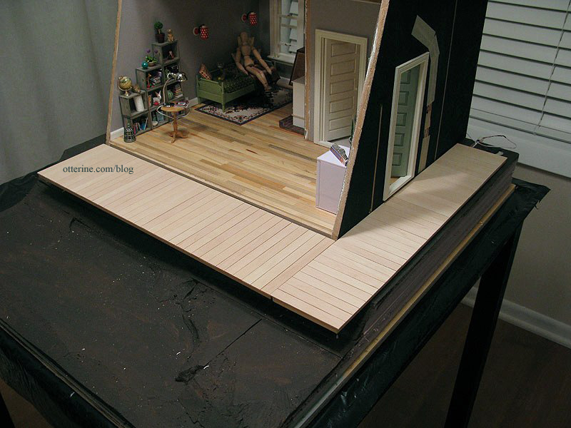
The framing under the main deck and side deck won’t show much, so I used some leftover Dura-Craft 3/16″ x 1/4″ strip wood to keep costs down. The wood isn’t nice enough to use for building or finishing anyway.
I started with the side deck since it requires the longest part of the framework. I transferred the top boards to a work surface, this time keeping the back side facing up and lining up the ends using a T-square. I used double sided tape again to keep everything in line.
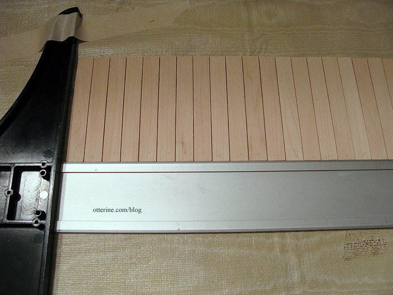
I cut two long pieces and two short pieces of the Dura-Craft trim, gluing them to the flat boards and to each other at the corners. I cut one additional long piece for the center of this box and glued it in place. I had to use the glue sparingly so it wouldn’t bleed through between the boards. I left more leeway on the uneven side, which I’ll explain in a moment.
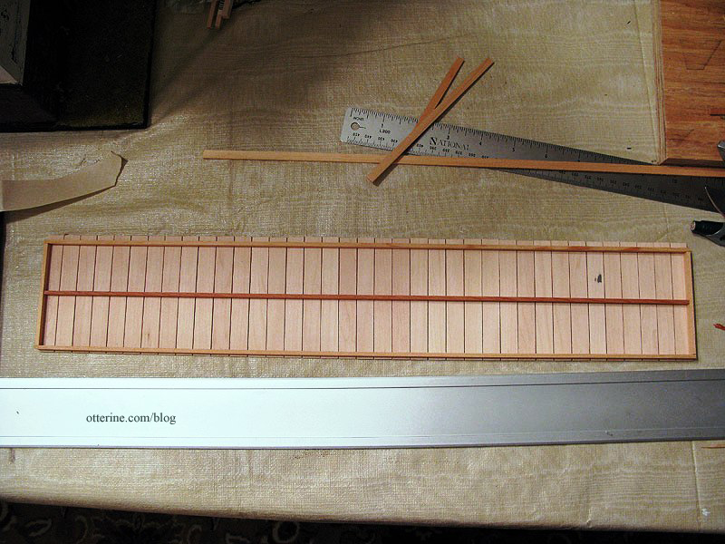
But, when I lifted it off the tape, some of the boards separated. :\
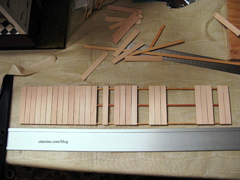
Ah, well, it wasn’t a total loss. I glued the boards back in place. A good, solid assembly. :]
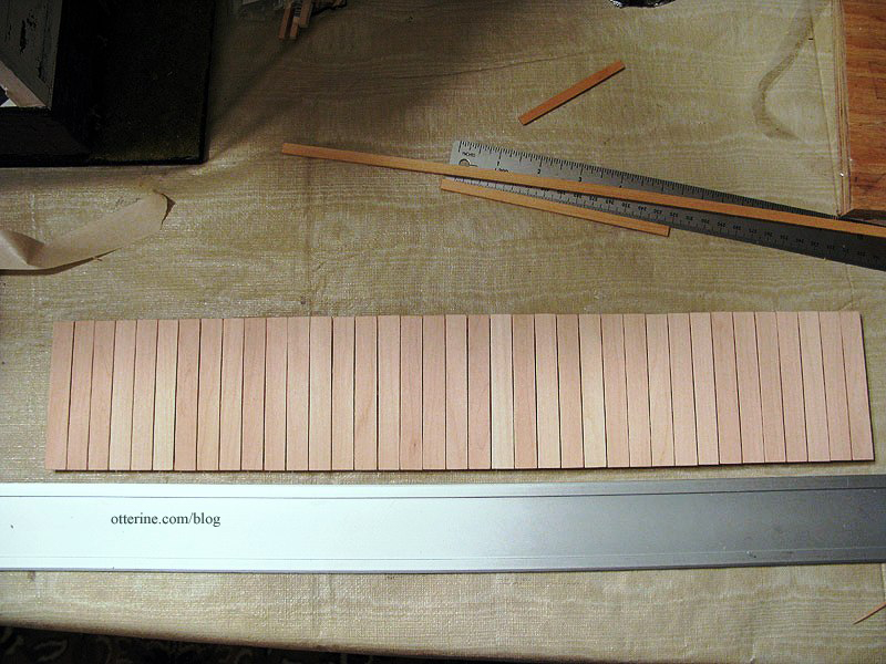
As mentioned above, since one side had been aligned with the T-square, that left the other side uneven. I marked the boards 3 3/8″ across (down from the original 3 1/2″).
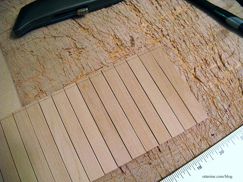
I slid a piece of plywood under the edge and cut off the excess.
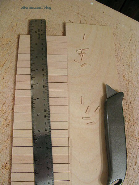
I repeated the process for the main deck, adding two inner lengths for support. This time, after putting the double sided tape on my work surface, I tapped it with my fingers to reduce the hold it would have on the flat boards. I had only two boards come loose when I flipped the assembly over.
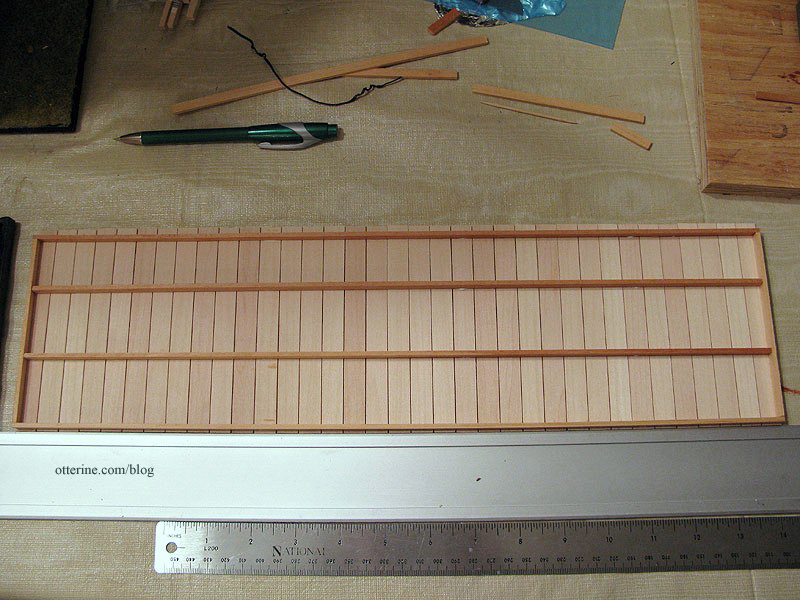
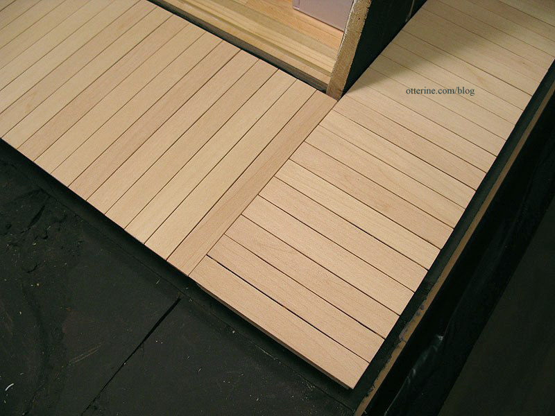
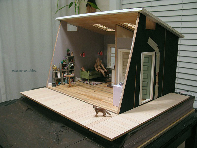
I also cut the boards down to 4 7/8″ from their original 5″ to align the uneven edge. I will keep the two portions separate so there is no strain at the corner.
It’s a clean fit. :D
So far, it’s working! :D
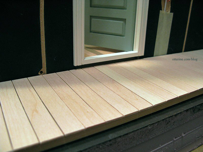
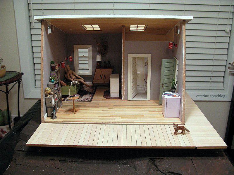
There is enough of a gap under the door to require a step.
I think Cora likes it.
Categories: The Artist's Studio
March 8, 2013 | 0 commentsThe Artist’s Studio – Walnut firewood box
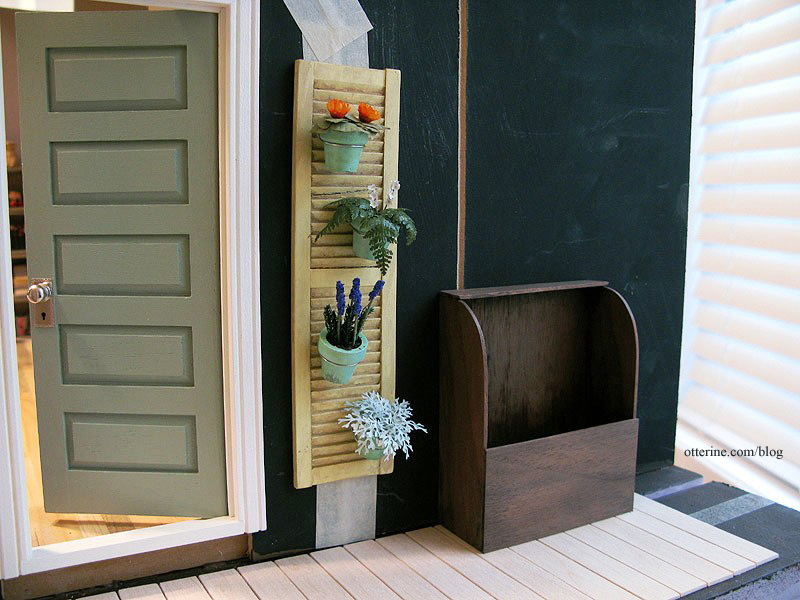
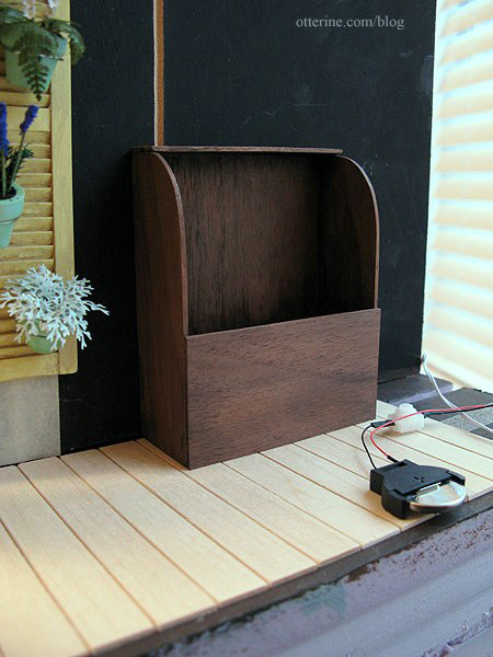
Building a firewood box for the Studio served two purposes. It will hold the wood stove switch so I don’t have to reach into the structure to operate the flickering LED fire, and it gave me the opportunity to work with walnut using my scroll saw.
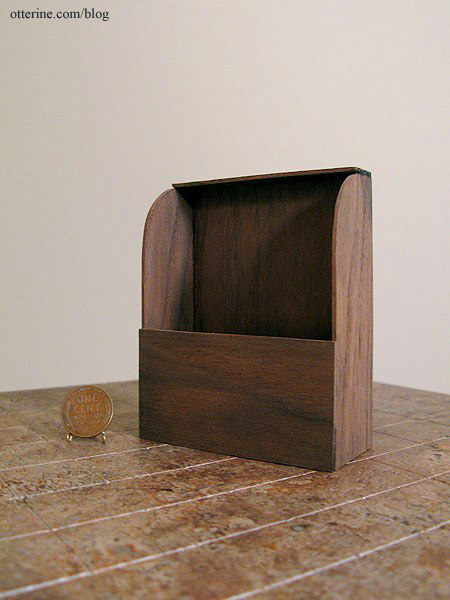
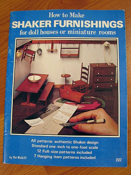
I followed a pattern in the book How to Make Shaker Furnishings for Doll Houses or Miniature Rooms by Pat Midkiff. What a long title! :D
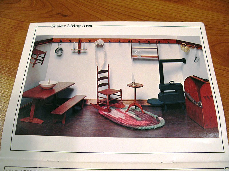
Here’s the living area photo from the book. Unfortunately, there is no pattern for the stove included. There are three pegs on the side of the firebox in the photo. I didn’t add them to the one I built since I didn’t have a walnut dowel.
The pattern was very simple to follow, and my two cut curves came out very close! :D I did change the dimensions slightly, because the sheets of walnut I had on hand were narrower than the largest pattern piece. I finished the box with one coat of Delta Ceramcoat Satin Varnish to bring out the beautiful color and grain. I added a light wash of black and brown to make it less shiny and new.
I will finish the side deck before drilling the hole in the bottom for the battery and switch.
Categories: The Artist's Studio
March 7, 2013 | 0 comments
NOTE: All content on otterine.com is copyrighted and may not be reproduced in part or in whole. It takes a lot of time and effort to write and photograph for my blog. Please ask permission before reproducing any of my content. (More on copyright)

The Artist’s Studio – The Deck, part 6
I taped the outer walnut boards and the center vein onto the frame support to mark where the support beams should end under the surface boards.

I cut the frame using the scroll saw, cutting in slightly to allow room for a veneer finish around the outside.


The local Home Depot had only the iron-on pre-glued veneer strips, and I didn’t want to wait to order online, so I used birch veneer. I had some leftover from previous projects. I cut a strip 1/4″ wide and glued it around the outer edge. It doesn’t hit every point, but that’s fine with me. It creates a natural, smooth finish around the outer edge and hides the framework (unless viewed from underneath).

After staining the veneer with Minwax Plantation Walnut, I began gluing the boards to the framework, using wood glue supplemented with super glue gel. Once I had the walnut pieces glued in place along the outer edge and center, I pressed the assembly flat with magazines and waited for the glue to dry.

Once the glue set on leaf 1, I started adding the cross boards using wood glue (and super glue gel only as needed). In some areas, the frame seems to show more than I would like but in the end it shouldn’t be as obvious.

By having the copy of the drawing underneath, I could see where to apply the glue so it wouldn’t seep out.

One leaf assembly done! :D

Categories: The Artist's Studio
April 25, 2013 | 0 commentsThe Artist’s Studio – The Deck, part 5
I finished up the second leaf for The Deck.

The third leaf had the most complicated design of the three, so I left it for last. Once the second leaf was complete, I went back to the first leaf and re-cut some of the boards for a better fit. Next was figuring out the framework. As a reminder, here is the frame support system for the real life deck.
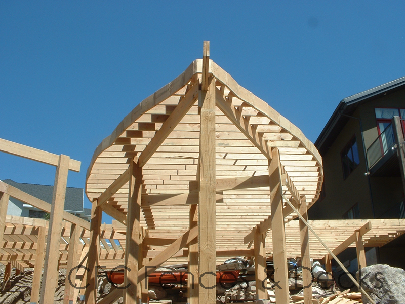
image from CFC Fences & Decks I mainly needed a frame that would attach to each surface board and be stable enough to be elevated over the front of the landscape board. Using another printout of the first leaf, I began building the frame with a center beam. From there, I planned to cut skinny sticks (to save on cost) to create cross beams every half inch. This should create multiple glue points for each board. Here is my mockup to determine layout.

I notched the center beam and cross boards for a solid fit, using glue to reinforce the joins.
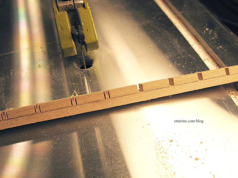

I used bass wood for the few areas where the skinny sticks were too short and left the ends long for now.

To add stability on the outer edge, I added more skinny sticks. These are not the cleanest cuts I’ve ever made, but you will see these only as the underneath structure of the deck.

I cut these notches using my handheld Dremel since they were angled and the main spine was glued together.

Next up…finishing the third leaf surface boards and building the basic frames for leaf 2 and leaf 3.
Categories: The Artist's Studio
April 24, 2013 | 0 commentsThe Artist’s Studio – The Deck, part 4
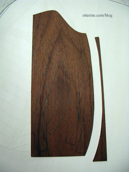
With the straight portions of The Deck assembled and the leaf patterns drawn, it was time to start cutting the pieces for the first of the leaves. Elga, who is a fabulous woodworker, suggested I cut the outer walnut frame in pieces, keeping the grain lengthwise as much as possible. I marked the outer frame into five pieces and cut them from the paper pattern.

I traced them onto the 1/16″ thick walnut sheet and then started cutting along the guidelines.
Here’s the cut outer frame with the center vein and walnut cross boards.
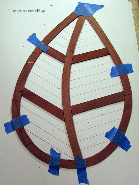
Then I cut the bass wood cross boards to fit. Each one is marked with a number so I can reassemble them easily.

The first leaf is now cut…two more to go and then the support frames need to be built.

Here’s the second leaf started.

Already, I am getting better at cutting and fitting. I’ll likely go back and re-cut a few of the boards from the first leaf that don’t fit as well as I’d like. :]
Categories: The Artist's Studio
April 23, 2013 | 0 commentsTiny paint tubes and other art supplies
The Artist’s Studio needs art supplies, of course! While searching for some suitable minis for the Studio, I ran across an amazing tutorial by Carol at true2scale using the metal wrapped from wine bottles. She provides paint labels, a box template and a painting for her tutorial. I printed my paint labels on Avery label paper to make it a little easier to work with, but I still used some tacky glue to keep the labels secure. I think I made mine a little smaller than the ones she did, so instead of adding beads for caps I dipped the tapered tips into black paint.
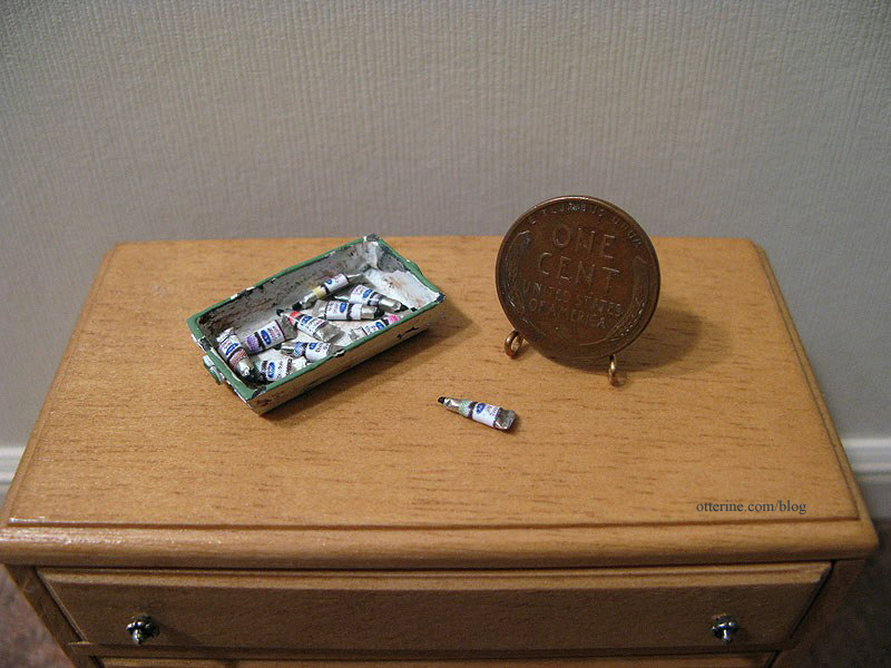
I think I might have been a little rough with the tiny tubes, because they look like they’ve been squeezed before, not fresh out of the packaging. :D I rather like that, though…looks more realistic when they all vary a little. I bought the tray at The 3 Blind Mice show specifically for the paint tubes.

I also made a portfolio from a pattern in Dolls’ House Details by Kath Dalmeny. I used a piece of Kraft Cardstock by Recollections, found in the scrapbook paper aisle at Michael’s. It’s the perfect thickness of cardboard for miniatures. I used imitation leather paper by The Paper Company for the accents and thin rope for the handle instead of paper. And, yes, it opens. :D

Lyssa sent me some bead jars. I added some extra labels from Carol’s tutorial to finish them for the Studio. These will help fill some shelf space. Thanks, Lyssa! :D

Categories: The Artist's Studio
April 21, 2013 | 0 commentsThe Artist’s Studio – Hummingbird shower part 4
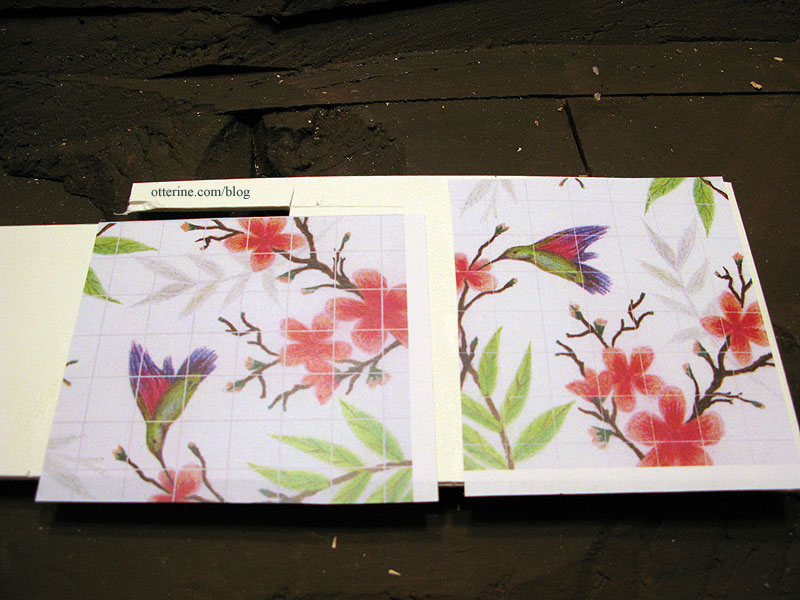
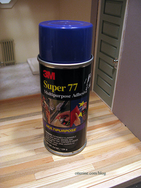
Using the two tile images shown previously, I did a test sample to see how the sealer would look. Since I had success with the Old World Tile in Baxter Pointe Villa, I decided to use the same Triple Thick Gloss Glaze in this instance. I used spray adhesive to attach my printed image to a mat board scrap, using the same part of the image for both to get an apples-to-apples comparison.
This is the spray adhesive I use. :]
I added the Triple Thick Gloss Glaze and let it dry overnight. I recommend two nights of drying time when using this, but I just needed to get a rough feel for the grout lines and wanted to move forward with the process. Here is the glaze before scoring the lines. The thick glaze really transformed the image, though I wasn’t really careful with the application on these samples. I’ll take better care to spread it evenly for the final.
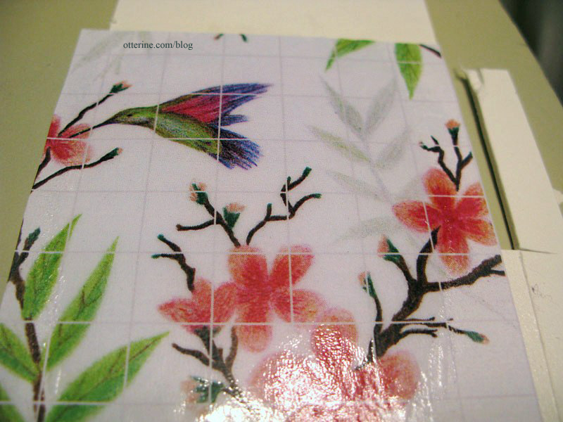
10-pixel grout lines 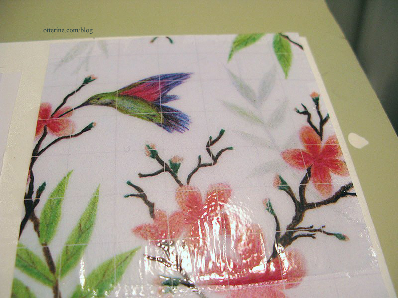
5-pixel grout lines I used a ball stylus to trace over the lines. As expected, the glaze lifted in some areas since it really needed another full day of drying time. This won’t happen in the final process since I’ll be sure to leave it alone the required time.
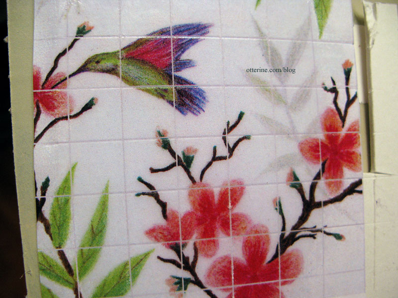
10-pixel grout lines 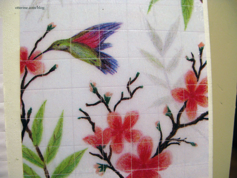
5-pixel grout lines I think the 10-pixel is the clear winner here. Not only were the lines easier to see to trace but it just seems a better break between the individual tiles. Next up, the real deal…
Categories: The Artist's Studio
April 18, 2013 | 0 comments
NOTE: All content on otterine.com is copyrighted and may not be reproduced in part or in whole. It takes a lot of time and effort to write and photograph for my blog. Please ask permission before reproducing any of my content. (More on copyright)


