The Artist’s Studio – The Deck, part 4
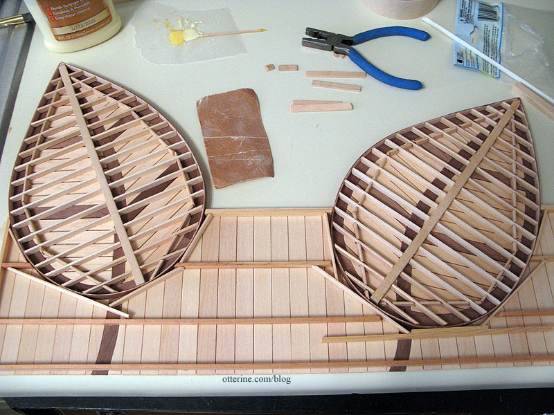
With the straight portions of The Deck assembled and the leaf patterns drawn, it was time to start cutting the pieces for the first of the leaves. Elga, who is a fabulous woodworker, suggested I cut the outer walnut frame in pieces, keeping the grain lengthwise as much as possible. I marked the outer frame into five pieces and cut them from the paper pattern.

I traced them onto the 1/16″ thick walnut sheet and then started cutting along the guidelines.
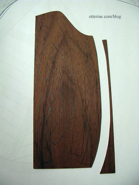
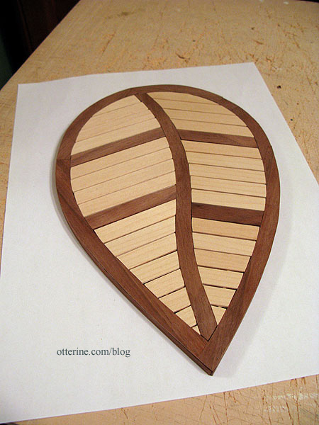
Here’s the cut outer frame with the center vein and walnut cross boards.
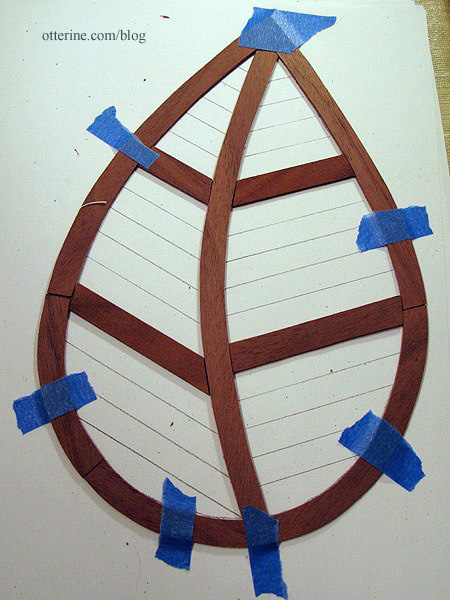
Then I cut the bass wood cross boards to fit. Each one is marked with a number so I can reassemble them easily.

The first leaf is now cut…two more to go and then the support frames need to be built.

Here’s the second leaf started.

Already, I am getting better at cutting and fitting. I’ll likely go back and re-cut a few of the boards from the first leaf that don’t fit as well as I’d like. :]
Categories: The Artist's Studio
April 23, 2013 | 0 commentsTiny paint tubes and other art supplies
The Artist’s Studio needs art supplies, of course! While searching for some suitable minis for the Studio, I ran across an amazing tutorial by Carol at true2scale using the metal wrapped from wine bottles. She provides paint labels, a box template and a painting for her tutorial. I printed my paint labels on Avery label paper to make it a little easier to work with, but I still used some tacky glue to keep the labels secure. I think I made mine a little smaller than the ones she did, so instead of adding beads for caps I dipped the tapered tips into black paint.
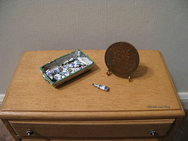
I think I might have been a little rough with the tiny tubes, because they look like they’ve been squeezed before, not fresh out of the packaging. :D I rather like that, though…looks more realistic when they all vary a little. I bought the tray at The 3 Blind Mice show specifically for the paint tubes.

I also made a portfolio from a pattern in Dolls’ House Details by Kath Dalmeny. I used a piece of Kraft Cardstock by Recollections, found in the scrapbook paper aisle at Michael’s. It’s the perfect thickness of cardboard for miniatures. I used imitation leather paper by The Paper Company for the accents and thin rope for the handle instead of paper. And, yes, it opens. :D

Lyssa sent me some bead jars. I added some extra labels from Carol’s tutorial to finish them for the Studio. These will help fill some shelf space. Thanks, Lyssa! :D

Categories: The Artist's Studio
April 21, 2013 | 0 commentsThe Artist’s Studio – Hummingbird shower part 4
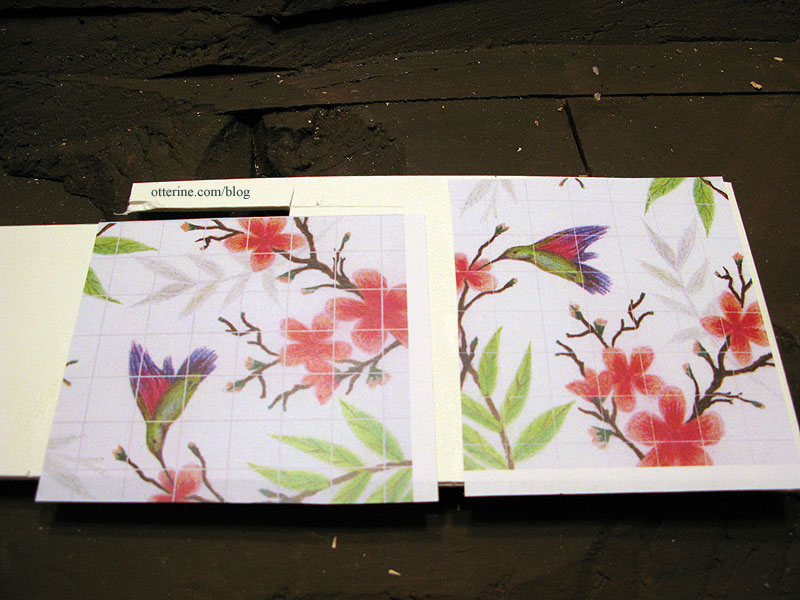
Using the two tile images shown previously, I did a test sample to see how the sealer would look. Since I had success with the Old World Tile in Baxter Pointe Villa, I decided to use the same Triple Thick Gloss Glaze in this instance. I used spray adhesive to attach my printed image to a mat board scrap, using the same part of the image for both to get an apples-to-apples comparison.
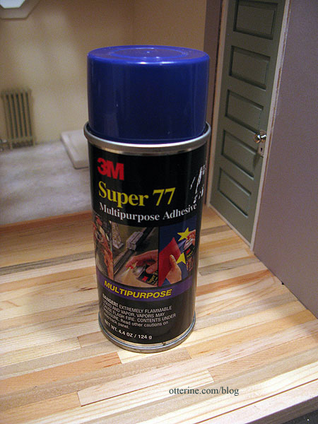
This is the spray adhesive I use. :]
I added the Triple Thick Gloss Glaze and let it dry overnight. I recommend two nights of drying time when using this, but I just needed to get a rough feel for the grout lines and wanted to move forward with the process. Here is the glaze before scoring the lines. The thick glaze really transformed the image, though I wasn’t really careful with the application on these samples. I’ll take better care to spread it evenly for the final.
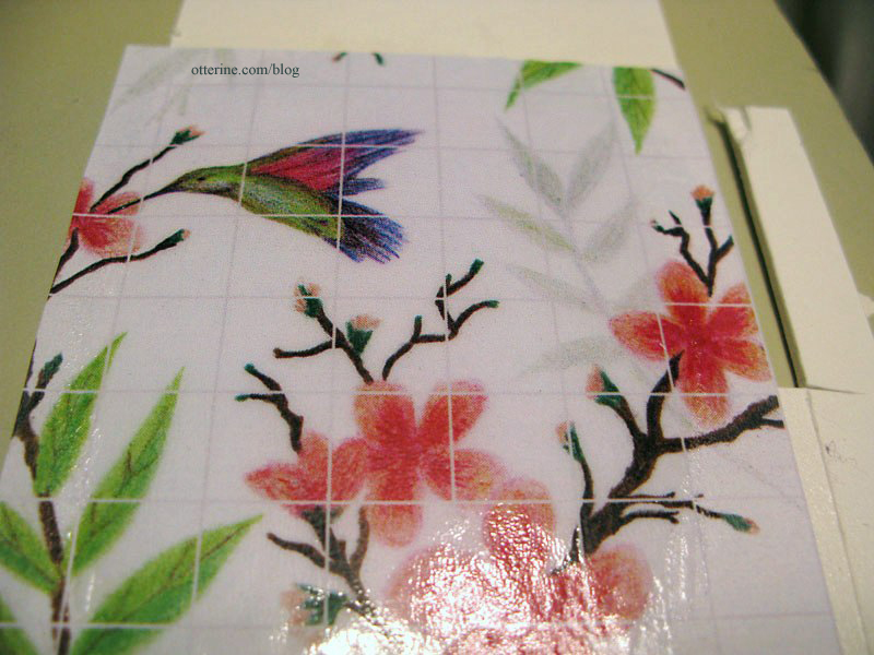
10-pixel grout lines 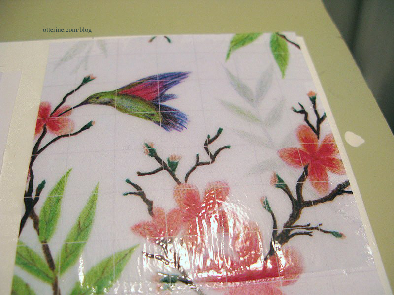
5-pixel grout lines I used a ball stylus to trace over the lines. As expected, the glaze lifted in some areas since it really needed another full day of drying time. This won’t happen in the final process since I’ll be sure to leave it alone the required time.
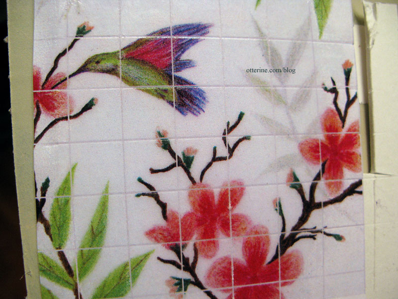
10-pixel grout lines 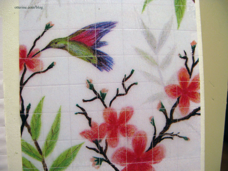
5-pixel grout lines I think the 10-pixel is the clear winner here. Not only were the lines easier to see to trace but it just seems a better break between the individual tiles. Next up, the real deal…
Categories: The Artist's Studio
April 18, 2013 | 0 commentsThe Artist’s Studio – Shingles and chimney
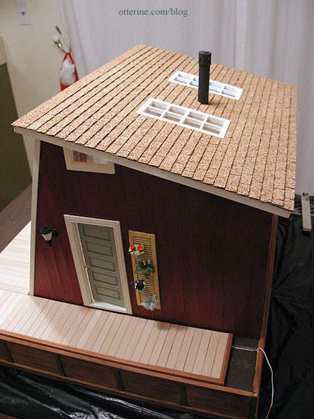
I was able to find two packages of Desert Tan rectangular shingles at All Small Miniatures, a brick and mortar dollhouse shop about an hour from my home. I had called local stores to see if anyone had them in stock, and the woman at All Small Miniatures had exactly what I needed. She was gracious enough to hold them until the weekend when I could drive out to get them. Meant to be! :D
Of course, while I was there, I had to look around…and other minis jumped into my shopping bag before I left. Anyway, on to shingling!
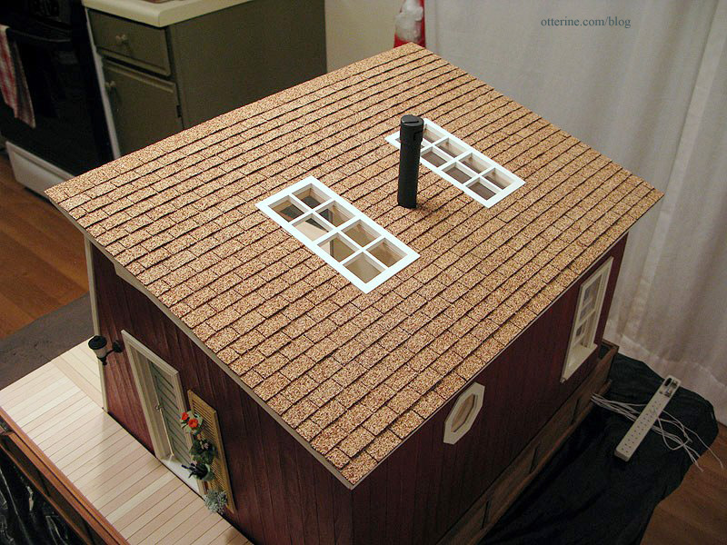
I used Quick Grip to attach these to the roof board. Easy peasy.
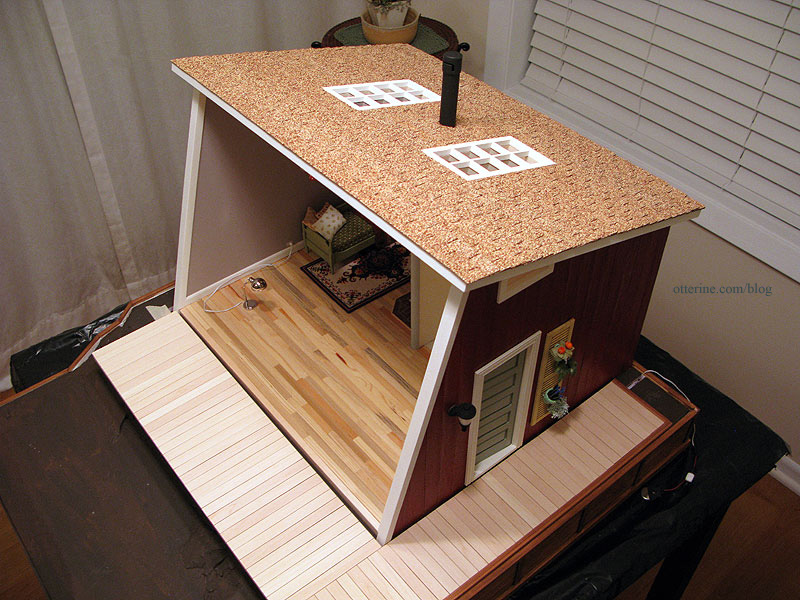
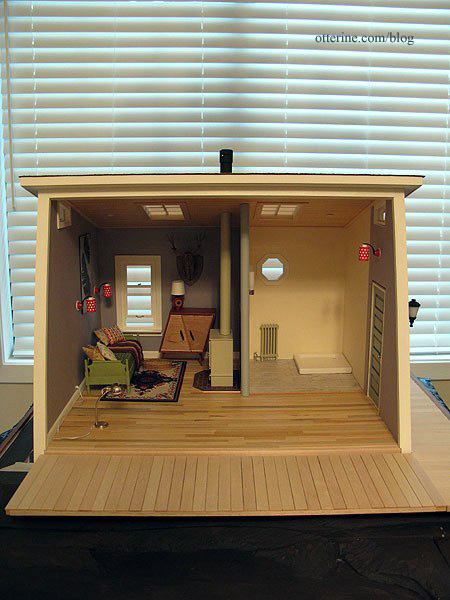
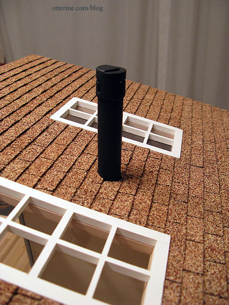
The chimney is made from bits and bobs. I had used a similar setup for Baslow Ranch. I tried to attach the chimney in the same spot as the wood stove, lining up the two visually.
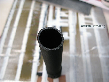
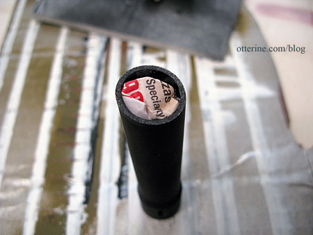
I super glued the chimney parts together and then spray painted it flat black. Since the chimney is hollow, I added a crumpled bit of newspaper inside to increase the gluing surface.
I cut the shingles around the pipe.
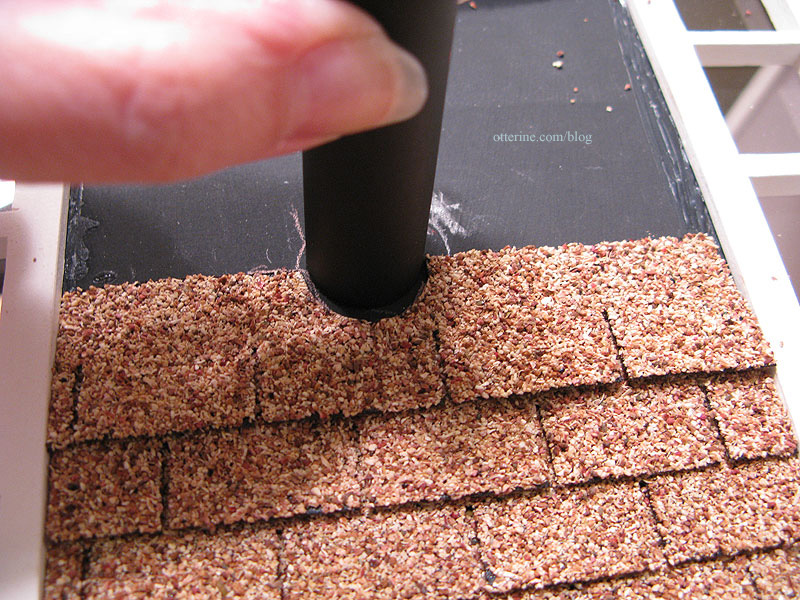
It’s a nice, seamless finish. :]
The desert tan is a great color with the red and walnut base.
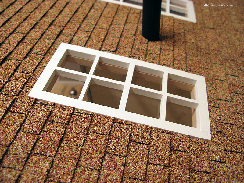
The skylights are perfectly set into the surrounding shingles.
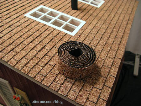
I had a little left over in the end.
I want to offer a special thank you to Lori at Happily Ever After for taking the time to check if she could get the shingles for me. Thank you to Lolly’s for also being so helpful. And, thank you to Fran for letting me know about a new product at miniatures.com – laser cut paper shingle strips that you paint with stone spray paint to get the color you want. It would have been a great second choice!
Categories: The Artist's Studio
April 17, 2013 | 0 commentsThe Artist’s Studio – Hummingbird shower part 3
I did a little prep work and sampling before forging ahead with the tile mural. First, I photographed my original hummingbird and flower drawing and then manipulated it in PhotoShop to lighten and sharpen since some color loss and blurring occurs in printing.
There are a few ways I figured I could make the tiles. I could cut out individual tiles and paste them to a board with “grout lines” in between. The problem I foresaw with this method was matching the precise lines of the drawing and getting the grout lines even. Also, I would have to cut my tiles slightly smaller since the overall dimensions of the drawing were exact to the shower stall size I wanted.
I opted for an easier and just as effective method: making gridlines in PhotoShop. I made my gridlines the lightest of greys, just to make them fall into the background slightly. Plus, even white tile grout isn’t bright white in real life. I also made sure there was a gridline in the very center where the mural would break at the corner of the shower.
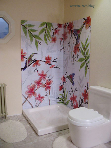
I made three test prints, the first of which had 14 half-inch tiles across with grout lines 10 pixels wide.
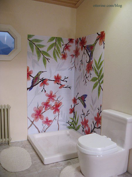
The second has the same half-inch tiles but with 5 pixel-width grout lines.
The third is done with quarter-inch tiles and 5 pixel-width grout lines.
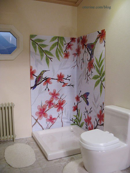
The half-inch tiles are the clear winner to me since they achieve the tile look in a realistic manner without detracting from the image the way the busier quarter-inch tiles do. The 5-pixel lines for the half-inch tiles seem better in print (in person anyway), but I will do a trial run of the next step using both samples to see which works better in the end. I don’t want to go through the whole process just to have the lines disappear for being too thin.
Categories: The Artist's Studio
April 16, 2013 | 0 commentsThe Artist’s Studio – Wood stove, part 6
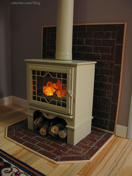
I finished up the wood stove, and I am ecstatic about how it turned out! :D When I last wrote about it, I had cut the stove pipe and primed the pieces.
I sanded the pieces once the primer was dry and sprayed them Krylon Satin Almond. I sanded once between the final color coats as well. I didn’t go with high gloss since that often looks unrealistic in mini.
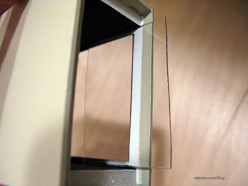
I cut a piece of acrylic sheet to fit the front opening.
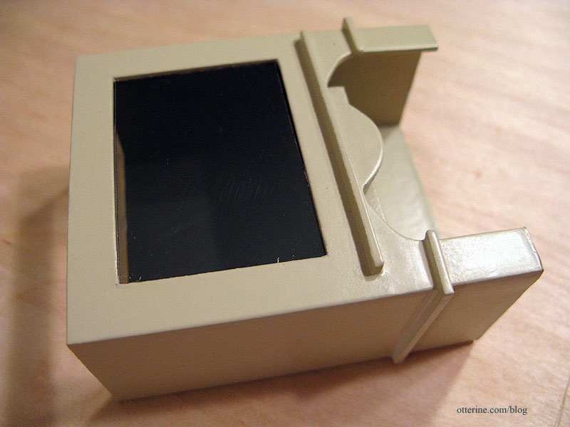
This fits using only tension, but I didn’t want to risk it coming loose. I cut a larger piece of acrylic to fit behind this piece.
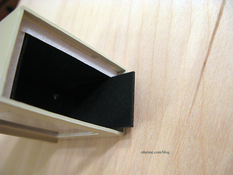
It is held in place with two pieces of black mat board glued inside.
I then glued the door in place, added a round head pin for the bottom tray latch and fashioned a knob from a jewelry finding and flat head pin. While I was painting, the delicate parts of the door grille broke. I cut part of the design away to salvage the piece. It still looks like a planned design. Crisis averted! The stove pipe has a pin in the bottom that holds it in place on the stove.
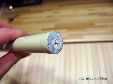
It’s a little crooked here since there’s nothing to hold it straight.
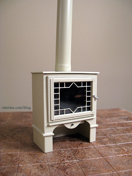
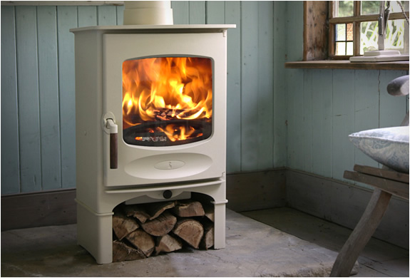
As a reminder, here is my inspiration piece from Charnwood.
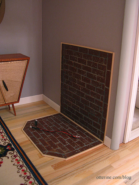
Inside the Studio, I glued in the brick hearth and trimmed it with 1/16″ x 1/16″ bass wood. I was able to add in the surrounding baseboards as well.
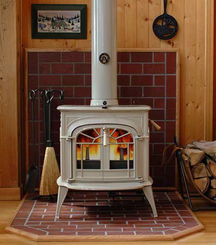
Here is my inspiration from hearth.com showing a partial brick wall.
I fed the flickering LEDs into the stove and then into the resin fire. I put on the lid and set the stove in place. The stove pipe fits against the ceiling and holds the stove in place with tension alone. This is good in case I ever need to take it back out. :]
And, here it is! Love! As much as I adore red stoves, I’m so glad I went with the almond.
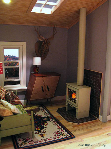
The firewood under the stove is one of my favorite details.
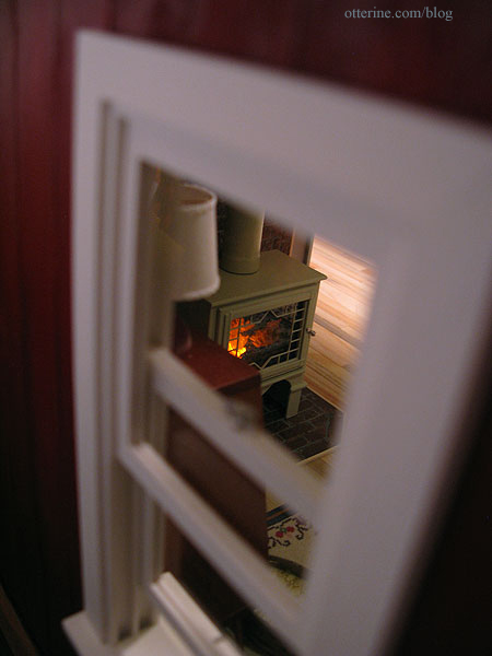
Looks cozy inside. :D
Categories: The Artist's Studio
April 15, 2013 | 0 commentsThe Artist’s Studio – Retaining wall, part 3
With the horizontal boards in place on the retaining wall, I glued the surrounding base boards from Mike. The next step was adding trim wood to finish the sides and back. I added 1/4″ x 1/16″ strip wood above the horizontal Woodsies planks. I then added various widths of trim around the top edge. For the back, I used some old Dura-Craft trim since it was the only wood I had on hand that fit in the space. It’s slightly different in color than the rest, but it won’t show in the end.
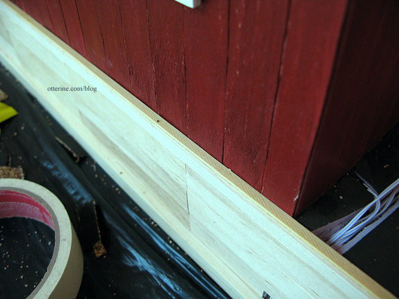
For the right and left sides, I used 1/8″ x 1/8″ trim up to the front drop of the retaining wall.
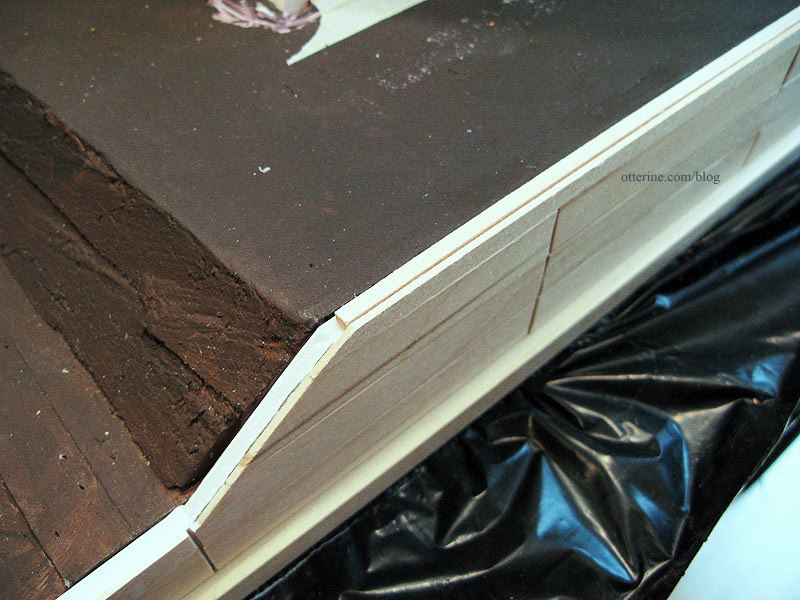
Over these edges, I added corner trim. I continued down the front of the retaining wall, cutting the angles with my scroll saw. They aren’t the cleanest joins, but they won’t be obvious once stained.
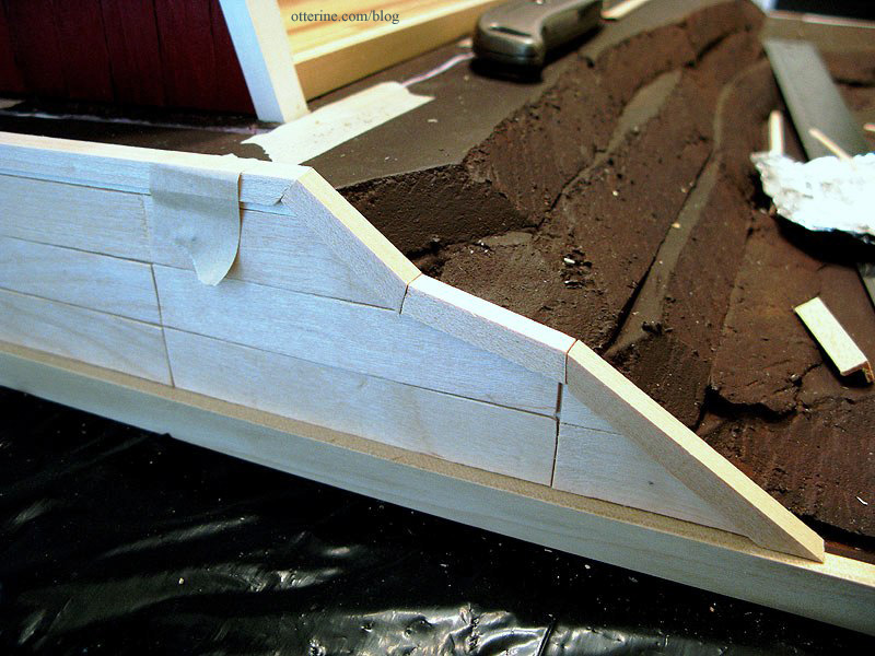
For the two rear corners, I added corner trim to finish the edges. I’ll add something decorative to finish the top corner later.
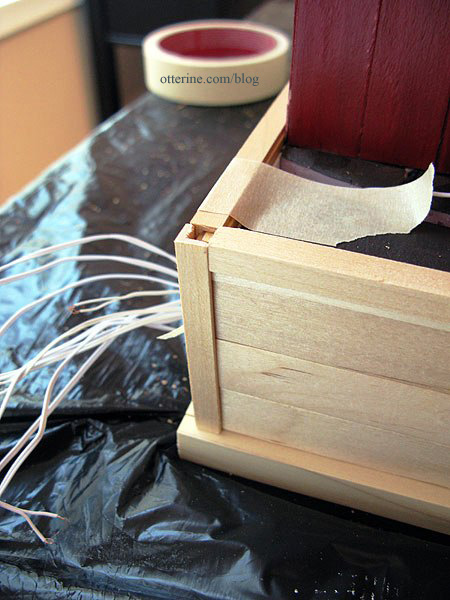
I cut vertical posts from 1/4″ x 1/16″ strip wood and glued them over the seams between the horizontal boards at 4″ on center intervals.
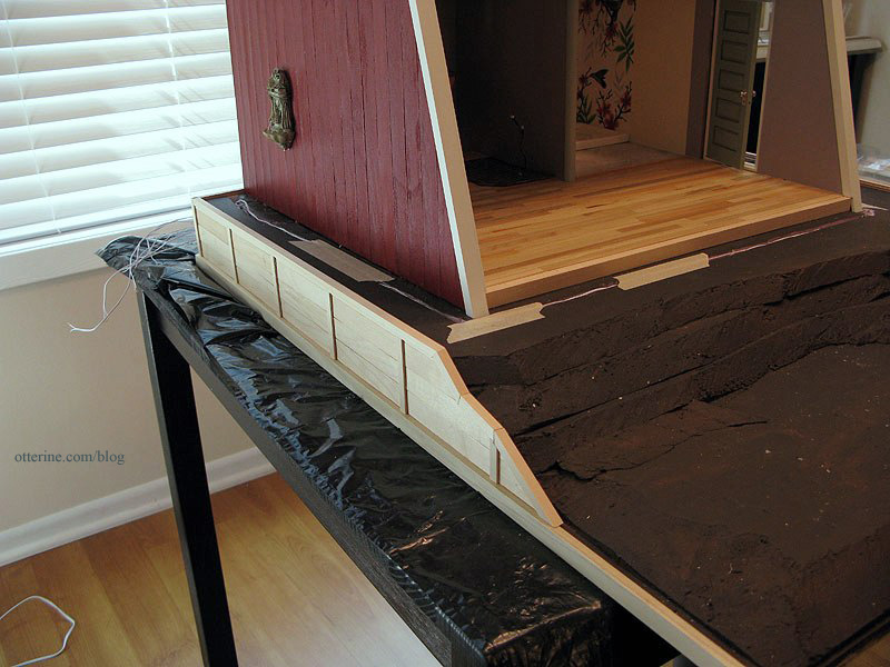
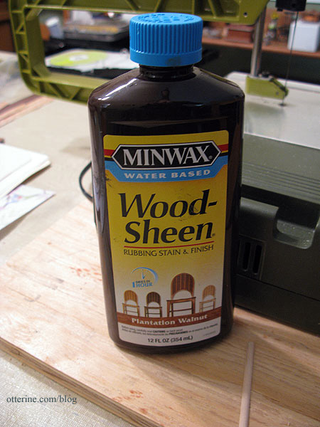
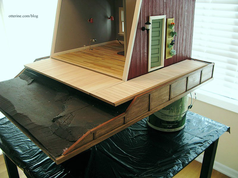
I stained the retaining wall with Minwax Wood-Sheen rubbing stain and finish in Plantation Walnut. I had purchased this on clearance awhile ago, and it works well. :]
I propped the Studio up on paint cans so I could apply the stain evenly around the base. The front board will be stained separately and added after landscaping.
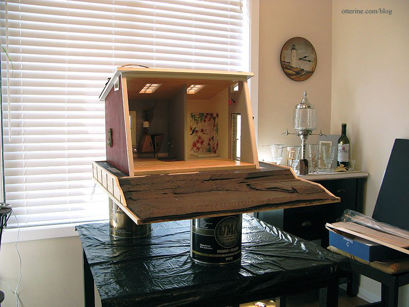
I taped off the wires in the back to keep from getting stain on them.
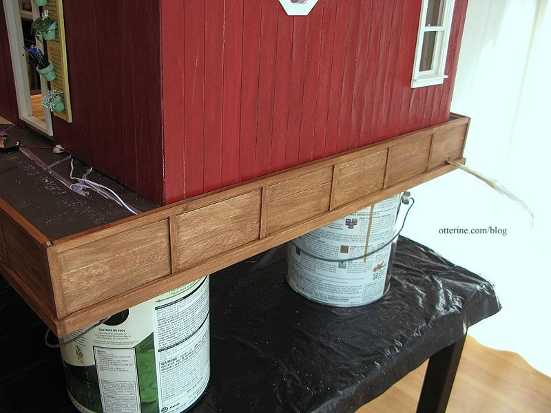
The walnut is a great color with the red. (Yes, I’ve started shingling the roof.)
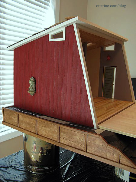
And, it will coordinate well with the walnut trim around the deck.
Categories: The Artist's Studio
April 14, 2013 | 0 commentsThe Artist’s Studio – Hummingbird shower part 2
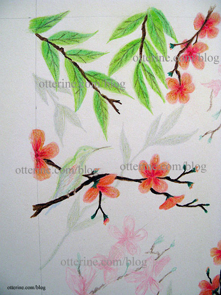
Since my initial sketch worked well for concept and composition, I’ve started filling in the final colors. I started with the leaves since I’m rather out of practice for drawing and they are the simplest part of the design.
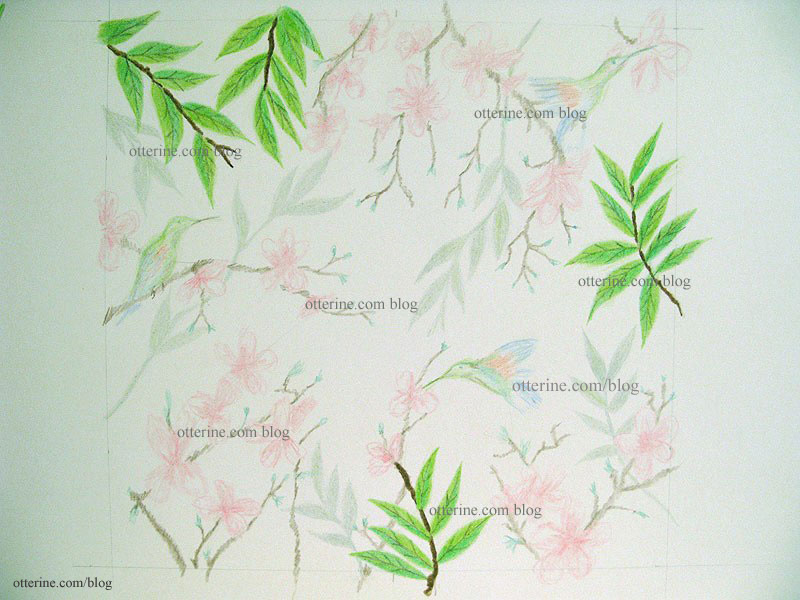
Here’s the initial sketch for comparison. I’m coloring right over the previously drawn areas.
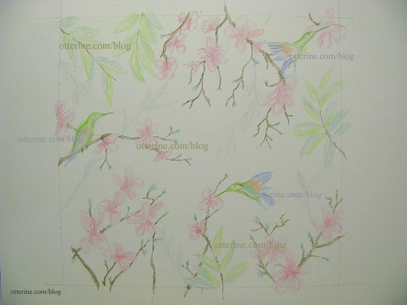
I did all of the leaves, including the shadowy branches, at the same time. This gave me a better chance of having them turn out similarly. If I did a portion of the drawing in one sitting and then another later, my technique, pressure or lighting might be different. Once I have the drawing filled in completely, I can go back and make shading adjustments.
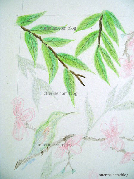
I started working on the flowering branches. Since I knew I wouldn’t be able to draw them all in one sitting, I decided to move around the drawing. If the remaining flowers end up looking a little different, at least they won’t be concentrated in one part of the drawing.
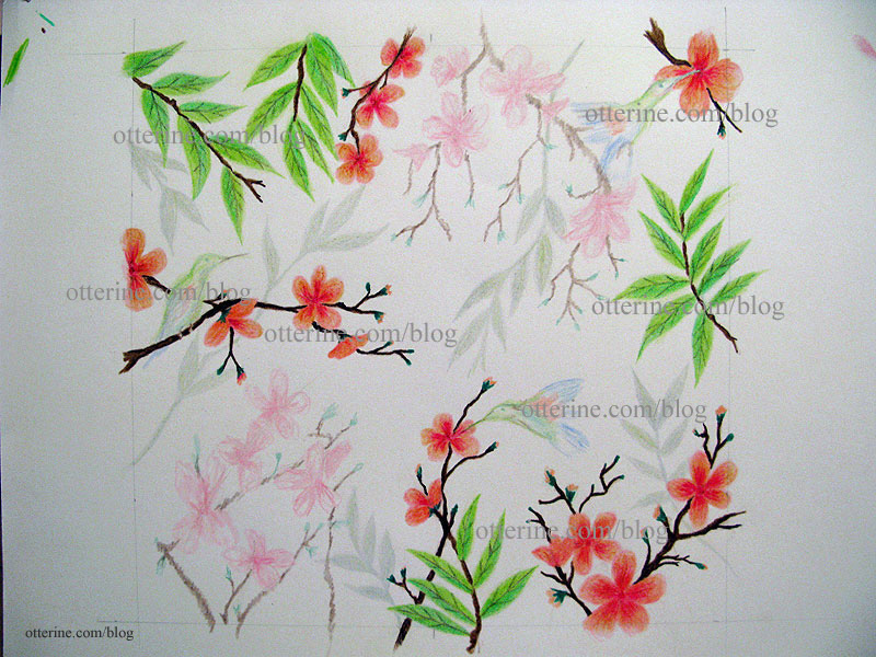
My flowers are more orange-pink than pure red pink like the inspiration art. I like that, though. Besides, once this drawing is scanned, printed and manipulated to look like tile, the colors will likely be more subdued than the original drawing. See I left room for tiny bird feet?
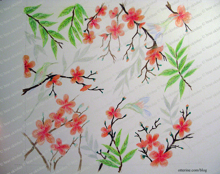
I finished the remaining flowers, though this time I went with a lighter touch. This brings the first flowering branches forward and gives some depth to the drawing.
I decided to just wing it (ha) and draw the birds right on the drawing without a practice run. The drawing for the mural is now complete.
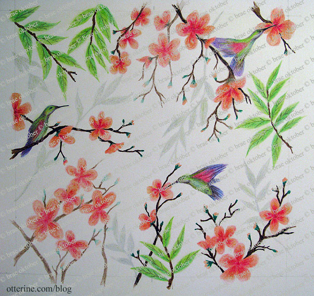
I did look at real life hummingbird pictures but continued the soft artistic feeling of the flowers and leaves in drawing the birds. They are colorful and turned out better than I had expected.
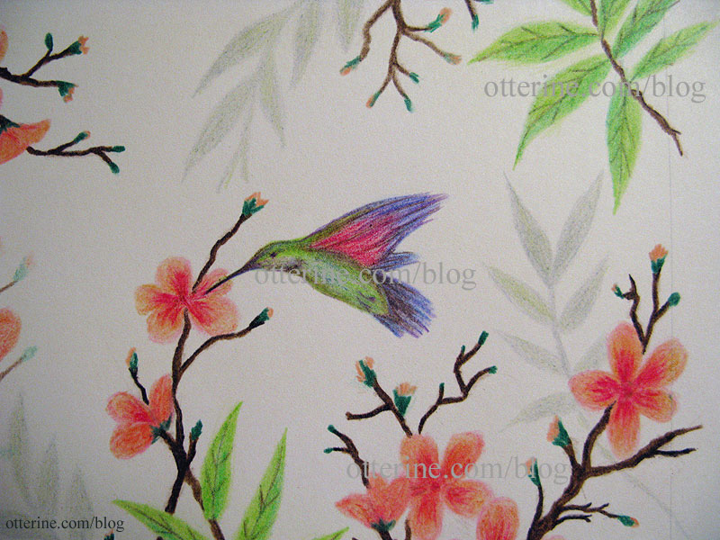
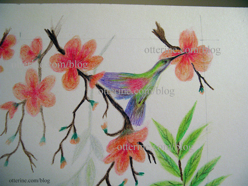
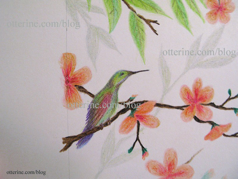
I made a quick scan and printout for mockup purposes. The end print will be softer than this one, but I love it!
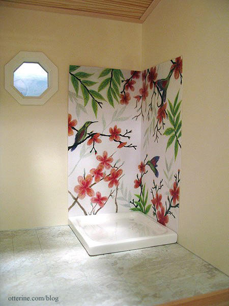
Next up — turning it into tile.
Categories: The Artist's Studio
April 13, 2013 | 0 commentsBlue medallion rug – completed
I have finished binding the blue medallion rug, and it is ready to take its place in The Artist’s Studio.
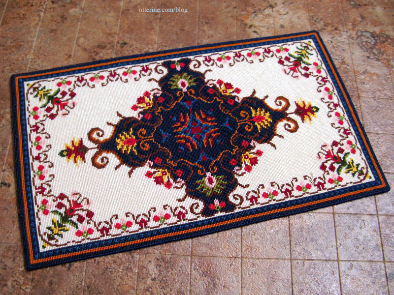
Cross-stitching time was 154.5 hours on 32 count Jobelan.
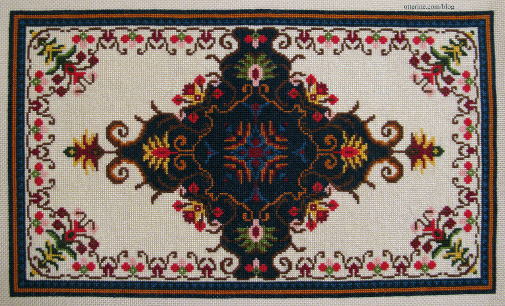
Final finishing took only a couple of hours. The final measurements are 7 7/8″ long by 4 5/8″ wide.
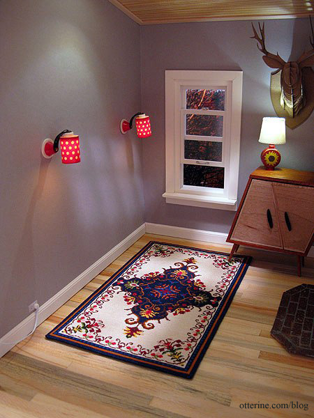
It fits well with the furnishings, though I will need to add feet to the daybed and whimsical cabinet to make them level.
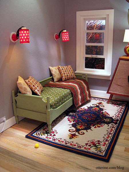
It’s such a striking design, which is what drew me in when I first saw it. The chart came from Jorge Cubells’s blog, though if you plan to make one for yourself, please write to Jorge for the half chart since the one listed on his blog is missing a column in the pattern. My final rug has this error, but it’s not noticeable.
Categories: Needlework - French knot rugs, The Artist's Studio
April 12, 2013 | 0 commentsThe Artist’s Studio – Clerestory windows
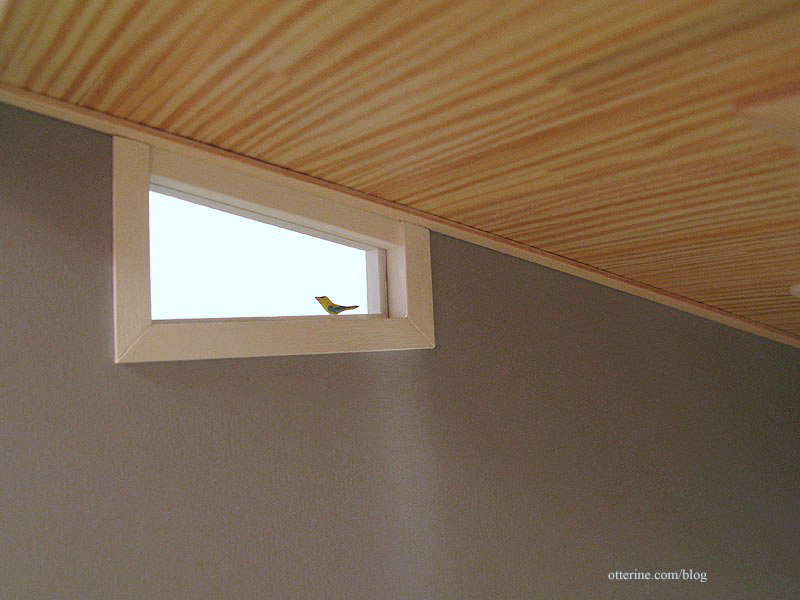
When I lowered the ceiling height of The Artist’s Studio, I had originally thought to fill in the lower portion of the original side windows. After a dry fitting of the roof in place, however, I decided I liked the odd shaped windows. A happy accident. :]
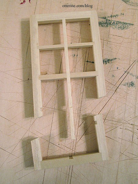
Of course, there are no readymade windows in this particular shape, so I would have to improvise. I had extra Houseworks 8-light windows, and they fit well in the existing hole. These are the same windows I’ll be using for the skylights. I marked where the window should be cut, leaving a little give for proper fitting.
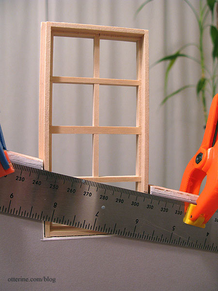
I used my scroll saw to cut along the lines and removed the interior pieces. I was able to cut both clerestory windows from one 8-light window.
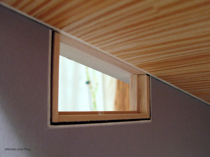
I tested the fit. You can see the pieces of strip wood I cut to fill in the groove in the ceiling over the window opening. This groove is what allows the roof board to attach to the walls. They aren’t glued yet, which is good since I need to adjust this one. :D
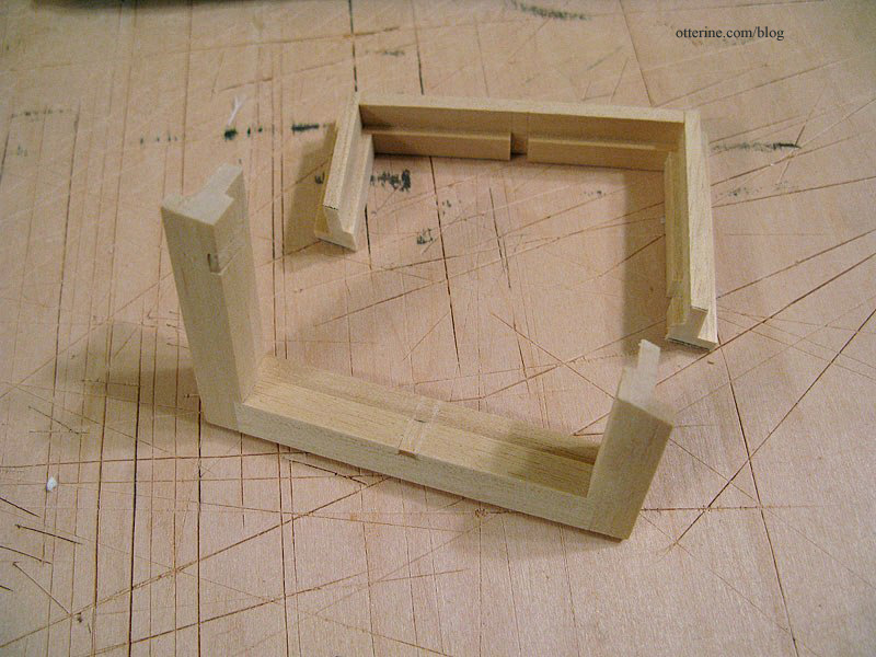
The removed interior pieces left cutouts in the outer frame. I used strip wood to make patches.
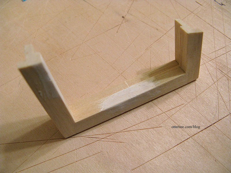
A little spackling added will give a smooth surface under the paint.
The acrylic sheet allows you to cut any shape or size window. These particular windows don’t come with acrylic inserts. I’ll leave the protective film on until I’m ready to install the windows.
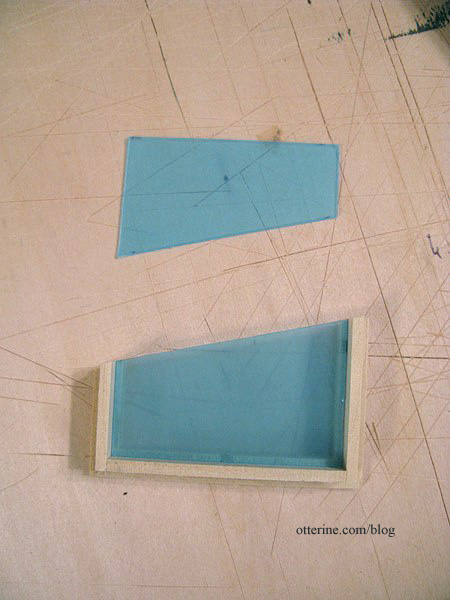
I tested the fit again.
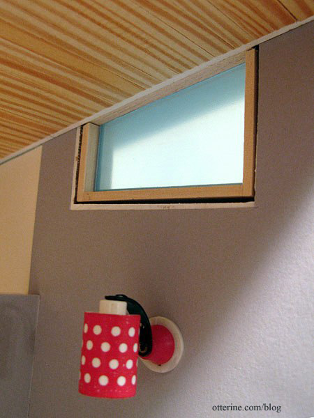
All good! :]
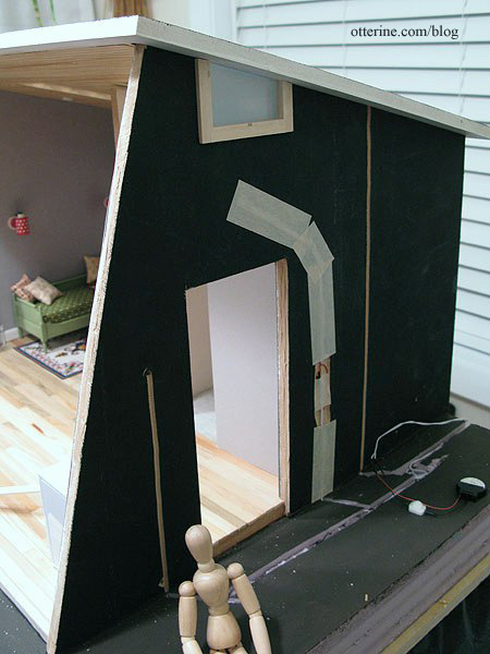
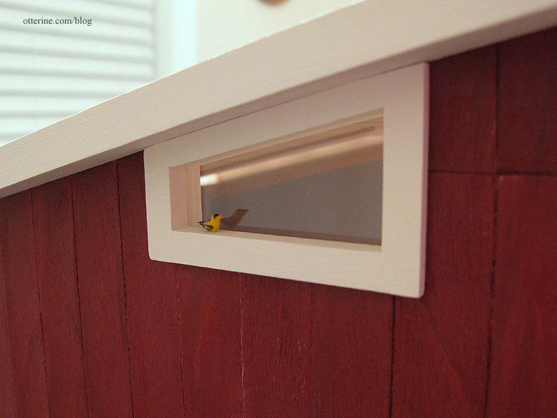
Once the eaves were finished, it was time to complete the windows and install them. I tested the fit with the eaves in place to see if any adjustments needed to be made. A little sanding, and the fit was snug.
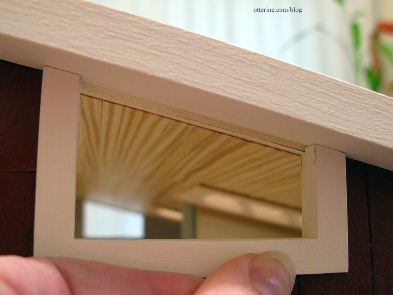
I cut 1/4″ strip wood to seal the top of the outer window and glued it in place. I cut another piece of 1/4″ strip wood to seal the top of the inner portion and glued it in place, making sure the acrylic could still slip out easily.
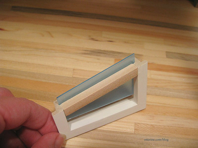
I checked the fit again…good. The reason for the overhang on the inside is that with the added siding on the exterior, the window is slightly inset when put in place.
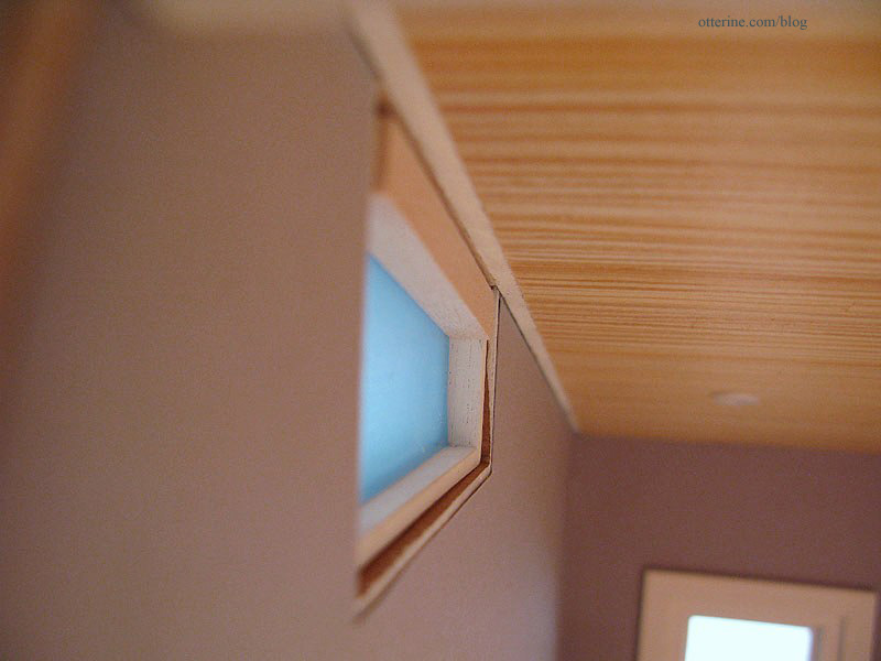
I added 1/16″ strip wood around the interior portion to make up the rest of the difference.
I painted the new parts then put the window inserts back in before gluing the windows in place, making sure they were snug against the eaves.
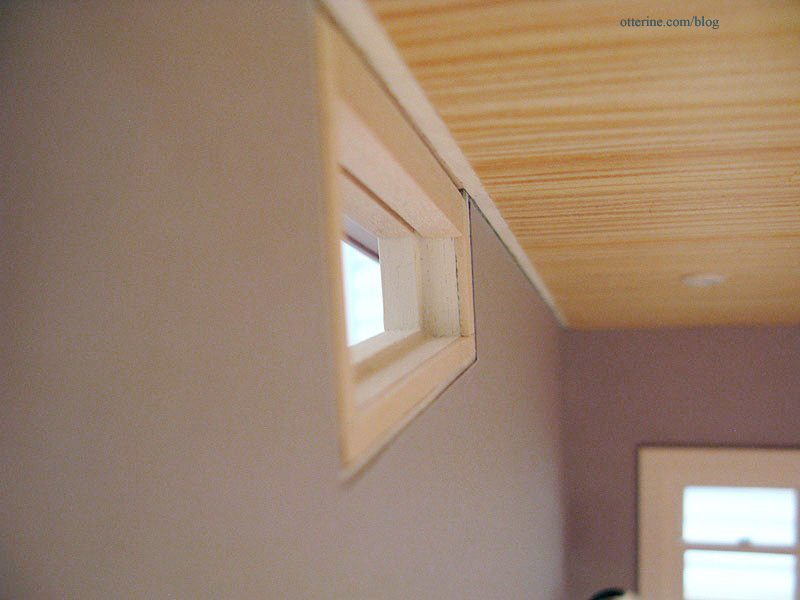
On the inside, I added plain bass wood trim sealed with varnish to finish the edges of the ceiling.
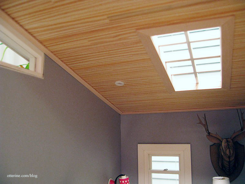
I cut interior trim for the clerestory windows and painted it Warm White.
I also cut the front opening interior trim and painted it Warm White.
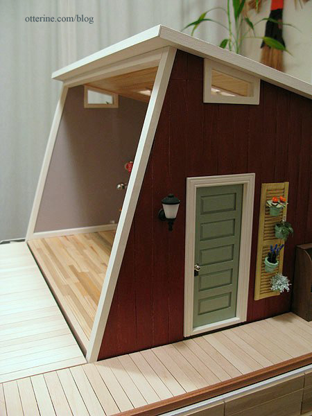
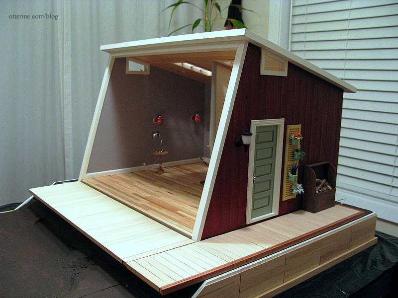
Trim takes a long time to finish, but it adds so much.
Categories: The Artist's Studio
April 10, 2013 | 0 commentsThe Artist’s Studio – Retaining wall, part 2
As noted in a previous post, the main part of the retaining wall will be made from Woodsies popsicle sticks that measure 6″ x 3/4″ x 1/16″. The back width of the base is 24″ so I marked the foam core board base in 4″ intervals.

Mike again came to the rescue! I needed 1/4″ x 1/2″ x 36″ strip wood, but the local stores carry only balsa in that length. It is too soft for base trim, so he sent me cut strips of poplar to finish the plywood edge. Unfortunately, I failed to tell him the amount needed so he sent only one board. While I awaited the rest, I used the single board to align the horizontal planks around the foam core base. I’ll add the base boards once they arrive.

I cut the Woodsies sticks to 4″ lengths and glued them to the foam core board base using the guidelines, starting in the middle. I used the Easy Cutter for the horizontal planks since the ends would be covered by the vertical posts.

I used a length of corner trim to align the tops as well. I’m awaiting my supply of this trim as well.

I made a small hole for the wires.

For the lead edges where the land descends, I kept the boards even, cutting the lines with a utility blade. I will build up the land to fill in the adjacent areas during landscaping.

I like the look of it so far.

Categories: The Artist's Studio
April 7, 2013 | 0 commentsThe Artist’s Studio – Eaves
Since I added some trim to the front of the Studio, the roof seemed off balance. I added a 3/8″ x 3/8″ strip of bass wood along the front edge of the roof board to make it more prominent in front.

To finish the eaves, I cut pieces of veneer to fit along the underside of the roof board. Instead of making board lines as I had done for the Heritage eaves, I opted for smooth soffits for the eaves. I think this makes for a more modern feel.
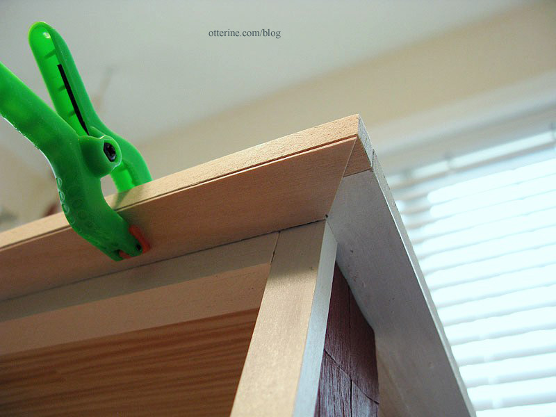
I cut angles at the corners to fit the pieces together.
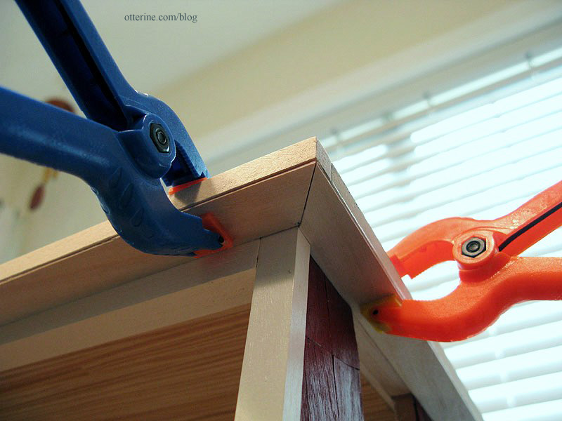
I cut bass wood strips to finish the outer edges of the roof board.
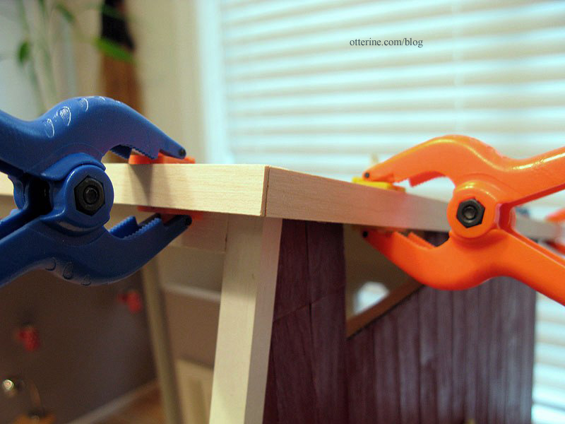
These eight boards create a good clean finish for the edges of the roof.
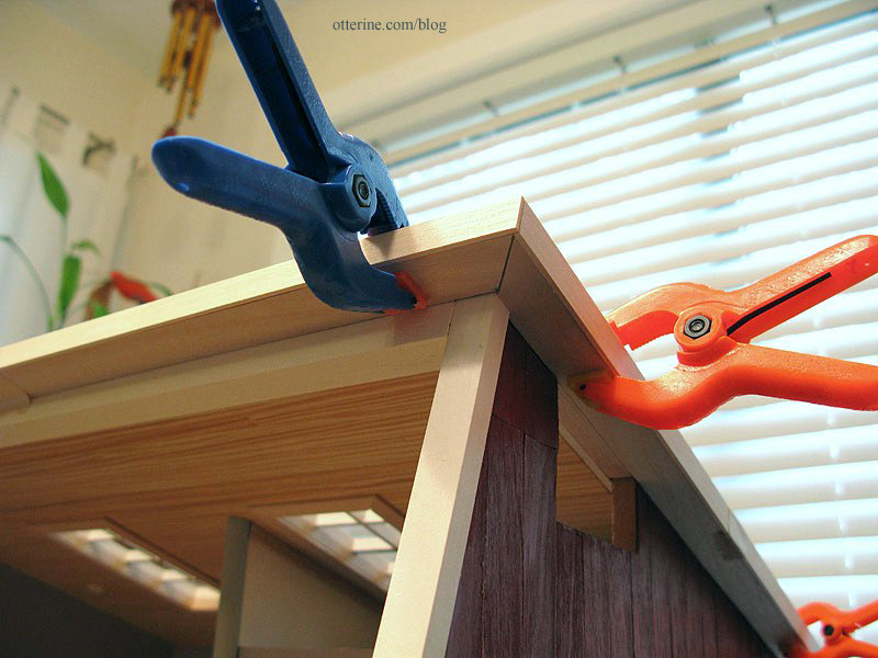
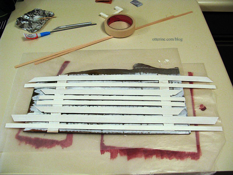
I painted the pieces with two coats of Warm White by Americana, a light sanding between coats. When I paint a grouping of boards, I tape them to a scrap of cardboard for easier painting.
I then glued them in place and touched up any gaps with small dabs of paint.
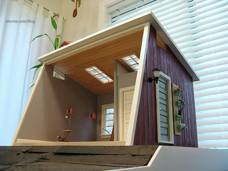
Categories: The Artist's Studio
April 6, 2013 | 0 comments
NOTE: All content on otterine.com is copyrighted and may not be reproduced in part or in whole. It takes a lot of time and effort to write and photograph for my blog. Please ask permission before reproducing any of my content. (More on copyright)

The Artist’s Studio – random details
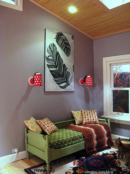
I’ve been making a number of accessories for the Studio as well as finishing up yet more trim and structural details. I cut a section of Feathers scrapbook paper by Recollections, glued it to a piece of black mat board and had instant wall art!
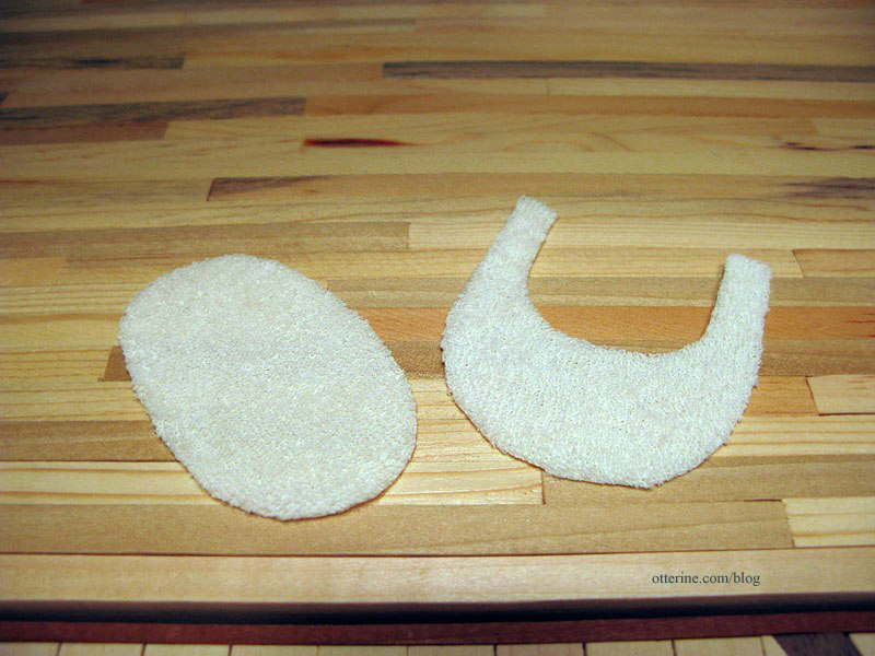
I made a bath mat and rug for around the toilet using baby terry cloth. I cut the shapes and then dabbed Fray Check all along the edges.
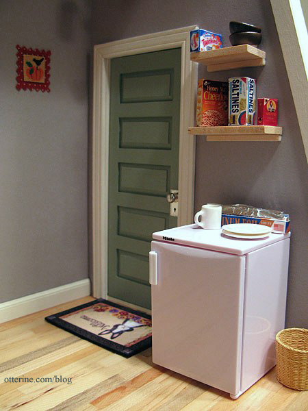
I made two modern block shelves for groceries and dishes to sit on above the Miele half fridge. I have more accessories planned for this space. The tiny cross stitch is by Mary Lynne at The Dollhouse Needle, but it has since been moved to the living area.
On the exterior, I wired the wood stove flickering LED switch inside the firewood box.
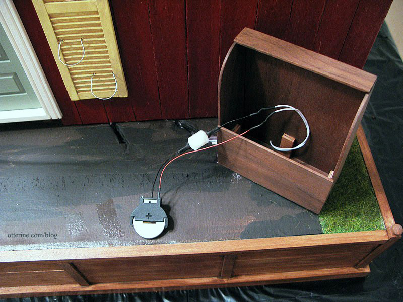
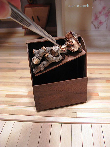
As shown previously, the firewood lifts out to access the switch and battery inside.
I created a simple step for the door from basswood.
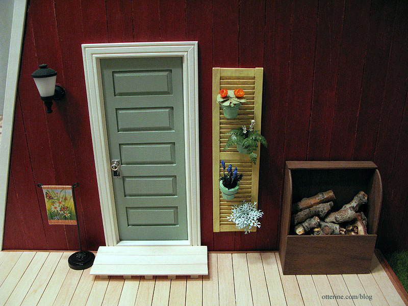
Even with templates, the red siding didn’t fit perfectly when installed. There was also a seam near the top in front where the wall was taller than the length of the siding strips. I painted strip wood to match and covered these imperfections.
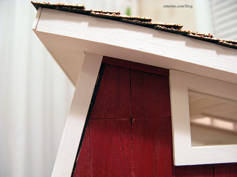
It’s a subtle change, but it makes the structure more complete.
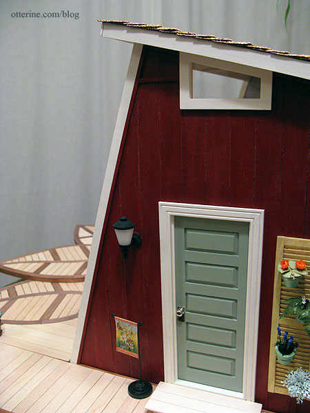
Slowly but surely…I’m getting there! :D
Categories: The Artist's Studio
April 30, 2013 | 0 commentsThe Artist’s Studio – landscaping
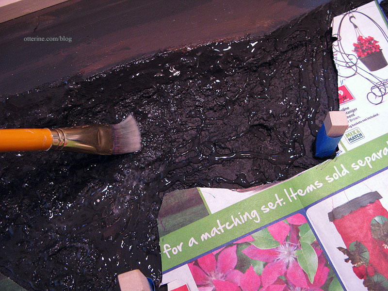
With The Deck completed, it was time to put in the landscaping. I started by applying stucco patch material to the previously sculpted builders foam base. This evened out the landscape and filled in holes and gaps. It also solidified the deck support posts into the foam base.
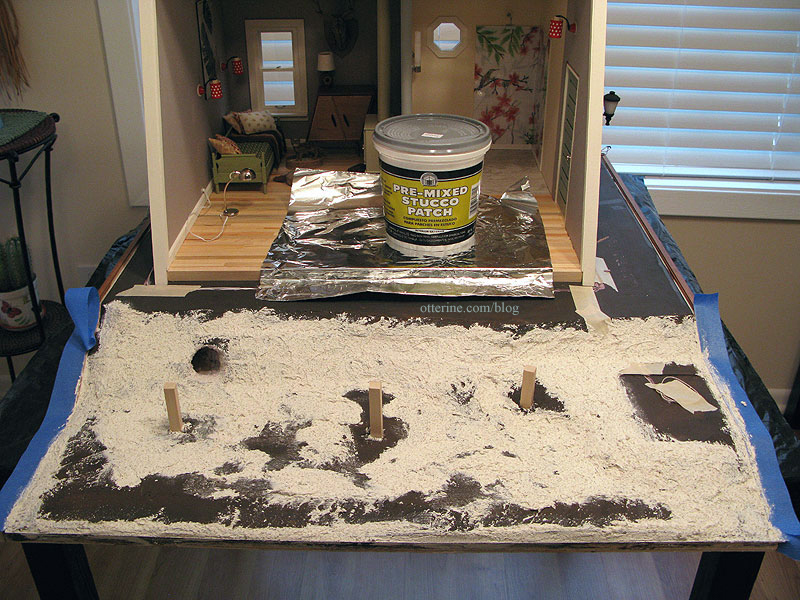
I checked the depth of the deck posts by putting the pieces back in place. Seems like the Studio would work for a sandy beach or snowy hillside, too. :D
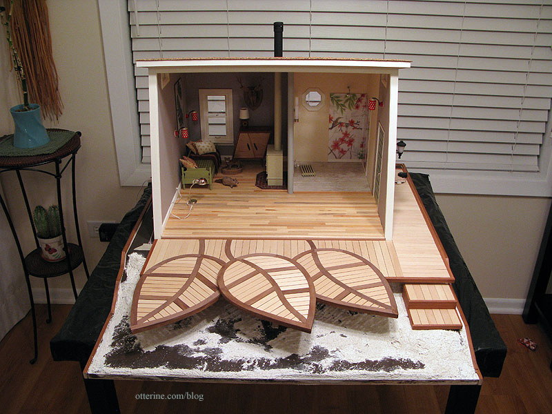
I covered all of the wiring channels with tape and then painted the new surfaces brown.
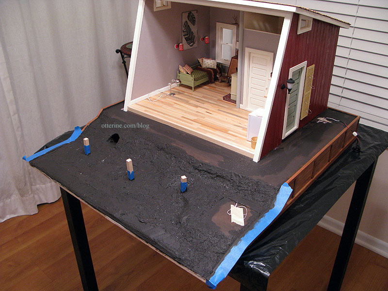
I had leftover Meadow Field Grass by Heki, from Scenery Express — one full sheet and several large scraps. I had used this material for The Aero Squadron Lounge. The grass placement included the back side by the firewood box, the entire side by the fountain and the front portion in front of The Deck. I cut patterns to determine how far in the grass would go.
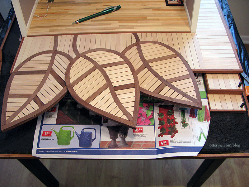
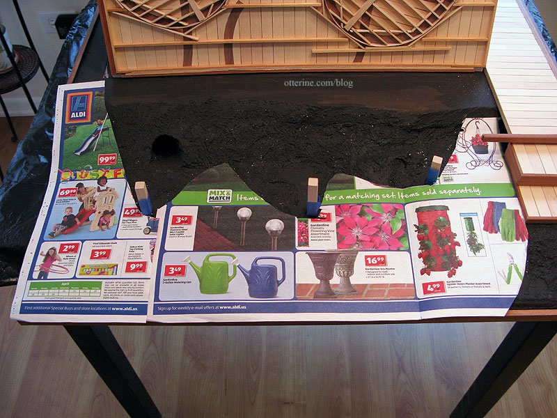
Inside this area under The Deck, I applied Fine Foliage/Turf in Dark Earth by MBS followed by Woodland Scenics Fine Dark Brown Ballast to serve as exposed dirt.
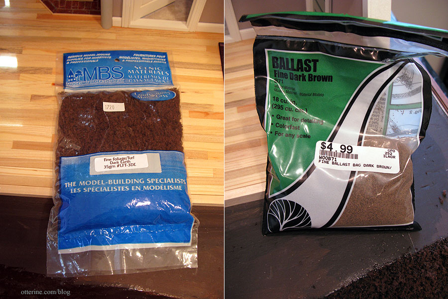
I used a brush to apply Aleene’s Clear Gel Glue and then liberally applied the landscaping materials. I pressed it in with my fingertips and then let it dry for an hour or so.
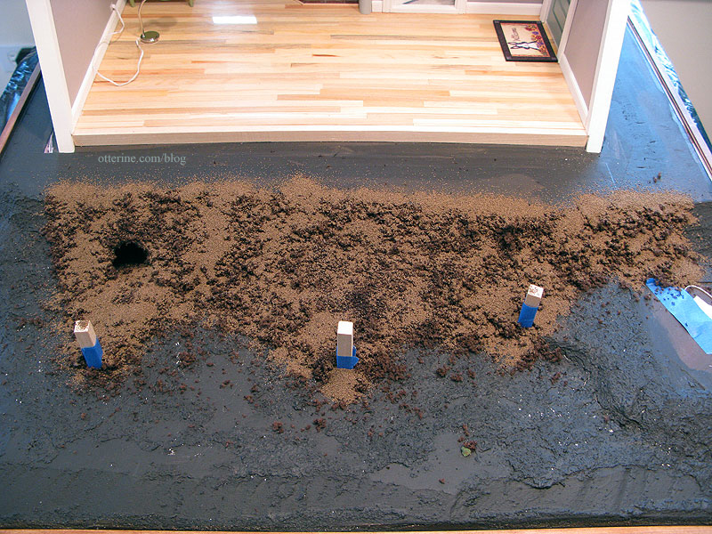
I added a gravel pathway at the bottom of the stairs using decorative terra cotta colored sand from Joann’s.
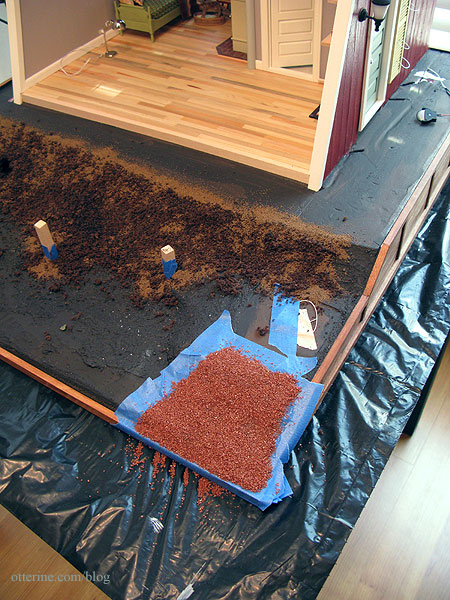
I checked my templates and cut the grass to fit. The back of this particular material is paper, so it makes it harder to piece. The sheets don’t come any larger, either. I cut it roughly with an X-Acto knife to keep it from being too uniform.
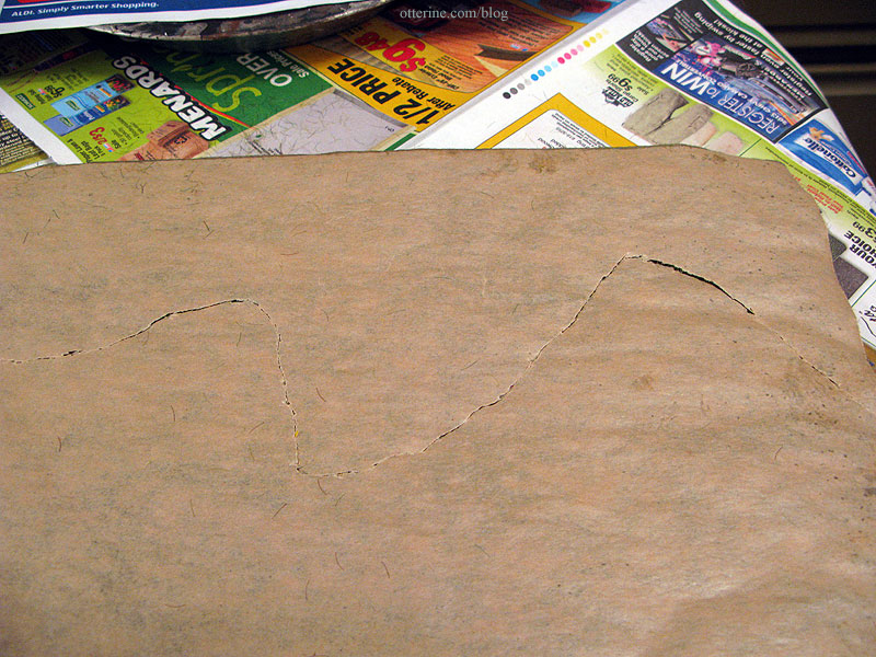
Where there are seams, I make them as natural looking as possible, as though there’s just a variation in the lawn in that particular spot.
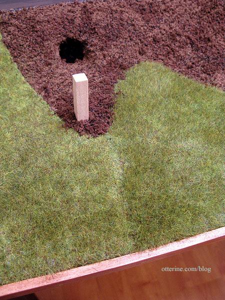
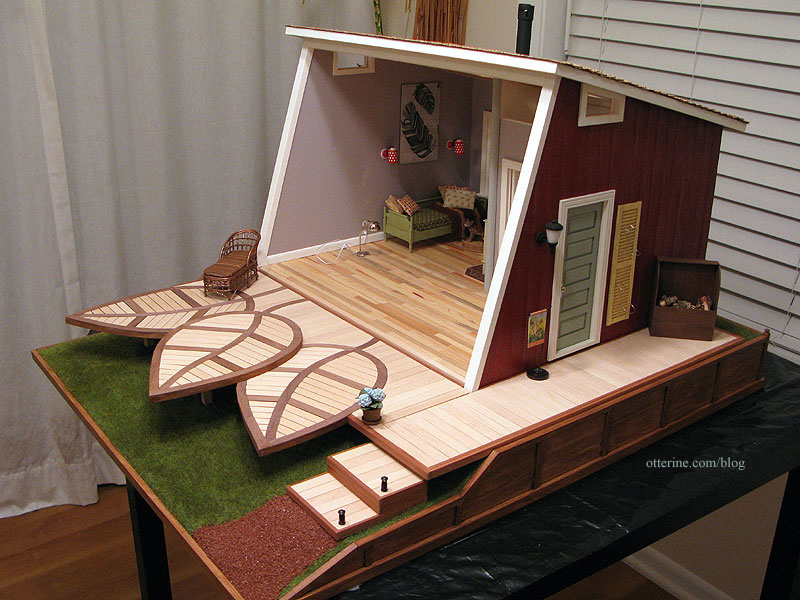
Here’s the finished landscaping without The Deck.
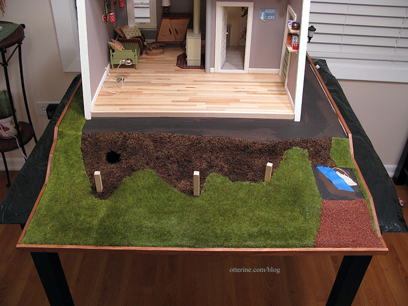
With The Deck in place, the seam is a little less obvious at first glance.
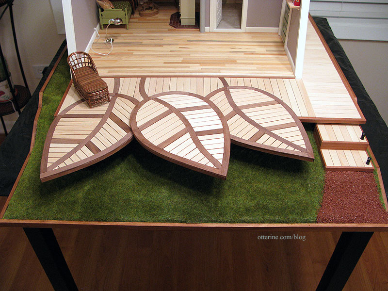
The materials do create wonderfully realistic landscapes, so it’s a shame they have to be pieced at all.
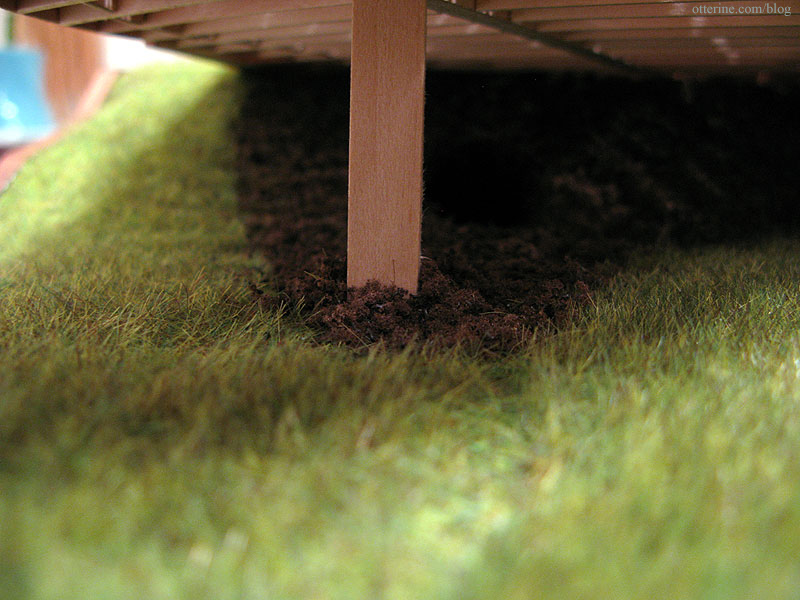
I kept the landscaping simple since there is so much already going on outside the Studio. :D
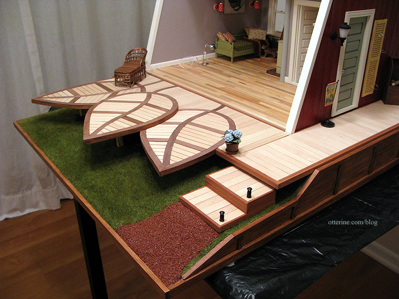
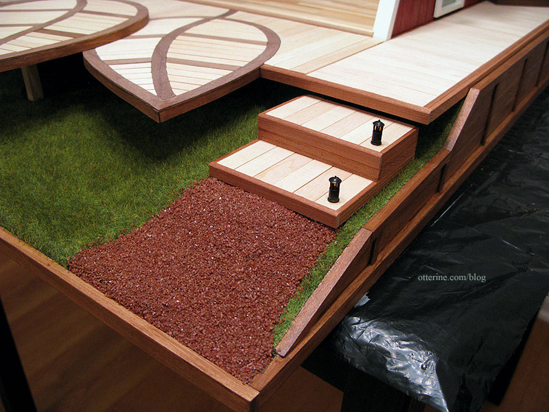
I added two landscaping lights from Creative Reproductions 2 Scale to the steps. These came three in a pack and needed to be wired in a series. I contacted Carl at CR2S to make sure I understood what this meant. He was very helpful and mentioned I could use two instead of three…but a single lamp could not be used with the 12V system since it would burn out the bulbs. Using only two means they burn brighter than if I had used three, but it is still safe to use with the 12V system. I don’t have them attached to the wiring system yet…so you’ll have to wait to see them lit up. :]
I like this particular color for the gravel because it doesn’t compete with the other exterior finishes.
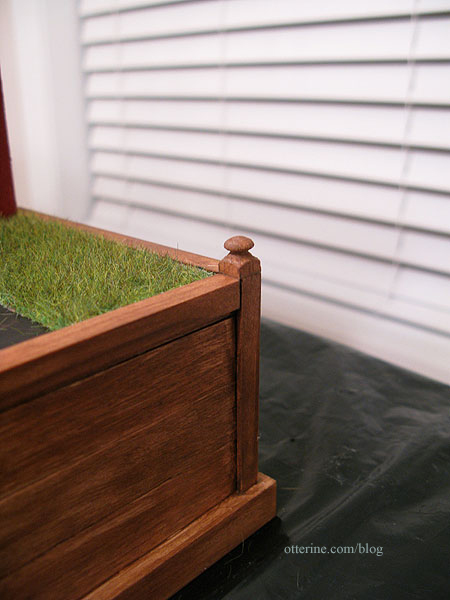
To finish the back two corners of the retaining wall, I used two toppers from narrow newel posts. I stained these to match the retaining wall.
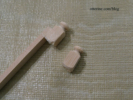
I taped them to a piece of basswood to run them through the scroll saw for a clean cut. :D
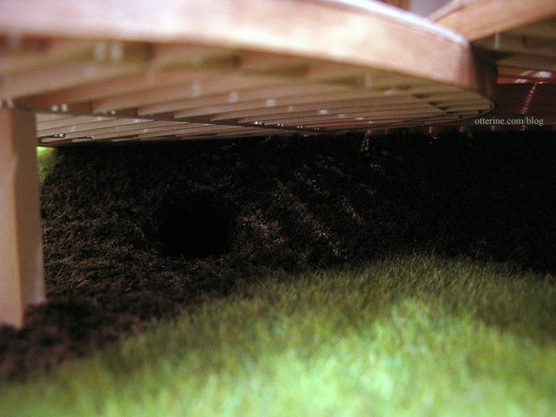
Inside Woodrow’s burrow, I left it mostly just painted foam since the interior wouldn’t be easily seen.
It’s coming together!!! :D
Categories: The Artist's Studio
April 29, 2013 | 0 commentsThe Artist’s Studio – The Deck, part 8
Continuing work on The Deck. I completed Leaf 3 with its winding center vein.
Leaf 3 sits on top of the main deck and the two side leaves. I tried three different angles to see what looked best.
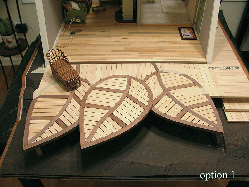
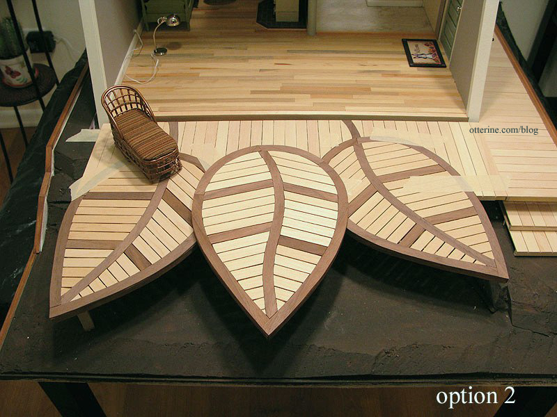
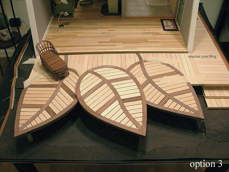
I liked this last layout the best, but before I could glue the top leaf to the main assembly I needed to address the stem.
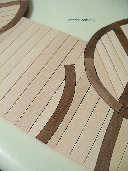
This stem is partial since Leaf 3 will cover the front area and I didn’t want to cut more boards than necessary.
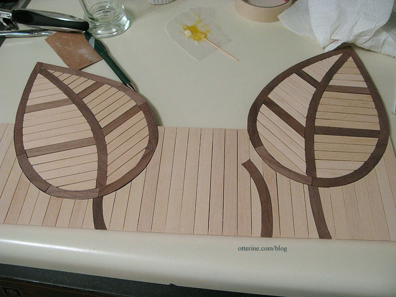
Here’s the original from Trex as a reminder.
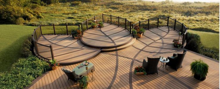
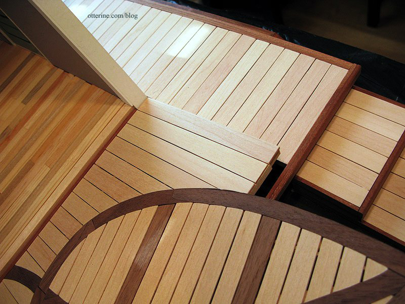
I then glued Leaf 3 in place and finished up the walnut trim around the main and side decks.
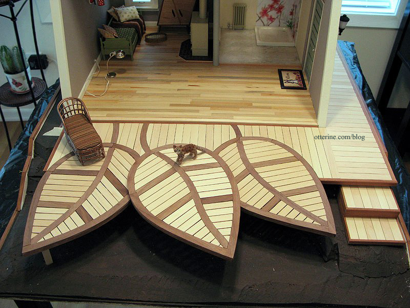
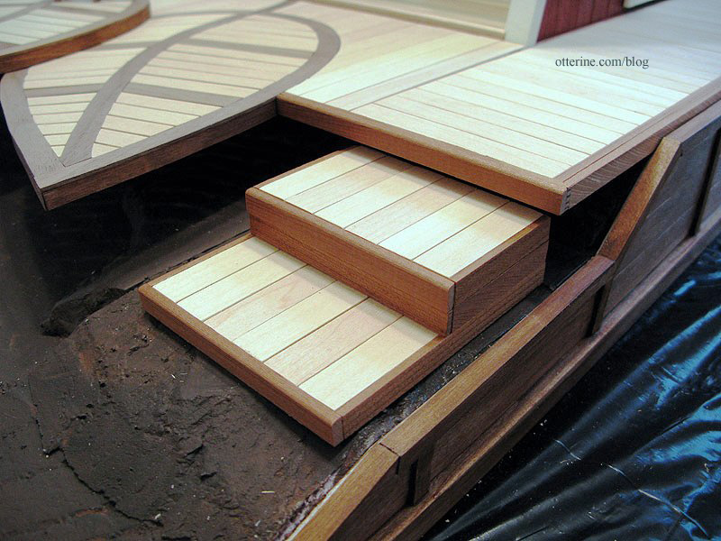
I used the two scraps from the leaf inset cutouts to make two matching steps up to the side deck.
I cut posts to support the leaves. I originally had these closer to the tips but moved them back once I started planning the landscaping. They will still support the leaves, perhaps more readily in these positions, but mostly stay out of sight.
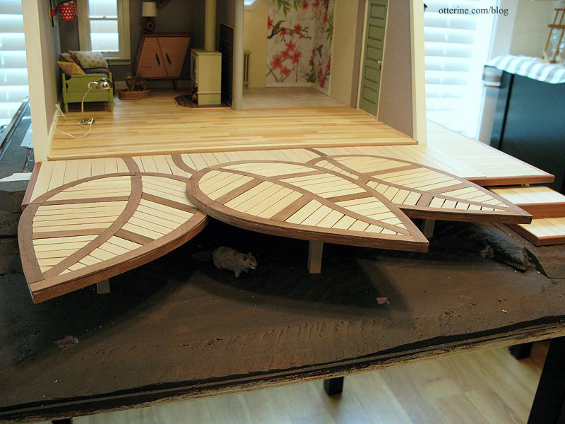
The entire deck will remain removable.
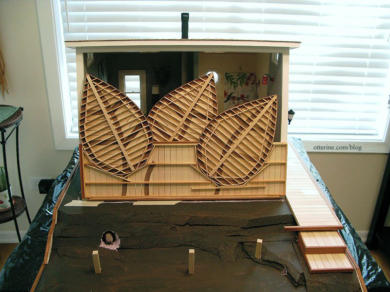
The side deck is one piece, and it slides forward until its interior trim abuts the front opening trim. For the front leaf deck , the trim by the front opening and the trim by the side deck keep it locked in place.
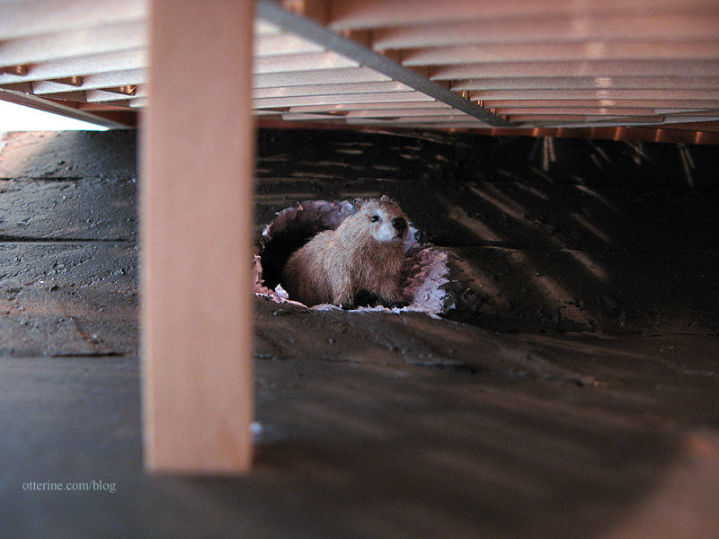
Who’s that under The Deck? It’s Woodrow!!! :D
Hooray! The Deck is done! :D
Categories: The Artist's Studio
April 28, 2013 | 0 commentsThe Artist’s Studio – The Deck, part 7
Continuing work on The Deck. I finished the second leaf in the same manner as the first leaf.
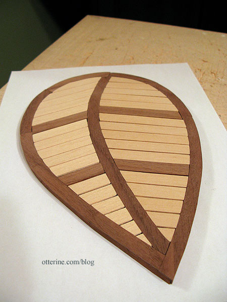
Before going further, I needed to see if I could replicate one part of the deck shown in the original inspiration piece. For reference, here is the beautiful deck from Trex.

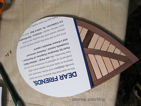
One of the side leaves is inset and on the same plane as the main deck. I took a scrap of card from the recycling bin and traced Leaf 1.
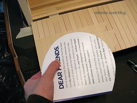
I then put a layer of masking tape over the main deck to keep the wood from splitting and the boards from lifting during the cutting process. I traced the outline onto the taped section.
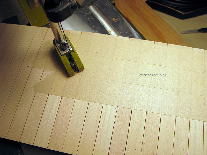
I then cut the main deck using the scroll saw. This was a one-shot deal. If it didn’t work, I’d have to reconstruct this part of the straight deck.
Moment of truth right before fitting…
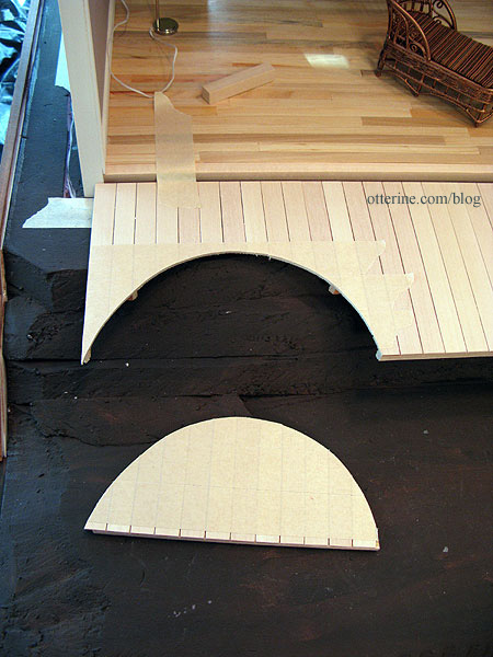
It worked!!! :D
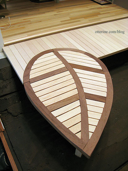
Having the leaf inset makes for easier furniture placement, too.
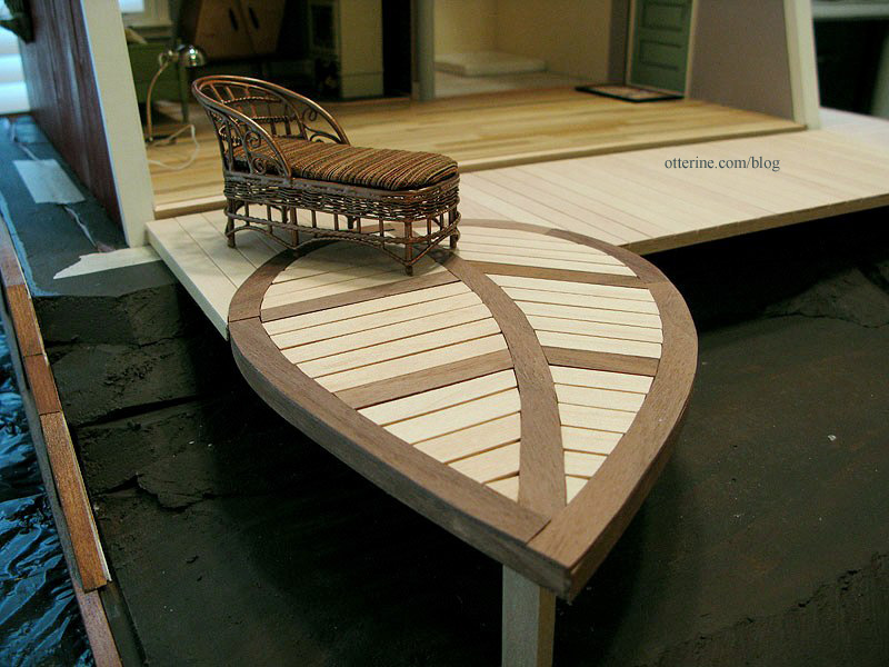
Since my deck is a smaller version of the original, I decided to inset Leaf 2 on the other side. This time, I cut it in deeper than Leaf 1.
Another feature of the original deck is that the leaves have stems that continue into the main deck. I cut pieces of walnut for the stems and marked them on the main deck. I removed the pieces from the deck and cut them to fit. I glued the pieces back in place with the walnut stems.
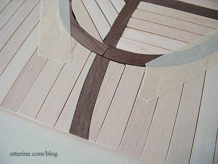
Marvelous! :D
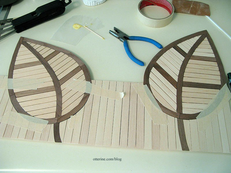
On the underside, I had to attach the two leaves to the main deck. I opted for lengths of skinny sticks. These won’t be readily seen, even when viewing the under structure.
And, just so you don’t think my vacation week has been all work and no play, here’s a funny picture of Jasper. He’s sleeping in a pose I like to call The Frozen Shrimp. Haaaaaaaaa! :D
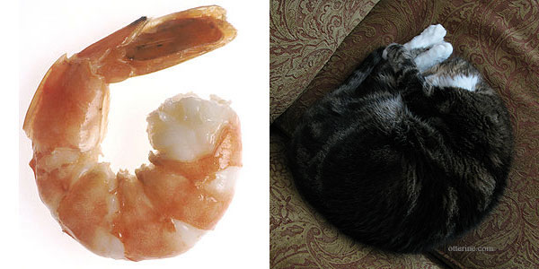
shrimp image from Wikipedia Categories: The Artist's Studio
April 27, 2013 | 0 commentsThe Artist’s Studio – Hummingbird shower part 5
For the final hummingbird tile mural, I cut around the drawing printout, leaving some bleed area around the edges. I used spray adhesive to mount the paper to mat board. Since I needed a close fit around the bottom edge where the shower base would sit, I used blue painter’s tape to mask off the bottom edge.

I then used the Triple Thick Gloss Glaze to seal the image. Once dry (two days later), I scored the tile lines with a stylus. Before removing the blue tape, I scored along the top of the tape to make sure it didn’t pull the glaze finish away from the tiles.

I cut along the center line and then the outer lines, leaving extra along the bottom. Oops…photographed them in the wrong order.

I propped the boards in place with the shower base to see how it looked and then glued them in place.

It’s hard to see the three dimensional aspect in the photos, but it looks just like high gloss tile in person. Hooray!

Next up, shower surround.
Categories: The Artist's Studio
April 26, 2013 | 0 comments
NOTE: All content on otterine.com is copyrighted and may not be reproduced in part or in whole. It takes a lot of time and effort to write and photograph for my blog. Please ask permission before reproducing any of my content. (More on copyright)


