
NOTE: All content on otterine.com is copyrighted and may not be reproduced in part or in whole. It takes a lot of time and effort to write and photograph for my blog. Please ask permission before reproducing any of my content. (More on copyright)
Categories:

The Artist’s Studio – wiring channels
I showed you the lighting plan in an earlier post. Today, I used my Dremel Trio to put in the initial wiring channels, and it was quick work! :D
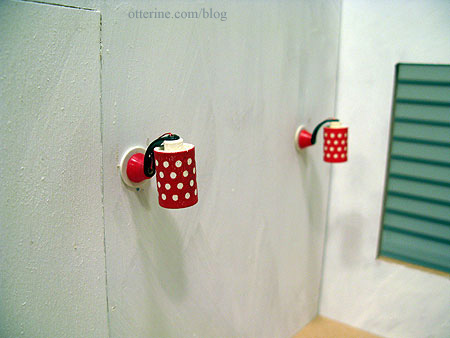
For the Lundby sconce by the entrance, I drilled a hole in wall so the wires would run down the exterior wall. As noted before, since I’ll be using non-replaceable bulbs, I need a backup plan in case I ever need to rewire these lamps.
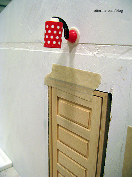
On the outside, I first measured the siding strips to determine where my open spot would be.
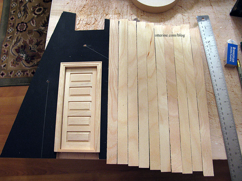
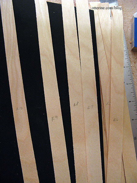
Since other siding strips might vary in width, I marked these in order so I could use them as is when I apply the siding.
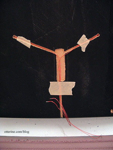
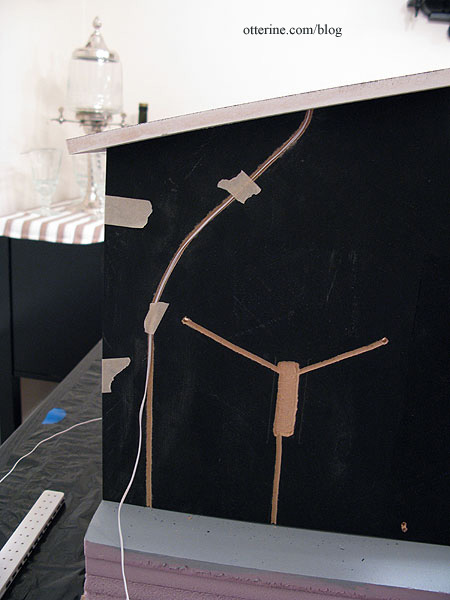
I made the usual wiring channel but routed an extra area where I can curl excess wires in case I need to rewire the lamp. I will leave this area uncovered by siding but hidden behind a fun exterior feature (to be revealed later). :D
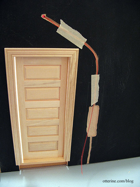
For the two Lundby sconces in the living area, I did the same process.
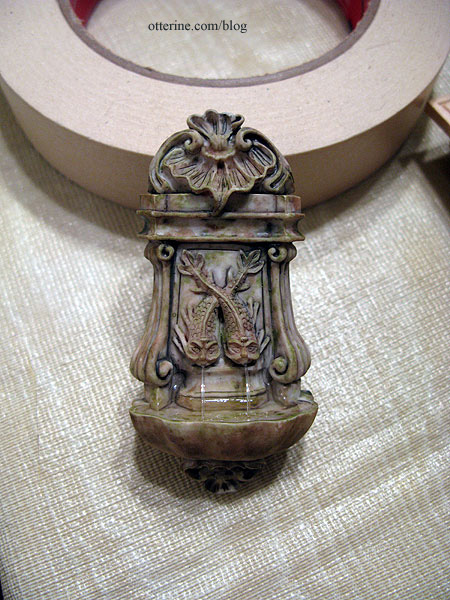
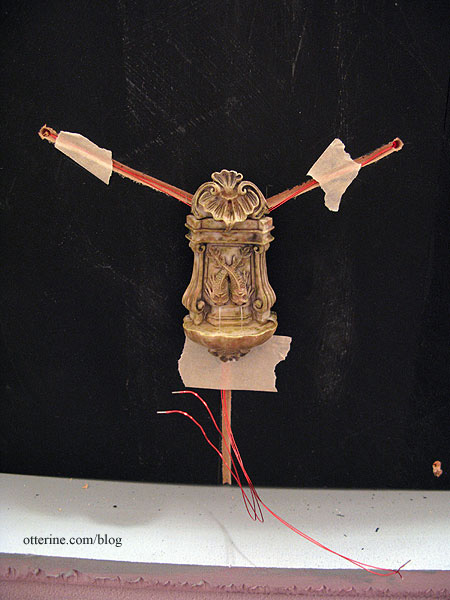
The exterior feature for this wall will be a water fountain.
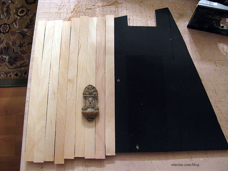
This is a lovely piece from Barb’s Corner on eBay.
These wires will be joined to one end wire to work as a set, and the routed area will be covered by the fountain.
I made a channel on the exterior under the door coach light in case I want to add another small light on the interior side.
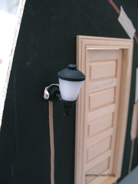
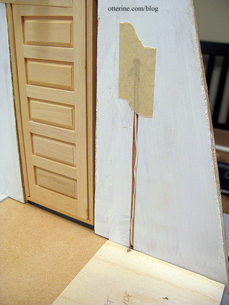
The wire for the door coach light will run inside. I drilled options to run the wire through the floor or through the wall to the outside.
The bathroom sconce wires run through the wall to the living area side.
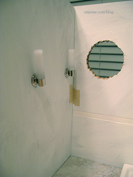
They will be wired as a set to work together, and the end wire will run out the back or through the floor (I drilled options for both).
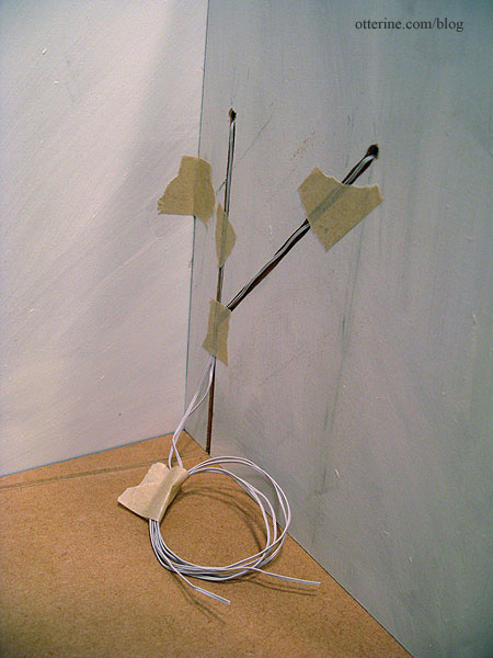
The sunflower lamp will have my usual faux outlet technique.
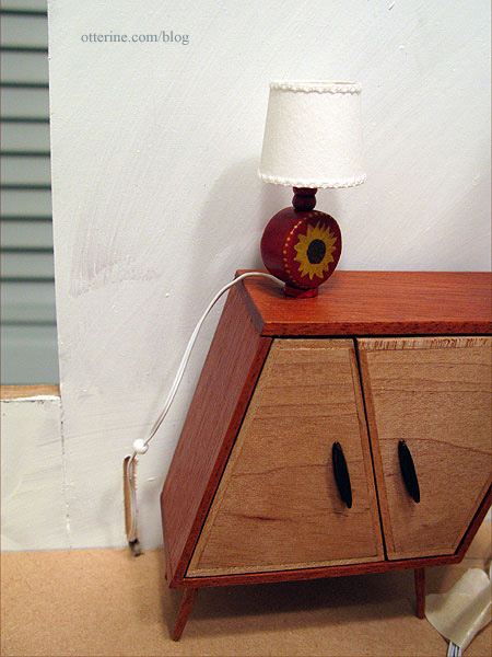
Whichever easel lamp I use, it will also have a wall outlet. You can see the channel on the side wall…again with options for the wire to go through the wall or through the floor.
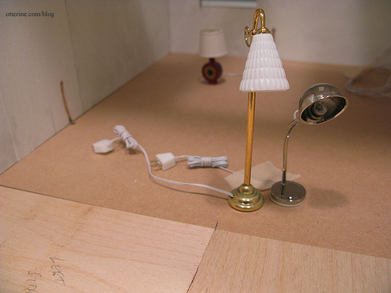
The recessed can lights require a larger drilled hole. I have a post on how to set these lights in place. The wiring channels for these run to the exterior side walls.
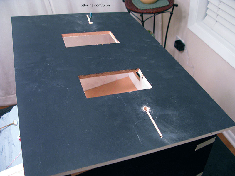
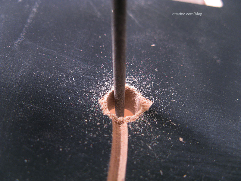
One of my lights wouldn’t fit, so I used a round needle file to adjust the hole.
On the fountain side, I curved the channel around the sconce channels.
On the door side, I made a straight channel.
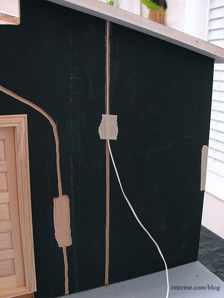
As I tested the fit of these particular wires, I realized the can lights would have to be installed before the exterior siding, which is exactly the opposite of what I want to do. I prefer to mount siding when the walls are unassembled so I can press them flat to dry as needed. But, I had a lot of success using drawing paper templates for the Heritage attic walls, so that will be my solution. I will make paper templates for the exterior walls and prepare the siding on those before gluing the templates to the walls near the end of the build. :D
Categories: The Artist's Studio
February 2, 2013 | 0 commentsThe Artist’s Studio – Wood stove – introduction
The Artist’s Studio is small but it needs a method of heating. I thought about simple radiators, but where’s the fun in that? Here’s my paper mockup of the wood stove for the living area. The bathroom will have a simple radiator.
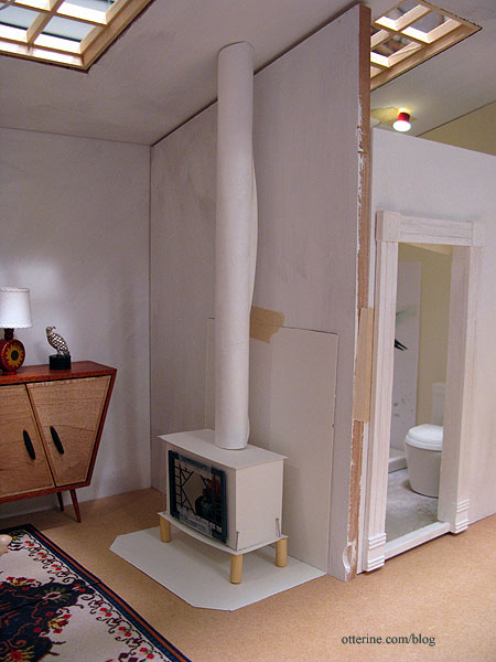
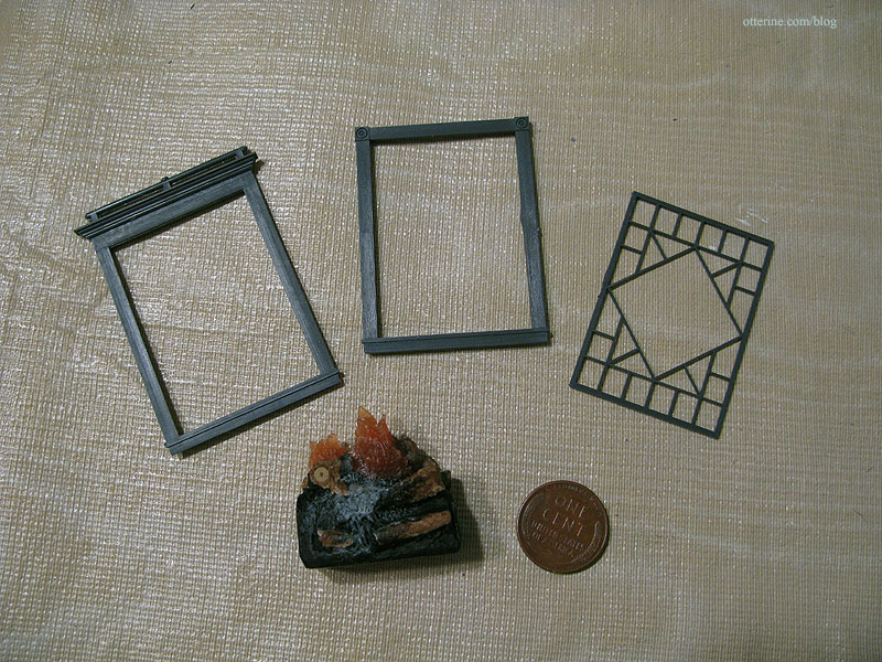
When I first started looking at wood stoves online, I liked the ones with decorative doors the best. I bought a Grandt Line O scale diamond pattern window (3743) to serve as the door. It comes in three parts, and I used two of the three to make the door. I also bought a small resin fire from Mainly Minis.
I made a quick paper mockup to test the overall stove size to fit the door and fire. I have the wood dowel from the original HBS Loft kit to serve as the stove pipe, but I rolled up a piece of paper for the mockup. I pinned on wood beads for the legs.
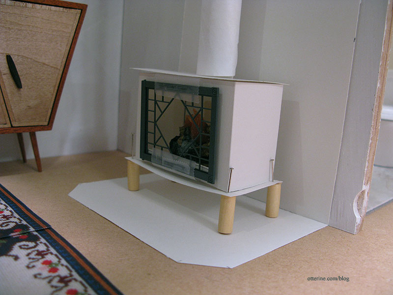
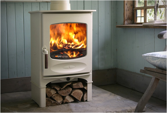
I think it’s a little short overall, so I plan to add a base for wood storage like this one from Charnwood.
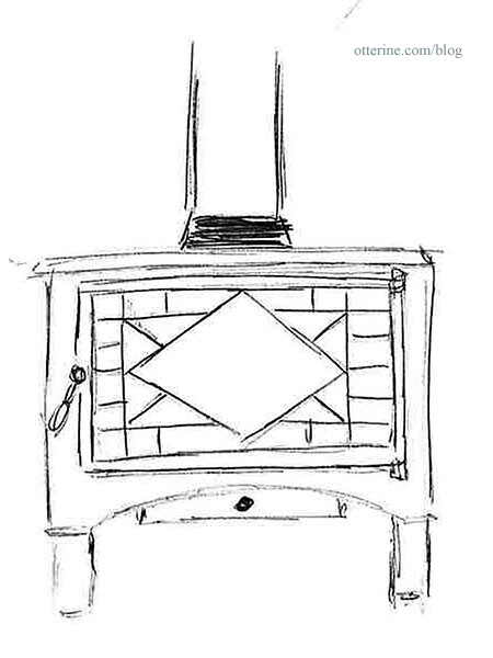
I like a the basic elements of the Charnwood stove, so I made this sketch for mine. I believe mat board will be the best material for the final stove. Kris at 1 Inch Minis does amazing things with mat board, and I’ve enjoyed working with it using her tutorials.
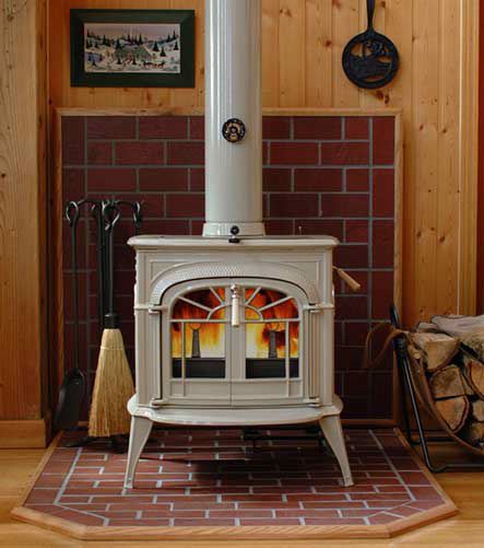
I had originally thought about bricking all the way up the wall in addition to the base under the stove, but then I saw this photo from hearth.com showing a partial brick wall. Love it!
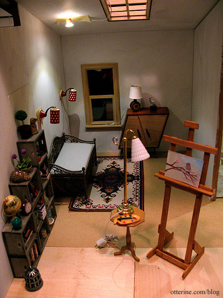
The stove rounds out the rest of the furnishings for the living area….nice and cozy! :D
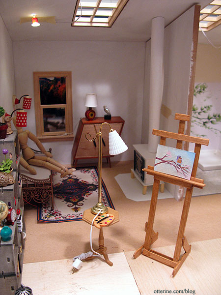
I also made a photocopy of the blue medallion rug I’ve been stitching to see if it will work in the space. I took two copies of the finished half and taped them together. I think there should be enough room for it here. No way would I put a white base rug in front of a wood stove or in a painting studio in real life, but in mini-land…it’s all good!
Categories: The Artist's Studio
January 15, 2013 | 0 commentsThe Artist’s Studio – lighting plan
With the new Dremel Trio in my possession, I can now cut wiring channels more precisely and quickly than by hand. I doubt I’ve seen the last of my handcut channels, mainly because plans change once a build starts. However, I am trying to put in the main channels I’ll need before assembly.
I plan to have two sconces by the daybed. As noted before, I rewired these Lundby lamps with non-replaceable bulbs.
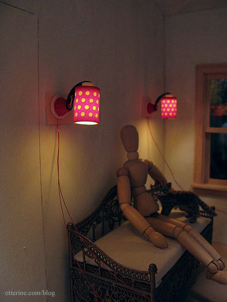
Since I’ll be using non-replaceable bulbs, I need a backup plan in case I ever need to rewire these lamps. I’ll rout out an area on the outside of this wall to curl excess wires as needed and will not cover this area with siding. I will disguise the bare patch with a wall fountain.
There will be a table lamp on the whimsical cabinet by minisx2. I have this sunflower lamp I made that might be a fun addition to the room.
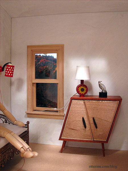
There will be either a floor lamp or table lamp for the easel area. This one is from The Dolls House Emporium. Painting and easel by Lyssa.
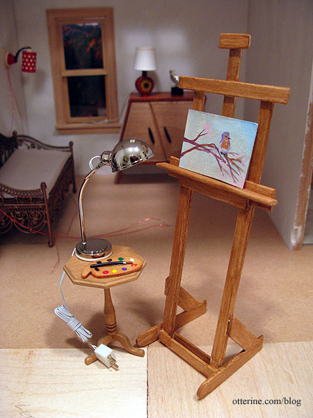
This one is from Dolls House Suppliers. You’ll notice that even though it is a floor lamp, I’ve still placed it on the table where it serves as an easel work light. It will need a new finish, though. :]
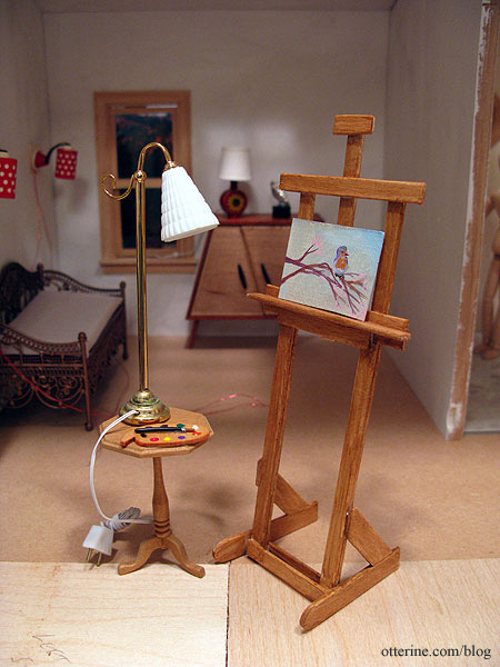
I bought this floor lamp before Monique wrote to tell me that she had found the other lamp I had been seeking. Once that one arrives, I’ll try it out, too. Whichever lamp I choose, it will need a wiring channel.
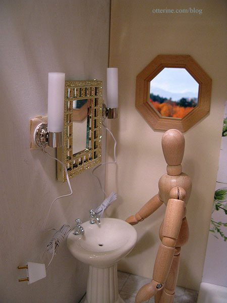
For the bathroom, I bought a pair of modern vanity lights from The DollsHouse Emporium. Their channels will merge into one on the living room side so they can operate as a set. The mirror is vintage Lundby, though I replaced the reflective glass with Darice mirror sheet. The mirror and pedestal sink are placeholders and won’t be in the final layout.
There will be another Lundby wall sconce with non-replaceable bulb above the front door. This channel is also on the outside, and I will add another fun feature to cover that hole.
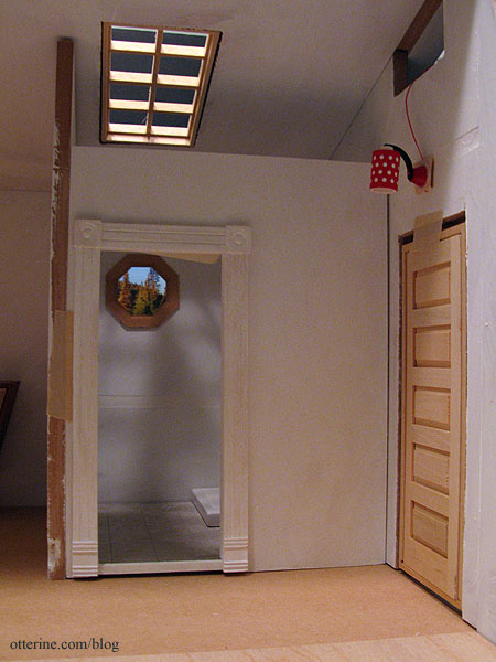
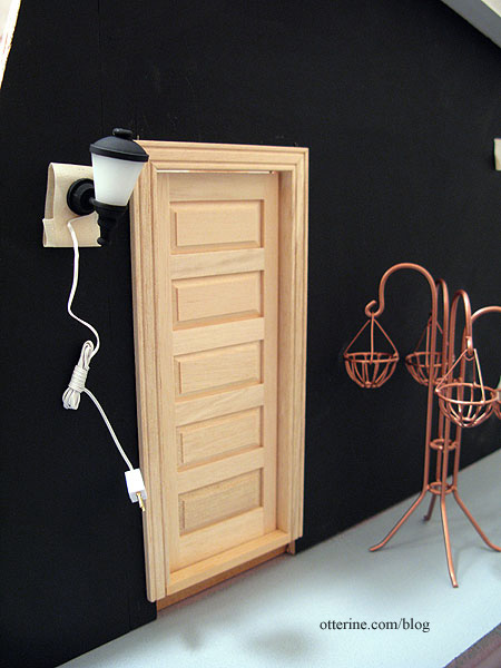
There will be at least one light on the outside, namely this modern coach lamp from Dolls House Suppliers by the front door. I might switch it to the other side of the door, though. Any other landscaping lights can be added later since the entire base is builders foam and channels can be cut easily at any time.
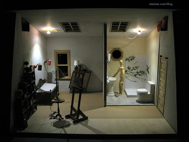
To finish off the build, there will be NovaLyte recessed can lights in the ceiling. They illuminate the whole build so well and complement the softer tones of the non-LED lamps.
Categories: The Artist's Studio
January 14, 2013 | 0 commentsThe Artist’s Studio – Tranquil bathroom
One of the best things about miniature builds is the fact that you can try all sorts of things you might not try in your real life home. This beautiful tile mural shower is so lovely, but it would likely be pricey to install and so specific that you might turn off buyers if you decided to sell your home. Of course, you wouldn’t worry about the latter if it was in the dream home you finally managed to achieve. :D
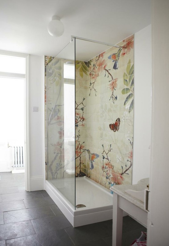
image from Fine & Country, original designer of the bath unknown I thought something as expressive as a mural shower would fit right in at The Artist’s Studio. If the original above came from an existing art source, I couldn’t find it after numerous image searches. If anyone recognizes it or knows of something similar, please let me know.
In the absence of being able to replicate that image in miniature, I did find some fun things along the way, from wallpaper borders to scrapbook paper to desktop wallpaper images. I printed the ones I found online and made color copies of the scrapbook papers to make mockups for your viewing enjoyment. The shower base from The Dolls House Emporium measures 3.5″ square, so the tile mural will be 7″ overall, with an inside corner.
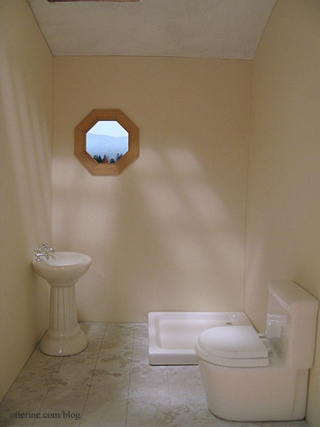
So you could get the full effect with the bathroom color, I cut the Canson Ivory drawing paper for the bathroom but haven’t glued it in place. I’m using a pedestal sink instead of the wall sink for now. I don’t know where the sink will end up on the inside wall, and I don’t want to mar the paper by taping the wall sink in place.
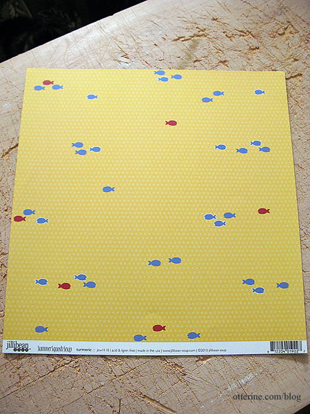
Option 1 – Fish-o-Rama
This is scrapbook paper called Turmeric by Jillibean Soup.
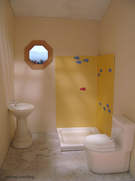
I moved the paper around until I found a fun grouping. The subtle dotted pattern doesn’t show in my color copy. It’s definitely quirky and cute, but even still, the fish seem too sparse on this small sampling.
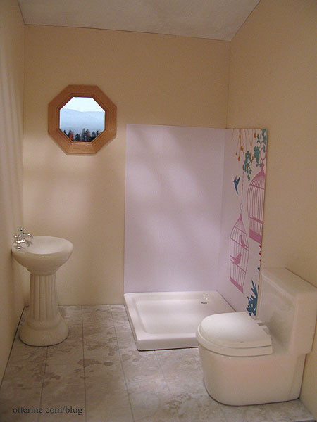
Option 2 – La Cage aux Folles (the birdcage)
Has anyone seen the 1978 French film by that name? I just love it. The American version The Birdcage is good, too, but the 1978 film is simply awesome! :D Anyway, this is scrapbook paper called Hummingbird By Kaiser Craft.
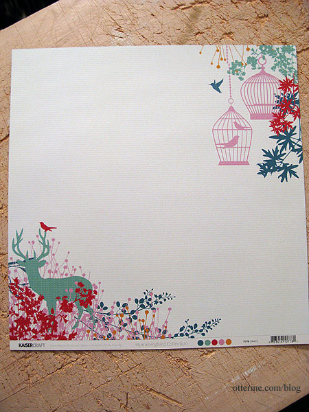
I used the upper right corner with the birdcage. Again, the color copy loses the subtle stripes in the background. With the cut, there’s a design on only one side and I’m not sure birdcages work with a shower. It would make a lovely wall mural in a regular room, though.
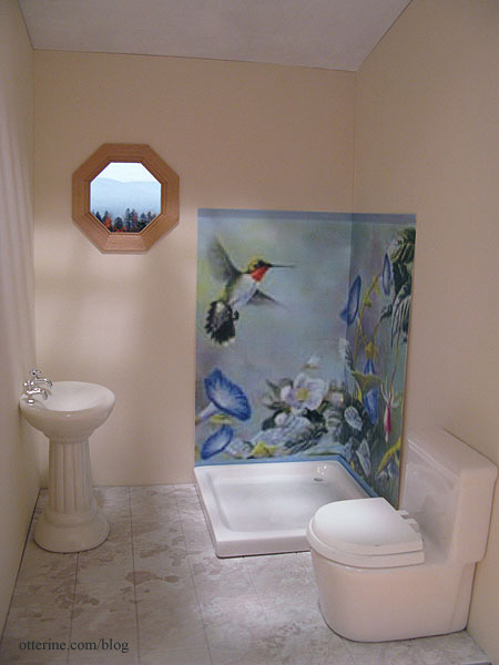
Option 3 – Hummingbirds in full color
This is a wallpaper border from Wallpaper – Inc. I’ve printed from the thumbnail, so it’s very blurry. You can get samples, and if I decide on this option that is what I will do. Maybe too out of scale.
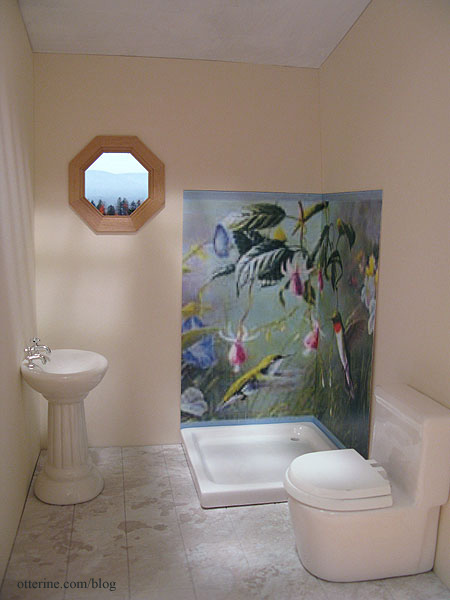
There are a few groupings along the pattern repeat, so this is another option. Seems too busy.
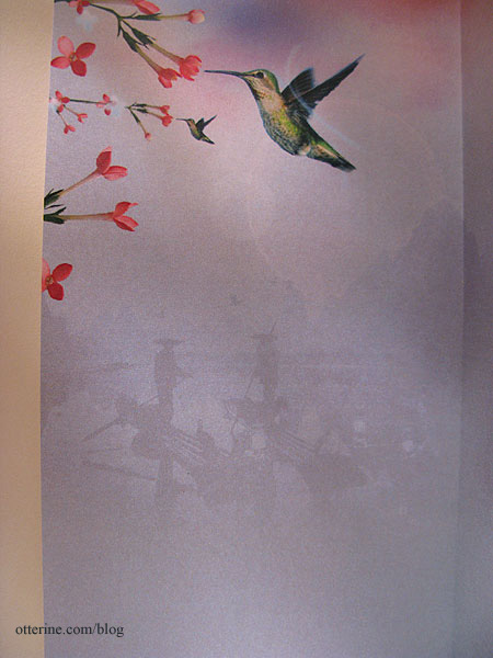
Option 4 – Chinoiserie inspired hummingbird
This is actually an iPad wallpaper. I miscalculated and made this mockup too small, but it works well enough to show the concept. The bird will be slightly larger when printed to the correct size, though it would be better if there were more flowers.
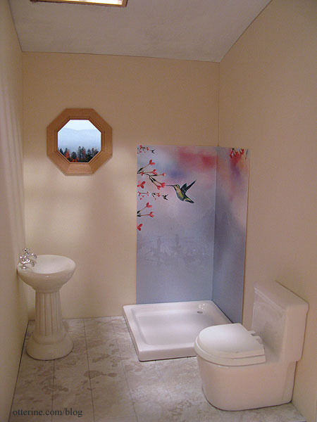
I like this one for its similar tone of the original, but I don’t know how I feel about those silhouetted boaters eyeing me in the shower. :O
Option 5 – Hummingbird in green
This is a desktop wallpaper called Hummingbird on White from 1ms.net. This one is lovely for its simplicity, and the green goes so well with the Ivory paper. This is another close but not perfect solution. I wish more of the branches fit into the sample and that the bird’s wings were more defined.
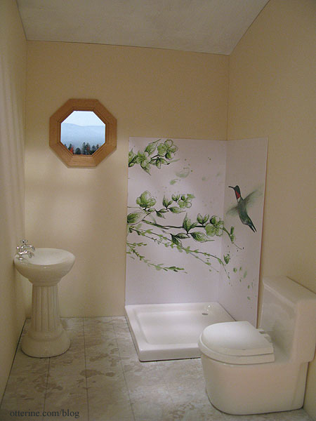
Thoughts? Do you prefer any one over the others? Should I scrap these and keep looking? I might have to draw it myself. :D
———-
As this year comes to a close, I offer my sincere thanks for all the warm wishes and generous compliments you’ve sent my way. Being part of this worldwide community is another great thing about minis, and you’ve all brought so much happiness to my life! Happy New Year!!!! :D
Categories: The Artist's Studio
December 31, 2012 | 0 commentsThe Artist’s Studio – Rustic crate bookcase
Of course, I can never fit all the items I want into any particular build, so things get pushed out and saved for later. One item that I love for The Artist’s Studio is the unique rustic cabinet.
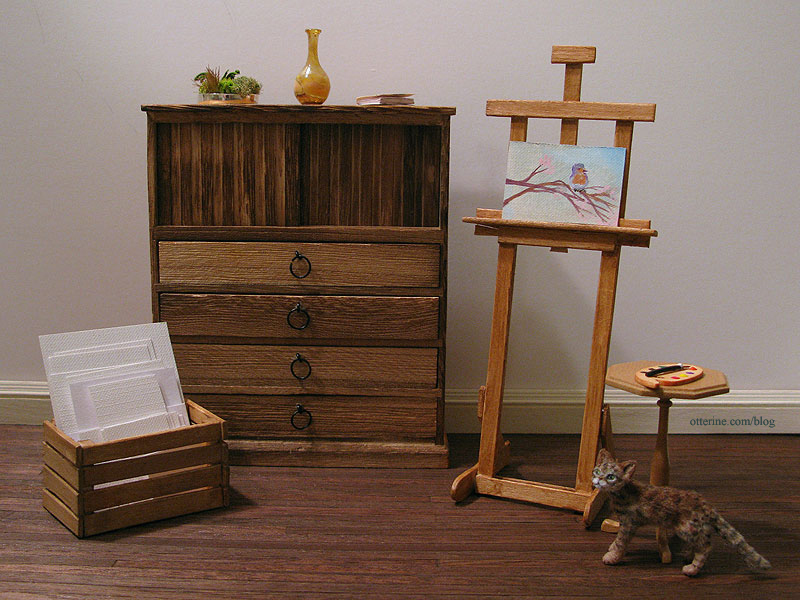
But, I’ve had this image in mind for the Studio all along, so out the cabinet must go! :\
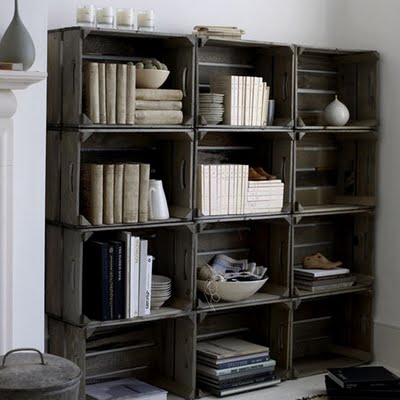
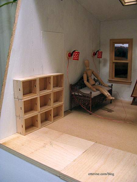
image from Recaptured Charm Could I have made nine identical crates? Yes, but why do that when Minimum World offers perfectly suitable ones already made? :D I bought these for $2 each instead of trying to make a bunch of identical crates, which would have taken days. With the angled front wall, I thought an offset stack would look best.
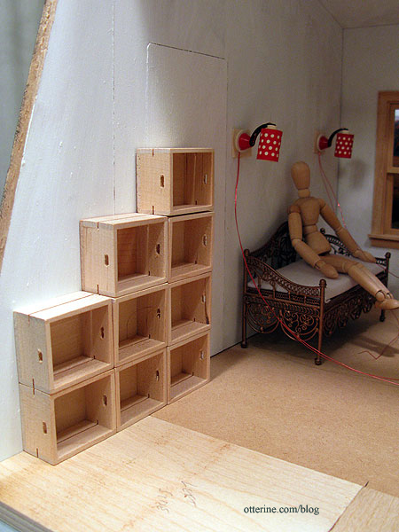
A set of nine in straight columns is not as interesting, and twelve (as shown in the original photo) wouldn’t fit in the allotted space without crowding the daybed.
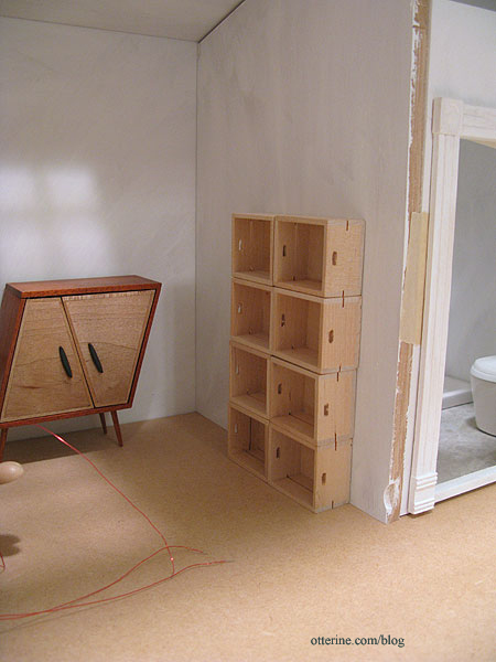
For reference, here’s a narrow configuration in the main living area. Again, the full stack of twelve would not have fit.
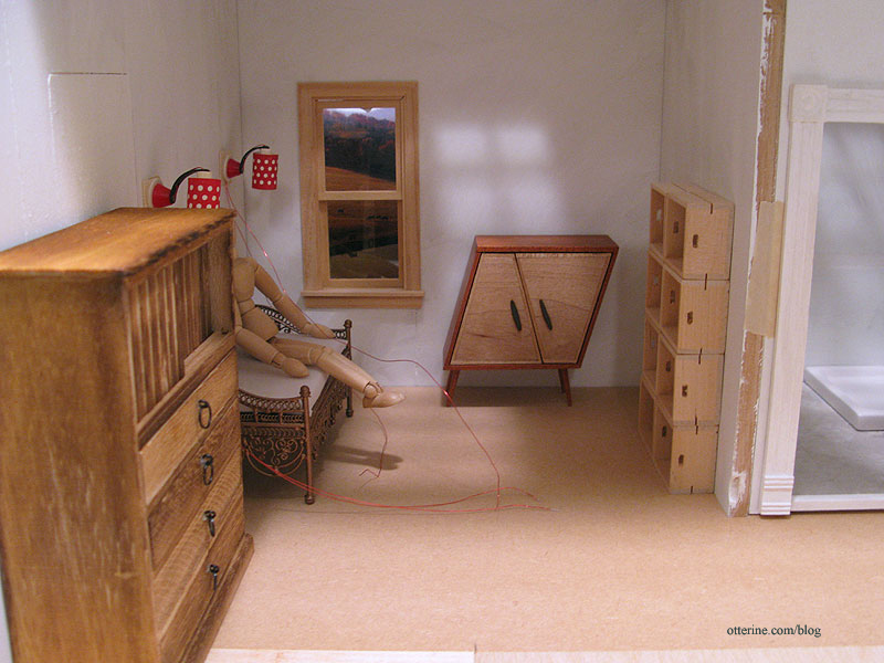
With the rustic cabinet in its original place, it’s just too crowded in my opinion.
I stained the crates with two washes of grey, black and brown.
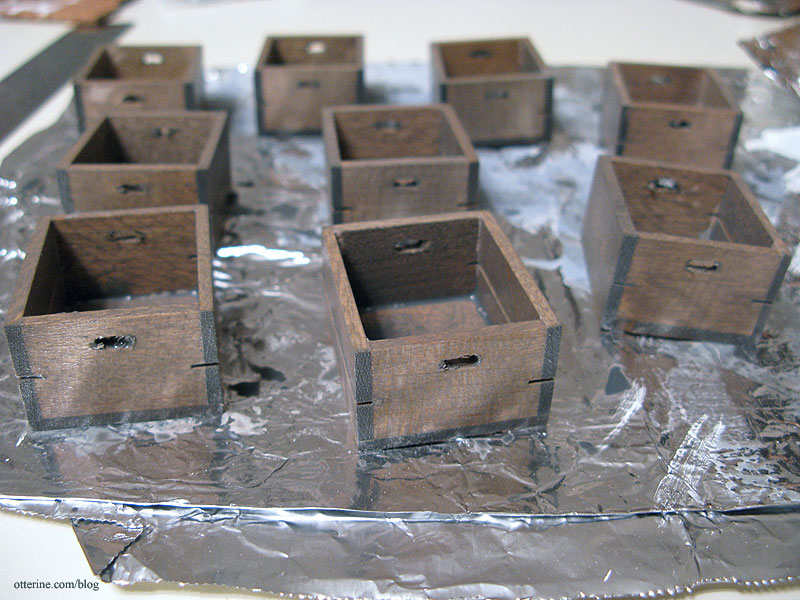
Already much better.

Once dry, I sanded them as needed. There was slopped glue around many of the seams, but that was easily masked by stuffing the shelves full. :D I put my wheat back penny in the bottom row for size reference.
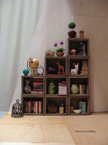
I’ll make some additional items appropriate for a studio, but I love the way they look so far with some minis I had on hand.
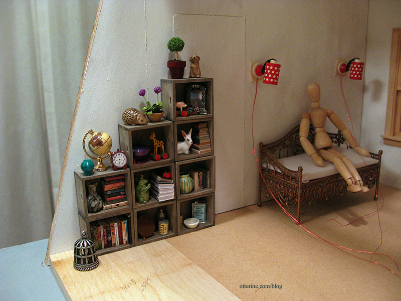
In fact, many of these items will have to stay…they just look so completely at home.
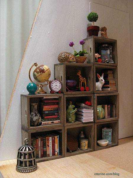
Categories: The Artist's Studio
December 27, 2012 | 0 comments
NOTE: All content on otterine.com is copyrighted and may not be reproduced in part or in whole. It takes a lot of time and effort to write and photograph for my blog. Please ask permission before reproducing any of my content. (More on copyright)


