NOTE: All content on otterine.com is copyrighted and may not be reproduced in part or in whole. It takes a lot of time and effort to write and photograph for my blog. Please ask permission before reproducing any of my content. (More on copyright)
Categories:

The Artist’s Studio – cardboard deer mount
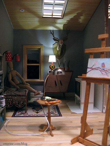
One of the fun things about making The Artist’s Studio is that I get to put interesting things in it. An artist needs inspiration and what better way to do that than to surround oneself with unusual works of art?
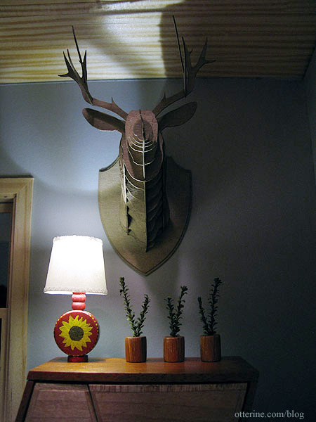
This cardboard deer head was made from a laser cut kit from Amazing Miniatures. It was very easy to assemble. I didn’t use glue other than to attach the two plaque pieces together and to hold the deer to the plaque. The rest is fitted together using the laser cut slots in the design.
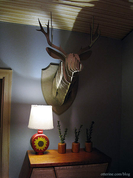
It adds a certain novelty to the Studio, don’t you think? :D
Categories: Miniatures, The Artist's Studio
February 22, 2013 | 0 commentsThe Artist’s Studio – Wood stove, part 2
Continuing work on the wood stove. I glued the back and sides around the foam core base. I cut another piece of foam core for the top and taped in place (no glue yet).

I added the foam core lining to the sides and back. I tested my small fire, and it still looks like there is a lot of space on either side.

I borrowed the fire from The Aero Squadron Lounge, which is glued to its holder, and it seems a better fit side to side.

I cut a thin frame for the window to make the door.

I glued the window into the frame, using super glue gel to attach the diamond insert. I will use the scrap of mat board to cut an acrylic window for the door later in the build.

I glued the front to the stove, still leaving the upper foam core piece separate.

I added a thin layer of spackling along the joins to smooth any small gaps.

I cut a top for the stove and glued it to the top foam core piece.

This will now serve as a locking lid for the stove. I can’t glue it as a solid unit until I get the stove painted and the flickering LED installed.

I added thin wood trim around the base and a narrow ledge under the door for detailing. I’m still thinking about whether I want to hinge the door or just glue it on with faux hinges. I’m planning to use a battery operated flickering LED for the fire, so I shouldn’t have to access the interior. Right now, I have it held on with mini hold wax. I will paint it separately, either way.

I added a lower tray made from foam core covered on the sides with mat board. I am guessing that detail on the original might be a tray that collects ashes?

I will use the round dowel that came with the HBS Loft kit to serve as the stove pipe, but I am going to wait to cut it until after the stove is finished and I have the final placement marked in the Studio. I might leave it whole and cut an opening in the ceiling, using the extension above the roofline as a chimney. Seems Cora has figured out where the warmth is coming from.

Yeah, I love it so far! :D

Categories: The Artist's Studio
February 20, 2013 | 0 commentsThe Artist’s Studio – Wood stove, part 1
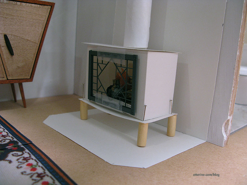
Here’s a quick reminder of my wood stove, shown in (very rough) paper mockup form.
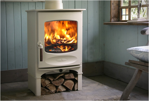
This stove from Charnwood is my main inspiration.
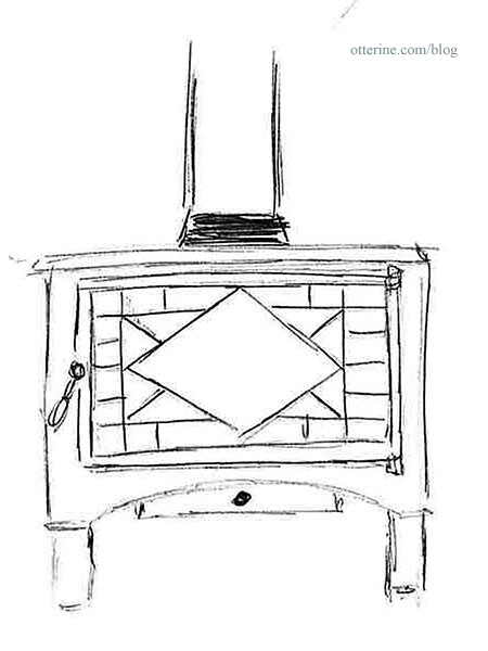
And my sketch for the version I plan to make.
Inspired by the work of Kris at 1 Inch Minis, I’ve opted for mat board. Since I am using a Grandt Line O scale diamond pattern window (3743) to serve as the door, I started there. I traced around the inside of the door frame and then marked the outline for the front.

I used circle templates to make the lower curve detailing. I added a little height to this piece since my mockup was too short in relation to the furnishings. This includes the wood storage area on the bottom. My stove measurements ended up being 1 15/16″ wide by 3″ tall.

Hello, lovely scroll saw! ;D

I don’t have a lot of practice cutting curves on the scroll saw…in fact, this was my first! So, the two sides were a little uneven. I flipped the cutout over and traced the outline onto the opposite side.

I used files and a sanding stick to even out the design. I also sanded the edges slightly to make it more rounded as though it were shaped from metal. Mine is a little fancier than the inspiration piece, but it will work well with the fancier door I have planned. I cut the back to match the front, leaving off the curved detailing.

I measured the depth required to hold the small fire from Mainly Minis and cut two pieces the same height as the front and back using this measurement as the width.

I cut an interior base to fit inside these four pieces from foam core board. I wanted a sturdy base to hold the fire inside the stove. I marked the line where the foam core shelf will sit inside the stove.

I tested the stove for fit in the room, and it looked good overall. I won’t need to adjust the brick surround much.

I think I need to switch this small fire with the wider fire I usually use, though. :D There’s a lot of space inside the stove, so I think I’m going to start by lining the sides and back of the interior with foam core.

Categories: The Artist's Studio
February 19, 2013 | 0 commentsThe Artist’s Studio – Interior progress, continued
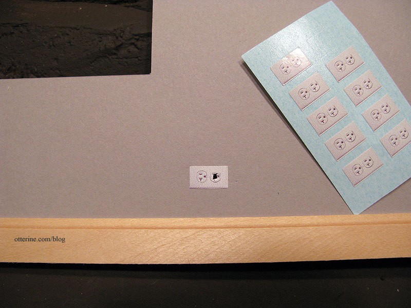
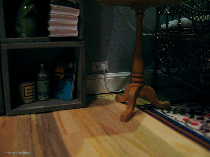
Continuing progress on the interior. Before I could install the wallpaper, I needed to make outlets for the two lamps that would be plugged into the walls. I usually make my faux outlets from wood, but this time I tried out the glossy printed ones from miniatures.com. They work well here since this is a more modern build.
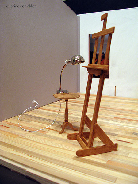
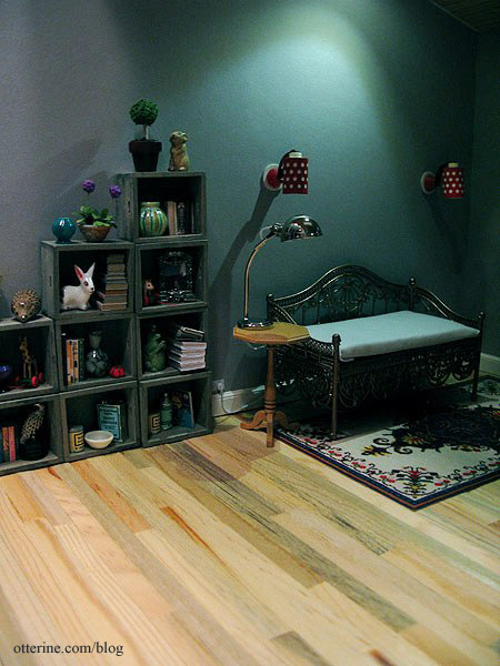
I decided to go with the silver lamp from The Dolls House Emporium, simply because it looked the most like a work lamp. I will build a taller table for it to work better with the easel.
I then glued in the wallpaper…always a test of patience. I also glued the Southern Pine flooring sheet to the ceiling board. I had to use four rows of boards from a second sheet to cover the entire ceiling.
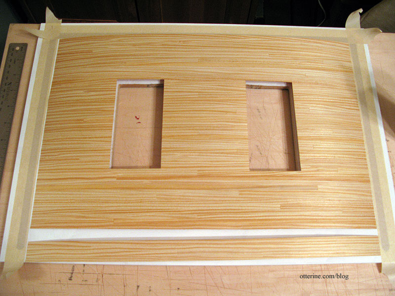
Once dry, I used the same Delta Ceramcoat satin varnish that I had used on the flooring. It warmed the wood tones slightly.
Just a quick note on why I initially wanted a natural wood ceiling and decided to stick with that idea. I guess I’ve considered this building to be an extra space built on a larger lot with a residence…like an efficiency apartment. So, it wasn’t built with the idea of its being a studio, per se, but a small retreat or guest cottage. Now, it is occupied by an artist, and the cozy warmth inside inspires creativity even if it’s not designed to be the most efficient artist studio with the best possible lighting and tons of storage.
I installed the Lundby sconces in the living area. Since these will need to be removable for rewiring, they are held in place with mini hold wax. On the outside, I ran the wires through the channels to the open area. Since I don’t want the wires to stick to the tape keeping them in place, I added quilling paper to the tape.
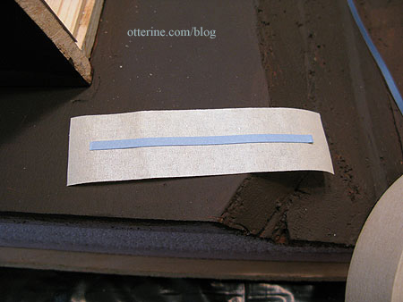
This will keep the wires in the channels but able to move freely in case of rewiring.
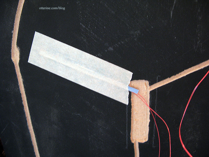
For the Lundby sconce above the door, I needed to glue in the wallpaper first. But, I can’t install the exterior coach lamp until after the siding is on the outside. But, I can’t install the siding until the ceiling is on and the recessed can light is wired. Oy.
So, I glued the part of the interior wallpaper that covers the Lundby sconce hole but left the lower portion free so I can wire the coach lamp later on.
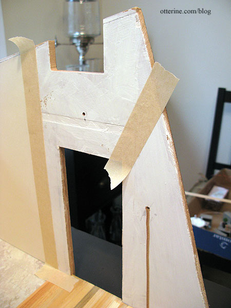
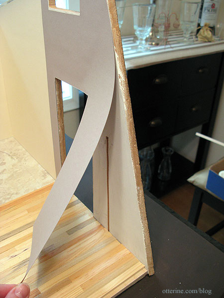
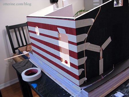
Since I had the wiring completed on the back wall, I decided to glue on the exterior siding template to see how easy it was (or not) to do. I spread Aleene’s Quick Dry glue on the back of the template and dotted it with dabs of super glue gel. I pressed it in place and taped it across. So far so good.
I painted the baseboard trim Warm White by Americana. Why that color and not true white? It’s softer, and I had an extra bottle of it from The Aero Squadron Lounge. Since the interior is still in progress, only the back and outer side baseboards are installed at this point. The outlet stickers worked very well.
I accomplished quite a lot over the long weekend.
The work lamp can double as a table lamp by the daybed, too.
Categories: The Artist's Studio
February 18, 2013 | 0 commentsThe Artist’s Studio – Interior progress
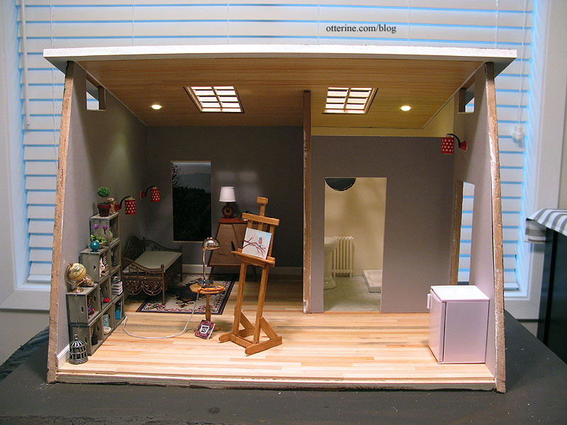
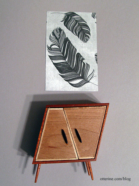
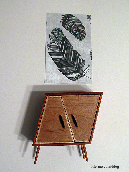
Today, I spent some time on the interior. I chose the darker of the two wallpapers – Daler-Rowney Dreadnought Grey. I tried both papers out with the whimsical cabinet by minisx2 and some scrapbook paper art I have planned for the space. The darker grey just set the pieces apart.
The lighter Canson Pearl Grey was too washed out in comparison.
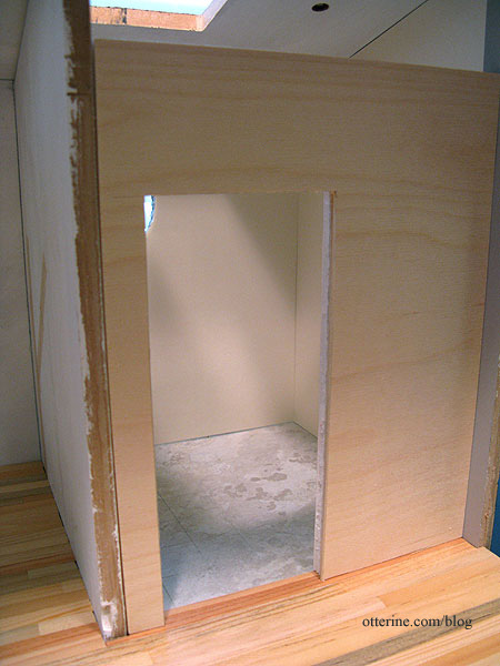
After putting the interior wall in permanently, my initial removable wall was no longer a good fit. I cut a new wall from 1/8″ plywood and 1/4″ foam core board. The two thicknesses glued together will be the size needed for a Houseworks door.
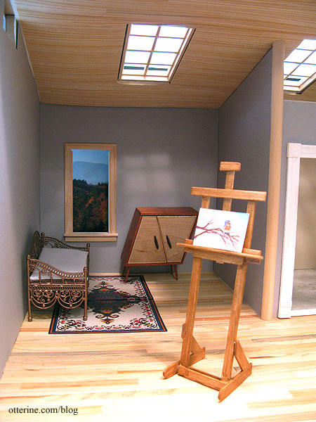
None of the wallpaper is glued in place yet since I have some lighting to work on first, but I tried out the wood ceiling with the new grey paper in place. I liked it well enough to cut the window openings for a more in depth mockup. I love the warmth and visual interest it adds.
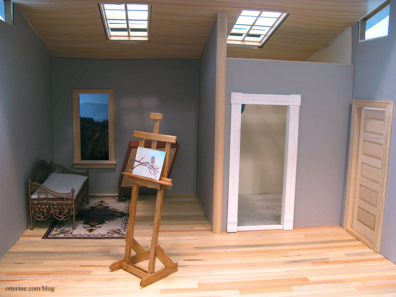
Since the bathroom wall will be removable, I’m going to finish the front edge of the dividing wall with 1/2″ wide half round trim. This will have the slightest overhang on either side of the 3/8″ thick wall and give some stability to the removable wall. It will also mask where the wallpaper ends on that removable wall.
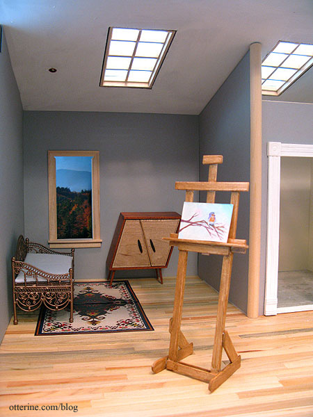
For comparison, here is the Studio with a plain white ceiling.
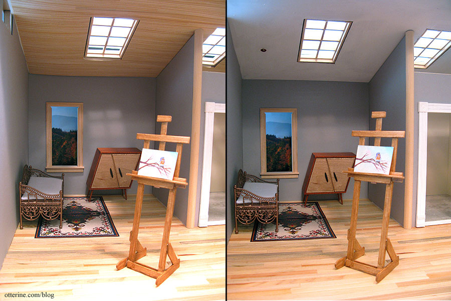
I’m sure some will like it better, but to me it seems too plain.
Categories: The Artist's Studio
February 17, 2013 | 0 comments
NOTE: All content on otterine.com is copyrighted and may not be reproduced in part or in whole. It takes a lot of time and effort to write and photograph for my blog. Please ask permission before reproducing any of my content. (More on copyright)


