The Artist’s Studio in The Dolls’ House Magazine
My mood was brightened today when I received my copy of The Dolls’ House Magazine all the way from the UK! In the November 2013 issue, there’s a full write-up on The Artist’s Studio.

Christiane wrote to me a few months back about featuring the Studio, and we had a nice chat. It’s so wonderful to be featured along with so many other talented artisans!
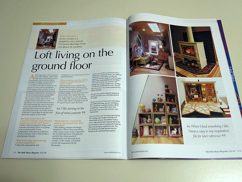
It was my first time reading the magazine, and there were not only a lot of great builds featured but a number of projects, patterns and tutorials. A very fine magazine!

I want to send out a huge thank you to Christiane and the staff at The Dolls’ House Magazine for a wonderful feature! :D
Categories: Books and media, The Artist's Studio
October 18, 2013 | 0 commentsMidnight Snack
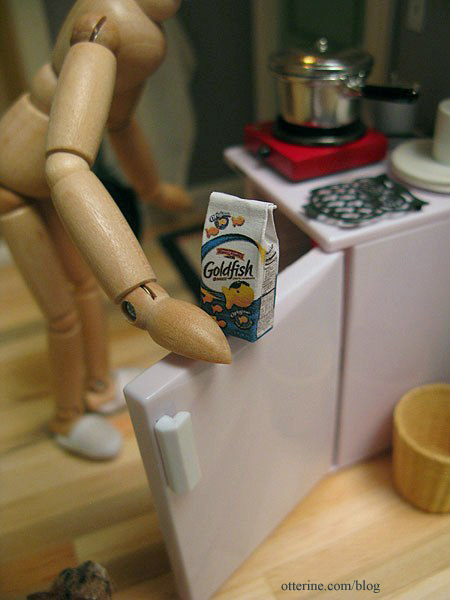
MinisModernas is running their second annual modern minis contest, and I set up a scene in The Artist’s Studio called “Midnight Snack.”
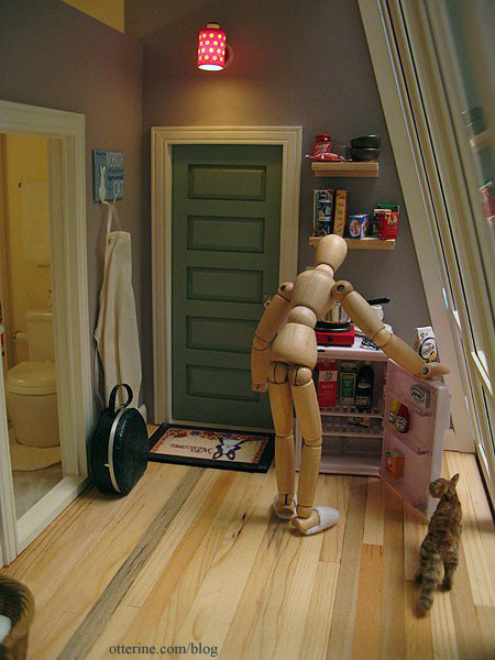
Looks like Cora is hungry, too.
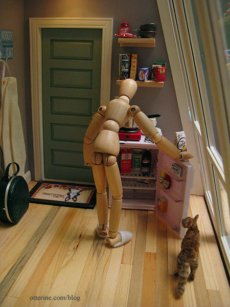
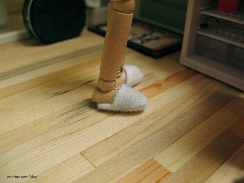
The slippers are from the Heritage, and I couldn’t believe they fit! :D
The goldfish crackers are from Cindy at Snowfern Clover.
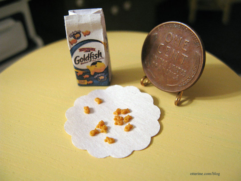
Yes, there are tiny goldfish crackers inside. Amazing!
Here’s what the kitchen looks like without the model setup.
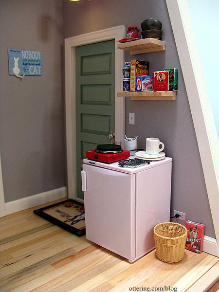
The hotplate was made by me and is one of my favorite features of the Studio. :]
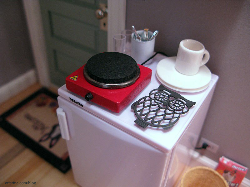
Thank you to MinisModernas for a wonderful modern minis contest! :D
Categories: Roomboxes and Mini Scenes, The Artist's Studio
June 1, 2013 | 0 commentsUndersized Urbanite: The Artist’s Studio
My entry in the Undersized Urbanite contest hosted by Christina at Little Victorian is The Artist’s Studio.
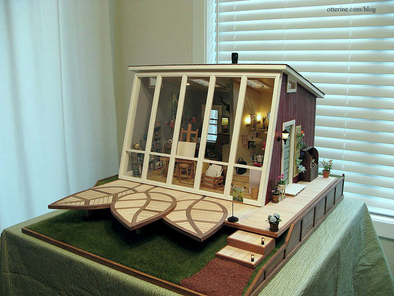
I drew my concept inspiration from The Thomases’ Rooftop Artist’s Studio (seen in the second gallery in this link) and Nell Corkin’s Summer Studio, created in tiny 1:144 scale.
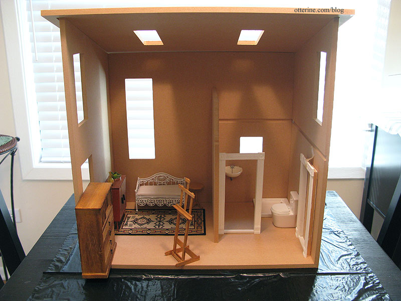
The basic structure is the Loft kit from miniatures.com (this was their 2012 Creatin’ Contest kit), though I made several modifications to it, including lowering the height by 5 3/8″ and creating an angled front wall.
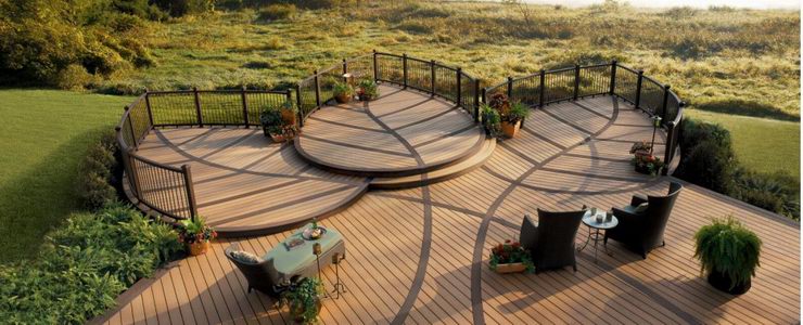
the first dry fit After the large window, the most prominent feature on the exterior is The Deck, scratch built by me based on an original real life deck by Trex. I left off the railing for my rendition since it’s rather low to the ground and I didn’t want to detract from the overall aesthetic.
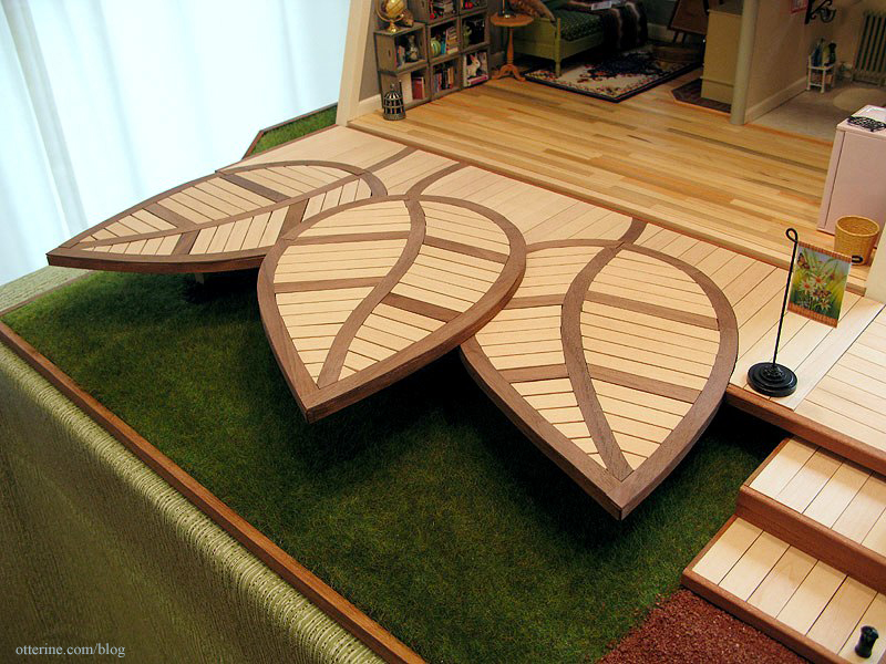
I tried to capture the essence of the original while making it my own. Here’s the original from Trex.
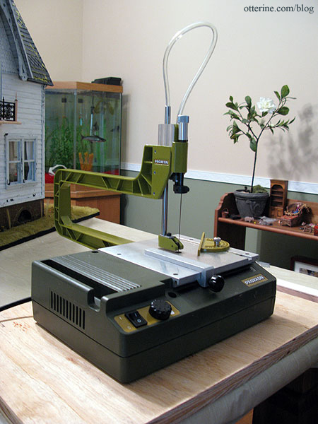
A special thanks to mom and the Proxxon scroll saw she gave me for Christmas! I could not have accomplished this deck without it.
The lights on the steps are from Creative Reproductions 2 Scale.
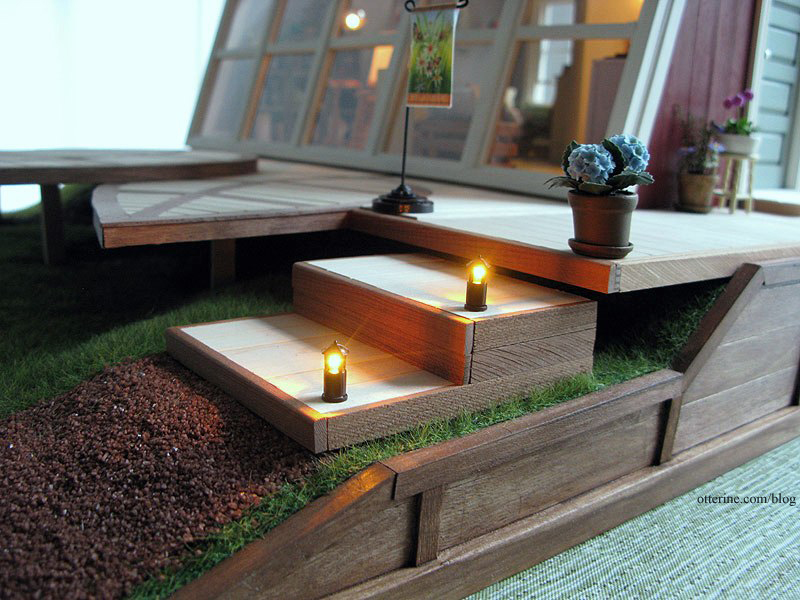
It’s not quite dark yet, so I’ll have to take some nighttime photos another time. :]
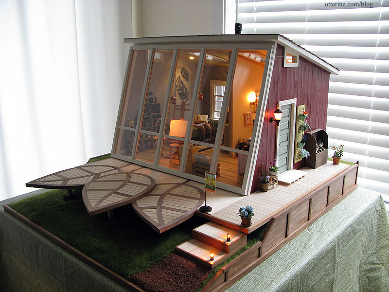
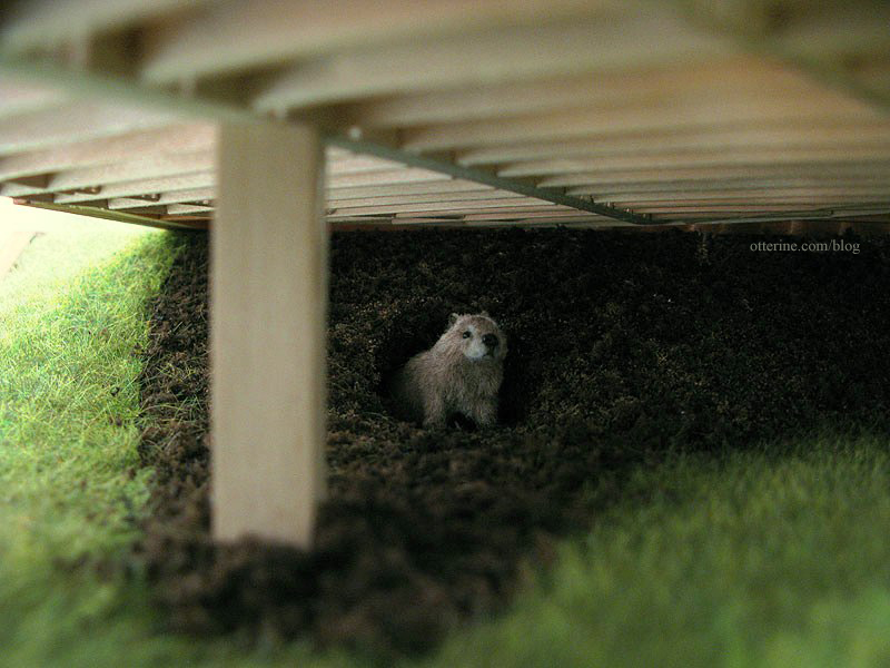
Woodrow’s comfortable burrow is hidden under The Deck. Woodrow was made by *Reve*.
The landscaping is simple and serene, with a retaining wall built around the sides and back.
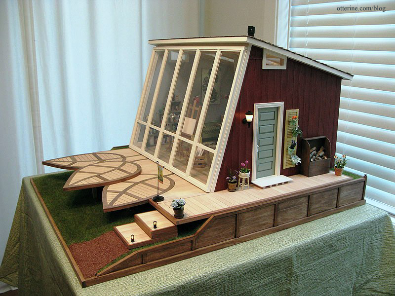
The scratch-built firewood box hides the switch for the wood stove inside.
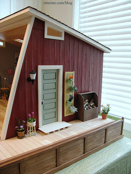
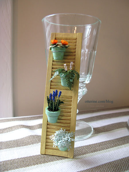
The shutter garden was made following a similar life sized piece.
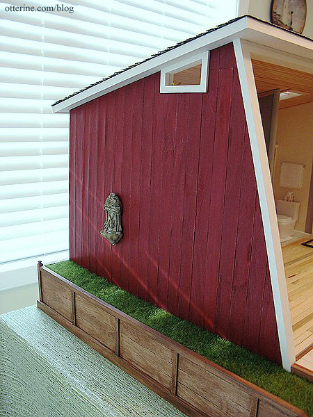
On the opposite side, there’s an elegant fountain, but I think I need to do some more gardening on this side. :D
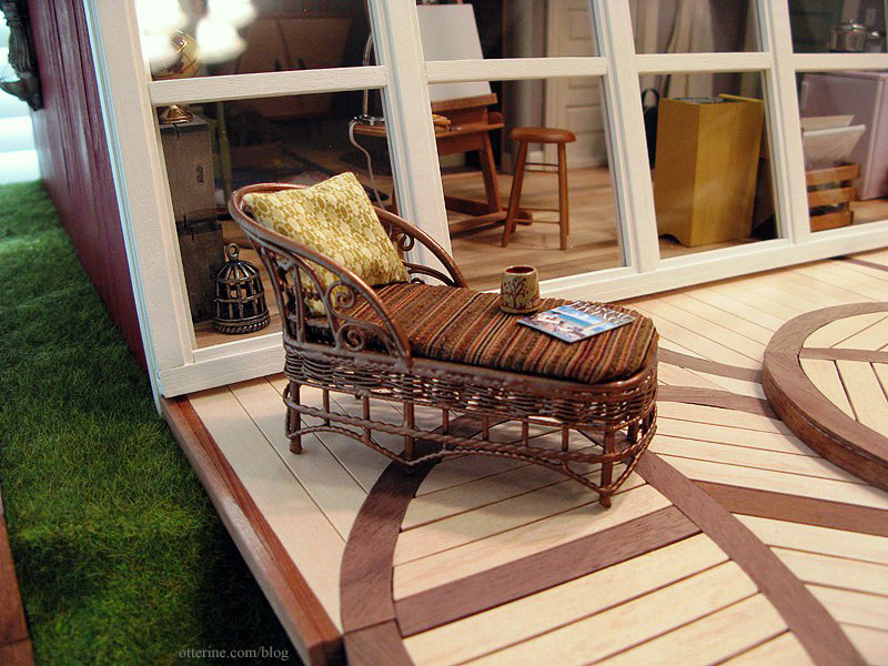
I painted and upholstered a chaise for The Deck. The magazine was made by me, and the mug is by Jane Graber.
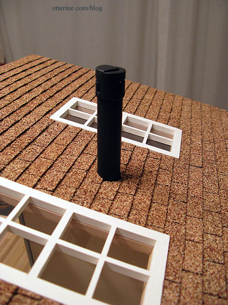
The shingles are by What’s Next and it was an adventure finding a supply for the Studio! The chimney is made from bits and bobs.
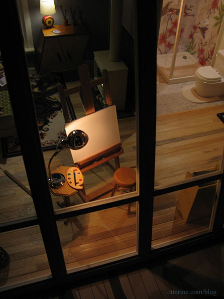
The window wall lifts off to access the interior. The window sits in front of the opening without any attachment beyond some mini hold wax to keep it from shifting. There’s enough of an angle to the front of the building and weight to the window assembly that it will lean in place otherwise.
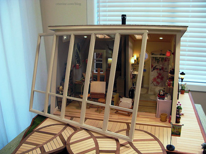
The rustic wood floor in the main area was installed piece by piece, and the wood ceiling was created using Southern Pine flooring sheets. The wallpapers are drawing papers: Daler-Rowney Dreadnought Grey for the main area and Canson Ivory for the bathroom.
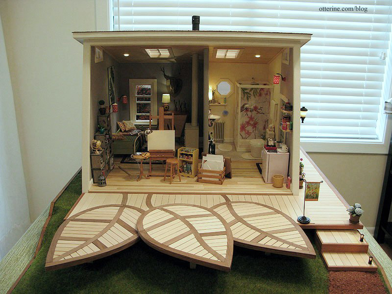
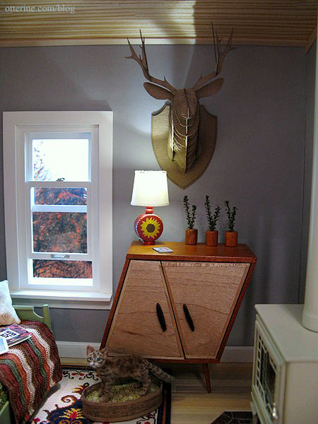
There is a living area with a daybed from a Realife Miniatures kit, a whimsical cabinet by minisx2 and a scratch built wood stove. I stitched the blue medallion rug and rewired some vintage Lundby lamps, one of which is from my childhood dollhouse. The wall art is a cut section of Feathers scrapbook paper by Recollections, glued to a piece of black mat board. The afghan is by Mary at Roslyn Treasures.
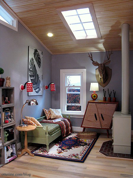
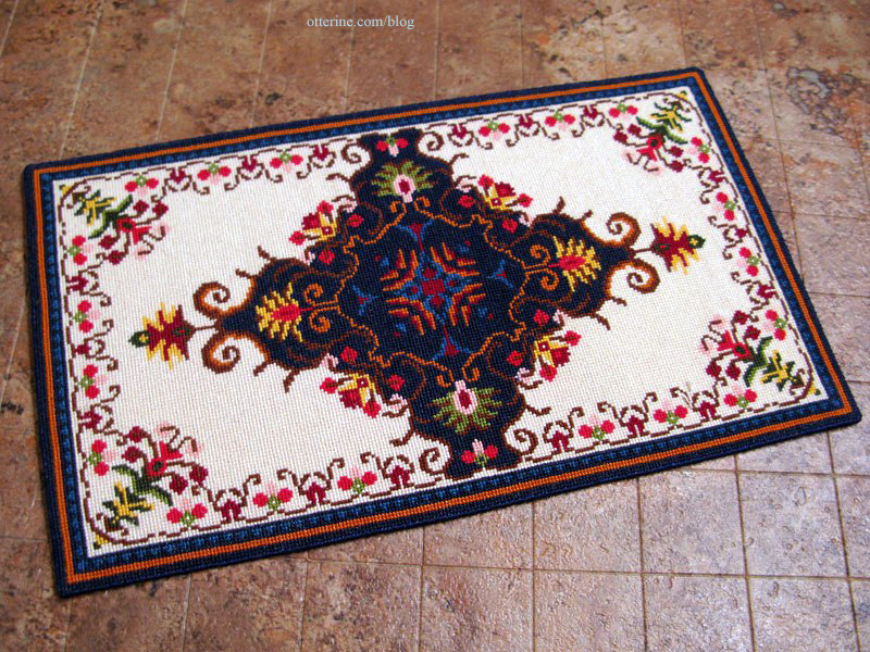
Cross-stitching time for the rug was 154.5 hours on 32 count Jobelan. Final finishing took only a couple of hours. The final measurements are 7 7/8″ long by 4 5/8″ wide.
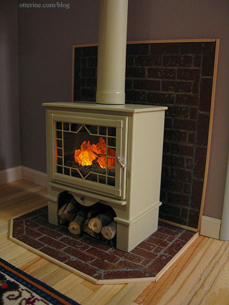
The wood stove was made from mat board, wood, a plastic small scale window, resin fire, LEDs and jewelry findings. The firewood is from an old tree cut down in its prime. The brick surround is egg carton material.
Cora was made by *Reve*, and her bed is a basket by Al Chandronnait from miniatures.com, though I added my own tufted insert.
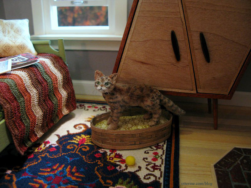
The cardboard deer is from Amazing Miniatures. I made the sunflower lamp, plants and book.
The forward area on the left side is the art space.
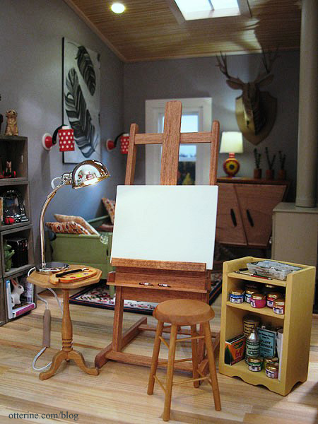
I wish I had such a lovely setup in real life!
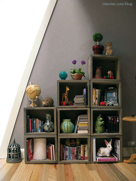
There are rustic crate shelves stuffed with books, goodies and objets d’art perfect for creating interesting still life compositions. Some of these items were purchased, some were gifts and some were created by me. It would be too long of a list to name them all here. :]
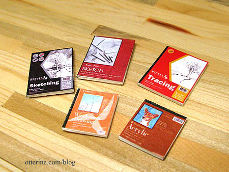
The artist paper pads were made by me.
There is an easel made using a pattern from Miniature Room Settings by Helen Ruthberg; I made it from basswood and stained it Minwax Cherry. The stool was purchased from All Small Miniatures. Lyssa sent me some art papers and wrapped canvases for a swap sometime ago. I glued one of the papers to mat board and primed it with white paint.
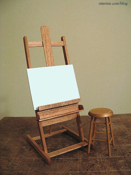
Right now, mine is an ode to all well loved easels when they were first brought home. :]
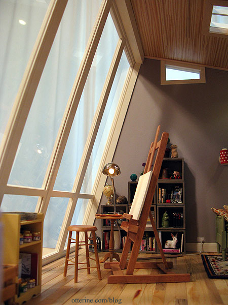
The book also had a pattern for a tabouret, which Dictionary.com defines as, “a small, usually portable stand, cabinet, or chest of drawers, as for holding work supplies.” In the interest of time, instead of making my tabouret from the pattern, I shortened a Daisy House floor shelf kit. It is painted Sunflower by Folk Art. Lyssa sent me the bead jars, and I finished with labels left over from the paint tube tutorial.
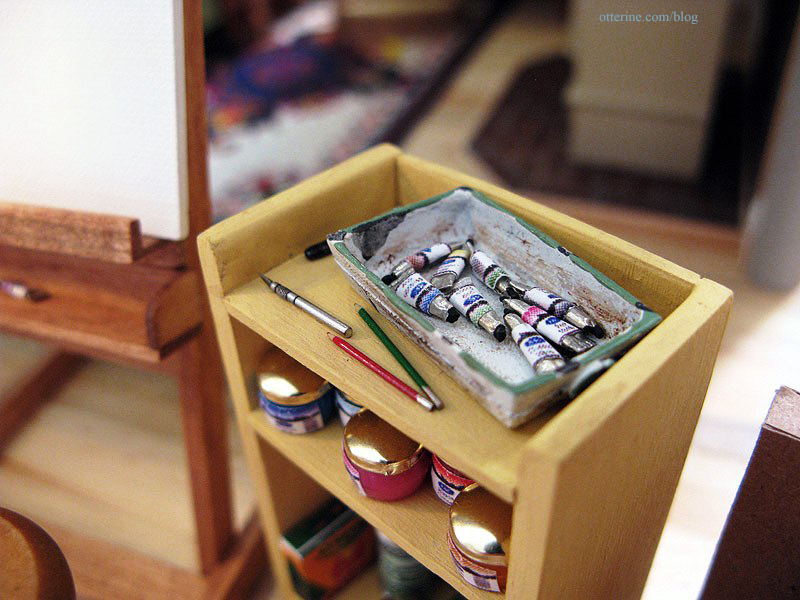
The tiny paint tubes were made from a tutorial by Carol of true2scale.
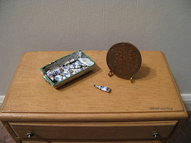
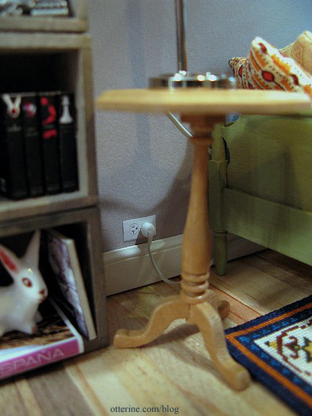
The lamp from The Dolls House Emporium is wired with one of my signature faux outlets. :] The sunflower lamp is also wired this way, but the cabinet hides the outlet.
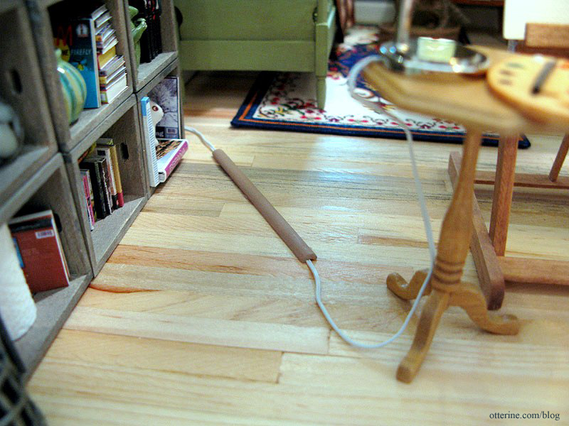
And, of course, you can’t have a cord stretched about waiting to trip you. I made a cord cover from half round trim with a channel cut to cover the cord. It is held in place with mini hold wax.
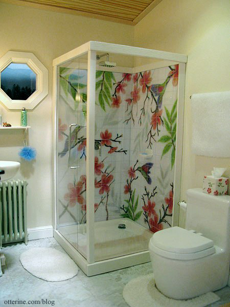
The bathroom occupies the right back corner and has a removable front wall. The lighting, shower base and toilet are from The Dolls House Emporium. The tile floor is Greenleaf vinyl tile. The radiator was made from a Chrysnbon kit.
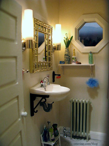
The wall sink and soap holder (it has a magnet to hold the soap on) are from Bibian’s Poppenhuis, and the mirror is a vintage Lundby piece from Vintage Lundby with a replacement insert made from Darice plastic mirror sheet.
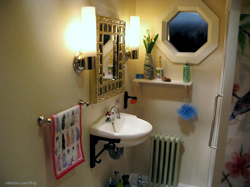
The kitty tea towel is from Marlene.
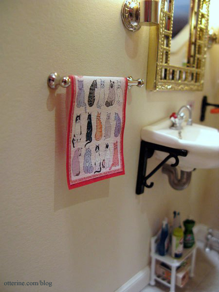
I made a wood shelf for accessories and toiletries to sit below the octagon window. I made the pet hair roller and loofah. The bottle came from Fran, the fox is by Barbara Meyer and the vase was purchased from All Small Miniatures. The GFCI outlet is a sticker from miniatures.com…love these!
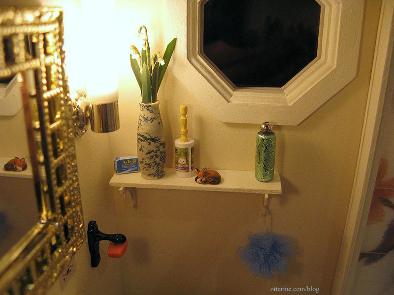
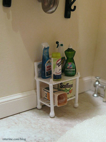
I used a half scale shelving unit for some cleaning supplies, a lightbulb pack and some extra toilet paper. In real life, you’d want to hide all these necessities, but in mini we just delight in seeing them out in the open. :D
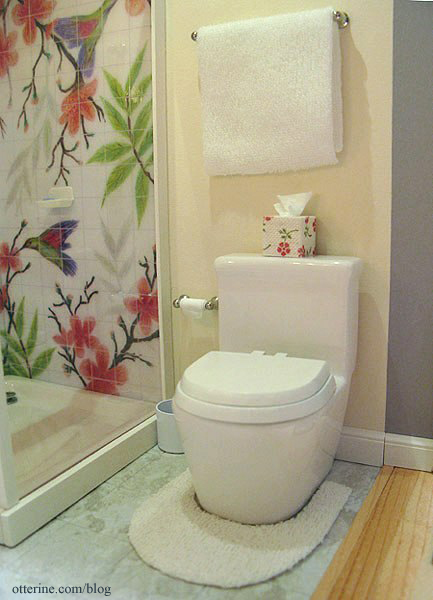
The chrome hardware was purchased, and I made the terry towel and bath mats. There is real tissue around the toliet paper holder, and I made the tissue box as well. It rather matches the shower, doesn’t it? The small metal waste bin is the largest from a set of kitchen canisters.
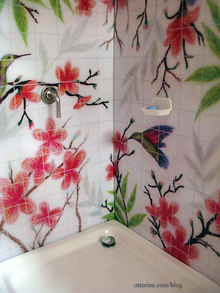
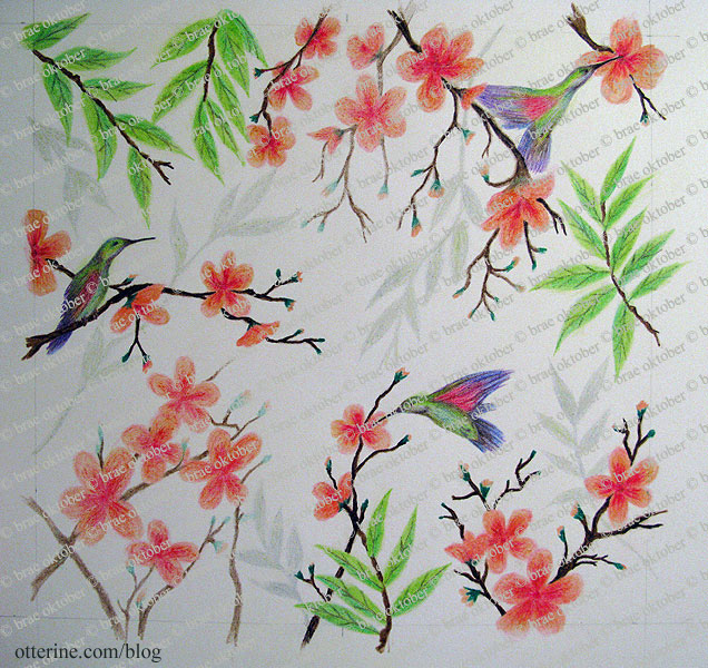
The hummingbird shower was made from scratch using original artwork drawn by me.
I photographed the artwork, added the grout lines in PhotoShop and made the tile teture with gloss glaze scored with a stylus. The shower head and water control lever are from ELF Miniatures.
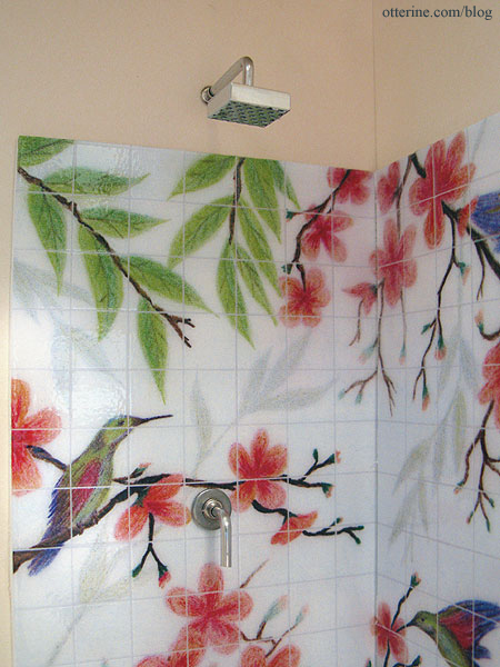
I used a simple washer to serve as an escutcheon for the water control lever. I added lines of red and blue paint to indicate the hot-cold adjustment. :D I glued a Chrysnbon soap dish to the shower wall. The blue soap and drain cover are also from ELF Miniatures.
Here is my drawing.
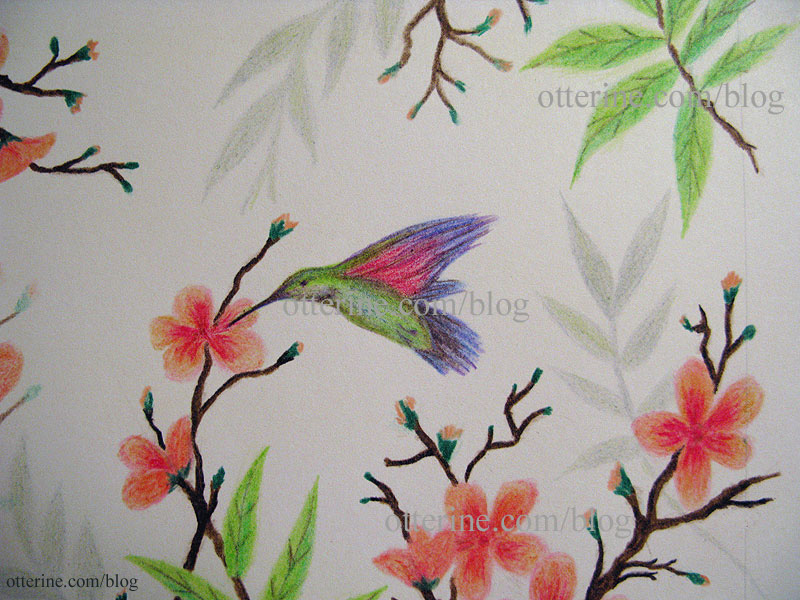
And a detail shot.
The baseboard for the bathroom is cut in pieces for inserting the removable wall, which also has a set of baseboard trim pieces.
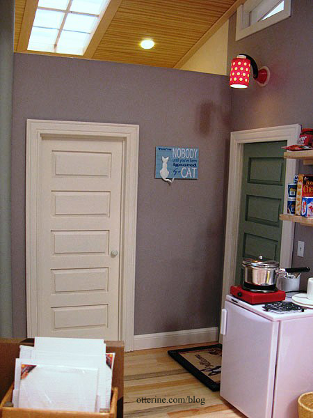
The wall plaque is from Fran at FranMadeMinis. I was having a fit trying to find just the right thing for this space, and Fran came through as always! Fran also made the vintage overnight bag – more on that later. I made the muslin apron using a pattern from About.com. It has tiny laser cut wood buttons from Dragonfly International.
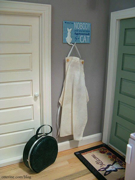
In front of the bathroom is the kitchenette. I envision this building to be an extra space built on a larger lot with a residence…like an efficiency apartment. So, it wasn’t built with the idea of its being a studio, per se, but a small retreat or guest cottage. Now, it is occupied by an artist, and the cozy warmth inside inspires creativity even if it’s not designed to be the most efficient artist studio with the best possible lighting and tons of storage. To that end, I was very limited with what I could do in the way of fine dining.

The Miele half fridge is from ELF Miniatures, and I recently purchased mini food items to go in and around it. It’s mostly snack foods and refreshments. There’s some wine in there! :D
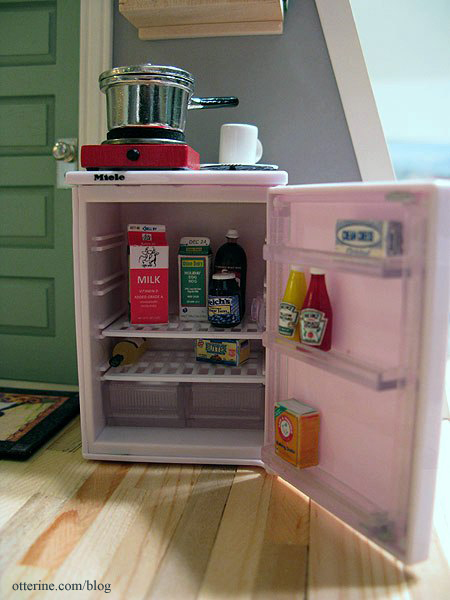
Cora has spotted something.
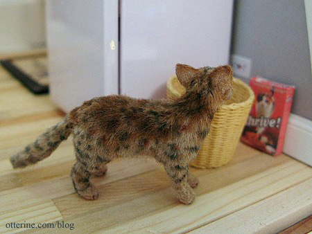
I made two modern block shelves for groceries and dishes to sit on above the fridge.
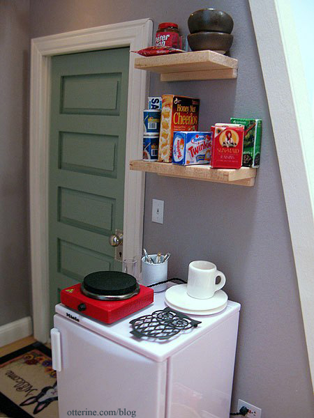
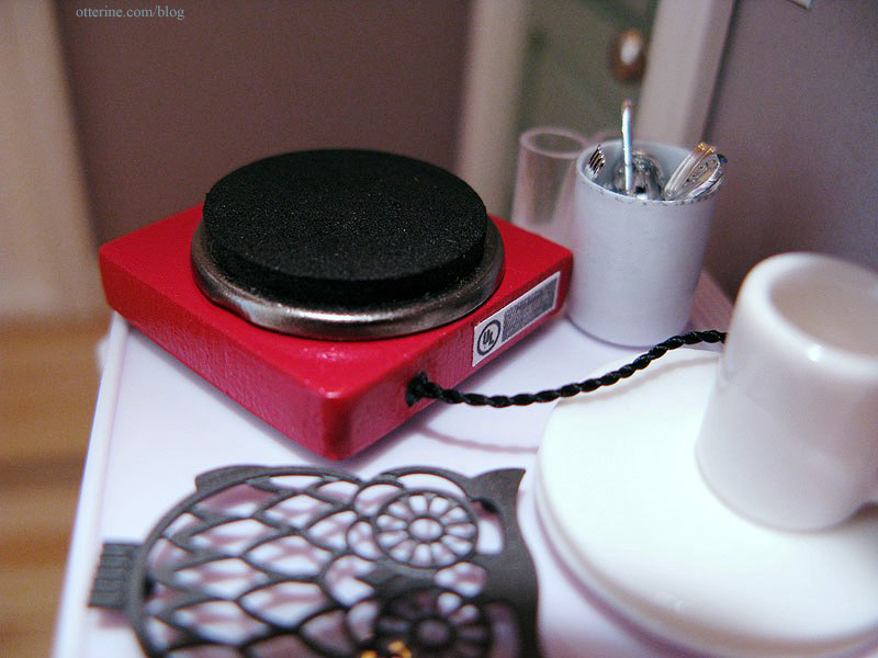
In order to heat up the soup and make instant oatmeal, I fashioned a hot plate to sit atop the fridge.

And, yes, it has a UL label in the back. :D
I hope you’ve enjoyed the tour through The Artist’s Studio! I have a few accessories I didn’t have time to complete before the deadline, so this is not the last you’ll see of it. :D
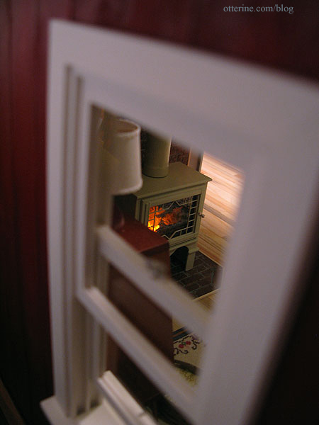
It got dark while I was writing this post! :O
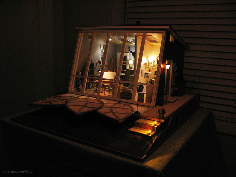
Time for a midnight snack…

Update: Hooray!!! The Artist’s Studio won first place! I get to choose my $100 gift certificate from Michaels, Home Goods or Etsy. Decisions, decisions! We winners also will receive a one-year subscription to Miniaturas, a delightful Spanish miniature magazine, along with a feature in the magazine!
Thank you to Christina for a wonderful contest and congratulations to Lyssa and Audra (the other two winners). I love both their projects! A big round of applause for all the other contestants, too, for a job very well done!
And a very special thank you to everyone who voted for me! Your generosity and encouragement mean the world to me! Thank you!
Categories: The Artist's Studio
May 4, 2013 | 0 commentsThe Artist’s Studio – Window wall, part 2
While the Studio looked fine with its open front, in reality that should be an enclosed wall. As noted in a previous post, I chose the mockup with the tall upper panes.
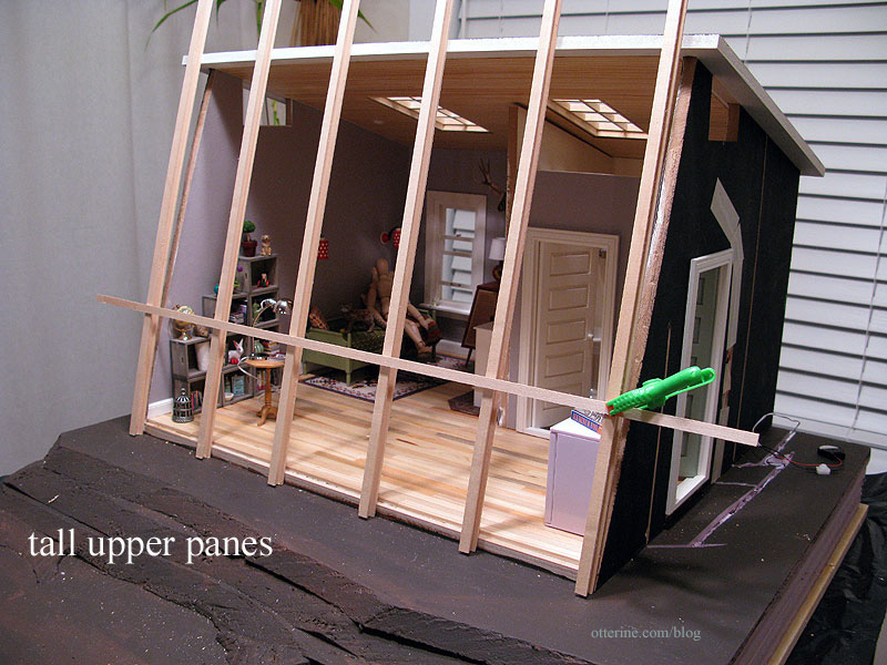
Mike helped me hammer out some details since he’s great with components and construction. I told him I planned to use wood I-beams, strip wood and clear acrylic for the vertical portion, but the top and bottom enclosing parts were confounding me. He suggested using the same I-beams on top and bottom, having the beams butt together while having the interior wood extend into the top and bottom. His idea helped it all click for me. Yes, it will all make sense with the pictures. :D
I bought the I-beams from Manchester Woodworks. The strip wood came from the local hobby shops: Michaels, Hobby Lobby, Blick, etc. The large acrylic sheet came from Hobby Lobby; it measures 2′ x 4′ and was $6 (before using a 40% off coupon). It’s not as thick as I might have wanted…but to buy a thicker sheet would have meant waiting for shipping…was not going to happen.
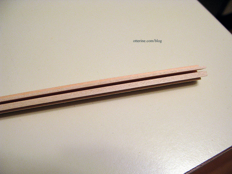
The plan was to insert 1/8″ x 1/4″ strip wood into the channel, then insert the acrylic pane, then insert 1/16″ x 1/4″ strip wood on the other side of the acrylic.
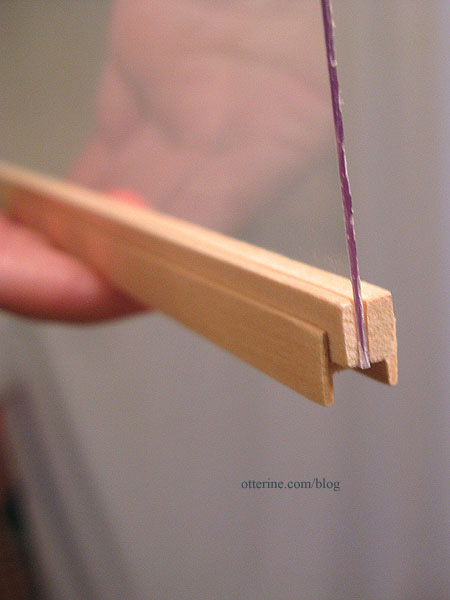
Why not make two strip wood grids and sandwich one large cut piece of acrylic inside? Sagging. I just didn’t think it would be a straight, solid (sag-less) window using that method. And, this window would be moved around to access the interior. It needed to be sturdy enough for handling.
I determined the outer frame by taping the I-beams together. Apparently, my artist’s model passed out at the thought of the math ahead. :O
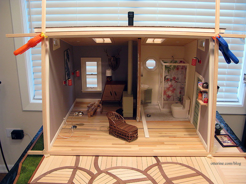
This gave me the inner vertical beam measurement of 12″ tall. I don’t want to bore you with the math, but here are the final measurements. I keep these in my blog mainly for my own reference so I don’t have to write them down. I can just search the posts. :D
The interior wood trim needed to extend 1/8″ past both the top and bottom to allow the top and bottom beams to lock in place. All these measurements made the acrylic panels slightly less than 3 1/2″ by 12 1/4″ each. In the interest of not wasting materials, I built one window panel without glue to see if this would work the way I thought it should. I took the protective film off of the test acrylic piece to get an accurate feel for the end result. I had plenty of acrylic to cut fresh panels for the final window, so it wouldn’t matter if this one was scratched during the planning and construction process.
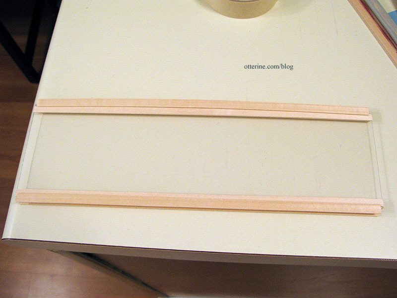
The top and bottom beams lock on. Trim wood would be used to fill in the track on the upper and lower beams later in the assembly.
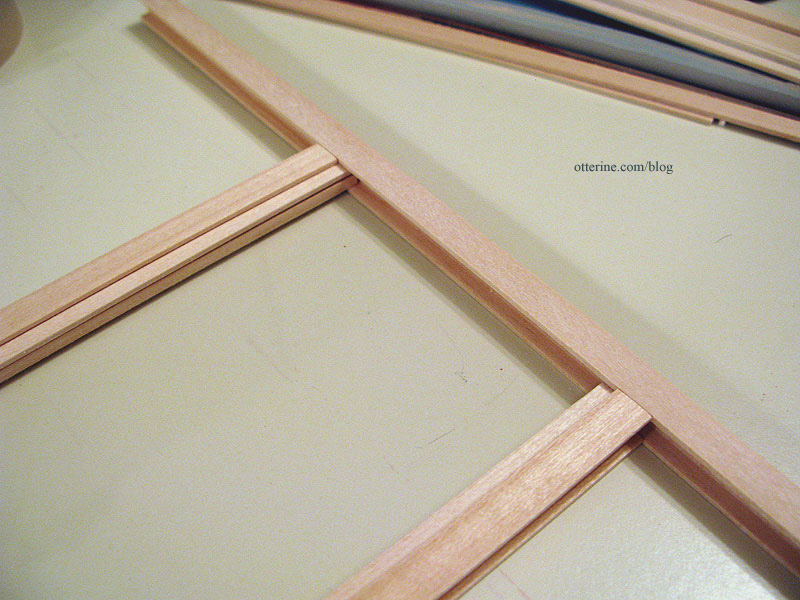
It felt pretty solid with only two bits of tape on it, so I thought, “This just might work!” :D
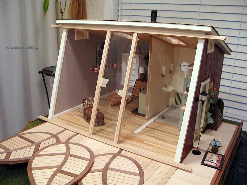
I sanded all of the wood pieces before building the window panels (all without glue), but I wanted to go further and paint as much as possible before adding the acrylic inserts. I took the mockup acrylic panel to use as my spacer and glued the strip wood into the I-beams.
Once I had the vertical supports assembled, I tested the fit on the Studio. So far, so good!
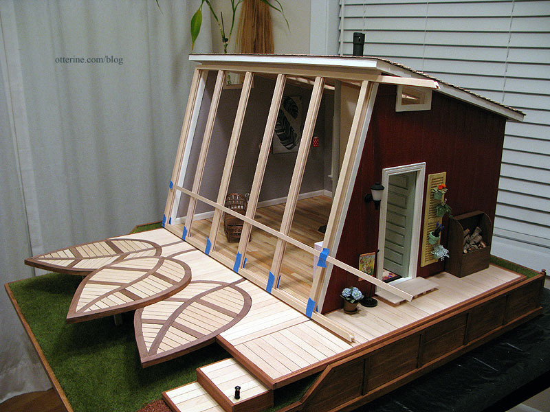
I cut the acrylic panels to use for the final window, leaving the protective film on. I slipped them into the channels and checked the overall width of the window to see if the acrylic panels needed to be adjusted.
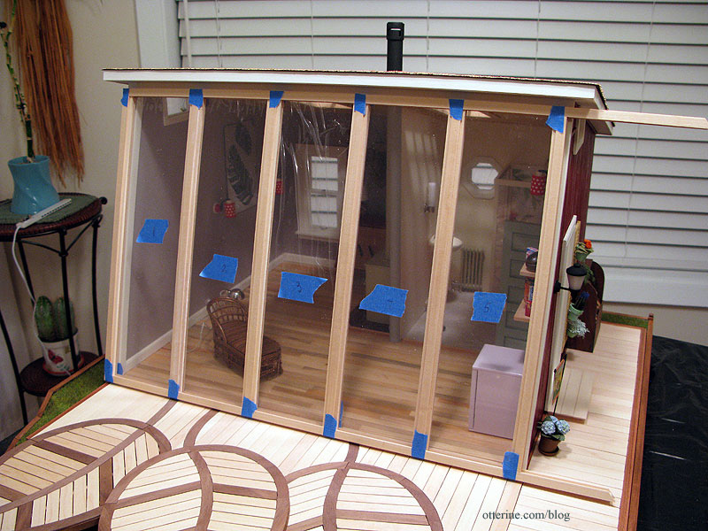
I marked the lengths for the upper and lower I-beams and cut them to fit. I filled in the open outside channels of the I-beams using leftover Dura-Craft strip wood. It’s not a perfect fit, but I didn’t want to go to the store for a few pieces of trim that wouldn’t be noticeable in the end.
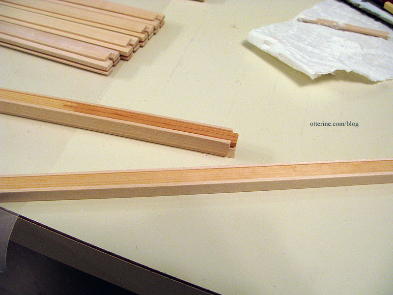
I then painted, sanded and painted these assemblies. After painting, I glued the vertical assemblies into the bottom beam using the acrylic panels and a carpenter’s square to ensure proper placement and alignment.
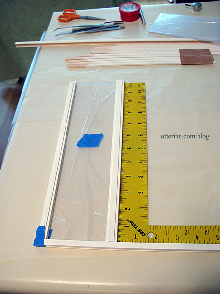
During the process, I kept checking the fit.
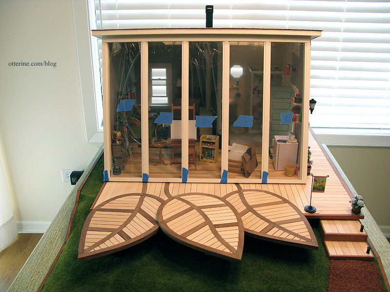
I cut pieces of the interior strip wood to fill in the bottom beam between the vertical supports on both sides. I used the mockup acrylic for this part since I didn’t want to get glue on the final pieces.
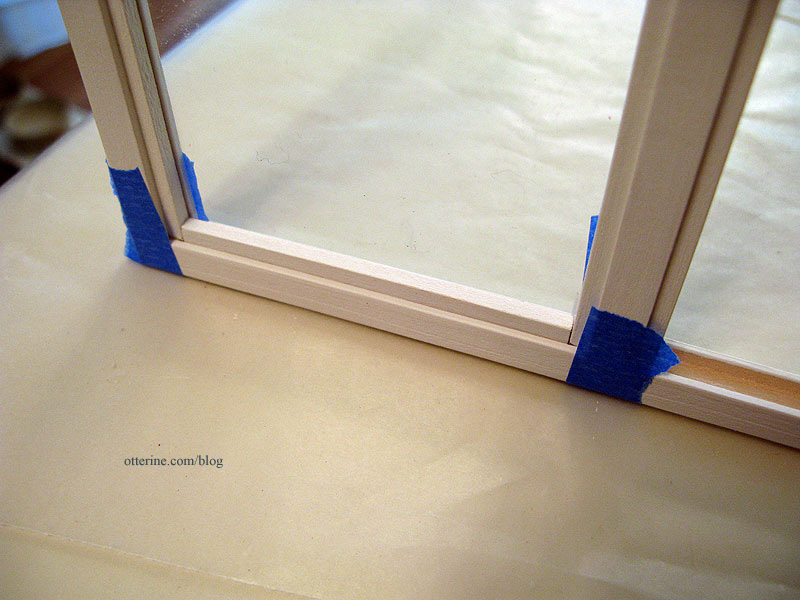
I cut pieces of strip wood to create the divide for the lower panes.
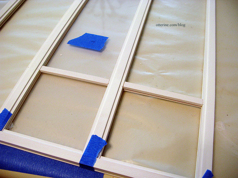
I then touched up the paint, removed the protective film from the acrylic, inserted the panes and pressed the top beam in place. I didn’t glue it because I was running short on time for the Undersized Urbanite contest and I might want to add a satin sealer later on. I slipped in the strip wood interior trim without glue as well. I placed the final window in front of Studio and breathed a sigh of relief. :D
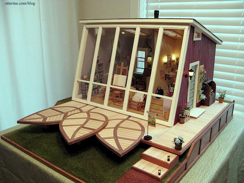
The window sits in front of the opening without any attachment beyond some mini hold wax to keep it from shifting. There’s enough of an angle to the front of the building and weight to the window assembly that it will lean in place otherwise.

The window wall just lifts off to access the interior.

From the inside…

Hooray!!!! :D
Categories: The Artist's Studio
May 3, 2013 | 0 commentsThe Artist’s Studio – Hummingbird shower part 6
With the hummingbird tile mural in place, it was time to address the shower walls and door. First, since I wasn’t sure how easily this would be accomplished once the shower surround was in place, I added the shower head and water control lever from ELF Miniatures.

I used a simple washer to serve as an escutcheon for the water control lever. I added lines of red and blue paint to indicate the hot-cold adjustment. :D I glued a Chrysnbon soap dish to the shower wall. The blue soap is also from ELF Miniatures.

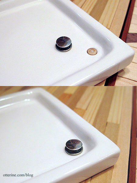
The drain cover is from ELF Miniatures, too. I added a piece of wooden dowel to create a surface for gluing it in place. The shower base is from The Dolls House Emporium.
I built a basswood frame for the shower surround, figuring it out as I went. I put the remaining furniture in place to see if this was going to work. It’s a reasonable sized room so it just squeaks by with enough space.
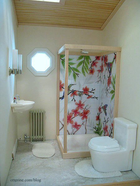
I painted the wood pieces Warm White by Americana and then installed the shower surround piece by piece. For some pieces, I used double-sided tape as well as glue and pins to keep it all solid and stuck together. I thought tape would be better than glue alone since the tape would stay sticky whereas glue would harden and run the risk of popping loose. It’s not the most solid construction, but since it is a stationary unit there shouldn’t be a problem with its staying together.
I cut one piece of acrylic sheet to serve as a partial wall and door on the sink side — I scored a line to delineate where the wall and the door separate. I cut another solid piece of acrylic to serve as the front wall. I had originally planned to pin hinge a working door, but the acrylic I had was just too thin to do so without a frame and the idea of a frame didn’t match the simple lines I wanted for the shower surround. The hummingbird tile is the focus, and the surround just encloses the unit to make it believable.
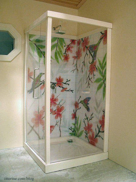
I cut small pieces of metal sheet (it has an adhesive back) and stuck them to the acrylic to mimic pin hinge casings. Here’s a photo that shows them better.
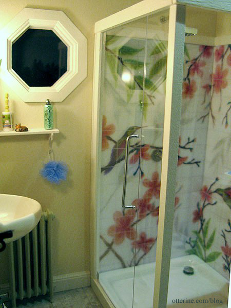
The door handle is from ELF Miniatures. I drilled holes in the acrylic to help keep it attached. And, yes, though it doesn’t open, the measurements of the door allow it to clear the wall sink with no problem. :D
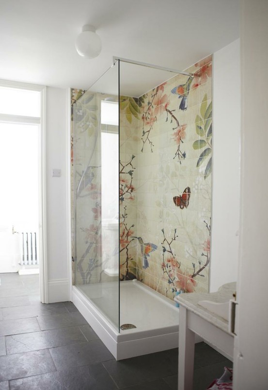
Here’s the original inspiration from Fine & Country.
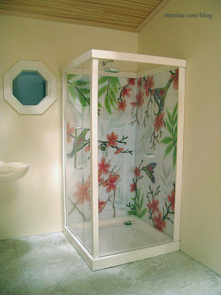
I love the way my interpretation turned out…and I especially like that the bathroom is almost done! :D
Categories: The Artist's Studio
May 1, 2013 | 0 commentsThe Artist’s Studio – random details
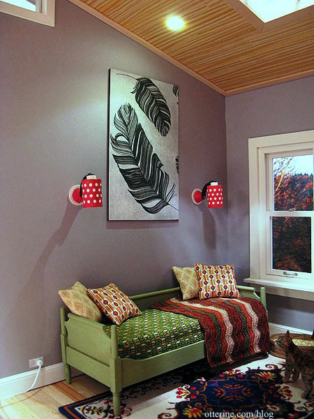
I’ve been making a number of accessories for the Studio as well as finishing up yet more trim and structural details. I cut a section of Feathers scrapbook paper by Recollections, glued it to a piece of black mat board and had instant wall art!
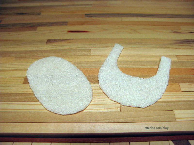
I made a bath mat and rug for around the toilet using baby terry cloth. I cut the shapes and then dabbed Fray Check all along the edges.
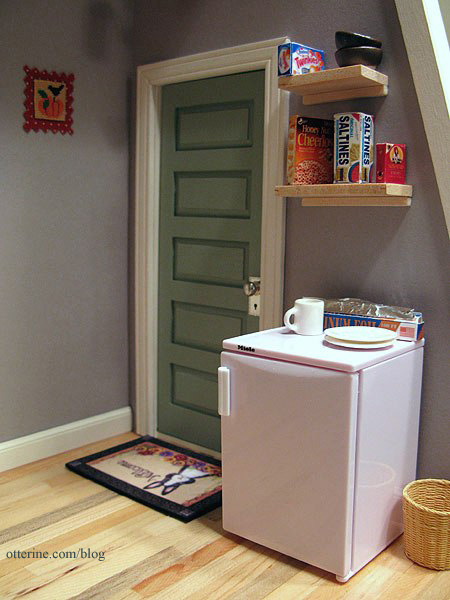
I made two modern block shelves for groceries and dishes to sit on above the Miele half fridge. I have more accessories planned for this space. The tiny cross stitch is by Mary Lynne at The Dollhouse Needle, but it has since been moved to the living area.
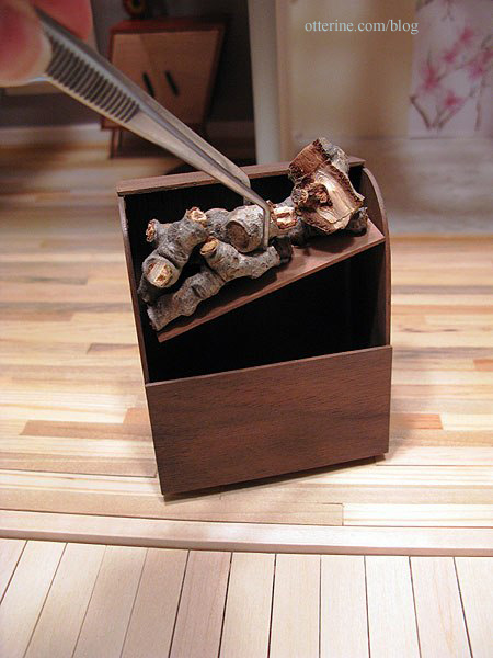
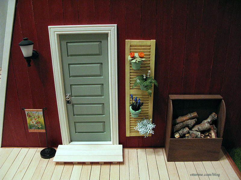
On the exterior, I wired the wood stove flickering LED switch inside the firewood box.
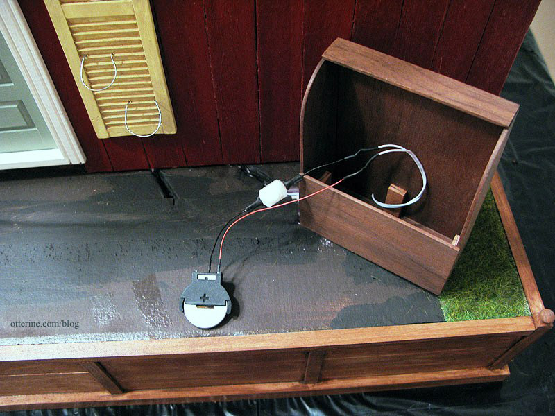
As shown previously, the firewood lifts out to access the switch and battery inside.
I created a simple step for the door from basswood.
Even with templates, the red siding didn’t fit perfectly when installed. There was also a seam near the top in front where the wall was taller than the length of the siding strips. I painted strip wood to match and covered these imperfections.
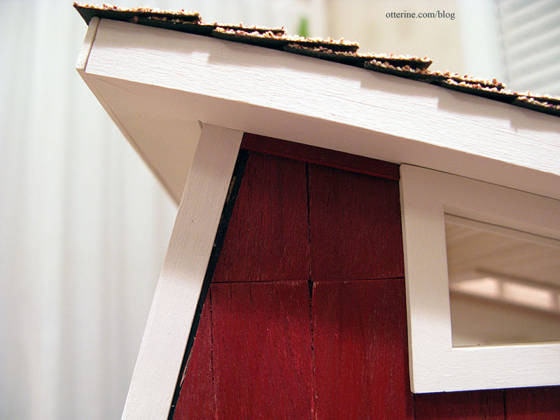
It’s a subtle change, but it makes the structure more complete.
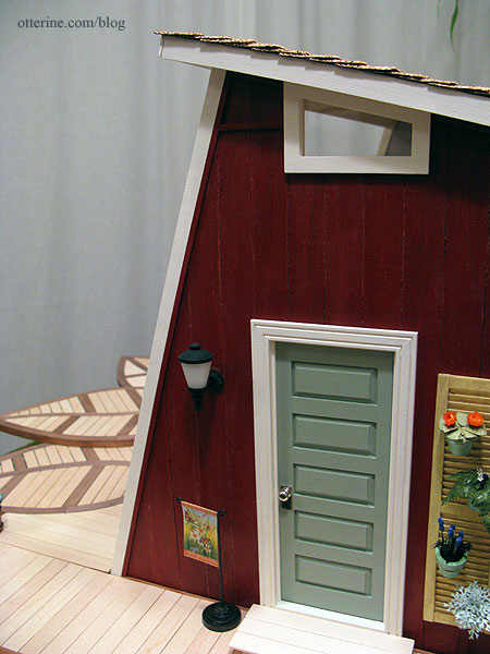
Slowly but surely…I’m getting there! :D
Categories: The Artist's Studio
April 30, 2013 | 0 commentsThe Artist’s Studio – landscaping
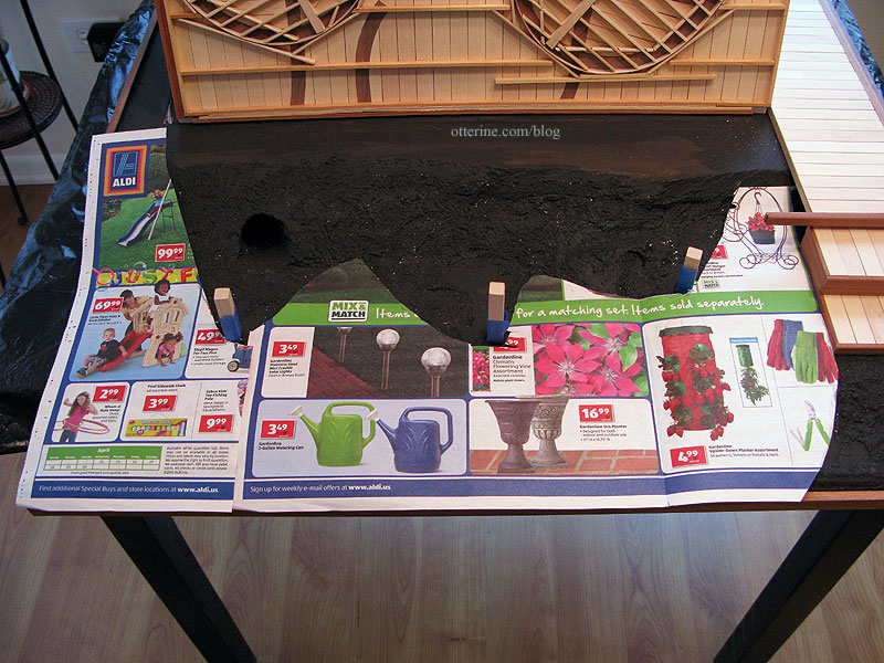
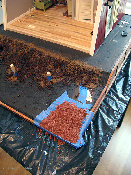
With The Deck completed, it was time to put in the landscaping. I started by applying stucco patch material to the previously sculpted builders foam base. This evened out the landscape and filled in holes and gaps. It also solidified the deck support posts into the foam base.
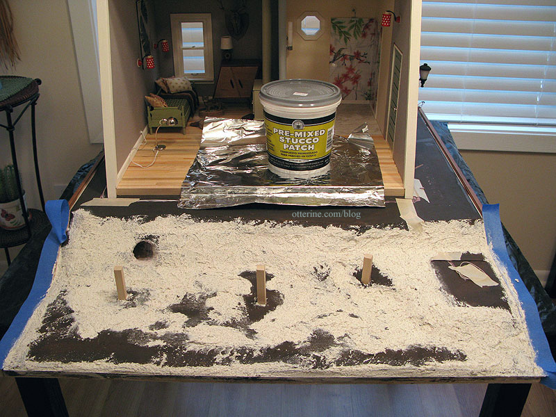
I checked the depth of the deck posts by putting the pieces back in place. Seems like the Studio would work for a sandy beach or snowy hillside, too. :D
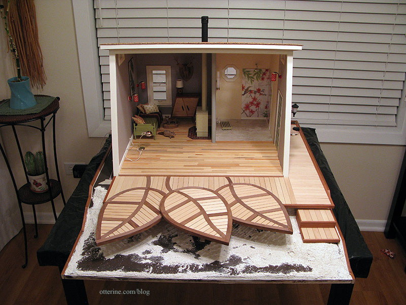
I covered all of the wiring channels with tape and then painted the new surfaces brown.
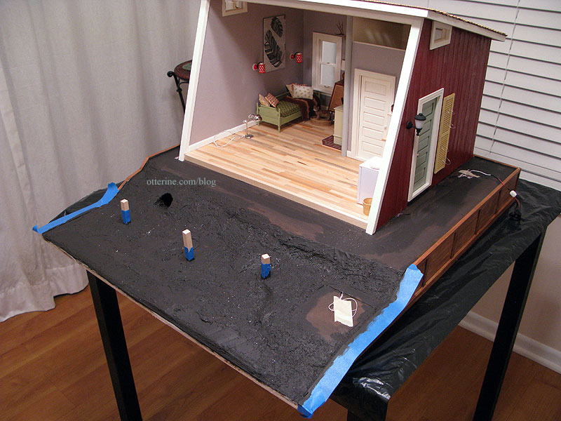
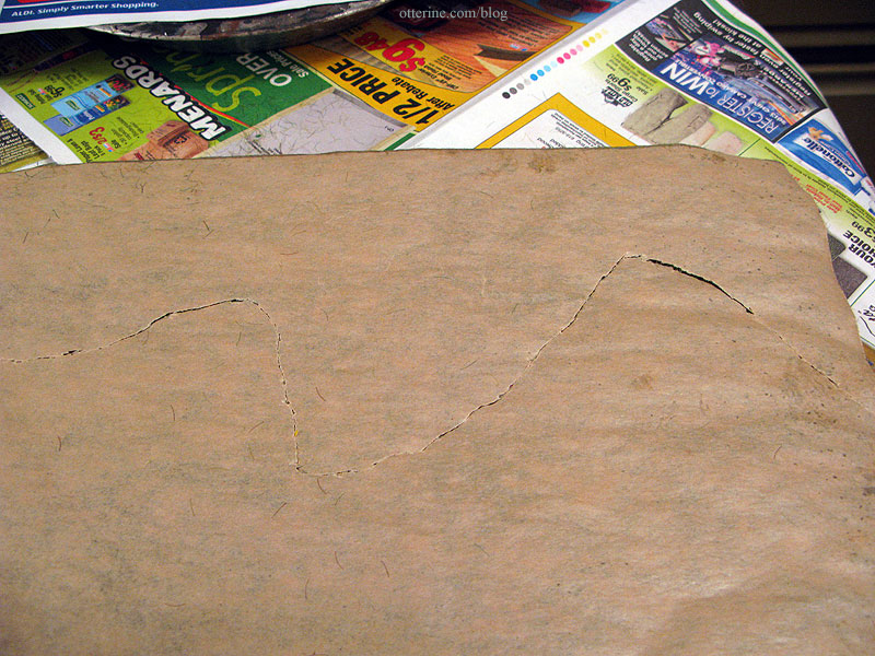
I had leftover Meadow Field Grass by Heki, from Scenery Express — one full sheet and several large scraps. I had used this material for The Aero Squadron Lounge. The grass placement included the back side by the firewood box, the entire side by the fountain and the front portion in front of The Deck. I cut patterns to determine how far in the grass would go.
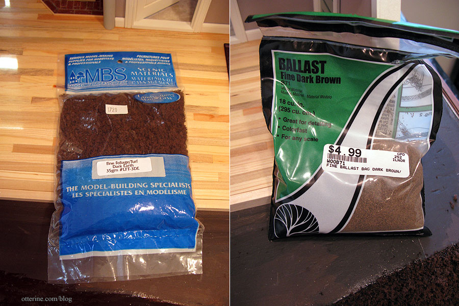
Inside this area under The Deck, I applied Fine Foliage/Turf in Dark Earth by MBS followed by Woodland Scenics Fine Dark Brown Ballast to serve as exposed dirt.
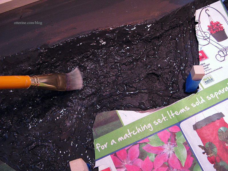
I used a brush to apply Aleene’s Clear Gel Glue and then liberally applied the landscaping materials. I pressed it in with my fingertips and then let it dry for an hour or so.
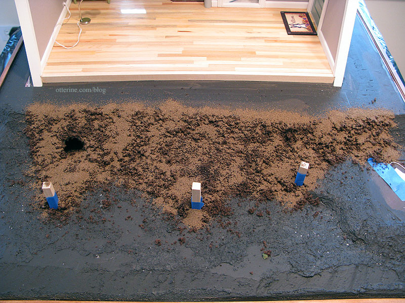
I added a gravel pathway at the bottom of the stairs using decorative terra cotta colored sand from Joann’s.
I checked my templates and cut the grass to fit. The back of this particular material is paper, so it makes it harder to piece. The sheets don’t come any larger, either. I cut it roughly with an X-Acto knife to keep it from being too uniform.
Where there are seams, I make them as natural looking as possible, as though there’s just a variation in the lawn in that particular spot.
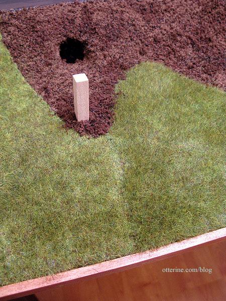
Here’s the finished landscaping without The Deck.
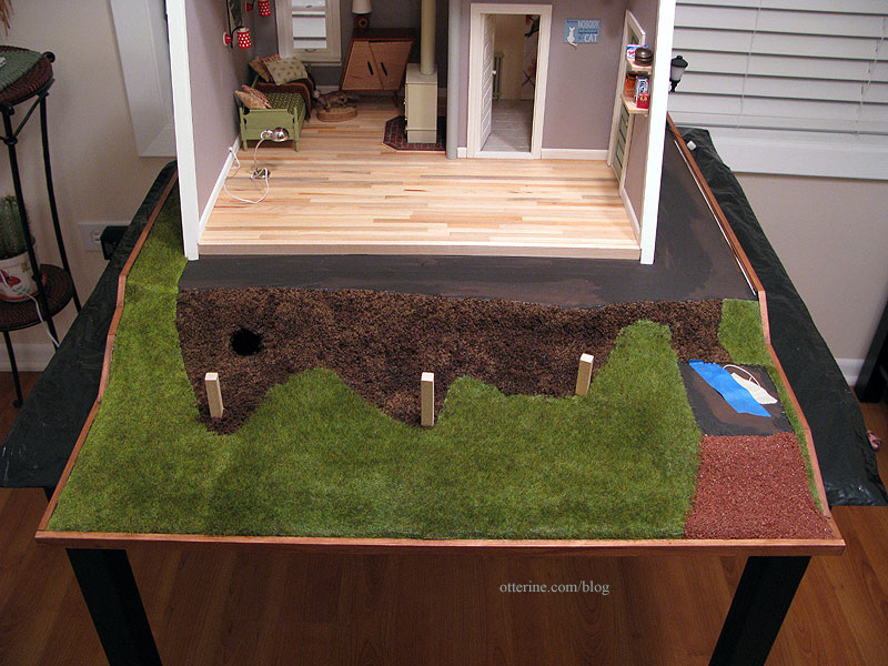
With The Deck in place, the seam is a little less obvious at first glance.
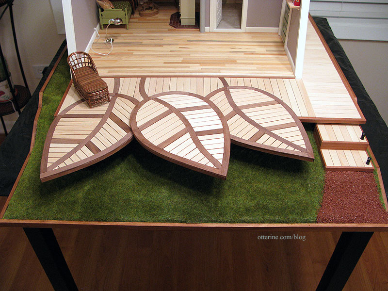
The materials do create wonderfully realistic landscapes, so it’s a shame they have to be pieced at all.
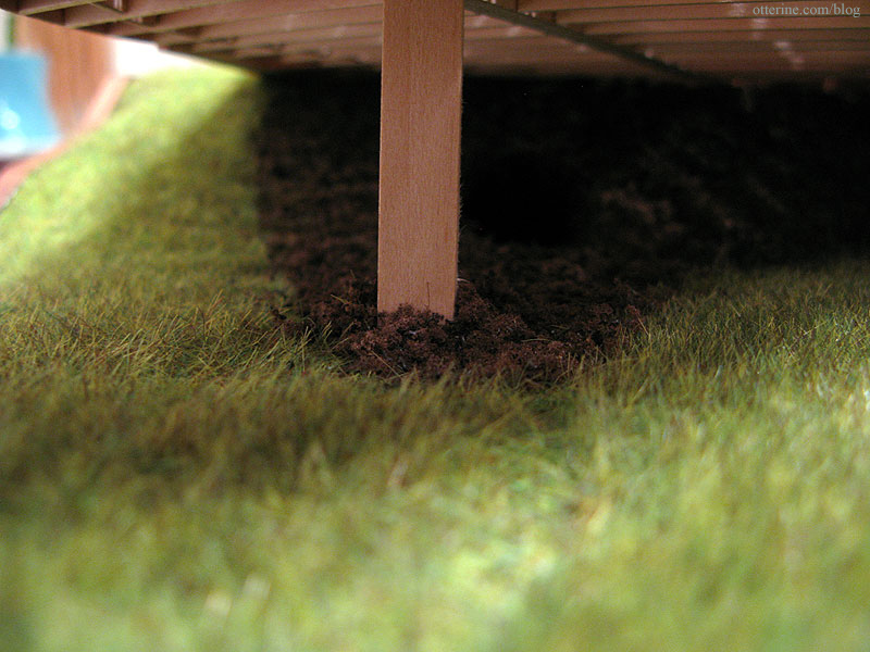
I kept the landscaping simple since there is so much already going on outside the Studio. :D
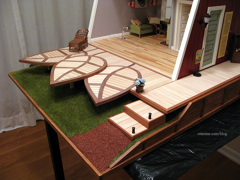
I added two landscaping lights from Creative Reproductions 2 Scale to the steps. These came three in a pack and needed to be wired in a series. I contacted Carl at CR2S to make sure I understood what this meant. He was very helpful and mentioned I could use two instead of three…but a single lamp could not be used with the 12V system since it would burn out the bulbs. Using only two means they burn brighter than if I had used three, but it is still safe to use with the 12V system. I don’t have them attached to the wiring system yet…so you’ll have to wait to see them lit up. :]
I like this particular color for the gravel because it doesn’t compete with the other exterior finishes.
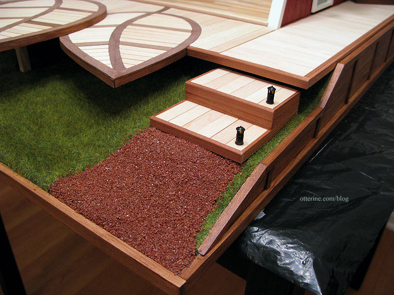
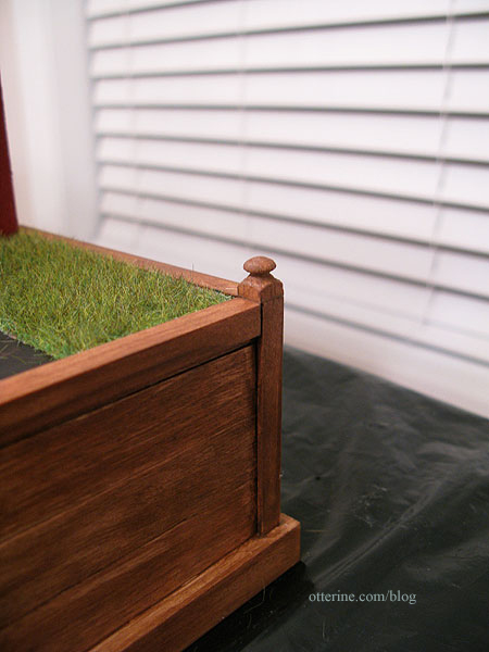
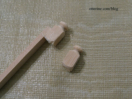
To finish the back two corners of the retaining wall, I used two toppers from narrow newel posts. I stained these to match the retaining wall.
I taped them to a piece of basswood to run them through the scroll saw for a clean cut. :D
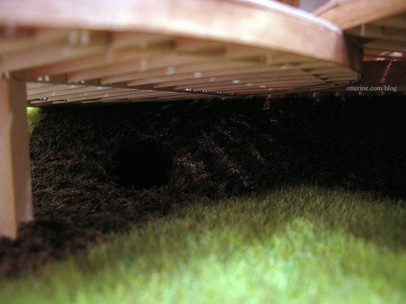
Inside Woodrow’s burrow, I left it mostly just painted foam since the interior wouldn’t be easily seen.
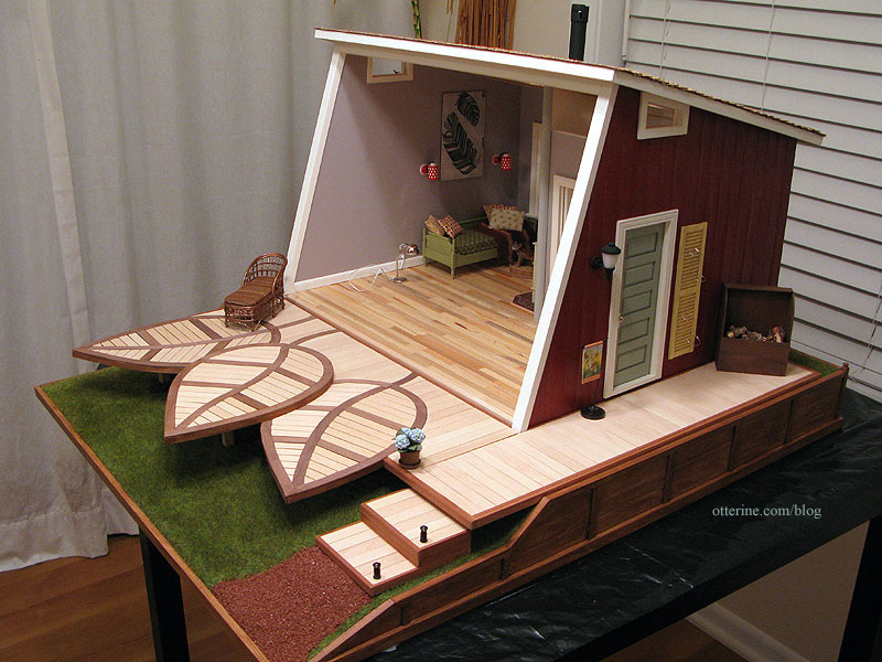
It’s coming together!!! :D
Categories: The Artist's Studio
April 29, 2013 | 0 commentsThe Artist’s Studio – The Deck, part 8
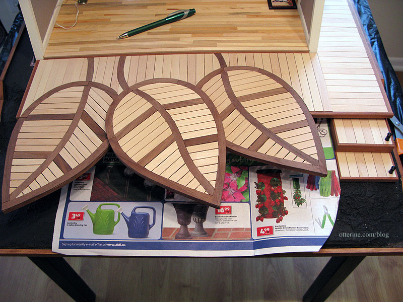
Continuing work on The Deck. I completed Leaf 3 with its winding center vein.
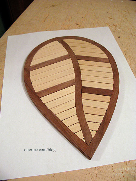
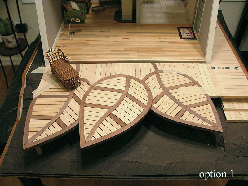
Leaf 3 sits on top of the main deck and the two side leaves. I tried three different angles to see what looked best.
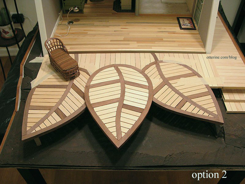
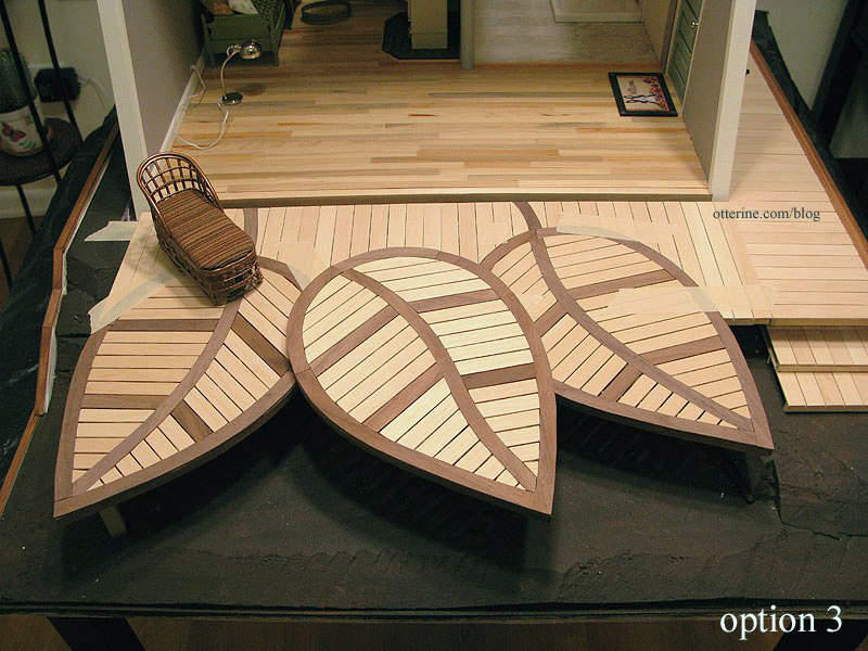
I liked this last layout the best, but before I could glue the top leaf to the main assembly I needed to address the stem.
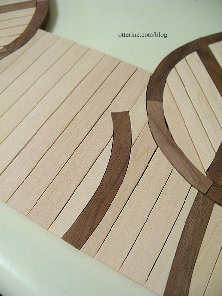
This stem is partial since Leaf 3 will cover the front area and I didn’t want to cut more boards than necessary.
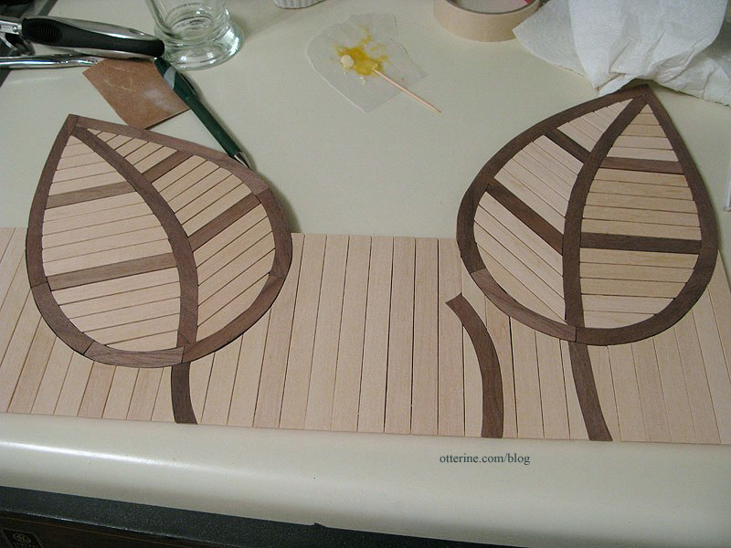
Here’s the original from Trex as a reminder.

I then glued Leaf 3 in place and finished up the walnut trim around the main and side decks.
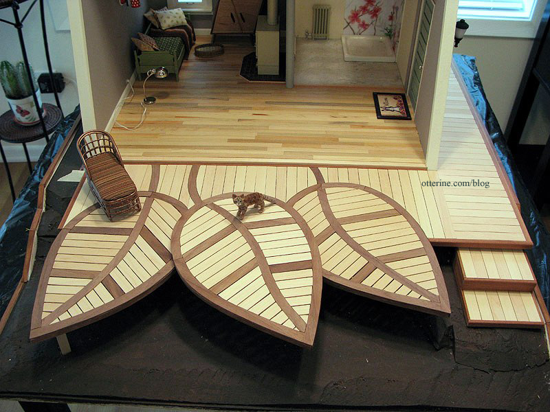
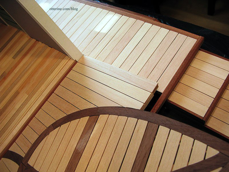
I used the two scraps from the leaf inset cutouts to make two matching steps up to the side deck.
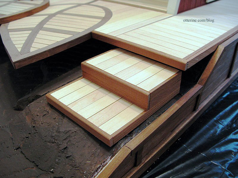
I cut posts to support the leaves. I originally had these closer to the tips but moved them back once I started planning the landscaping. They will still support the leaves, perhaps more readily in these positions, but mostly stay out of sight.
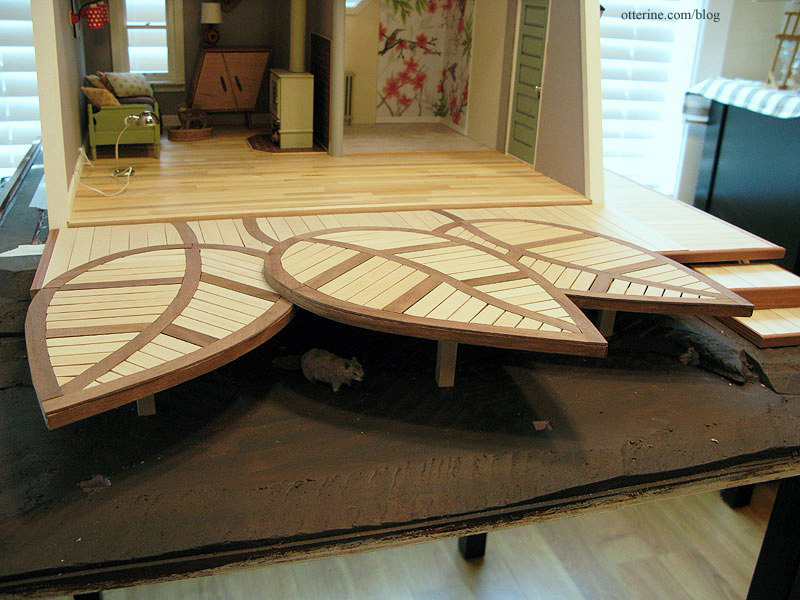
The entire deck will remain removable.
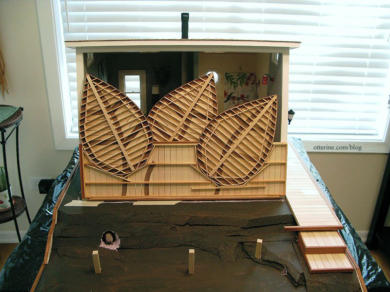
The side deck is one piece, and it slides forward until its interior trim abuts the front opening trim. For the front leaf deck , the trim by the front opening and the trim by the side deck keep it locked in place.
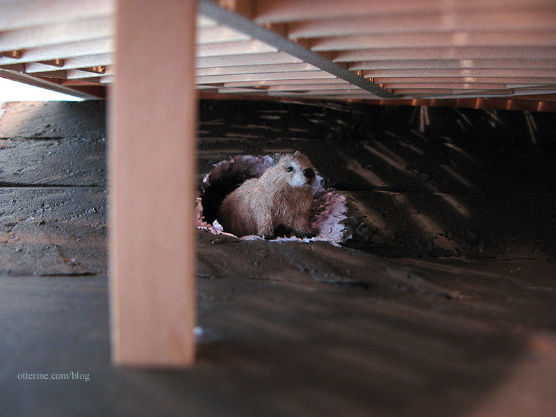
Who’s that under The Deck? It’s Woodrow!!! :D
Hooray! The Deck is done! :D
Categories: The Artist's Studio
April 28, 2013 | 0 commentsThe Artist’s Studio – The Deck, part 7
Continuing work on The Deck. I finished the second leaf in the same manner as the first leaf.
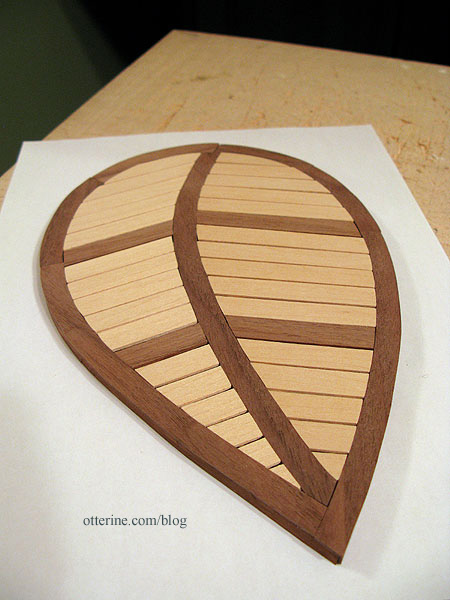
Before going further, I needed to see if I could replicate one part of the deck shown in the original inspiration piece. For reference, here is the beautiful deck from Trex.

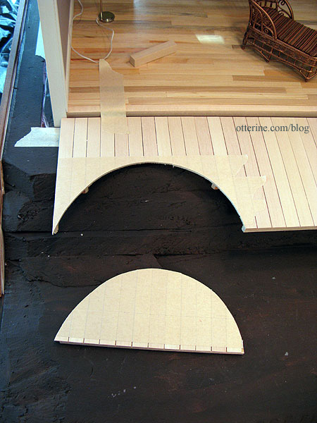
One of the side leaves is inset and on the same plane as the main deck. I took a scrap of card from the recycling bin and traced Leaf 1.
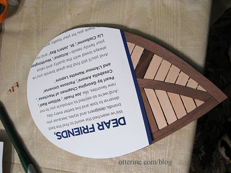
I then put a layer of masking tape over the main deck to keep the wood from splitting and the boards from lifting during the cutting process. I traced the outline onto the taped section.
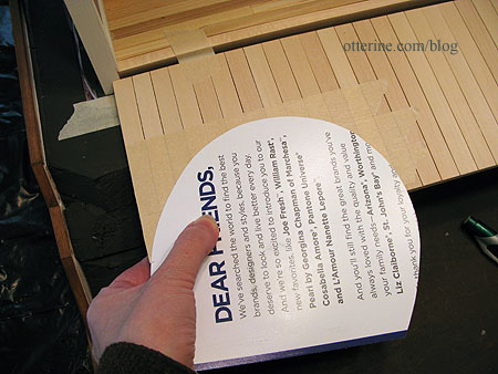
I then cut the main deck using the scroll saw. This was a one-shot deal. If it didn’t work, I’d have to reconstruct this part of the straight deck.
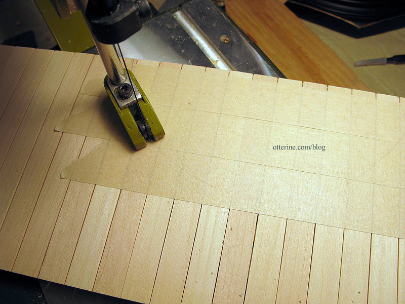
Moment of truth right before fitting…
It worked!!! :D
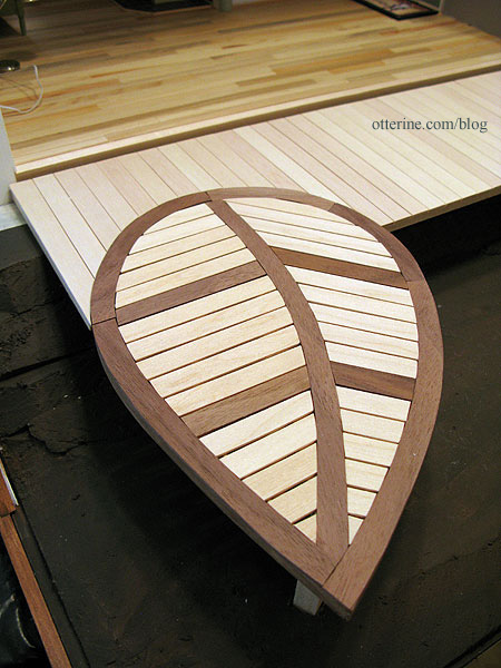
Having the leaf inset makes for easier furniture placement, too.
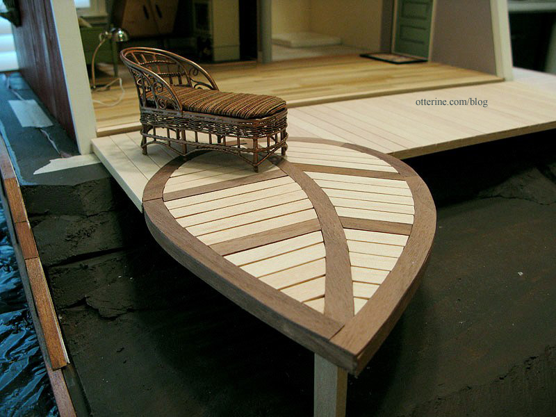
Since my deck is a smaller version of the original, I decided to inset Leaf 2 on the other side. This time, I cut it in deeper than Leaf 1.
Another feature of the original deck is that the leaves have stems that continue into the main deck. I cut pieces of walnut for the stems and marked them on the main deck. I removed the pieces from the deck and cut them to fit. I glued the pieces back in place with the walnut stems.
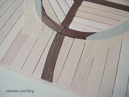
Marvelous! :D
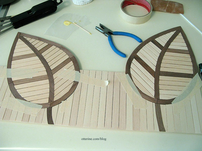
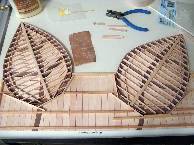
On the underside, I had to attach the two leaves to the main deck. I opted for lengths of skinny sticks. These won’t be readily seen, even when viewing the under structure.
And, just so you don’t think my vacation week has been all work and no play, here’s a funny picture of Jasper. He’s sleeping in a pose I like to call The Frozen Shrimp. Haaaaaaaaa! :D
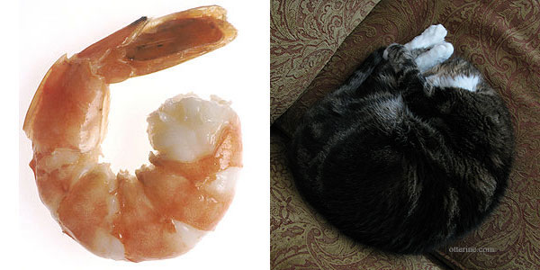
shrimp image from Wikipedia Categories: The Artist's Studio
April 27, 2013 | 0 commentsThe Artist’s Studio – Hummingbird shower part 5
For the final hummingbird tile mural, I cut around the drawing printout, leaving some bleed area around the edges. I used spray adhesive to mount the paper to mat board. Since I needed a close fit around the bottom edge where the shower base would sit, I used blue painter’s tape to mask off the bottom edge.

I then used the Triple Thick Gloss Glaze to seal the image. Once dry (two days later), I scored the tile lines with a stylus. Before removing the blue tape, I scored along the top of the tape to make sure it didn’t pull the glaze finish away from the tiles.

I cut along the center line and then the outer lines, leaving extra along the bottom. Oops…photographed them in the wrong order.

I propped the boards in place with the shower base to see how it looked and then glued them in place.

It’s hard to see the three dimensional aspect in the photos, but it looks just like high gloss tile in person. Hooray!

Next up, shower surround.
Categories: The Artist's Studio
April 26, 2013 | 0 commentsThe Artist’s Studio – The Deck, part 6
I taped the outer walnut boards and the center vein onto the frame support to mark where the support beams should end under the surface boards.

I cut the frame using the scroll saw, cutting in slightly to allow room for a veneer finish around the outside.


The local Home Depot had only the iron-on pre-glued veneer strips, and I didn’t want to wait to order online, so I used birch veneer. I had some leftover from previous projects. I cut a strip 1/4″ wide and glued it around the outer edge. It doesn’t hit every point, but that’s fine with me. It creates a natural, smooth finish around the outer edge and hides the framework (unless viewed from underneath).

After staining the veneer with Minwax Plantation Walnut, I began gluing the boards to the framework, using wood glue supplemented with super glue gel. Once I had the walnut pieces glued in place along the outer edge and center, I pressed the assembly flat with magazines and waited for the glue to dry.

Once the glue set on leaf 1, I started adding the cross boards using wood glue (and super glue gel only as needed). In some areas, the frame seems to show more than I would like but in the end it shouldn’t be as obvious.

By having the copy of the drawing underneath, I could see where to apply the glue so it wouldn’t seep out.

One leaf assembly done! :D

Categories: The Artist's Studio
April 25, 2013 | 0 commentsThe Artist’s Studio – The Deck, part 5
I finished up the second leaf for The Deck.

The third leaf had the most complicated design of the three, so I left it for last. Once the second leaf was complete, I went back to the first leaf and re-cut some of the boards for a better fit. Next was figuring out the framework. As a reminder, here is the frame support system for the real life deck.
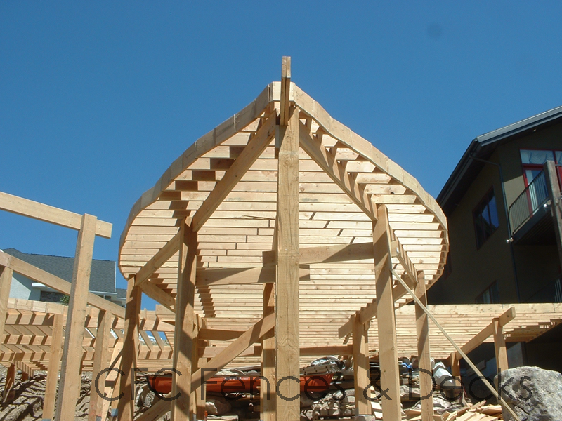
image from CFC Fences & Decks I mainly needed a frame that would attach to each surface board and be stable enough to be elevated over the front of the landscape board. Using another printout of the first leaf, I began building the frame with a center beam. From there, I planned to cut skinny sticks (to save on cost) to create cross beams every half inch. This should create multiple glue points for each board. Here is my mockup to determine layout.

I notched the center beam and cross boards for a solid fit, using glue to reinforce the joins.

I used bass wood for the few areas where the skinny sticks were too short and left the ends long for now.

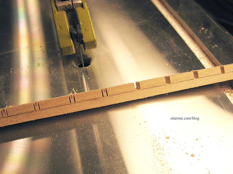
To add stability on the outer edge, I added more skinny sticks. These are not the cleanest cuts I’ve ever made, but you will see these only as the underneath structure of the deck.

I cut these notches using my handheld Dremel since they were angled and the main spine was glued together.

Next up…finishing the third leaf surface boards and building the basic frames for leaf 2 and leaf 3.
Categories: The Artist's Studio
April 24, 2013 | 0 comments
NOTE: All content on otterine.com is copyrighted and may not be reproduced in part or in whole. It takes a lot of time and effort to write and photograph for my blog. Please ask permission before reproducing any of my content. (More on copyright)

The Artist’s Studio in The Dolls’ House Magazine
My mood was brightened today when I received my copy of The Dolls’ House Magazine all the way from the UK! In the November 2013 issue, there’s a full write-up on The Artist’s Studio.

Christiane wrote to me a few months back about featuring the Studio, and we had a nice chat. It’s so wonderful to be featured along with so many other talented artisans!

It was my first time reading the magazine, and there were not only a lot of great builds featured but a number of projects, patterns and tutorials. A very fine magazine!

I want to send out a huge thank you to Christiane and the staff at The Dolls’ House Magazine for a wonderful feature! :D
Categories: Books and media, The Artist's Studio
October 18, 2013 | 0 commentsMidnight Snack
MinisModernas is running their second annual modern minis contest, and I set up a scene in The Artist’s Studio called “Midnight Snack.”

Looks like Cora is hungry, too.

The slippers are from the Heritage, and I couldn’t believe they fit! :D

The goldfish crackers are from Cindy at Snowfern Clover.

Yes, there are tiny goldfish crackers inside. Amazing!

Here’s what the kitchen looks like without the model setup.

The hotplate was made by me and is one of my favorite features of the Studio. :]

Thank you to MinisModernas for a wonderful modern minis contest! :D
Categories: Roomboxes and Mini Scenes, The Artist's Studio
June 1, 2013 | 0 commentsUndersized Urbanite: The Artist’s Studio
My entry in the Undersized Urbanite contest hosted by Christina at Little Victorian is The Artist’s Studio.

I drew my concept inspiration from The Thomases’ Rooftop Artist’s Studio (seen in the second gallery in this link) and Nell Corkin’s Summer Studio, created in tiny 1:144 scale.

The basic structure is the Loft kit from miniatures.com (this was their 2012 Creatin’ Contest kit), though I made several modifications to it, including lowering the height by 5 3/8″ and creating an angled front wall.

the first dry fit After the large window, the most prominent feature on the exterior is The Deck, scratch built by me based on an original real life deck by Trex. I left off the railing for my rendition since it’s rather low to the ground and I didn’t want to detract from the overall aesthetic.

I tried to capture the essence of the original while making it my own. Here’s the original from Trex.

A special thanks to mom and the Proxxon scroll saw she gave me for Christmas! I could not have accomplished this deck without it.

The lights on the steps are from Creative Reproductions 2 Scale.

It’s not quite dark yet, so I’ll have to take some nighttime photos another time. :]

Woodrow’s comfortable burrow is hidden under The Deck. Woodrow was made by *Reve*.

The landscaping is simple and serene, with a retaining wall built around the sides and back.

The scratch-built firewood box hides the switch for the wood stove inside.

The shutter garden was made following a similar life sized piece.

On the opposite side, there’s an elegant fountain, but I think I need to do some more gardening on this side. :D

I painted and upholstered a chaise for The Deck. The magazine was made by me, and the mug is by Jane Graber.

The shingles are by What’s Next and it was an adventure finding a supply for the Studio! The chimney is made from bits and bobs.

The window wall lifts off to access the interior. The window sits in front of the opening without any attachment beyond some mini hold wax to keep it from shifting. There’s enough of an angle to the front of the building and weight to the window assembly that it will lean in place otherwise.

The rustic wood floor in the main area was installed piece by piece, and the wood ceiling was created using Southern Pine flooring sheets. The wallpapers are drawing papers: Daler-Rowney Dreadnought Grey for the main area and Canson Ivory for the bathroom.
There is a living area with a daybed from a Realife Miniatures kit, a whimsical cabinet by minisx2 and a scratch built wood stove. I stitched the blue medallion rug and rewired some vintage Lundby lamps, one of which is from my childhood dollhouse. The wall art is a cut section of Feathers scrapbook paper by Recollections, glued to a piece of black mat board. The afghan is by Mary at Roslyn Treasures.

Cross-stitching time for the rug was 154.5 hours on 32 count Jobelan. Final finishing took only a couple of hours. The final measurements are 7 7/8″ long by 4 5/8″ wide.

The wood stove was made from mat board, wood, a plastic small scale window, resin fire, LEDs and jewelry findings. The firewood is from an old tree cut down in its prime. The brick surround is egg carton material.

Cora was made by *Reve*, and her bed is a basket by Al Chandronnait from miniatures.com, though I added my own tufted insert.

The cardboard deer is from Amazing Miniatures. I made the sunflower lamp, plants and book.

The forward area on the left side is the art space.

I wish I had such a lovely setup in real life!

There are rustic crate shelves stuffed with books, goodies and objets d’art perfect for creating interesting still life compositions. Some of these items were purchased, some were gifts and some were created by me. It would be too long of a list to name them all here. :]

The artist paper pads were made by me.

There is an easel made using a pattern from Miniature Room Settings by Helen Ruthberg; I made it from basswood and stained it Minwax Cherry. The stool was purchased from All Small Miniatures. Lyssa sent me some art papers and wrapped canvases for a swap sometime ago. I glued one of the papers to mat board and primed it with white paint.

Right now, mine is an ode to all well loved easels when they were first brought home. :]

The book also had a pattern for a tabouret, which Dictionary.com defines as, “a small, usually portable stand, cabinet, or chest of drawers, as for holding work supplies.” In the interest of time, instead of making my tabouret from the pattern, I shortened a Daisy House floor shelf kit. It is painted Sunflower by Folk Art. Lyssa sent me the bead jars, and I finished with labels left over from the paint tube tutorial.

The tiny paint tubes were made from a tutorial by Carol of true2scale.

The lamp from The Dolls House Emporium is wired with one of my signature faux outlets. :] The sunflower lamp is also wired this way, but the cabinet hides the outlet.

And, of course, you can’t have a cord stretched about waiting to trip you. I made a cord cover from half round trim with a channel cut to cover the cord. It is held in place with mini hold wax.

The bathroom occupies the right back corner and has a removable front wall. The lighting, shower base and toilet are from The Dolls House Emporium. The tile floor is Greenleaf vinyl tile. The radiator was made from a Chrysnbon kit.

The wall sink and soap holder (it has a magnet to hold the soap on) are from Bibian’s Poppenhuis, and the mirror is a vintage Lundby piece from Vintage Lundby with a replacement insert made from Darice plastic mirror sheet.

The kitty tea towel is from Marlene.

I made a wood shelf for accessories and toiletries to sit below the octagon window. I made the pet hair roller and loofah. The bottle came from Fran, the fox is by Barbara Meyer and the vase was purchased from All Small Miniatures. The GFCI outlet is a sticker from miniatures.com…love these!

I used a half scale shelving unit for some cleaning supplies, a lightbulb pack and some extra toilet paper. In real life, you’d want to hide all these necessities, but in mini we just delight in seeing them out in the open. :D

The chrome hardware was purchased, and I made the terry towel and bath mats. There is real tissue around the toliet paper holder, and I made the tissue box as well. It rather matches the shower, doesn’t it? The small metal waste bin is the largest from a set of kitchen canisters.

The hummingbird shower was made from scratch using original artwork drawn by me.

I photographed the artwork, added the grout lines in PhotoShop and made the tile teture with gloss glaze scored with a stylus. The shower head and water control lever are from ELF Miniatures.

I used a simple washer to serve as an escutcheon for the water control lever. I added lines of red and blue paint to indicate the hot-cold adjustment. :D I glued a Chrysnbon soap dish to the shower wall. The blue soap and drain cover are also from ELF Miniatures.

Here is my drawing.

And a detail shot.

The baseboard for the bathroom is cut in pieces for inserting the removable wall, which also has a set of baseboard trim pieces.

The wall plaque is from Fran at FranMadeMinis. I was having a fit trying to find just the right thing for this space, and Fran came through as always! Fran also made the vintage overnight bag – more on that later. I made the muslin apron using a pattern from About.com. It has tiny laser cut wood buttons from Dragonfly International.

In front of the bathroom is the kitchenette. I envision this building to be an extra space built on a larger lot with a residence…like an efficiency apartment. So, it wasn’t built with the idea of its being a studio, per se, but a small retreat or guest cottage. Now, it is occupied by an artist, and the cozy warmth inside inspires creativity even if it’s not designed to be the most efficient artist studio with the best possible lighting and tons of storage. To that end, I was very limited with what I could do in the way of fine dining.

The Miele half fridge is from ELF Miniatures, and I recently purchased mini food items to go in and around it. It’s mostly snack foods and refreshments. There’s some wine in there! :D

Cora has spotted something.

I made two modern block shelves for groceries and dishes to sit on above the fridge.

In order to heat up the soup and make instant oatmeal, I fashioned a hot plate to sit atop the fridge.

And, yes, it has a UL label in the back. :D

I hope you’ve enjoyed the tour through The Artist’s Studio! I have a few accessories I didn’t have time to complete before the deadline, so this is not the last you’ll see of it. :D

It got dark while I was writing this post! :O

Time for a midnight snack…

Update: Hooray!!! The Artist’s Studio won first place! I get to choose my $100 gift certificate from Michaels, Home Goods or Etsy. Decisions, decisions! We winners also will receive a one-year subscription to Miniaturas, a delightful Spanish miniature magazine, along with a feature in the magazine!
Thank you to Christina for a wonderful contest and congratulations to Lyssa and Audra (the other two winners). I love both their projects! A big round of applause for all the other contestants, too, for a job very well done!
And a very special thank you to everyone who voted for me! Your generosity and encouragement mean the world to me! Thank you!
Categories: The Artist's Studio
May 4, 2013 | 0 commentsThe Artist’s Studio – Window wall, part 2
While the Studio looked fine with its open front, in reality that should be an enclosed wall. As noted in a previous post, I chose the mockup with the tall upper panes.

Mike helped me hammer out some details since he’s great with components and construction. I told him I planned to use wood I-beams, strip wood and clear acrylic for the vertical portion, but the top and bottom enclosing parts were confounding me. He suggested using the same I-beams on top and bottom, having the beams butt together while having the interior wood extend into the top and bottom. His idea helped it all click for me. Yes, it will all make sense with the pictures. :D
I bought the I-beams from Manchester Woodworks. The strip wood came from the local hobby shops: Michaels, Hobby Lobby, Blick, etc. The large acrylic sheet came from Hobby Lobby; it measures 2′ x 4′ and was $6 (before using a 40% off coupon). It’s not as thick as I might have wanted…but to buy a thicker sheet would have meant waiting for shipping…was not going to happen.
The plan was to insert 1/8″ x 1/4″ strip wood into the channel, then insert the acrylic pane, then insert 1/16″ x 1/4″ strip wood on the other side of the acrylic.

Why not make two strip wood grids and sandwich one large cut piece of acrylic inside? Sagging. I just didn’t think it would be a straight, solid (sag-less) window using that method. And, this window would be moved around to access the interior. It needed to be sturdy enough for handling.
I determined the outer frame by taping the I-beams together. Apparently, my artist’s model passed out at the thought of the math ahead. :O

This gave me the inner vertical beam measurement of 12″ tall. I don’t want to bore you with the math, but here are the final measurements. I keep these in my blog mainly for my own reference so I don’t have to write them down. I can just search the posts. :D
The interior wood trim needed to extend 1/8″ past both the top and bottom to allow the top and bottom beams to lock in place. All these measurements made the acrylic panels slightly less than 3 1/2″ by 12 1/4″ each. In the interest of not wasting materials, I built one window panel without glue to see if this would work the way I thought it should. I took the protective film off of the test acrylic piece to get an accurate feel for the end result. I had plenty of acrylic to cut fresh panels for the final window, so it wouldn’t matter if this one was scratched during the planning and construction process.

The top and bottom beams lock on. Trim wood would be used to fill in the track on the upper and lower beams later in the assembly.

It felt pretty solid with only two bits of tape on it, so I thought, “This just might work!” :D

I sanded all of the wood pieces before building the window panels (all without glue), but I wanted to go further and paint as much as possible before adding the acrylic inserts. I took the mockup acrylic panel to use as my spacer and glued the strip wood into the I-beams.

Once I had the vertical supports assembled, I tested the fit on the Studio. So far, so good!

I cut the acrylic panels to use for the final window, leaving the protective film on. I slipped them into the channels and checked the overall width of the window to see if the acrylic panels needed to be adjusted.

I marked the lengths for the upper and lower I-beams and cut them to fit. I filled in the open outside channels of the I-beams using leftover Dura-Craft strip wood. It’s not a perfect fit, but I didn’t want to go to the store for a few pieces of trim that wouldn’t be noticeable in the end.

I then painted, sanded and painted these assemblies. After painting, I glued the vertical assemblies into the bottom beam using the acrylic panels and a carpenter’s square to ensure proper placement and alignment.

During the process, I kept checking the fit.

I cut pieces of the interior strip wood to fill in the bottom beam between the vertical supports on both sides. I used the mockup acrylic for this part since I didn’t want to get glue on the final pieces.

I cut pieces of strip wood to create the divide for the lower panes.

I then touched up the paint, removed the protective film from the acrylic, inserted the panes and pressed the top beam in place. I didn’t glue it because I was running short on time for the Undersized Urbanite contest and I might want to add a satin sealer later on. I slipped in the strip wood interior trim without glue as well. I placed the final window in front of Studio and breathed a sigh of relief. :D

The window sits in front of the opening without any attachment beyond some mini hold wax to keep it from shifting. There’s enough of an angle to the front of the building and weight to the window assembly that it will lean in place otherwise.

The window wall just lifts off to access the interior.

From the inside…

Hooray!!!! :D
Categories: The Artist's Studio
May 3, 2013 | 0 commentsThe Artist’s Studio – Hummingbird shower part 6
With the hummingbird tile mural in place, it was time to address the shower walls and door. First, since I wasn’t sure how easily this would be accomplished once the shower surround was in place, I added the shower head and water control lever from ELF Miniatures.

I used a simple washer to serve as an escutcheon for the water control lever. I added lines of red and blue paint to indicate the hot-cold adjustment. :D I glued a Chrysnbon soap dish to the shower wall. The blue soap is also from ELF Miniatures.

The drain cover is from ELF Miniatures, too. I added a piece of wooden dowel to create a surface for gluing it in place. The shower base is from The Dolls House Emporium.

I built a basswood frame for the shower surround, figuring it out as I went. I put the remaining furniture in place to see if this was going to work. It’s a reasonable sized room so it just squeaks by with enough space.

I painted the wood pieces Warm White by Americana and then installed the shower surround piece by piece. For some pieces, I used double-sided tape as well as glue and pins to keep it all solid and stuck together. I thought tape would be better than glue alone since the tape would stay sticky whereas glue would harden and run the risk of popping loose. It’s not the most solid construction, but since it is a stationary unit there shouldn’t be a problem with its staying together.
I cut one piece of acrylic sheet to serve as a partial wall and door on the sink side — I scored a line to delineate where the wall and the door separate. I cut another solid piece of acrylic to serve as the front wall. I had originally planned to pin hinge a working door, but the acrylic I had was just too thin to do so without a frame and the idea of a frame didn’t match the simple lines I wanted for the shower surround. The hummingbird tile is the focus, and the surround just encloses the unit to make it believable.

I cut small pieces of metal sheet (it has an adhesive back) and stuck them to the acrylic to mimic pin hinge casings. Here’s a photo that shows them better.

The door handle is from ELF Miniatures. I drilled holes in the acrylic to help keep it attached. And, yes, though it doesn’t open, the measurements of the door allow it to clear the wall sink with no problem. :D

Here’s the original inspiration from Fine & Country.

I love the way my interpretation turned out…and I especially like that the bathroom is almost done! :D
Categories: The Artist's Studio
May 1, 2013 | 0 comments
NOTE: All content on otterine.com is copyrighted and may not be reproduced in part or in whole. It takes a lot of time and effort to write and photograph for my blog. Please ask permission before reproducing any of my content. (More on copyright)


