
NOTE: All content on otterine.com is copyrighted and may not be reproduced in part or in whole. It takes a lot of time and effort to write and photograph for my blog. Please ask permission before reproducing any of my content. (More on copyright)
Categories:

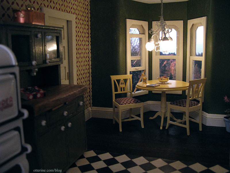
Heritage – kitchen table and chairs
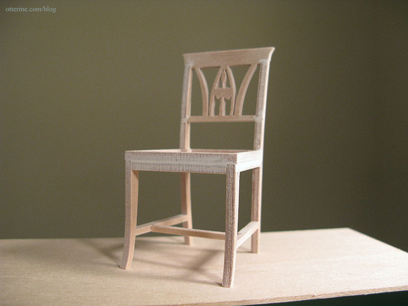
The Lilje chairs kit from Art of Mini is similar to the laser cut kits I’ve worked with, but they are made using what is described as a “water cut technique.”
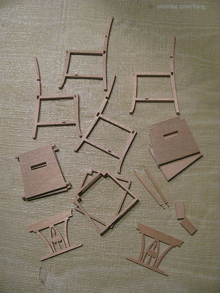
They don’t have the dark ashen residue of laser cut kits but have the same clean and precise cuts.
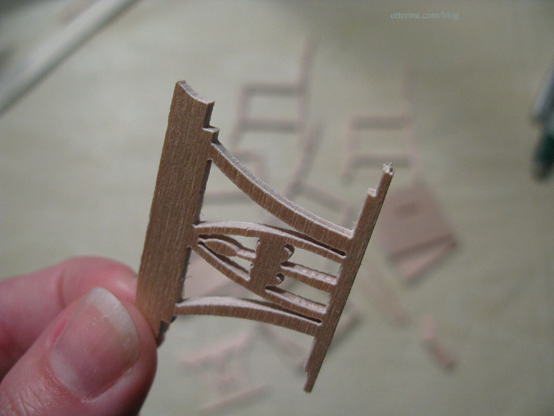
The instructions were in Dutch, but I was able to scan the document, use OCR on the file and paste the text into google translate for a reasonable translation. ;] It also helped that I had made similar items before.
With just a light sanding, the parts were clean and easily fit together. This is a very high quality kit.
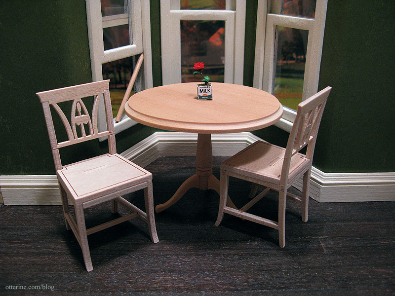
These seem a good match with the House of Miniatures dining table. The seats will be upholstered and the entire set painted.
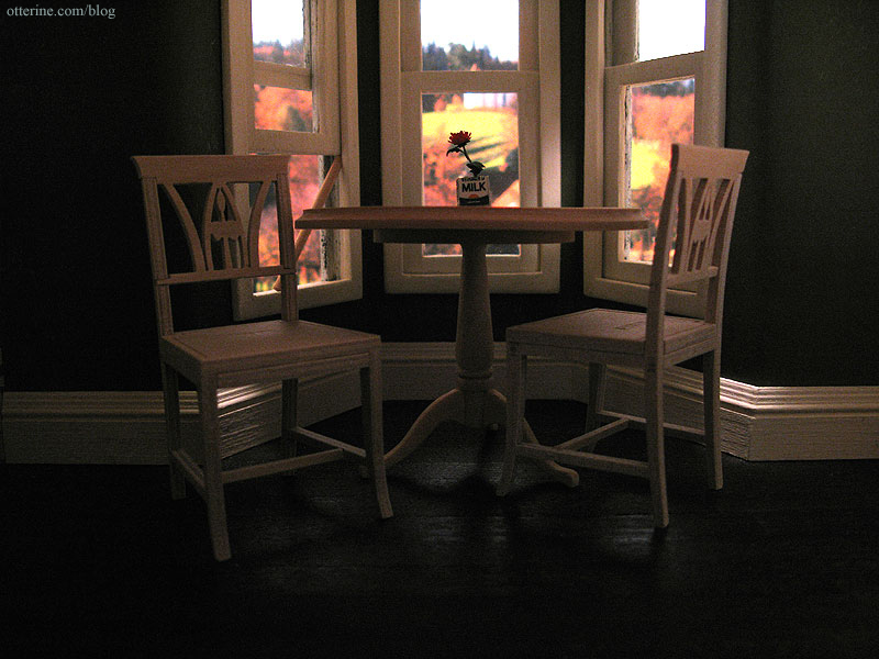
They have a wonderful cottage feel, perfect for my vintage kitchen.
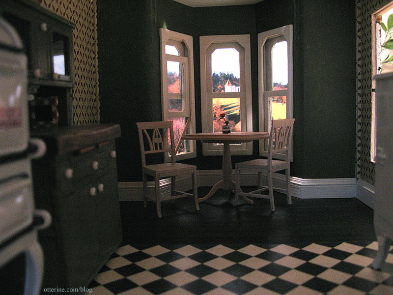
Some gaps show due to the way they are assembled from parts, so I added a bit of spackling to minimize the appearance and sanded smooth before painting.
I painted the table and chairs Italian Sage by Folk Art. I wanted to keep the table and chairs lighter in hue so they wouldn’t be lost in the deep room, though I do plan to install a light above the table. Here they are shown with only one coat of paint and a swatch of the plaid I had intended for the upholstery.
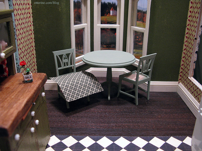
But, in the room, the set was lost and the green didn’t work well.
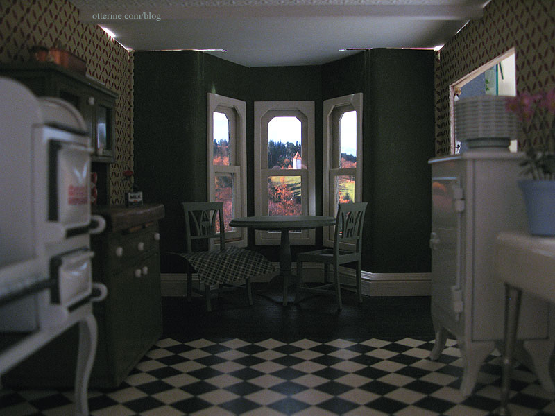
I opted for Sunflower by Folk Art to cover the Italian Sage used originally.
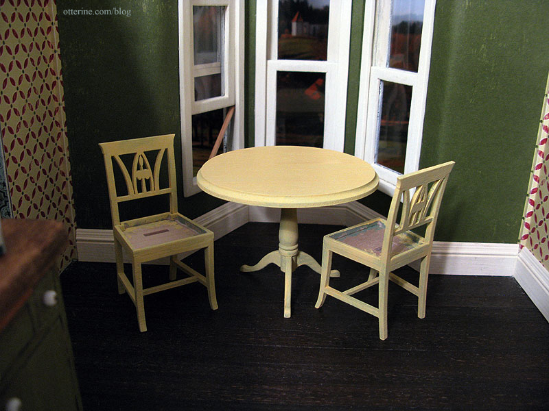
I was sloppy and heavy handed with the paint for a few reasons. First, I still haven’t sanded it after painting so the wood is rough anyway. I didn’t want to sand the sage paint and create green dust to mix with the new yellow paint. Second, I wanted to see if it even made things better. And, lastly, if it still wasn’t the right color, the yellow is still light enough to cover.
I do like it better already. I discovered the secret to making things look like they’ve been painted over and over. Just paint them over and over. :D
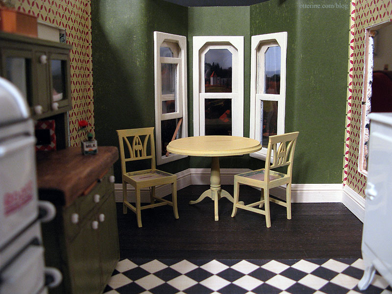
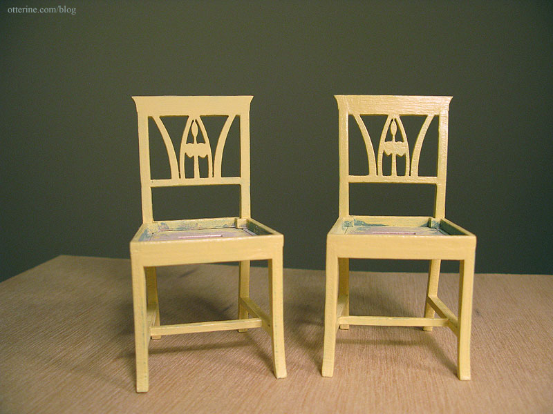
Since these are meant to be old chairs, likely repainted over the years, I rubbed a bit of the yellow off the top to let the green show through. I then added a light coat of Delta Ceramcoat satin varnish. It darkened the yellow and gave the set a nice, hand-painted look. The one on the right is the finished chair.
There are a lot of great quilting cottons in the fabric stores, but finding the right scale isn’t always easy. There are some great miniature fabrics on the market, but they are most often found online and sometimes you just want to be able to see them in person. I printed out a sheet of paper with a 1 inch square opening, a 1.5 inch square opening, and a 1″ x 4″ rectangular opening to take to the local fabric store. Looks like robot! :[]
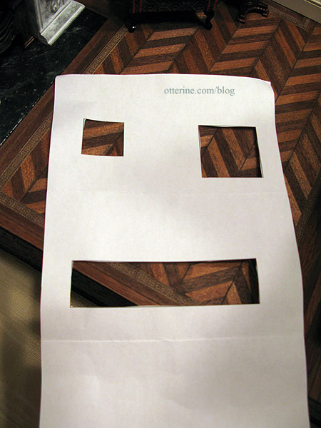
The 1.5 inch square is roughly the size of an upholstered chair seat or a throw pillow.
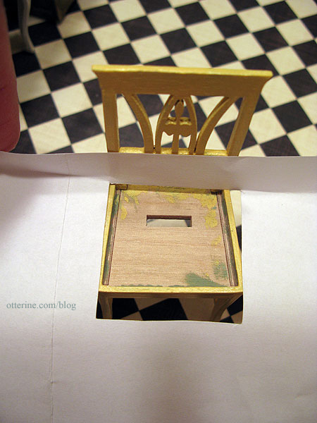
Holding these over various fabrics allows me to see how small or large the patterns would be in miniature.
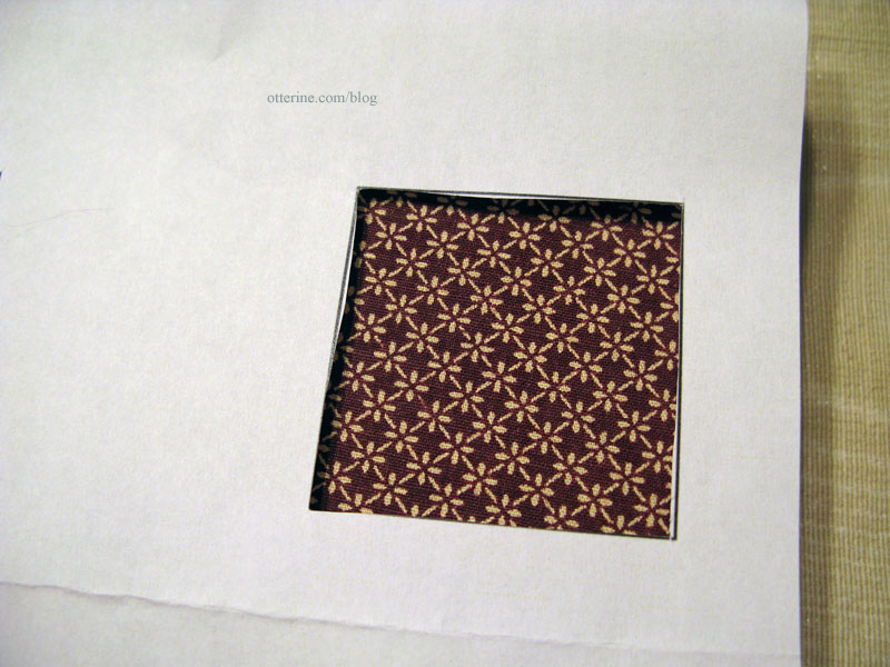
For the kitchen chairs, I chose a brown and ivory print. I think it is close enough to the dark red to tie in well with the wallpaper.
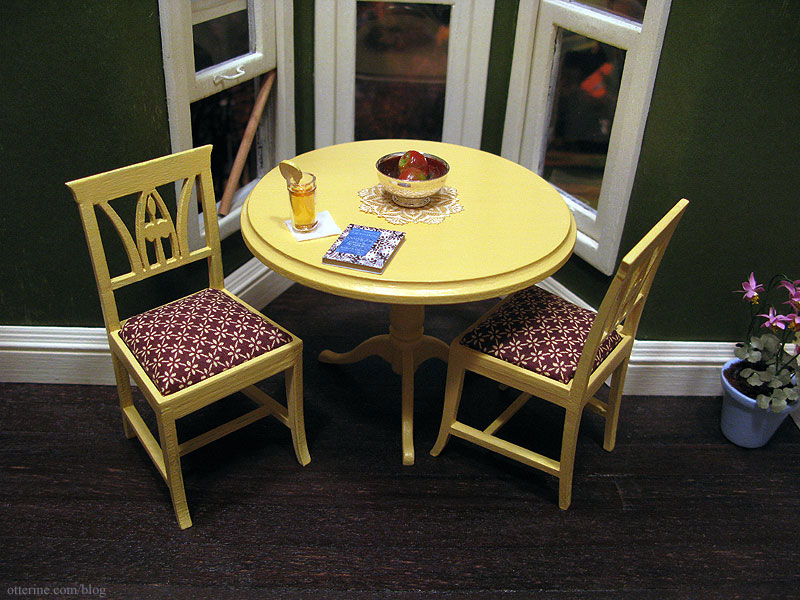
Grandma is enjoying an iced tea and reading about lacemaking. The paper doily is from miniatures.com, and the Clare Bell Brass silver Revere bowl is from Green Gables Dollhouse. The apples were purchased some time ago, though I can’t recall where. The flowers are from Michelle at Little Rabbit Miniatures.
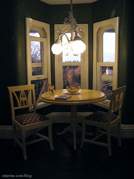
I love the soft sheen on the table from the satin varnish, and those cushions sure look comfy! :D
Categories: Furniture, The Haunted Heritage
February 14, 2012 | 0 commentsBespaq bed makeover and bedroom layout
It’s fun to take a piece of unfinished furniture and spruce it up just so. It’s even good to take a relatively inexpensive piece and change it, even paint it, to make it fit into a scene better. But, I feel as though I am going to get a collective GASP when I say I intend to redo this Bespaq bed, including the finish, which I intend to paint.
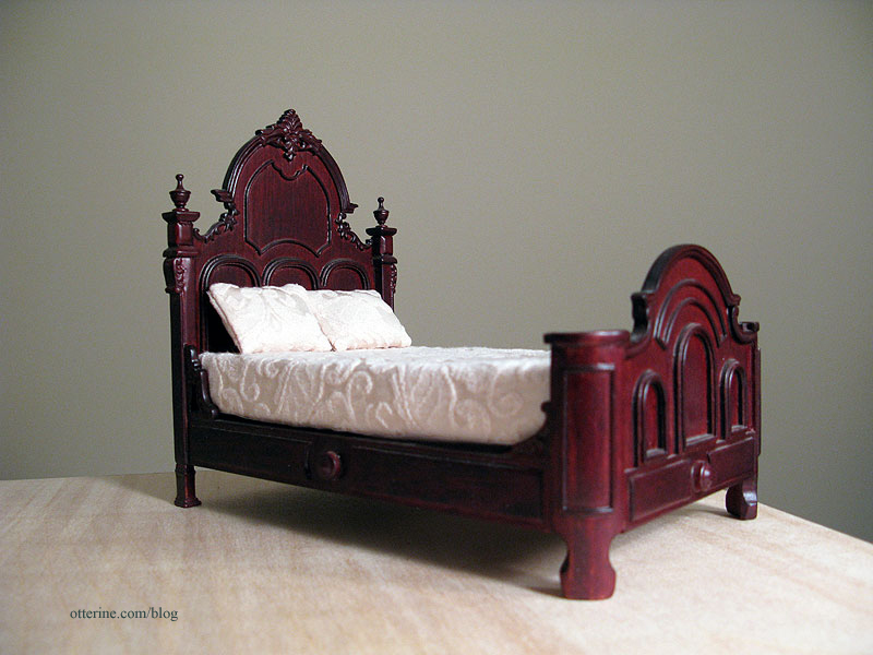
I love the bones of it, and the detailing is wonderful. But, the stain is all wrong, and the bedding is just deplorable for scale. Changing the bedding alone still wouldn’t fix the problem with the color.
As a refresher, here is the paper for the bedroom. This is by Recollections and has the macabre name of Out of Time.

To cover the varnished surface, I first sprayed the bed with grey primer. This is how it will stay until probably after the first of the year when I get a chance to paint it.
Since the kitchen is the same shape as the bedroom, I’ve used it to determine the general layout of the bedroom. You’ll need to do some imagining here with me. If you look at the top of the front and side walls, you can see where the two swinging windows will be — there won’t be a bay window up front. The rest will be solid walls.
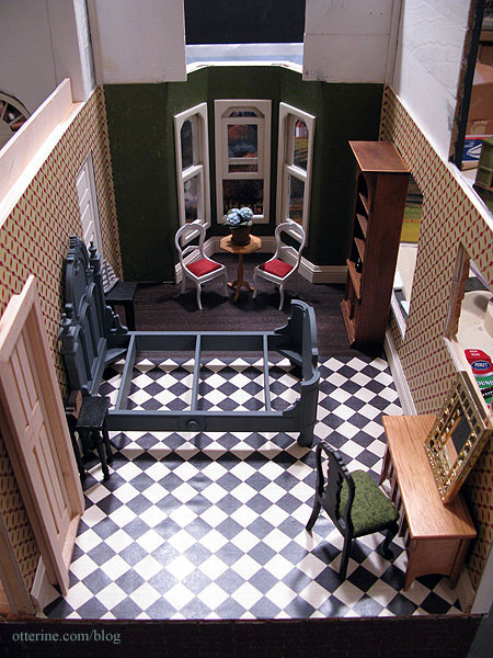
This leaves room for the big bed, one or two small nightstands on either side, and the narrow door on the inside wall. There won’t be a door where you see the pocket door, of course. I’d like to have seating, so maybe I will set up the Chrysnbon Victorian chairs and small table in front of the swinging window.
On the outer wall, there will be a wardrobe (where the bookcase is) and a vanity and chair (where the Mackintosh sideboard, Lundby mirror and black chair are).
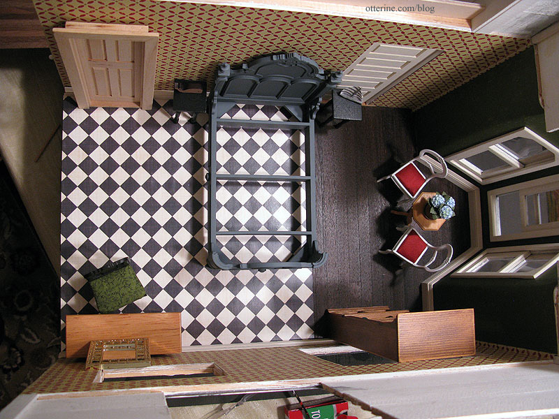
I think the layout works well, though there are the roof peaks to deal with concerning the height of the wardrobe. I might end up with a shorter dresser instead.
Categories: Furniture, The Haunted Heritage
December 22, 2011 | 0 commentsThe Sofa
As you’ve seen before, I bought the beautiful conversation piece known as The Chair made by Kris of 1 Inch Minis. She was kind enough to send me the extra fabric she had and let me know where she bought it. Unfortunately, there wasn’t enough for more than pillows and curtains or maybe an ottoman, and I really wanted to make a sofa to match. The Heritage just would not stand for mismatched furniture in the parlor. What would people say?! ;D
Sarah, a fellow member of the Greenleaf forum, mentioned that she saw the fabric at her local Joann store. I was unable to find any in my area, and she was kind enough to buy some for me during her next visit and sent it to me. Hooray!
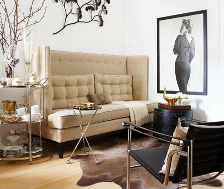
I went back through my idea file to see what would be able to hold its own with The Chair and still have a similar style to it. I found this beautiful high back sofa from AT Design Group.
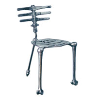
As an aside, check out their skeleton chair! :D I foresee a plastic Halloween decoration becoming a 1:12 scale chair in the future. Ha ha! Creeptastic!
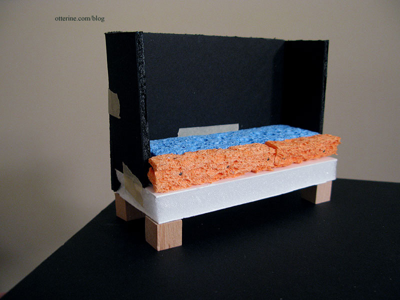
I used my knowledge from the Millie August sofa kit I put together and my initial attempt at an upholstered couch made with dried out (new) kitchen sponges.
I built a quick mockup in 1/2″ foam core board, 1/8″ foam core board and kitchen sponges (new and dried before using), leaving a bit of wiggle room for batting and fabric upholstery. I used 1/2″ wood cubes for the feet, though I planned to make legs like the original later in the build. I had to piece the sponges since the ones I bought were not long enough, though they were the perfect thickness.
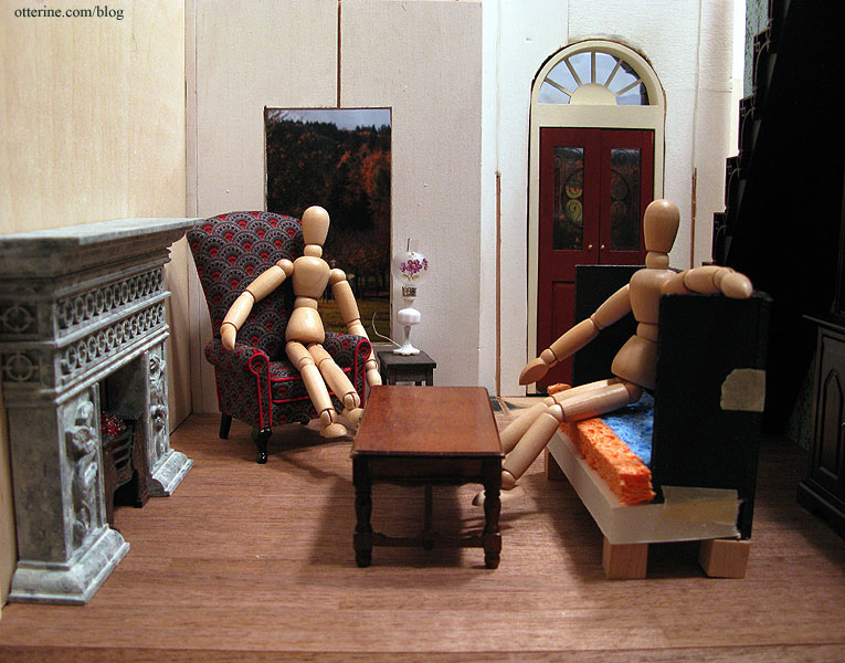
I put the mockup in the parlor to see if the size was good in relation to the chair and for the room itself. I made it shorter than The Chair since it looked off being the same height. As the models show, it works well have a tall chair and a slightly shorter sofa.
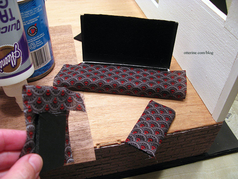
I then began putting the sofa together, first by covering most of the pieces with a layer of black felt under the printed fabric. I usually use millinery batting, but since this is a darker fabric I went with a darker under layer. It’s also thin enough cotton that I worried the lighter batting would show through. I didn’t take step by step photos here mainly because I had to work fast with the quick dry glue and parts of the assembly process were rather fiddly. :D
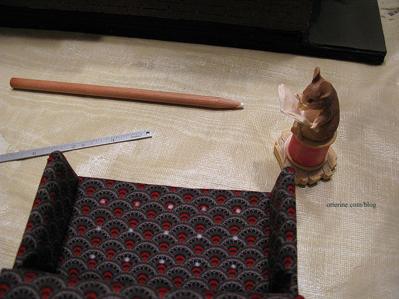
I added three rows of buttons to recreate the tufted appearance of the original by looping thread through the fabric and tying in the back. Shown here is the layout marked with a chalk pencil. Looks like my secret is out, too…I have a mouse tailor for guidance. ;]
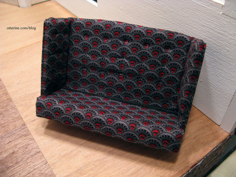
The tufting was a lot of work, but it was worth the effort. I just love the effect. I foresee other tufted minis in my future.
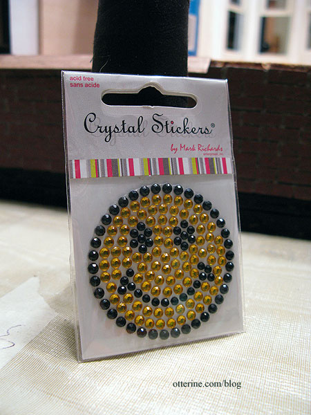
Using a glittery bead smiley face I bought for a dollar, I made buttons to cover the threads creating the tufts by gluing the crystals in place.
I made the tufted cushions using sewn pillows stuffed with flat pieces of felt and tufted with the same thread and buttons I had used for the tall back and sides. I like that they ended up a bit misshapen as though they’ve been used and moved about over the years.
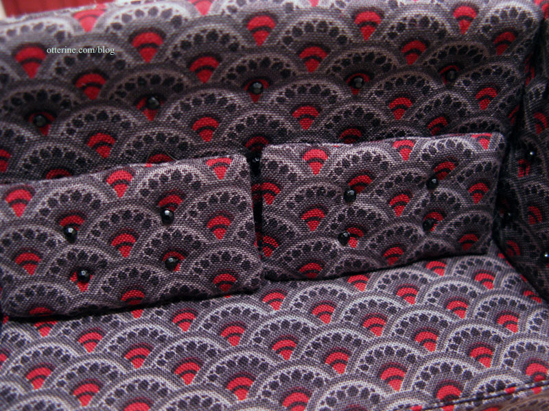
I think the crystal buttons work rather well, though I’ll need to buy another sticker not only because there were not enough to complete all the tufts (the missing ones are hidden behind the pillows) but also in case these pop off as time goes by. I’d never be able to match them otherwise.
The original appears to have a wood base, and I liked this detail. I built a frame and legs from bass wood and painted the assembly black followed by a satin varnish.
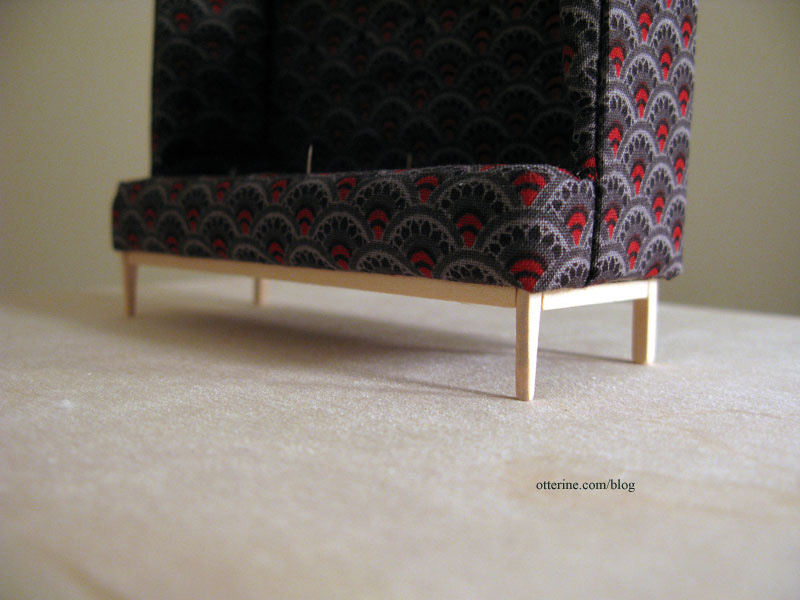
For the main cushion made from the kitchen sponges, I used the method of making cording that I learned from the Millie August kits to add a bit of realism. I opted for self fabric cording instead of red as on The Chair. Not only would it be unlikely to match, but there is so much going on with The Sofa that I worried contrast cording would detract from it. I may add a small red throw pillow or blanket over the back when I get further into the decorating phase to tie it in more with The Chair.
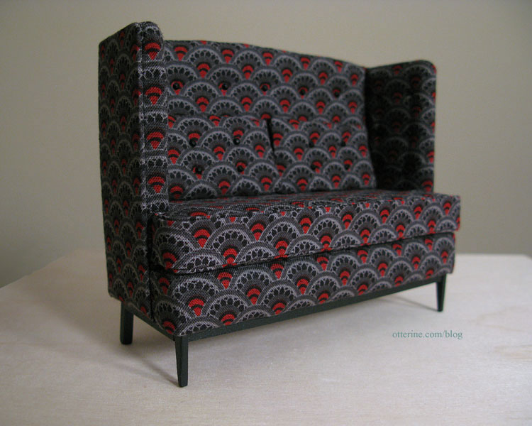
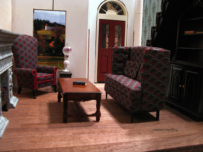
And, here is The Sofa!!! It is my second “from scratch” upholstered piece. :D Love!
And, here it is with The Chair.
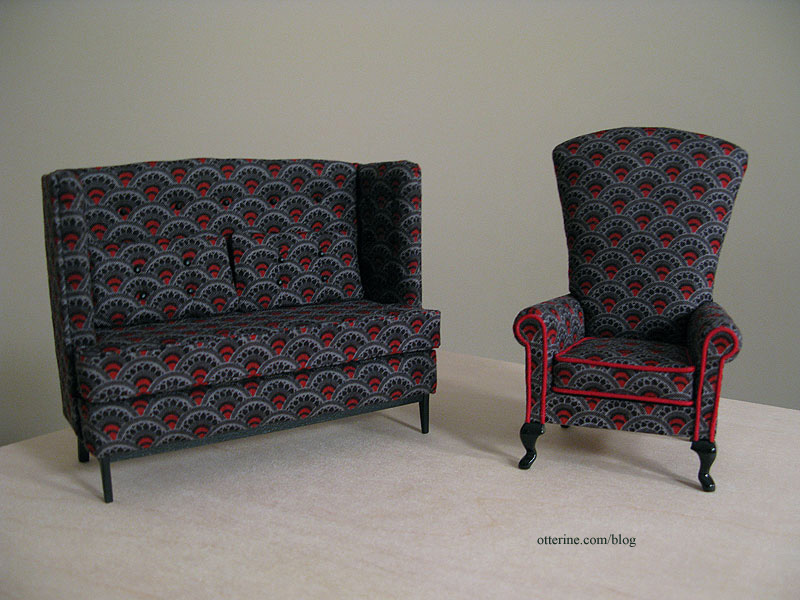
The lack of red in The Sofa is a little glaring with them side by side, but it’s less intrusive when in place in the parlor. Plus, there will be a lot of other things going on in the room as well.
Categories: Furniture, The Haunted Heritage
November 8, 2011 | 0 commentsCustom built wine rack
I am so brimming with excitement over how this turned out that I just needed to share. :D This wine rack is attached to a Houseworks cabinet, so I built a box from 1/8″ thick bass wood to mimic the structure of that cabinet. I painted just the lead edges of the inside as well as the entire exposed side of this addition.
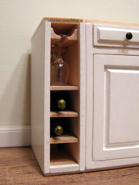
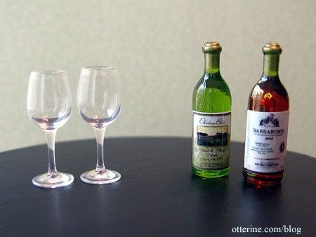
Inside, I have a place to hang wine glasses and to store three bottles of wine. I bought these items at the Bishop show even though they were a little large for scale. I think they work wonderfully here since they aren’t sitting next to anything else that would give away that fact.
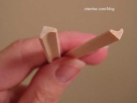
I made the glass holder from mini cove molding…it was actually a sample from a dollhouse wood supplier. There was exactly the amount I needed for this project. Score!
To keep the glasses from sliding too far back, I glued in a block right behind where the second sits. I left the holder and the shelves in natural wood.
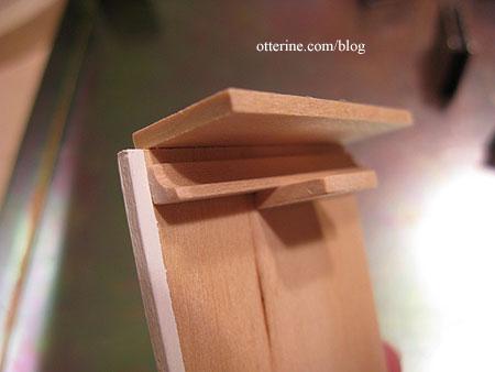
Each shelf is made from 1/16″ thick bass wood. Just as with the glass holder, I put in a stopper to keep the bottles from sliding back too far.
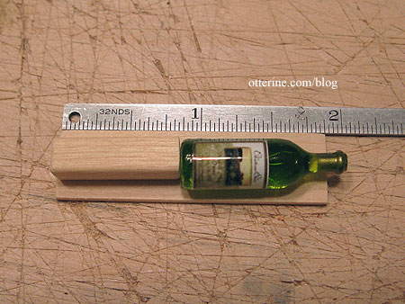
To keep the shelves in straight while the glue dried, I used a 3/8″ post as a spacer.
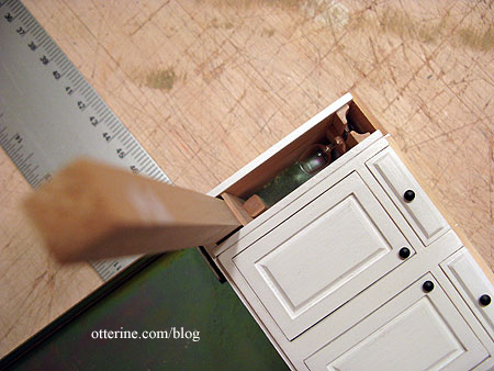
Now, who wants a glass of wine? :D
Categories: Baxter Pointe Villa, Furniture
June 12, 2011 | 0 commentsOly Studio Ichibad Side Table in miniature
Here is the side table I built, inspired by the Oly Studio Ichibad Side Table (as of 2024, the link to the square top table no longer works, but they have this round version).

My version was made from a premade wood square that measured 1 1/4″ across and 1/8″ thick and wood spindles by Tiny Turnings. Mine is a bit larger than a direct 1:12 scale conversion, but that actually works better for the scene it’s intended for.

I first drew a 1/8″ grid on the square with pencil and then used an X-Acto knife to score along those lines.

I painted the edges and back of the square with black acrylic and then started washing on various paint colors watered down to keep the color transparent (Coffee Bean, Black Cherry and Sunflower by Folk Art; Terra Cotta by Americana; and Barn Red by Apple Barrel).
I had to go over the scored lines again after painting with the X-Acto knife. I then used two coats of Triple Thick Gloss Glaze by Americana on the top and one coat of Delta Ceramcoat Satin Varnish on the sides. My scored lines aren’t as obvious as in the inspiration table, but I still like the way it turned out. Too much surface texture on a mini table can also make it difficult to display things on it.
For the legs, I cut the Tiny Turnings into 2″ lengths with the connectors intact. For the separators, I cut 1 3/16″ lengths also with the connectors intact.

I sanded around the ends of the separators with an emery board to make a smaller dowel that would fit into a drilled hole in the leg.


I cut one of the separators in half, splitting the connector in half. I sanded around the outer ends of the separators but left the inner connector halves as is.

I am not really a fan of brass or gold finishes, so I painted the bottom portion with two coats of Iridescent Silver by Liquitex. It was a little shiny and new, so I applied a black paint wash over the finish and dabbed away the excess. It was just enough to add some depth to the color.
I then drilled holes in the bottom of the table for the tops of the legs.

I think it turned out pretty well! :] It’s a bit rickety from being top heavy, but that’s the nature of lightweight materials in miniature.
Categories: Furniture
June 2, 2011 | 0 comments
NOTE: All content on otterine.com is copyrighted and may not be reproduced in part or in whole. It takes a lot of time and effort to write and photograph for my blog. Please ask permission before reproducing any of my content. (More on copyright)


